Table of Content
Discover a Variety of Brown Colors with Names and the Psychology Behind Them
Brown is an often-ignored color. People think that the color of dirt is of little significance. Yet designers know that there is an amazing world hidden in the various shades of brown color.
Imagine a cup of freshly brewed, foamy mug of cappuccino. What color would you call that? What about your guilty pleasure – a bar of rich and decadent chocolate that you love? That is right; both of those are brown.
The brown family has a number of shades to choose from, from simple and drab hues to comforting, warm tones that will leave you wanting to snuggle and nap. So, the question is why is it that people associate brown with drab boredom? And what are the brown colors with names that we can use to challenge that perception?
Join us as we explore the rich world of brown colors, and discover what shades and hues and used are professional graphic design services to raise the visual impact of their designs.
Let’s begin.
The Psychology of Brown – How Different Shades of Brown Color Affect Us
Some shades of brown are quite common in use, especially in applications such as interior design. This is especially true for wood tones, such as oak, pine, and mahogany. According to color theory, that is because these shades of brown color evoke a sense of warmth, giving your space a cozy, welcoming vibe.
It is one of reason that most men had their dens decorated in various shades of the brown family, from dark brown rugs and carpets to wood paneled walls and flooring. Unlike reds or blues, browns are easier on our eyes too, and like green soothe. And when combined together, the result is a vibe that relaxes and unwinds mind, body, and soul.
In fact, why do you think woodland retreats are so popular with people nowadays? The mix of dark shades of green and subdued brown tones make for a soothing environment that is unmatched.
But it isn’t just calm that brown exudes. It also gives off a warm energy that seeps into you, courtesy of its red and yellow parent colors. All of this combined results in a color family that forms a strong connection to the natural world around us, offering a great contrast to more ethereal shades like blue.
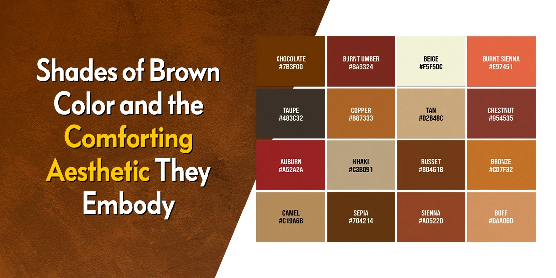
20 Beautiful Shades of Brown Color That Leave Us Well Grounded
Now that we know the earthly connection of the shades of brown color, and their psychological impact on us, you might be raring to add some brown shades to your color palettes. The question is – which shades should you use?
Let’s dive in and explore the top brown shades that can add a new life to your color palettes, and anchor your color combinations together. Let us start.
Brass #B5A642

Let’s start with one of the three popular shades of metallic brown. Brass is a beautiful, dusky shade of yellow-brown, with light undertones of green and gray. A warm shade of brown, it gives its designs a certain metallic charm, combining the vintage charm of copper with the vitality of yellow. Overall, this shade is one of the most popular colors that start with B, and is a valuable addition to any color palette.
Bronze #CD7F32

While Brass is an alloy of copper that is lighter than its parent, bronze is the darker alloy of copper, similar to antique brass from colors that start with A. Well, bronze is not exactly darker, but rather has an earthly tone to it, while copper seems lighter due to its warmer hue. And like brass, bronze can be a great accent shade for your color palettes, adding a comfortable earthly tone to your designs.
Buff #FFC680

Buff is an interesting shade of brown that can also be called a warm tan, due to its higher concentration of orange. Buff is an interesting shade of brown that can also be called a warm tan, due to its higher concentration of pastel shades of orange color. However, in the presence of cooler shades in its palette, it will seem warmer than if used alone. And when used in combination with darker, warmer shades like ochre, or true neutrals like beige, Buff will transform into a brighter, more vivid color.
Chestnut #954535

Chestnut is an interesting shade of brown, with a distinct red-maroon tone to it that goes very well with burnished shades of gold color. The color is one of the darker warm shades of brown color, that pairs equally well with lighter shades like cyan, and darker, regal shades like dark blue. But it really works best with whitish neutrals, such as ivory. And unlike some of the other shades we have discussed, it isn’t much used as an accent color, but rather in textures and backdrop for some character.
Camel #C19A6B

Camel is one of those nature-inspired shades of brown color from colors that start with C that is said to be reminiscent of camel hide. It is a lighter shade of the color, with some yellowish overtones, which makes it go perfectly with a number of different color groups. This trait is why camel-colored coats are usually used as overcoats, as they complement nearly any kind of pattern and color scheme. Somehow, the look of this shade lends a feeling of vintage nostalgia to its application, making it a great addition to your color palette.
Burnt Sienna #882D17

Burnt sienna is said to be one those reddish-brown shades that is often represented in the earth around us. Along with ochre and umber, which are also shades derived for different types of potting clay, they make up the three most popular heated clay tones. A versatile color, it pairs equally well with warmer tones like orange, dark shades like green or blue, or even pastels, neutral, and metallic shades like cream or copper.
Chocolate #7B3F00

The color chocolate is reminiscent of the shade of creamy, sweet milk chocolate, rather than that of dark chocolate or the cacao beans. As such, it has a beautifully warm, comforting, and filling vibe to it that elevates any design that uses it. Interestingly, pairing it with light shades of pink color lend a sweetness to the color, just like pairing it with burnt orange makes it warmer. However, green is the preferred choice if you want to leverage chocolate’s maximum potential.
Cordovan #893F45

Cordovan is a confusing color, as both the red and brown color families claim it as their own. This is similar to the case of magenta, which is often included in both shades of purple color and pink. In any case, it is the shade of cordovan leather, which is named after the city of Cordoba, where it originated. A dark, red-purplish-brown, it’s a color most often seen in high-end dress shows made out of shell cordovan, or English riding boots called the “Cordwainer”.
Cinnamon #D2691E

Cinnamon is an interesting shade that is named after the color of this ground spice. A warm, medium shade of brown, it pair surprisingly well with black, something many of its brothers have a hard time doing. Its versatile in other aspects as well, giving an elegant look with pastels and neutrals, gets warmer when paired with reds or oranges, and dials it back when paired with shades of blue.
Tan #D2B48C

Among browns, shades of tan color can be seen in everything from leather shows to belts, jackets, and more. It is one of those shades of brown color that are considered a true neutral. Complementing the color it is paired with, tan gives a coo, soothing vibe when paired with blues, while its warmth increases when paired with yellows, reds, or their tertiary colors. Moreover, it turns surprisingly elegant when paired with other neutrals like cream, off-white, and ivory, or even black.
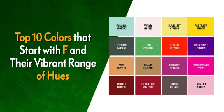
Fawn #E5AA70

Fawn is a beautiful shade of orange-brown from colors that start with F that is meant to mimic the color of the fur of a baby deer. One of the lightest and warmest shades of brown color in this list, it is an exceedingly beautiful color that pairs well with almost all other shade out there due to its near-neutral tone. The combination of navy or royal blue with fawn is a popular choice for interior design. Moreover, its combinations with greens and other shades of brown gives a strong nature vibe, due to its earthy tone.
Khaki #C3B091

Khaki is a light shade of earthy brown with a significant tinge of shades of gray color to it. It is also the color of one of the most heavyweight and long-lasting fabrics, which we know as the khaki fabric. The color is surprisingly low maintenance, pairing equally well with bright greens and natural greens. Moreover, it also pairs well with other neutral colors, as well as pure white, for an elegant, timeless look.
Mahogany #C04000

Mahogany is a warm, reddish-brown shade of color, and one of the most beautiful shades of brown color we see in nature. Named for the mahogany tree, it pairs well with cool shades of blue, neutrals, white, gray, and even various shades of black color. The rule however is, that the lighter the shade its paired with, the warmer mahogany looks. And the darker the paired shade, the more subdued it looks.
Ochre #CC7722

Ochre is one of the clay-toned shades of brown color that includes the likes of umber and sienna. The lightest shade among the three, ochre has a distinctive yellow tone to it, unlike the other two which are darker with more prominent red undertones. A rich shade, it can be toned down using neutrals and soft shades of white color like off-white and cream. Alternatively, pairing it with other rich, strong colors like purple or deep reds, it takes on an increased intensity that elevates the whole design. However, pairing ochre with eclectic colors like teal or royal blue result in unique, if attractive color palettes.
Russet #80461B

Russet is one of the most interesting shades of brown color on this list. A medium brown shade, it has a subtle purple tone to it, that helps it pair well with various shades of blue. When paired with blue, it results is a stable vibe. Similarly, pairing it with warm shades of red and orange give us an autumnal vibe, while pairing it with greens give us a refreshing, natural feel.
Taupe #483C32

Taupe is one of those shades of brown color whose place on this list is often debated. A dark shade of brownish-gray, the color is said to represent the fur color of a French mole. Now, many people believe the color to be one-dimensional and boring. However, it makes for a great foundation shade, where you can combine it with dark, rich browns, warm orange and reds, and even bright turquoise.
Umber #635147

Umber represents one of the oldest known pigments on this earth, one that has been used for millennia by humans. The darkest of the three clay pigments we have mentioned on this list, many acclaimed Renaissance painters used it to add shadows as an alternative to black. A versatile shade, it works well with a wide variety of colors including shades of teal color, making it perfect to add to your color palette for mixing.
Beige #F5F5DC

The original beige from shades of beige color represents the color of undyed wool, and is named thus in French. A light shade with just a hint of brown, it is one of the true neutral colors, meaning it adapts its perception according to the different scenarios. Pairing it with brown, earthy tones give us a subdued, eco-friendly vibe, while mixing it with other neutral and near-neutrals give it an upscale, elegant vibe.
Sand #C2B280

Sand is an interesting shade of color, as it is designed to be a desaturated shade of bright yellow, unlike the distinct pink hue of desert sand from colors that start with D. Reminiscent of the color of common sand, it has a distinct yellow-gray vibe, with subtle undertones of brown. A neutral shade, it pairs well with a variety of colors, growing in warmth against softer shades of blue, while tempering and softening the impact of dark blues.
Brown #964B00

It is a fact that people do not like brown. Many ignore it for being to boring, or earthy. Many ignore it for being too boring, even deep and beautiful brown shades like earthy brown from colors that start with E. Representing nature, it pairs well with green for a nature-friendly, soothing vibe, while adding it to pinks give us a fashionable look. But it is when paired with white that its best qualities are enhanced.
More Shades of Brown Color
FAQs
| Is beige a shade of brown? Yes, beige is a shade of brown, and one of the few true neutrals in the family. |
| Is tan a brown or a variant of beige? Tan is a distinct brown shade that may look similar to beige, but has a stronger brown affiliation. |
| Is brown a luxury color? Yes, a few shades of brown like cordovan are considered luxury colors. |
Conclusion
In summation, the various shades of brown color make for a color family that is versatile, yet closer and more uniform in visual impact than many of the other color families we have seen. This means that the brown family is universally a grounding color, and no matter the shade used, it helps connect us with nature.

Logopoppin
Logopoppin is a graphic design agency that specializes in logo designing, web development, video production and advanced branding services. We love to innovate businesses with new age technologies, allowing them to improve their visual reputation.

