Table of Content
Discover the Best Green Colors with Names and How to Use them to Elevate Your Art
Green is one of the primary colors in the world, and as such, is very important for the formation of the various interesting colors we see around us every day. However, green is an important color for humans biologically as well, serving as a useful evolutionary trait for us.
Now, we can choose from an enormous array of shades of green color, depending on our applications. Arguably, there are more shades of green proper, than either red or blue, the other two primary colors, have. But why? Why are green color combinations found so prolifically in our environment, both naturally and artificially?
Moreover, what do these popular shades of green represent? We know the reds symbolize passion, and the blues a sense of calm. So what do the greens represent? Join us as we dive into the world of green colors and learn what the various shades of the green color family symbolize. We will also get to the bottom of the mystery as to why nature and creatives like graphic design services prefer different hues and shades of green in their palettes.
Shades of Green Color – Brief Overview of the Color Family
The most popular color model that we see and use in our lives today is the RGB model. Composed of the primary colors Red, Green, and Blue, it forms the basis of all others colors in the spectrum, forming combinations with each other and their secondary or tertiary shades to create new hues and colors.
Now, green is an interesting color family. It exudes a feeling of calm like blue, and adds a sense of vitality and energy like red. However, unlike blue, the calm it exudes is that derived from nature and immersing yourself into its bounties. Similarly, the boost of energy it provides is different to the hot, passionate energy of red. Rather, it is the revitalizing energy of our connection with nature, the energy circulating within all living beings, whether its subdued hunter green from colors that start with H, or the bright neon green.
Ever wondered why people prefer vacationing in the wilderness, surrounded by the soothing calm of nature? Just try it. Go hiking in a forested area around you. Find a secluded spot off the track, and just sit there for a while with your eyes closed.
The sounds of leaves rustling, the scampering of squirrels and birds around you, and the soothing green canopy over you; all of these combined result in a vibe that is hard to beat. Moreover, according to color theory, green can serve as a grounding conduit for the conflicted feelings and emotions inside a viewer, helping us calm the storm. That is why shades of green color are so important to know and understand, as they can add an unmatched charm to our designs and other applications.
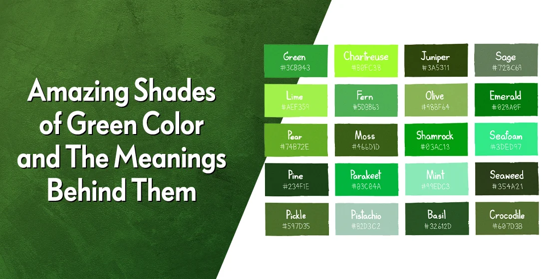
Top 20 Shades of Green Color That Can Enhance Your Brand Color Combinations
So, now that we have taken a look at the reason behind the popularity of various shades of green color, you might go looking for some green colors that suit your fancy. But how would you know which ones would add value to your purposes? Considering that there are hundreds of shades and hues of green colors with names that defy understanding, how will you find the right options to add to your palette? Especially when you don’t know their design or logo color meanings.
Join us as we explore twenty of the top shades of green, and see how we can create the perfect green color combinations for our color palettes.
Forest Green (#228B22)

The first shade of green we are going to discuss today is forest green. Forest green is a vivid yet deep shade of green that is meant to be reminiscent of a deciduous forest, with trees that shed their leaves each year and see new growth come spring.
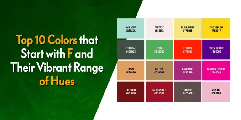
The color is quite different than say, fern green or pine green, where the former has a yellowish-brown tinge to it, while the latter has a distinctive blue tint. Overall, it is one of the most famous shades of green color today that belongs to colors that start with F.
Olive (#BAB86C)

Olive is an interesting shade of green, which people often confuse with colors like beige, but with a slight greenish hue. Although you may think that it is a light color, olive is actually one of the darker shades of green color with significant tones of brownish-yellow shades of gray color to it.
The color is quite versatile, working in different color combinations to create nearly opposite effects. With shades like beige, cream, ecru, and more, it can serve as an understated backdrop, while it can also add interesting accents when paired with darker shades of green color.
British Racing Green (#004A0F)

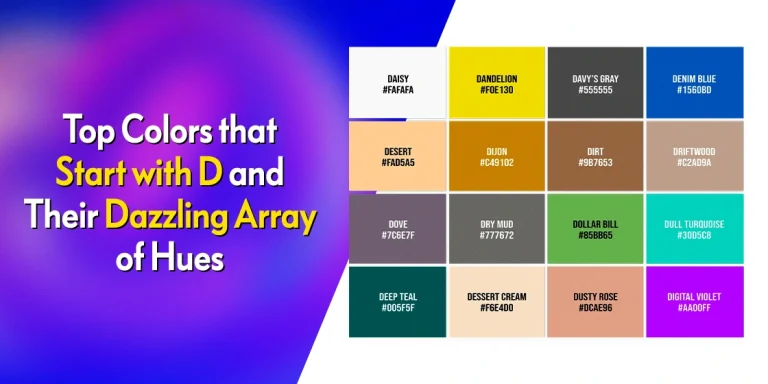
British Racing Green is one of the more iconic shades of green, known for being sported by British racing car and drivers for decades now. British racing green is a dark and deep shade of the color, with a slight yellowish tinge to it that lends a warmth to it. And although it may look similar to dark green shades like deep emerald green from colors that start with D, its subtle yellow warmth sets it apart from the bluish cool tones. British racing green is a dark and deep shade of the color, with a slight yellowish tinge to it that lends a warmth to it. Overall, it is a great shade to use.
Green Apple (#7AD91C)

Green apple, or apple green, is a vivid shade from colors that start with G that is designed mimic the color of the outer skin of an unripe Granny Smith apple. Looking at it brings you visions of tart, crisp apples, warm apple pie, and visions of summer days spent playing in the fields, and then cooling down with cool glasses of cider at grandma’s house. This is a shade of green you would use to add a bit of vibrancy to your art.
Alpine Green (#005B52)

Alpine green is a cool tone of green that has a distinctive blue tone to it. Meant to be reminiscent of the canopy of the alpine conifers high up the mountains, which look more blue than green due to the variance in sunlight, it lends a cool, soothing vibe to your designs. Now, although it looks like it belongs to the color blue from colors that start with B, its RGB configuration shows that it is certainly one of the shades of green color.
Sea Green (#2E8B57)

Sea green is a beautiful shade of green that brings to mind the warm, pristine sands of the beach, with slow waves going by as you lie down and enjoy it. This is a color that is more reminiscent of the beaches in areas like Madagascar or Maldives, with reefs under the water changing the hue of the water from deep blue to green. This shade is quite versatile, and can be used as an accent or a primary shade in your palette easily.
Myrtle Green (#367A77)

Myrtle green is another one of the shades of green color inspired by nature, with a distinct hue of dark shades of blue color in it. It is a color that is reminiscent of the dark green, almost blue coloration of the Myrtus leaves, giving a cool and beautiful tone of color for your palettes.
Persian Green (#00A897)

Persian green is a beautiful shade of bright green with a high concentration of blue in it. Used in many types of Persian art and handicrafts, it is a peculiar shade of color indeed. When used alone, it has a distinct blue tone, while when used with colors that complement it such as the various shades of tan color, then you will see that the color looks surprisingly green. This shade is just one of the many examples as to how our mind tricks our perception.
Emerald Green (#50C878)

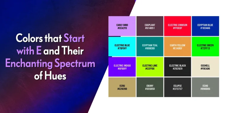
Emerald green is one of the lighter shades of green color, belonging to colors that start with E. it is meant to be reminiscent of the color of an unpolished emerald, which after cutting and polishing results in a deeper shade of the color. A regal color, it adds a touch of elegance to any application it is used in, from apparel to art, interior design, and more.
Neon Green (#39FF14)

Neon green is one of the most electrifying shades of green color, similar to acid green from colors that start with A, but one that should be used with some caution. It is a shade that is reminiscent of the neon green lights used by storefronts and businesses in the 70s and 80s. In interior design color palettes, this shade can add a welcome pop of color in an otherwise monochrome or drab backdrop. But beware of using it too heavily in your design, lest it take over and impact the visuals desired.
Jade Green (#1FA774)

Jade green, as the name suggests, is named after the jade stone, an important element in many oriental cultures, and known for its perception of purity. The jade color is a soft shade of green with a slight blue tinge reminiscent of shades of teal color, which changes depending on how the light interacts with the color. This variation in its perception is what gives it its characteristic charm, and makes it a great color to add to your palette.
Pakistan Green (#006600)

Pakistan green is a dark, deep shade of green unlike any other. Despite being dark, a certain brightness to it makes this green shade quite attractive in designs. Reminiscent of the color used in Pakistan’s flag, it is one of the most interesting shades of green color inspired by countries and their flags.
Midnight Green (#044A59)

Midnight green is a dark blue-green that is the color of the sky near midnight, illuminated slightly by ambient city lights or the moonlight itself. A cool shade of green, it can work great as a dark backdrop in your color combinations, accented by lighter, brighter shades that pop off it.
India Green (#128807)

India green is another shade of green that is inspired by the colors of a country’s flag. A brighter, lighter shade of green than Pakistan green, this shade of green is used for the bottom third of the flag, alongside orange and white. Although lighter, there is a certain vitality of pigment in its mix, making it an interesting shade to watch in action.
Celadon (#ACE1AF)

Celadon is another beautiful, pastel color that belongs to colors that start with C. One of the few popular shades of green color that are considered pastels, you would think that it would work best as a backdrop for spaces such as nurseries. However, it can work equally well to add some light elements to a darker background, working well with a variety of colors including variouspinks or browns.
Malachite (#0BDA51)

Malachite is a vivid shade of green with a very slight hint of blue that electrifies in any application. It is a color that could be a versatile addition to your color palettes, working well with various shades of pink color easily. Now, for such a bright shade of green, it would be better if you used it sparingly, otherwise it may take over the other, softer elements of your design.
Bottle Green (#006A4D)

Bottle green is one of the most popular shades of green color, offering a dark, subdued, yet elegant vibe unmatched by any other shade of the green family. Overall, it is a great color to use in your brand palette, working well with various shades of black color, whites, browns, and more. Overall, it is a great color to use in your brand palette.
Chartreuse (#DFFF00)

Chartreuse is a vivid, electrifying shade of green that is often confused for yellow. It is a shade that, despite its brilliance, works well with other colors, even the regal colors like lilac from shades of purple color. So, if you want to use a shade of color that packs yellow’s vitality, yet has a visual impact greater than it, then chartreuse is a great option for you.
Pistachio (#AED09E)

Pistachio is a soft, pastel shade of green that is meant to be reminiscent of the green outer color of dried pistachio nuts. Sometimes, a brighter shade of green is also considered as pistachio, which has a vivid hue to it similar to the bright green pistachios found in Turkiye. However, for the most part, this softer shade of green from tertiary colors is what most applications consider as pistachio, and it is a great way to add a soft touch to an otherwise sharper design.
Kelly Green (#4CBB17)

Kelly green is a vivid shade of green inspired by Irish roots and culture. Meant to be reminiscent of the shades of green color as seen in shamrocks, it is often used to celebrate Irish events like Saint Patrick’s Day and more, just like Erin green from colors that start with E. Now, if you want to use a bright shade of green that your consumers would also feel familiar with, then Kelly green is a great option for that.
More Shades of Green Color
FAQs
| What are the prettiest shades of green color? While its said that beauty is in the eye of the beholder, some of the prettiest shades of green include: Forest green Kelly green Jade Teal Seafoam green |
| What shade of green is closer to yellow? Chartreuse is the closest of all shades of green to be confused for yellow. However, despite its similarity, the color has a distinctive green tinge to it. |
| Are some shades of green color considered luxury? Yes, shades of green color like jade, emerald, and more are considered luxury shades that are worn in complement to other luxury shades like purples and reds. |
Conclusion
To sum it up, various shades of green color depict different vibes. Some give a regal aesthetic, while others like neon green are used for their shock value. However, it is up to the designer to find the right shades of green for their applications, based on the relevant color meanings.
In the end, the green family of colors is a large, and mostly versatile one. In conjunction with shades of brown color, it helps us connect with nature, giving a sense of calm to their designs.

Logopoppin
Logopoppin is a graphic design agency that specializes in logo designing, web development, video production and advanced branding services. We love to innovate businesses with new age technologies, allowing them to improve their visual reputation.

