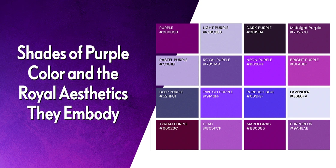
Table of Content
Discover an Amazing Variety of Purple Color with Names and See What They Represent
As we all know, different color families, and even the specific shades within them, influence our emotions and perceptions when we see them. Now, we know that reds are used to give your designs a sense of energy, vitality, and passion. Blues, on the other hand, are colors that affect calm and trust, elements that are necessary for a brand’s success. So what do shades of purple color, the combination of red and blue, represent in color theory?
Purple has long been considered a color group associated with royalty and elites in general, enjoying a regal position due to its rarity and difficulty of production. From the Roman Empire to civilizations even older, the cream of those societies has worn the color.
But with so many different shades and purple colors, how do you know which ones to use in your palettes? In fact, can substitute one shade for the other from the purple palette, or do different shades of purple color represent different things?
Let’s dive in to the rich world of purple, and explore what some of the top shades in this color family represent. The colors and shades we will discuss today are those that are sure to add immense value to any professional graphic design agency’s branding color schemes.
So, join us as we begin this journey.
Shades of Purple Color – Historical Significance and What They Represent
Purple is one of those shades of color that has been derived by the ancients from their native fauna. While the red pigment carmine (cochineal red) was derived from the Cochineal insect in the New World, most of Europe used the color called crimson or vermillion, derived from the Kermis insect, but wasn’t as vivid.
The earliest record of discovering and using purple comes from the city of Tyre, in Phoenicia (now present day Lebanon). There, the locals produced the deep and vivid purple die from the crushing and fermentation of the Murex snail, found on the shore of Tyre. And the resultant color was known as Tyrian purple, named after its origin city.
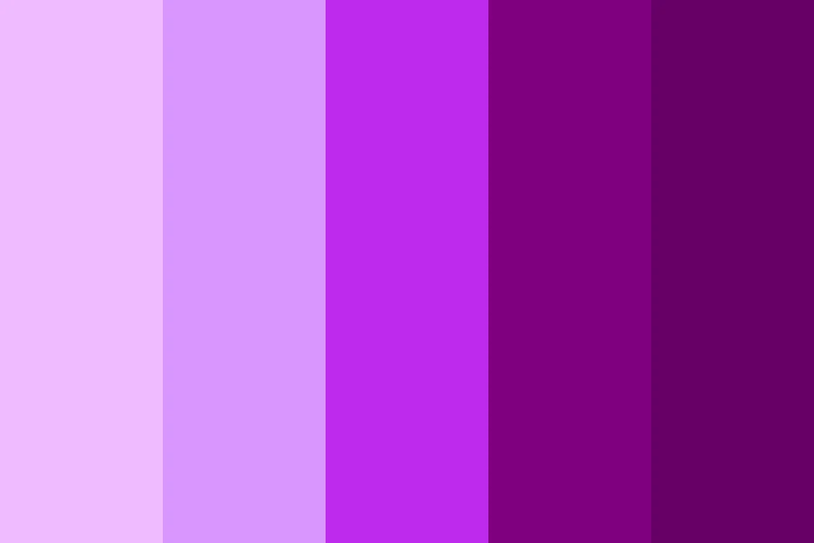
In those days, the color quickly became a symbol of the very rich and the royalty, solely because its rarity and difficult production meant that only the wealthy could afford it. And as the color quickly entered Rome, it became a symbol of the Empire, being dubbed Imperial purple.
Now, as a mixture of red and blue, the different shades of purple color give off slightly different vibes to each other. However, one element is common to them – the feeling of calm confidence and self-assured energy they embody.
That is why the colors and its related shades have long been associated with the royalty and religious clergy. In the centuries past, these people were believed to be the bravest, wisest, and the most spiritually connected of the people in the land. And these elements have trickled down into our modern symbols, such as the Purple Heart medal for bravery, or the purple vestments worn by the clergy during Lent.
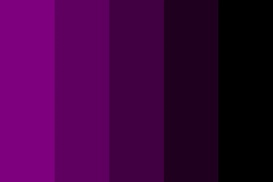
Similarly, the spiritual connection of purple can also be witnessed by the color’s use as a symbol of mourning. In many old European and Asian cultures, the deep shades of purple are used alongside black as the colors of mourning and remembrance of the dead.
So, that is how the different purple shades show various aspects of spirituality. On one end, we have the lighter, brighter shades showing the spiritual loftiness of colors like royal purple and Tyrian purple, while the darker shades remind us of the unavoidable nature of death in life.
24 Shades of Purple Color That Add an Amazing Royal Charm to Your Color Palette
Now that we have looked at the significance of the various shades of purple color, you might be wondering about the wonders of this color group. Well, that exactly what we will be exploring next. Although the purple color family has a number of shades, we have chosen the top two dozen of those colors to discuss today.
So, let’s find out what are the top purple colors that you can use to enhance your brand color palettes today.
Mauve (#E0B0FF)

Mauve is one of the more popular shades of purple, albeit one that is known for its muted or light profile. A soft shade, it is a popular option for interior design color palettes, especially those going for a comfortable pastel look. its versatility lies in the fact that it can be easily paired with lighter shades like cream, as well as darker shades, to add to the shade’s elegance.
Violet (#8F00FF)

Violet is one those vibrant shades of purple that has historically been associated with the royals and the aristocracy, due to its deep and rich pigmentation. Its mix of blue and red leans more towards the blue, meaning that the color induces calm, with a bit of excitement mixed into it. And while violet itself is a shade of purple, there are a number of purple shades that can be said to be derived as tertiary colors from violet rather than purple proper.
Floral Lavender (#B57EDC)

Floral Lavender, which is also known as medium violet, is a shade of purple reminiscent of the lavender blooms, showing a beautiful shade of the color that is the perfect mix of richness and soothing lightness. Providing a more balanced mix of red and blue compared to actual violet, the color serves as a great accent against softer, neutral backgrounds.
Boysenberry (#893660)

Boysenberry is one of the more interesting shades of purple color from colors that start with B, offering a dark, deep shade of purple that still embodies a warm, energetic aesthetic due to a red-leaning color mixing. Although a dark shade of the color, the distinctive reddish-tone of the color lends it a warm vibe, reminding us of warm summers filled with sweet and delectable fruit preserves and juices, including boysenberry juice.
Lilac (#C8A2C8)

Lilac is an interesting shade of purple, said to be reminiscent of the lilac blooms. It ranges from a blue-oriented shade that looks like a light gray-purple, to a shade that is slightly pinker and more vivid than the shade shown above. A light shade, it adds a soft, feminine energy to the designs you use it for, and can work well in color combinations with shades like turquoise for a visually striking impact.
Pansy Purple (#78184A)

Pansy purple is one of the more striking shades of purple color, which lies somewhere between violet and indigo, with a distinctive red tone to it. It is designed to represent the darker, inner color found in the pansy flower, which adds a touch of lush beauty to the bloom. Incidentally, when looked at side-by-side with Boysenberry, the two shades look quite similar, with the latter somewhat lighter and less reddish in tone.
Aubergine (#614051)

Aubergine, also known as eggplant purple, is a dark, deep shade of purple that has a certain brownish cast to it, from colors that start with A. Named after the color of the eponymous vegetable; it is the perfect shade when you want to add a depth of color to an otherwise monochrome design. And it can replace black for instances such as logos on white or other neutral backgrounds. Moreover, this impressive shade from colors that start with A goes perfect with a number of dark colors, such as a rich forest green.
Orchid (#DA70D6)

Orchid is a light shade of purple that many people often confuse for pink. And while it may look like it belongs to the pink family, looking at it for some length of time will show you that it has a distinct purple cast to it. The color is designed to be reminiscent of the orchid flower, whose petals start out pink but darken to a purple as it nears the center. Overall, the shade is one often associated with royalty, with Queen Elizabeth II even wearing an orchid dress on occasion.
Iris (#5D3FD3)

Iris is another one of the popular shades of purple that is named after a flower. And although the iris blooms in a variety of colors, including yellow, blue, orange, white, and pink, purple is often the color most associated with the shade. It is a deep, dark shade of purple, with a heavy lean towards the darker shades of blue color. However, just like with the orchid color, there is a certain purple tinge to it that highlights its color family.
Plum (#843179)

Plum is one of the most beautiful shades of purple color that is warmer than eggplant with a certain reddish hue, and richer than lavender in terms of color depth. The shade is designed to mimic the color of a ripe plum, and works great to a saturated pop of color over neutral backgrounds, or even as a central feature of a design.
Amethyst (#9966CC)

Amethyst is named after the semi-precious gemstone that is used in jewelry for its brilliant shade of purple with bluish overtones. The color is often used to denote a sense of wealth, power, and luxury, all due to its association with jewels. Amethyst is a versatile color that works as well with dark shades of greens and blues, as well as metallic shades of gold color and silver.
Fuchsia (#FF00FF)

Fuchsia is an anomaly. It is a color that is highly debated among the creative circles, with half claiming that is a shade of purple, while the other half classifies it amongst shades of pink. And frankly, we get the confusion. However, this brilliant, electric shade of purplish-pink fulfills the requirements for both color families, and thus we believe it warrants an entry on both lists.
Mulberry (#770737)

Mulberry is another interesting shade of purple that is meant to resemble the purplish hue of a ripe mulberry. The succulent, sweet fruit looks black when ripe. However, if you press it to extract the juice, you will find that this is the color you get from it. Mulberry adds a certain charm and energy to its applications, which attracts people to it. This makes it great for brand color palettes, whose primary purpose is to attract people to their businesses.
Dark Amaranth (#9F2B68)

The amaranth shade is also named after the fuchsia flower; however, the color is lighter than the actual flower. With the darker shade of amaranth, called dark amaranth, the color is now closer to its source. The color, although considered a purple, has a definitive reddish cast to it, that makes it closer to the magenta end of the purple family. Overall, this deep shade from colors that start with D is perfect for a variety of applications, from interior design to fashion.
Byzantium (#702963)

Byzantium is one of the richest shades of purple, often described as having a dark reddish hue. In fact, its connection to the Roman Empire and its Tyrian purple resulted in it being called Tyrian red, due to its high red tone. That is why Byzantium has a strong connection with royalty, and has been used by many monarchs and rulers within their official apparel, including the clergy.
Bright Purple (#BB05FF)

Bright purple is a shade of purple that simultaneously seems to favor both red and blue in its hue. The color grabs your attention instantly, giving off a playful yet strong and confident vibe. The shade nears the magenta spectrum, incorporating the warmth the color group is known for, as well as a strong blue shade that gives it a stable, calming effect. That makes it a great option for apparel or designs where you want to make a statement.
Royal Purple (#7851A9)

Royal purple is a derivative of Tyrian purple, both lighter and bluer than the host color. One of the more well-known shades of purple, it was derived as a slightly cheaper alternative to Tyrian purple, which was an extremely expensive commodity, and was made by mixing indigo with Tyrian purple. The result is a bluer purple that still highlights its rich and regal standing among the various shades of purple color.
Raisin Purple (#290916)

Raisin purple, also simple known as raisin, is a very dark, almost black shade of purple with a distinctive brown tone. Now, it may seem like using such as dark color may not be very common. However, where depth of color can add a subtle yet memorable impact such as interior design, it works great instead of dark shades of black color, when paired with light shades that make this purple pop.
Tyrian Purple (#66023C)

Tyrian purple is one of the most popular shades of purple that is still hard to replicate artificially in the exact tone that we extract from the murex snail. Named after the city of Tyre in Lebanon, where the pigment originated, the shade has a distinctive reddish-purple cast to it, adding energy and a royal opulence to the application where it’s used. Along with carmine from colors that start with C, Tyrian purple is one of the few shades that is historically linked to royalty and the aristocracy
Wine (#2C041C)

Wine is a dark, deep shade of purple that is meant to be reminiscent of the juice and the subsequent wine made by the popular Italian purple grapes. The color is one of the darkest shades of purple color, with a distinctive purple tone to it, unlike other dark shades that give off brown, red, or magenta vibes. Against warm shades of white color such as cream, the wine color is a great way to add small, subtle, yet memorable pops of color that leave a lasting impact.
Wisteria (#BDB5D5)

Wisteria is one of the most beautiful shades of purple color on this list, despite the fact that it leans towards bluish-purple shades of gray color. Light and free, the shade highlights a soft, joyful vibe that enchants both mind and soul. Although the color has a distinctive bluish cast to it, the overall vibe is that of a light and bright purple that can be used for a variety of applications without any issues.
Red Purple (#953553)

You have seen various shades of purple color with a distinctive red tinge to their mix. Colors like Boysenberry are great examples of this phenomenon. But red purple is an entirely different ballgame altogether. But red purple is an entirely different ballgame altogether, which makes many people believe that it lies between purple and shades of red color perfectly. The result is a color that looks purple, but with the added red to it giving it a slight magenta cast that makes this shade unique and beautiful.
Mardi Gras Purple (#880085)

Mardi Gras purple is a bright, vivid shade of purple with a slight magenta tone, which is one of the three colors used to represent the New Orleans festival of Mardi Gras. It is one of the triumvirate of colors as specified in the 1892 “Symbolism of Colors” parade theme. Purple represents justice, green represents faith, and gold represents power. Combined, the three form the basis of a good society, aka “Justice, Faith, and Power”.
True Purple (#672E8C)

True purple is the original interpretation of the color purple, as it is devised by the mixing of the two primary colors red and blue. Unlike violet, which is a more popular shade of purple, it is a true secondary color, while violet is a tertiary shade as it is formed by mixing purple with red. Simultaneously warm and cool, it embodies the characteristics of both parents, resulting in a beautiful and versatile shade.
More Shades of Purple Color
FAQs
| What is the rarest of shades of purple color? Tyrian purple has a long and regal history, and is one of the rarest shades of purple that can still be found today. |
| What are some luxury shades of purple color? Some of the top luxury purple shades include: Amethyst purple Orchid Fuchsia Byzantium Tyrian purple Royal purple |
| What is a pale shade of purple called? Mauve is one of the palest shades of purple color that is used by creatives today, which is used to embody a soft and calming energy into its applications. |
Conclusion
In summation, the number of different shades of purple color that are available for our use are uncountable. And with each shade embodying a slightly different mix of its parents’ aspect, finding that perfect shade to match your vibe can be a bit difficult.
However, if you look through the 24 shades of purple color we have discussed above, it would help find the right starting point for your journey, helping you create the perfect color palette for your designs.

Logopoppin
Logopoppin is a graphic design agency that specializes in logo designing, web development, video production and advanced branding services. We love to innovate businesses with new age technologies, allowing them to improve their visual reputation.

