Table of Content
Discover How the Top Shades of White Color Can Help You Add a Neutral Touch
What does the color white represent for you? For us, it evokes images of snow-capped mountains, light and wispy clouds, and a blank canvas waiting for inspiration to hit the artist. White, in its purest form, embodies a sense of new beginnings, innocence, and absolute clarity.
But is that all there is to this color? Beyond its pristine and pure nature, shades of white color boast an array of hues, each carrying subtle nuances that can influence our perception. Now these perceptions can be slightly different based on the undertones present in the white shade, as well as the cultural perceptions around us. And the simple fact is that the slight variations in hue and shade is often undiscernible to the naked eye.
So, the question is – how can you navigate all of that to find the perfect shades of white for your color palette? Join us as we explore the psychology behind various white shades in all their glory, discuss some of the best white hues to elevate your color palettes, and discover how professional graphics design services use them to their advantage.
The Psychology Behind Different Shades of White Color and What Do They Represent
As we mentioned before, shades of white color represent a sense of purity, innocence, and clarity. This is similar to how shades of yellow color are said to have a lively and energetic aesthetic, or blue having a calming vibe.
These psychological aspects are very important as they allow us to choose the perfect shades to use in our design, in order to get our message across effectively. Broadly speaking, variety of white shades can embody one or more of the five different aesthetics, including:
- Purity and innocence
- Peace and tranquility
- Simplicity and Minimalism
- Refinement and sophistication
- Sterility and coldness
Let’s see these aesthetics in a little more detail.
Purity and Innocence
This is the most well-known association with shades of white color. That is why it is often used in wedding dresses, baptismal gowns, and sterile environments like labs and doctor’s rooms to signify cleanliness and a fresh start.
Peace and Tranquility
Lighter shades of white with blue-gray undertones, like ivory and eggshell, evoke a sense of calm and serenity. That is largely due to the addition of shades of blue color, which are a known calming color family. They create a feeling of spaciousness and can be used to create a relaxing atmosphere in homes as well as settings that are more neutral.
Simplicity and Minimalism
White is often associated with a clean, simple, and minimalist aesthetic. It allows other colors to take center stage, creating a sense of order, as in the case of honeydew from colors that start with H for example, with its light blue hue serving a cooling neutral backdrop. That is also one of the reasons that some cultures around Southeast Asia and the subcontinent associate white with the dead, as they believe that the dead have no need for adornment or embellishment.
Refinement and Sophistication
Certain shades of white color, like cream, alabaster, and pearl exude a sense of elegance and sophistication. They are often used in high-end fashion and design for a timeless, luxurious feel. With their light undertones offset by complementary accessories in warm tones like shades of tan color, items made in vintage suede or leather can turn the color into something more.
Sterility and Coldness
While certain shades of white color can be calming, when used alone or in excess, it can also feel sterile and cold. This is why it’s important to balance white with warmer hues like shades of beige color or tans, or even natural textures in order to break its monotony, unless your application requires that sense of sterility.”
Pristine Shades of White Color That Can Help Your Color Palette Pop
Now that we have taken a look at the psychological perception of white, and the aesthetics its various shades embody, you might be wondering what shades of white color you should add to your palettes. Well, you are welcome to go find the best white shades that complement the rest of your palette.
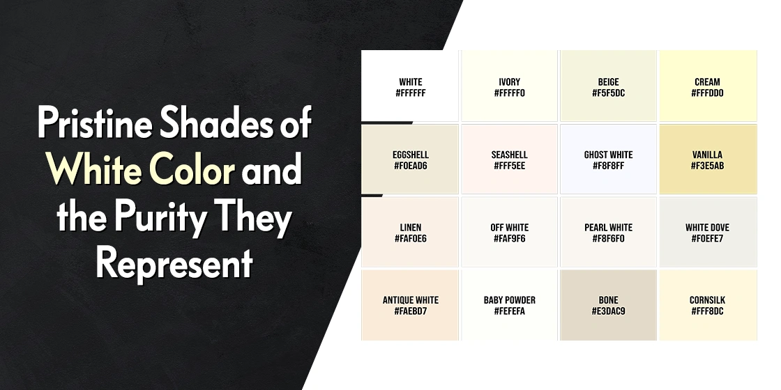
However, if you don’t know where to start, we have compiled a list of some of the top shades of white color, that can be used for a variety of scenarios and applications easily. So, join us as we explore the amazing world of white, and discover how to add some pure white charm to our designs.
Pure White

This classic white is the most neutral and versatile. It can be used as a base color in a design or to create bold contrasts with darker hues. The quintessential white, this shade embodies a sense of new beginnings and absolute clarity. In design, pure white acts as a blank canvas, allowing other colors to take center stage. It creates a sense of spaciousness and works well in minimalist or modern settings.
Pure White Hex, RGB, and CMYK Codes
The pure white hex, RGB, and CMYK codes are as follows.
Hex: #FFFFFF
RGB: rgb(255,255,255)
CMYK: cmyk(0,0,0,0)
Ivory

Ivory is a warm and creamy white with a hint of yellow. It adds a touch of warmth to a space and pairs beautifully with many colors. It adds a touch of warmth to a space and pairs beautifully with many colors, especially soft shade of blue from colors that start with B. Picture antique ivory piano keys, inviting exploration and creativity. Unlike the starkness of pure white, ivory pairs beautifully with warmer tones like gold or wood accents, creating a timeless elegance.
Ivory White Hex, RGB, and CMYK Codes
The ivory white hex, RGB, and CMYK codes are as follows.
Hex: #FFFFF0
RGB: rgb(255,255,240)
CMYK: cmyk(0,0,6,0)
Eggshell

Eggshell is a light and airy white that creates a sense of spaciousness, similar to the lighter alabaster from colors that start with A. This light and airy white offers a breath of fresh air for enclosed spaces. Its high light reflectivity makes even small rooms feel larger and creates a sense of tranquility. Accents of eggshell with their soft, diffused glow, are perfect for reading nooks or bedrooms, inviting relaxation.
Eggshell White Hex, RGB, and CMYK Codes
The eggshell white hex, RGB, and CMYK codes are as follows.
Hex: #F0EAD6
RGB: rgb(240,234,214)
CMYK: cmyk(0,3,11,6)
Cream

Cream is a rich and luxurious white with a hint of pink-yellow in it, from colors that start with C. It exudes a sense of sophistication and pairs well with other warm tones. Exuding refined opulence, cream is one of the richest shades of white color, which is why it is so popular in high-end interior design color palettes. Unlike the barren landscape of pure white, cream pairs well with other shades for a sophisticated and inviting feel.
Cream White Hex, RGB, and CMYK Codes
The cream white hex, RGB, and CMYK codes are as follows.
Hex: #FFFDD0
RGB: rgb(255,253,208)
CMYK: cmyk(0,1,18,0)
Pearl

Pearl is a soft and elegant white with a subtle iridescence, with a hint of shades of brown color in it. It adds a touch of glamour and sophistication to design. Unlike pure white, pearl offers a depth of color and complexity to an otherwise minimalist piece of art. Picture a pearl white wedding dress with a subtle shimmer, hinting at understated luxury, or a pearl white vase with a smooth, almost iridescent finish, adding a touch of elegance to a table setting.
Pearl White Hex, RGB, and CMYK Codes
The pearl white hex, RGB, and CMYK codes are as follows.
Hex: #EAE0C8
RGB: rgb(234,224,200)
CMYK: cmyk(0,4,15,8)
Ghost White

Ghost white is a cool and crisp white that appears almost blueish. It creates a modern and energizing feel and works well with bright pops of color, including various shades of orange color, pinks, and greens. Ethereal and almost transparent, ghost white creates a sense of lightness and airiness. It’s often used as a background color to make other colors pop.
Ghost White Hex, RGB, and CMYK Codes
The ghost white hex, RGB, and CMYK codes are as follows.
Hex: #F8F8FF
RGB: rgb(248,248,255)
CMYK: cmyk(3,3,0,0)
Snow White

Snow white refers to a shade of bright and clean white that resembles freshly fallen snow. It adds a touch of purity and innocence to a design and creates a stark contrast with darker colors. Moreover, it offers a touch of youthful energy and creates a sharp contrast with darker colors. Picture a snow-white tablecloth setting the stage for a festive Christmas dinner set in front of a statement wall in dark shades of teal color, adding a touch of warmth and cool cheer to the event.
Snow White Hex, RGB, and CMYK Codes
The snow white hex, RGB, and CMYK codes are as follows.
Hex: #FFFAFA
RGB: rgb(255,250,250)
CMYK: cmyk(0,2,2,0)
White Smoke

White smoke is another one of the shades of white color with hints of shades of gray color and a bluish cast, offering a more contemporary and neutral feel. It can be used effectively to create a sense of space and calmness. White smoke, a very light white with a hint of gray or blue, captures the essence of nature well. In design, it adds a touch of depth to a white palette without sacrificing the sense of calmness. Picture white smoke painted clouds in a landscape artwork, adding a touch of realism and depth to the scene, especially since it works really well against darker shades of green color too.
White Smoke Hex, RGB, and CMYK Codes
The white smoke hex, RGB, and CMYK codes are as follows.
Hex: #F5F5F5
RGB: rgb(245,245,245)
CMYK: cmyk(0,0,0,4)
Antique White

Antique white is a soft and creamy white with a slight hint of yellow-pink to it, often used to create a vintage or aged look. Steeped in history and nostalgia, antique white pairs equally well with softer shades of purple color like mauve, and darker shades like magenta. Unlike pure white, this shade offers warmth and a more natural feel. Picture antique white lace curtains filtering sunlight through the living room, creating a sense of warmth and vintage elegance.
Antique White Hex, RGB, and CMYK Codes
The antique white hex, RGB, and CMYK codes are as follows.
Hex: #FAEBD7
RGB: rgb(250,235,215)
CMYK: cmyk(0,6,14,2)
Champagne

A light and peachy white, champagne is reminiscent of chilled, bubbly champagne. It adds a touch of warmth and femininity to a space. Unlike the more neutral shades of white color, this shade offers a touch of warmth and festivity. Picture champagne white bubbles rising in an elegant flute trimmed in shades of gold color, symbolizing celebration and delight, with a certain high-end feel. How about champagne white walls in a high-end restaurant with dark wood furnishings, creating a light and airy atmosphere perfect for a special occasion.
Champagne White Hex, RGB, and CMYK Codes
The champagne white hex, RGB, and CMYK codes are as follows.
Hex: #F7E7CE
RGB: rgb(247,231,206)
CMYK: cmyk(0,6,17,3)
Seashell

A soft and calming white with a hint of pink, seashell is reminiscent of a seashell’s pearly interior. It creates a sense of tranquility and connection to nature, which is the essence of seashell white, a shade that evokes tranquility and a connection to nature. Unlike pure white, it offers a touch of warmth and a sense of tranquility and a connection to nature. The color is highly popular with spas and salons, often paired with softer shades of pink color, and accented with bright metallic tones.
Seashell White Hex, RGB, and CMYK Codes
The seashell white hex, RGB, and CMYK codes are as follows.
Hex: #FFF5EE
RGB: rgb(255,245,238)
CMYK: cmyk(0,4,7,0)
Bone White

Bone white is a very light and cool white with a hint of blue-gray to it. It creates a feeling of airiness and openness, perfect for minimalist or Scandinavian design styles, especially when paired with less-saturated shades of black color like ebony. This color is slightly off-white, resembling the natural color of animal bones, and offers a more grounded and organic feel compared to pure white. Imagine bone white walls in a rustic farmhouse kitchen, complementing natural wood elements and creating a sense of warmth and tradition.
Bone White Hex, RGB, and CMYK Codes
The bone white hex, RGB, and CMYK codes are as follows.
Hex: #F9F6EE
RGB: rgb(249,246,238)
CMYK: cmyk(0,1,4,2)
More Shades of White Color
FAQs
| How many shades of white color are there? There are over 150 shades of white color, plus many different tints and hues. |
| How should I choose my shades of white color? Its important that you match your shade of white to the tone of your color combinations. If your color palette is cool, then choose a cooler shade of white. If your palette is warm, then choose a warmer shade. However, if you want to temper the impact of your color palette, then a more neutral tone of white would be the best option. |
Conclusion
White may seem like a simple color, but it offers a surprising depth and versatility. By understanding the psychology behind the various shades of white color, you can harness their power to create a range of emotions and effects in your art, design, or even fashion choices. Remember, white is not just about purity; it’s a fresh canvas waiting to be explored, a color that can add both serenity and sophistication to your world.
By understanding their subtle nuances, you can harness the power of the white color family, from the pristine clarity of pure white to the calm serenity of eggshell or the nostalgic charm of antique white.

Logopoppin
Logopoppin is a graphic design agency that specializes in logo designing, web development, video production and advanced branding services. We love to innovate businesses with new age technologies, allowing them to improve their visual reputation.

