

Table of Content
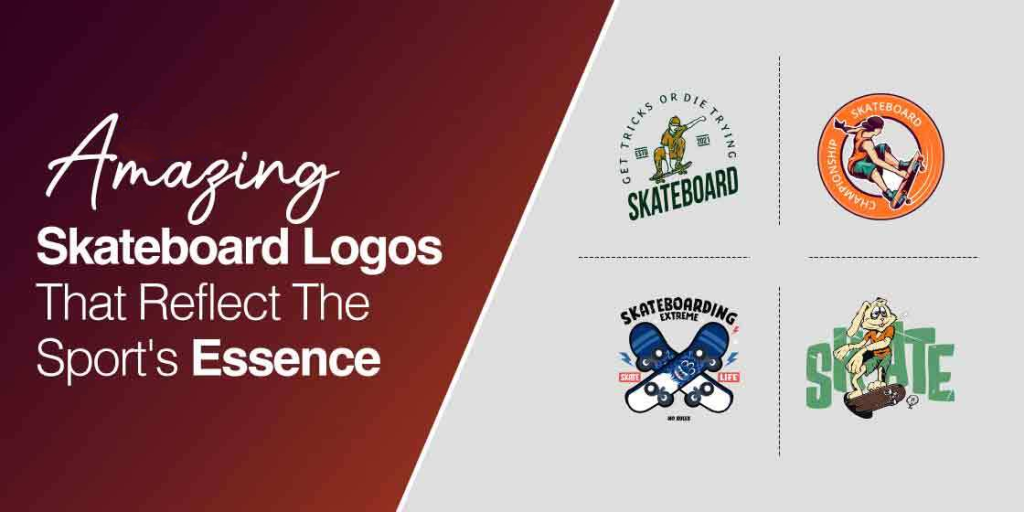
Discover the Inspiration behind Great Skateboard Logos That Represent a Top Brand
No doubt, skateboarding is an adventure of its own kind. From the youth of old who enjoyed grinding the rails, to the undying legends of their childhoods like Tony Hawk, a guy who lives and breathes skateboarding, the activity has its fans as well as detractors. And considering its popularity as well as its anti-establishment vibe, it’s no secret that the younger generations of today want to enjoy it with cool skateboard logos that represent their non-conformist beliefs.
Apart from that, companies that make skateboards put a lot of R&D, time, and effort into manufacturing sturdy and durable boards designed to take their rider to the max. And in order to stand out from their competitors in a market that is still very niche, these skateboarding companies take help from various logo designing services to develop creative yet appealing skateboard company logos.
These logos aren’t only compelling, but they help build a separate identity using a unique logo design. With the best skate logos, they bond with skaters, communicate their message and provide essential information about the brand.
Do you want to know how? See below.
Top Categories of Skate Logos We See Around Us That Inspire Awe
Today, skateboarding isn’t as popular as it was a decade or so ago. However, despite that, there has been a significant rise in the number of skateboarding and other boardsports enthusiasts. That, combined with the growing awareness of consumer likes and dislikes, and the highly dynamic nature of the design world, has resulted in skateboarding companies revamping their logos.
And not just any logos at that. The skateboarding logos we see today are perfectly suited to the wild, non-confirmative nature of the sport they represent. Skateboarders today are outlaws, with many areas across the globe classifying them as public nuisances, and even penalizing skateboarders outside of skateboard-designated areas.
From graffiti-like tags to unorthodox symbols, there are a lot of different, high quality logo art we see today in the skateboard industry. And categorizing them broadly, we can say that there are three main types of skate logos we see today.
- Graffiti-style brands and symbols for that daredevil vibe
- Wordmark street tags that showcase the outlaw spirit
- Well-designed corporate-like logos for the mainstream brands
Let’s take a look at them in greater detail.
Skate Brand Logos with Graffiti-Style Street Symbols
Skateboarding has long been a sport for the social outlaws, with skateboarders considered a menace to society even today. Therefore, a corporate-looking logo would never do a skateboarding company justice. Let’s take a look at some graffiti-tag style skateboard logos to see the vibe they represent.
Spitfire Skateboard Logo Design
A part of a Deluxe Distribution network, Spitfire, was launched back in 1987. The brand is known for its wheels, but Spitfire also makes stickers, clothing, bags, and wallets.
Kevin Ancell was the mastermind behind the big and redhead logo, which is one of the iconic skateboarding company logos to date.
No doubt, the logo successfully conveys a sense of wildness and excitement with eyes and teeth. The black outline and red color make the logo intense, making it one of the fun skateboard logos.
Girl Skate Logo Design
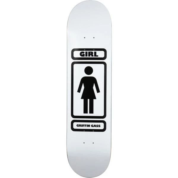
The company doesn’t only make skateboarding products for females, but it has launched skateboards for male skaters.
The image features a classic girl often seen on the bathroom doors, making it a recognizable logo. It doesn’t always print in mint green. However, the color choice is wise considering the name of the brand.
The Girl logo design also makes it one of the best examples of simple yet memorable skateboard logos. You can keep minimal elements in a logo and still make people recognize it.
Powell Peralta Triple-P Skateboard Logo
The “Triple-P” or Powell “bug” logo makes the best example of the “graphics” logo from the late 70s. The Triple-P logo is identifiable, compact but has movement, and is powerful regardless of the sizes.
It had two varieties; one with the “Powell” placed in the center and other had “Brite-Lite” written in the logo.
It is fun enough to not look like a corporate logo design. But the logo is playful enough to go well with the identity they built as a skateboard company.
Dogtown Cross Skate Company Logo
Have you ever tried to incorporate more elements into your existing logo? If not, you can take the Dogtown Cross logo for inspiration.
At first, Wes Humpston decided to keep only three letters, “D,” “T,” “S,” in the logo. The designer casually named the brand Dogtown Skate.
However, the logo evolved when Humpston decided to add a banner. The designer also added dragons and waves later that boosted the visual appeal of the logo.
Powell Peralta’s Rat Bones Skate Logo
Craig Stecyk sprayed the letter “X” on the wall. It shows two bones crossing each other with an aggressive rat above the “X.” Stecyk created the logo due to the infamous Venice pier.
The symbol was used as a pattern for new boards and wheels. No one thought that the symbol would become famous, but it became an iconic logo design.
Rat Bones logos is undoubtedly an eye-catching design. It also contributed to the fame of Powell Peralta – an American skateboard company.
Toy Machine Skateboarding Logo
If you look at the sports logos of skateboard companies, you’ll notice they often go for abstract images for their logos. However, Toy Machine didn’t hesitate to take a different road.
The brand opted for a monster for its skateboard logo, which enjoys the status of an icon in the industry. The monster is frightening enough to look edgy and cool. You can see how lower case and rounded writing give informal and friendly vibes.
These elements have made the design more fun and less frightening. It is also a balanced skateboarding brand logo design that stands out on a skateboard.
Alien Workshop Skateboarding Logo
The skateboard brand wasn’t based in Southern California’s skate industry. It emerged from the ashes of Gordon & Smith – a famous and long-standing skateboard and surf brand.
The workforce consisted of former team riders for G & S, including the owners of Alien Workshop, Mike Hill, and Chris Carter. Observing the logo, it’s safe to say that Alien Workshop’s logo was ahead of its time.
It took inspiration from the themes of UFO encounters and conspiracy theories. No doubt, the logo idea, and aesthetics set the brand apart from its 90’s competitors, making it one of the more unique types of logos gracing skateboards at that time.
Santa Cruz Screaming Hand Skateboarding Company Logo
After three decades, the Screaming Hand is still known as the icon representing the youth and its connection with skateboard culture. It is one of the stunning 80’s skateboarding logos that genuinely represent the era of skateboarding.
There’s no denying that the skaters were drawn to it because the symbol was creepy and whimsical. On the other hand, the concept, overall shape, and original color scheme make the design interesting.
Considering its brilliance, countless skaters and non-skaters tattooed the hand symbol. The idea of creating a screaming blue hand demonstrates the wild and neo-psychedelic style of art.
H Street Four-Arrowed Skateboard Logo
Francesco Albertini met Tony Mag during his visit to California. He asked him to design and trademark a logo for him that looks unique from others. From there on, H-Street was formed. The shape was heavily “street” related, and he observed that “H-Street” would also stand for “each street.”
For example, if you’re at a crossroad, going in any direction would be easier. The idea didn’t move mag, but Albertini convinced him telling how skateboarding is a universal sign of peace and friendship.
Later, the four arrowed logos caught Mag’s attention that it represents skateboarding as an expanding cultural phenomenon. Today, the H-Street logo is the recognizable skateboard logo design.
Powell Peralta the Ripper Skateboarding Logo
The skull-breaking ripper took around six months to evolve into a complete logo. The inspiration was the Skull and Sword logo to create the ripper. Vernon Courtland Johnson, the designer, focused on the two aspects while designing the ripper logo.
First, the designer worked on the ripped background and transformed a broken wall into the fabric folded in the shreds. Second, the designer worked on several eyes to find the one not so whimsical and dark.
Considering other skateboard logo ideas, the logo has the most ripped-off graphics, serving as a symbol of youth culture and skate business.
Skateboarding Logos in the Style of Street Tags with Wordmarks
The next category of skate brand logos involves skating symbols that look as if these wordmark designs were made to represent a far larger company. These companies often serve as a sort of transitional bridge between brands that are significantly corporate-looking, and completely non-conformist companies.
Let’s take a look at some of the top skateboard logos from this category.
Alva Skateboard Logo
One of the greatest skateboarders, Tony Alva, built his skateboard company and chose to exceed the style and sensibility associated with skateboarding.
Alva Skates logo is all about attitude and is appreciated to date. If you look at the colors, they evoke the emotion of energy and intensity. The font and black outline put together the overall design.
The Alva company logo design isn’t an average one. Alva decided to go for his signature as a logo, and they were ahead of the trends that were being followed then.
Creature Skate Logo
The comPowell1.pany is known for using horror themes on its skateboards. You can see its effect on the logo, especially the text. The green color complements the logo and is eye-pleasing too.
Creature Skateboards is a product of professional skaters, including Darren Navarrette, Jason Adams, Russ Pope, and Barket Barrett.
If you’re a die-hard skater, you can find complete skateboards at Creature Skateboards, including wheels, trucks, bearings, decks, along with customizable decks and accessories.
Shut Skating Logo
Skateboarding was anti-social in 1986, and the company Shut Skates emerged as the subculture of the skate-punk movement.
Shut Skates was also the first-ever proper company in New York, where the number of skaters wasn’t massive with a straightforward skateboard logo design. The team working for the company was different from the West Coast.
Skateboarding seems to belong to California. However, Shut Skates dismissed the idea and proved that it isn’t necessary to run a skating company from sand and surf.
CIRCA Skateboarding Logo Design
Can you see the two bars wrapped around a rounded triangle? It’s the primary graphic of the logo that directly refers to the brand name and makes it the best skateboard brand logos.
The triangle is seen as a symbol of strength; however, the edges are kept rounded to maintain a friendly vibe. The bold and gently curved letters also give the message of strength and friendliness.
If you look at the letter “I”, it resembles the number 1, which dictates excellence in whatever the brand does.
Birdhouse Skateboard Company Logo
Did you know the Birdhouse logo represents the company’s name and industry? Take a look at the design that features the letter “B” in the lower case. The letter is kept in the shape of the curving road, giving the impression of movement and casual vibes.
You can see the company’s name written in friendly rounded, lower case letters. The designer maintained creativity by replacing the dot on the letter “I” with a small bird.
The logo of Birdhouse fits one of the cardinal rules of skateboard logos that is to create a simple yet iconic image.
Skull Skates Logo
Indeed, Skull Skates is one of the cool skateboarding logos but it wasn’t the original logo. Earlier versions of the logo featured the letters G.N.C on the logo’s left side. G.N.C stands for Great North Country Skateboards.
The company used a Yin and Yang symbol in the black and white color scheme. When the company decided to change its name to G.N.C Skates, the logo was redesigned, and the skaters called it Skull Skates.
Moreover, the first version of the skull featured a cut-out of grip tape on the skate deck. This method helped the skull achieved those hard, jagged lines.
Zero Skateboard Logo
You may have seen skateboard companies’ logos with details and hidden messages. The original gangster skull symbol for the Zero logo is cliché.
This 90s-style, logo fonts based design was initially meant for apparel like t-shirts, but it became the brand’s primary logo. People love the idea of having a skull as a brand’s logo because it was unique compared to the options available at the time.
Zero decided to go for it and created the blood version for the same symbol. Being a well-known skate company, the Skull logo became one of the famous 90’s skate logos and has earned cult status.
Independent Iron Cross Skating Logo
Jim Philips, who is known for his iconic skate graphics using sports fonts was asked to design the truck company logo. Jim decided to go for an earlier skateboarding icon.
It was the surfer cross with the reflection of 50’s surf culture. Skateboarding was also the new rebel activity, and the designer thought it would be the best idea to recycle the cross.
The idea wasn’t welcomed as it should be. But once the brand owners saw the Pope wearing a hat and robe featuring the Iron Cross, they agreed to go for it.
And it is now considered one of the most iconic skateboard logos of all time.
That’s how the ironic Independent logo started to represent skateboarding, skateboarders, and unmatched quality.
Well-Designed Skateboard Company Logos Representing Proper Skateboard Brands
Finally, we get to the last category. This category of skate logos consists of skateboarding companies that sport logos with a significantly corporate feel to them. Rather, its not so much the corporate look, than it is about their logo design looking like it belongs to a mainstream brand.
While more popular skateboarders prefer to associate with smaller, niche brands that work well with their individual vibes, these mainstream skating businesses are perfect for newcomers to the sport. They offer a variety of equipment, as well as street cred for those who are interested in joining the sport.
So let’s see what these skateboarding logos have in store for us.
Flip Skateboard Logo
One of the high-level skateboard companies, Flip’s logo is simplistic and fun. The color scheme is eye-pleasing, and placing the “I” upside down adds a hint of creativity to the logo.
The company sells great quality skateboards and uses 7-aply maple to manufacture the deck of the Flip skateboards.
You can get standard decks and P2 models made of an oval-shaped fiber reinforcement panel for extra durability.
Santa Monica Airlines Skateboard Logo
SkipEngblom was the man behind Santa Monica Airlines or SMA. The gifted and talented surfboard shaper has shaped many skateboards that his company sold.
The logo of the company represents history, teamwork, and quality. After three decades, its logo is still captivating and resonates with the company name.
Santa Monica Airlines still runs the business; they provide skateboards with hand-stained wood decks available in various shapes and sizes.
Vision Street Wear Skateboard Logo
The Vision’s logo isn’t the typical one, and it doesn’t imply counterculture. It features mainstream characteristics, which were visually applicable in the 80’s.
The company is known for using bright and fluorescent colors and hypnotic patterns. They are known for producing bold-face graphics on sneakers, shirts, and skate decks.
Although true skaters aren’t into mainstream skating clothing anymore, the Vision has remained a big name as wannabe skaters widely appreciate them.
Santa Cruz Dot Skate Logo
The trademark Dot logo of Santa Cruz is easy to read and unique. The letters “A” and “S” in the text were kept as a closed triangle. You can also see the red color inside the letters.
Jay Shuirman – one of the founders of NHS, Inc., a skateboard distribution company in Santa Cruz, suggested putting a giant red dot behind the text.
The logo is recognizable and has emerged as one of the prominent iconic skateboard logos within Santa Cruz County. Did we mention locals consider the logo as the badge of pride?
Element Skateboard Logo Design
The Element logo showcases two circles with a tree-like symbol inside the inner circle. You might find its logo simplistic and different from other skateboard logos.
The meaning of the logo is as simple as its design. The company motivates people to protect the environment.
The color combination of white and red promote the meaning of strength, harmony, and success. Moreover, the font – Avant Garde Gothic suits the overall design.
ADIO Skateboard Logo
Did you know the name of the brand comes from an African word for unity? Apart from that, the attractive logo features various elements.
Look how the letter “A” is made; its wavy shape reminds of concrete ramps of skateboarding parks. The shape of the letter “A” also communicates movement.
The text is bold and angular, which is a good idea to add a showcase in skateboard logos. The image doesn’t entirely connect to the name, but it makes the logo recognizable.
Plan B Skateboards Logo Design
The central image of the logo looks like a stylized letter “B.” But if you turn the symbol on its side, it represents a skateboard shape. Awesome!
On the other hand, the square shape conveys the message of quality and straightforwardness, just like various NFL logos also do. The choice of shape sets the brand apart in the field where most brands prefer round shapes.
While talking about the Plan B logo, you can’t ignore its color scheme. The green looks tasteful. It’s a fresh color, which is a pleasant contrast to red and other bright colors that skateboard logos often use.
Sessions Skating Logo Design
The Sessions has one of the simplistic but meaningful skateboard logos. The winning star is kept in the pentagon, which represents intelligence and strength. Can you see the letter “S” in the center of the star?
The wavelike letter “S” communicates movement, and it also resembles a road. You don’t find text in the logo, but there was no need for it as the logo speaks for itself. The star within the pentagon gives off Houston logo design vibes, which makes the overall logo all the more interesting, both conceptually and visually.
Moreover, the Sessions logo makes the perfect example of a simple design with elements that effectively communicate the brand’s message.
Skateboard Logo Elements That Ensure That Your Emblem Is a Resounding Success
All skateboarding logos have something unique in them. Skateboarding brands have shaped what skateboarding is today. Most of the brands are launched by famous and skilled skaters.
No doubt, the brands did a great job as businesses and created a culture of skaters. They were professionals and facilitated future skaters with unmatched skates and other accessories.
When we talk about skateboard brands, we can’t ignore their skateboard logos. Some of these logos are timeless and still grab attention. The unique elements make a skate logo stand out and put it in the limelight.
Color Combos
Colors are an essential part of these skateboard logos. We’ve seen a bold selection of colors in some of the skate logos, and some amazing color combinations representing the rebel skateboarding culture. For example, who thought the bright blue shade of the Santa Cruz Screaming Hand logo would be a massive success?
Hidden Meaning
Incorporating a meaning in a logo isn’t a new practice. Brands keep the meaning in a logo to communicate it with their audience. For example, the tree in the Element logo was put to motivate people to protect the environment.
Font or Typography
Typography also plays an essential role in the success of a logo. In some cases, typography can align with the theme of the brand. Take the Creature Skateboard logo for an example. Its text is unique and goes well with the horror theme that the brand follows for skateboards.
Unusual Symbols
Using interesting symbols in a logo is another element that contributes to the success of a logo. Like many brands, skateboard brands have also been seen using visually appealing symbols in their logos. For instance, the Screaming hand in the Santa Cruz and Skull in the Zero logo design grab attention and look awesome.
Frequently Asked Question
| What are the top 10 skateboard brands? Following are the top 10 skateboard brands with awesome skateboard logos. – Birdhouse – Circa – Plan B – Osiris – Independent – Girl – Adio – Sessions – Toy machine – Destructo |
| Has anyone landed 1080 on a skateboard? Tom Schaar, a 12-year-old, was the first skateboarder to complete the elusive 1080 move. It is one of the difficult moves of skateboarding. The move has only been done by a few skateboarders but never on vert. |
| Why is skateboarding illegal? Skateboarding can damage objects. And vandalism is seen as willful damage to public or private property. Therefore, skateboarders are often seen as vandals by non-skaters, and it’s considered illegal. |
| Is an 8.25 skateboard good for beginners? New skaters need to start from size 8 and move up gradually. The size 8 is considered the average size, whereas 8.25 is also a good number. However, it might make flipping the board a bit harder, but it’ll offer more stability and surface to land on. |
Summing it up!
Considering the brands mentioned above, it’s safe to say that skateboard logos are fun and visually interesting. Be it a logo from the 80s or 2000s, and they are well-thought and well-executed.
That’s why most of these logos were ahead of their time. On the other hand, the designers also played their part and created stunning logos adding unique elements to them.
Do you also need a captivating logo design? Our graphic design company has got you covered. We adore the idea of experimenting and developing compelling logos featuring innovative elements.
Latest news you want to know!
Subscribe for cutting-edge design inspiration at Logo Poppin! Elevate your brand with updates on logos, branding, web design, and video animation.
Note that by clicking “subscribe,” users may agree to our privacy policy and consent to Logo Poppin to use your contact data for newsletter purposes.
Logopoppin
Logopoppin is a graphic design agency that specializes in logo designing, web development, video production and advanced branding services. We love to innovate businesses with new age technologies, allowing them to improve their visual reputation.

