Table of Content
Discover What Shape Your Spa Logo Design Can Take to Be a Success in the Industry
When we talk about a specialty business, such as a spa or a wellness center, its important that we understand the various branding elements that go into establishing a strong brand identity. And the first thing that most of these businesses should focus on, is their spa logos. While often ignored by the older generations, the newer generations of business owners understand the importance of a strong brand symbol that would help them establish a strong social and digital footprint. They know that the better your brand identity and symbol, the more likely a consumer is to walk through the door.
With social media and digital marketing channels the primary mode of marketing and branding these days, its important to have a logo that presents well digitally. That is because the internet can help you to reach thousands of customers at once. It can boost your business recognition by effective marketing on different platforms. But to do that, you need to have a strong logo to represent that business identity.
To create a professional spa logo design, companies often rely on an experienced logo design agency that has the appropriate expertise with your industry. These agencies can assist you in building creative logos, so that your brand can look unique.
However, before we get to the design part, you need to have an ideas of what your logo should look like. And to do that, you need to take a look and understand the concept behind some amazingly successful spa logo ideas.
So, let’s begin.
Why Does Creating Effective Spa Logos Require Your Utmost Attention?
We know how most fitness and wellness businesses like spas care for their branding. A strong and impactful brand allows their fitness business names to get recognition in the market, especially when they are still comparatively new to the higher tier of spa businesses.
However, the same is also true for the smaller, more locally inclined spa businesses. They too want to solidify their branding to get recognition in the industry. The growth of digital channels has indeed helped them to build strong online brands, fronted by spa logos that appeal to the consumer aesthetic. And in the clutter that is branding on the internet today, a logo that stands out and speaks to the consumer is a logo that will help its brand succeed.
Best Spa Logo Ideas to Help You Ensure Your Spa Icon Looks Awesome
While logo design can seem like a simple endeavor in some aspects, the amount of work involved to do it properly often ends up confusing businesses about what they are supposed to do. While they understand that its better to hire a professional to create their logo, they forget that they too have some homework to do before the hired professional gets to work.
Essentially, you need to understand your brand and its identity, so that you can convey that to the designer. As the owner of your business, there is no one who understands its better than you. However, you do need to jot it down in a way that allows the designer to incorporate that identity into an expressive and well-matched spa logo.
So, to get an idea about how to design a logo for a spa center, here are some examples of design elements and spa logo ideas that can help you express your brand message.
Female Silhouette to Highlight Self-Love and Beauty

It is definitely a nice idea to include a female silhouette in your spa logo design. It creates a direct relevance with your brand, allowing people to understand the main business theme.
The colors in this type of logo should be chosen according to your branding requirements. Many people choose the evergreen combination of pink and white while designing these logos. But, surely you can bring some sort of variance in that by picking your own colors.
Soft Color Palettes
Soft color palettes can set a soothing and comfortable tone for the consumers, right from the start when they view your spa logo. Using soft pastels and shades of pink, blue, green, and more, you can help your logo attract the clientele perfect for your brand, helping establish strong, meaningful connections between your business and those customers.
Female Face Profile in Relief

You can also design a stunning logo by using a woman’s face in a negative space. This is quite a unique concept that will make your logo highly creative among others. The colors for this type of logo depends on your choice. You can either use the traditional spa shades, or could also go for a monochrome color scheme highlighting the simplicity and effectiveness of your spa logo.
Artistic Typography-Based Designs
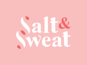
If you are looking for a logo that can engage young people towards your spa center, take a look at this logo. Though it is a great example of wordmark logo design, but it looks very decent with a traditional combination of pink and white colors. The concept of this wordmark is based around salt therapy that primarily provides relief from anxiety, cold, stress and other problems. And the stylized design of the typography, with inverted ends of the main letters of that logo to mimic a color inversion, make for one of the best spa logos on this list.
You can alter the wordmark style of this logo as per your requirements. Similarly, you can also change the colors and make the background transparent depending on your branding.
Addition of Eastern Wellness Aesthetic with the Lotus Flower and Hot Massage Stones
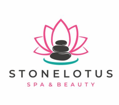
Lotus flowers are often linked with spa and massage centers, due to their connection with wellness, inner peace, and the concept of yoga. This logo is also a great demonstration of that. Furthermore, it is designed with the beautiful hot massage stones that elevates the overall look of the logo, and subtly separates it from yoga businesses and firmly establishes it as a spa.
More Eastern Symbolism with the Use of Calming Bamboo Shoots
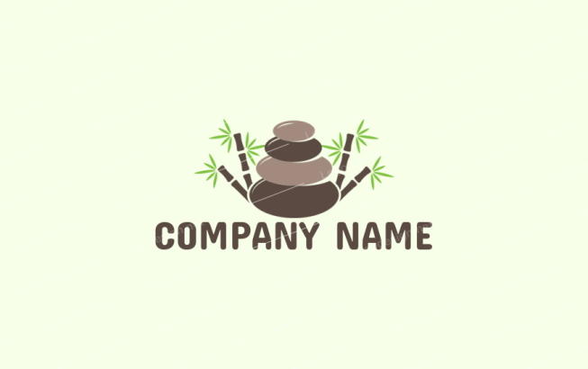
Just like lotus flowers, bamboo shoots are also associated with the traditional spa centers. Representing rebirth and nature, this spa logo precisely shows how you can build a set of strong brand symbols with simple elements like these. However, its important that you choose a color scheme that highlights these elements, but more importantly, helps your business stand out.
A Rainbow of Colors to Show Joyous Freedom
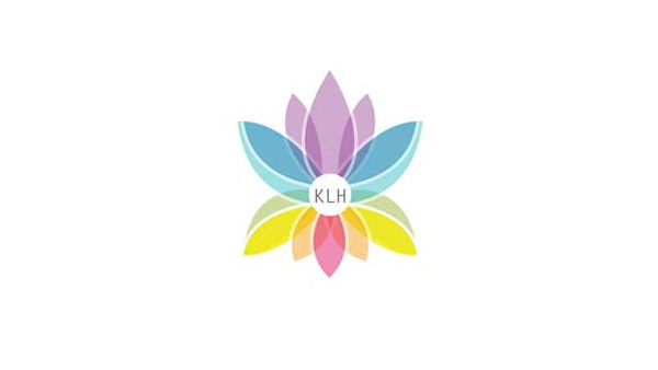
Adding rainbow colors in the logo could also be a great option to grab a client’s attention. It looks very beautiful, provided you have used the right structure and hierarchy of colors in the design. This given logo is a definite illustration of that, showcasing how classy rainbow colors can be used in a design.
Spa Logos with a Certain Luxury Feel
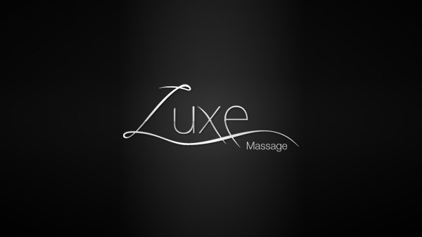
When designing a logo, it is also important to bring some sort of luxury extravagance to it, especially if that is a vibe your business plans to portray as well. This is necessary because it can add something special to your spa logos, helping it stand out in a sea of similar brand symbols. This particular example will give you a little idea how to design such logos. It has a very fabulous font style, designed with a creative shade of black and grey in center.
Soft, Rounded Lettering for a Calming Vibe
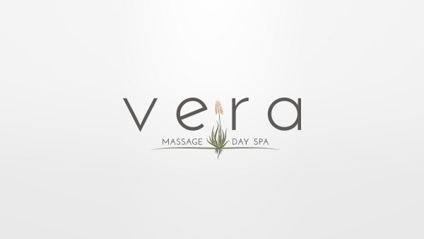
If you are focusing on the wordmark styled logo, try to integrate a new trend of soft lettering. This looks clean and easy to the eye, offering a sophisticated view of the brand. You can use it with some custom logo fonts that incorporate some subtle elements of your brand, giving a perfect illustration of your business wordmark.
Examples of Potential Spa Logos to Help You Choose the Perfect Style of Brand Symbol
Now that we have taken a look at some great spa logo ideas, let’s take a look at some amazing spa logos that will put those elements to the test. Let’s discover how those spa logo design elements look like in the wild.
Pina Spa Logo

We all know that lotus flower is often associated with the field of spa, hence it could be used with one of its logos. The below given example is a perfect illustration of that. It is designed with a simple looking lotus flower along with a traditional wordmark. You can also use any fitness slogan with this logo to make it more impactful in looks.
Lifehouse Spa & Hotel
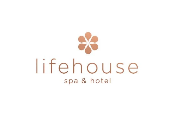
Lifehouse is a famous spa located in Essex, United Kingdom. It is popular due to the smoothing massages and stress free environment. This logo is also a clear demonstration of this fact. It is designed neat and clean, defining the true theme of the spa center.
Panu Natural SPA

If you are looking to design a logo that can showcase decency, take a look at this example. It looks very good due to a unique flower-like style. You can also take inspiration from this logo to design one for yourself. It is up to you to select various designing essentials like fonts, shades, etc. as per the preferred requirements.
Rose Massage Spa Logo
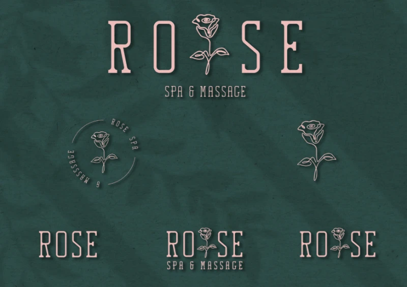
Just like people use tulips as a demonstration of spa centers, roses are also often preferred for the same action. You can use them with your logos with a perfect combination of catchy colors. According to design perspective, pink roses will suit best to design these types of spa and fitness logos.
Maven Spa
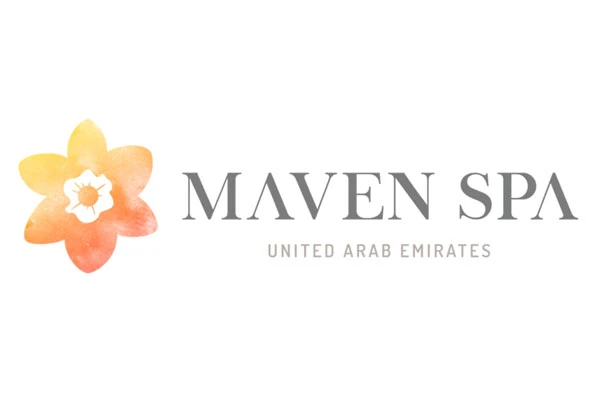
Looking to bring simplicity in logos? Take a look at this exquisite example. This logo represents a highly popular spa center located in the UAE. It includes a leaf of maple and a simple wordmark describing the name of a company. You can also design another logo by looking at it. This particular logo is a perfect example of that, defining business names with cleanliness.
Top Spa Logos from Around the World to Inspire and Get Your Creative Juices Flowing
Some spa logos have taken their brands from simple wellness businesses, to some of the most lucrative spa businesses in the world. There is something about these brands and their symbols that helped consumers choose them over their competition.
Let’s take a look at these amazing ideas, and see if they inspire the design for your very own spa logo.
The Spa at Mandarin Oriental
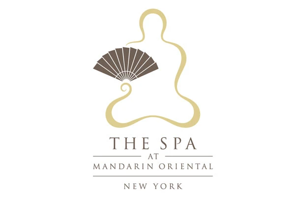
If you want to know how to depict a perfect description of a spa center, this is the exact logo for that. It showcases a simple but complete illustration of a spa center. It is a very famous logo associated with the name of a popular spa hotel in New York named Mandarin Oriental. It features the profile of a person sitting in the lotus pose, but looks like the outline is made of incense smoke.
Moreover, the person seems to be holding an oriental hand fan, thus further solidifying the mandarin roots of the spa. Overall, it is one of the best spa logos we will see in this list.
SHA Wellness Clinic and Spa
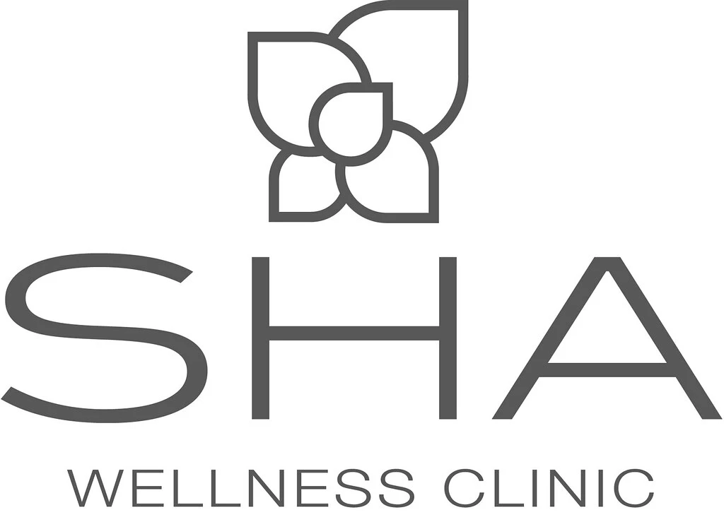
SHA Wellness Clinic is a wellness retreat and spa designed to heal mind, body, and soul. The logo design for the spa is quite simple, relying on a clear, blocky font for its wordmark, accented by an illustration of a lotus flower, as seen from the top. Overall, although the design of this spa logo is simple, it effectively conveys its brand message.
Acquaforte Thalasso and Spa

Acquaforte is a Roman-style Thalasso and spa in Sardinia, and offers a wide array of spa and wellness retreat options for its consumers. Designed to be a destination spa location, the location highlights its aqua-based offerings with a sea-blue and white logo, with the bottom of the letter “Q” having a stroke that looks like a wave.
Simple, elegant, and effective – these are the hallmarks of this amazing example from the top spa logos today.
COMO Shambhala Estate

COMO Shambhala Estate is a wellness spa that specializes treating the mind, body, and soul for true inner peace. The calming essence of its premises is largely due to its natural setting, surrounded on all sides with the bounties of nature to let their patrons unwind and relax.
Coming to its spa logo, the design is quite simple. However, there are some striking design elements that we want to point out.
First, the shape of the design is the form of a falling droplet of water, highlighting the pointlessness of fighting the inevitable, and going with the flow. The concentric spiral inside the droplet signifies the flow of life, with a certain start and end point. Finally, the color of the logo, surprisingly, is a shade of brown called camel from colors that start with C that provides a grounding connecting to nature.
While it may look simple at first glance, its obvious that a lot of effort went into its design concept.
Final Words
The success of spa businesses lies in their offerings, branding including the spa logos, and most importantly, their targeting. If you are a spa located near a place that mostly middle-to-lower income consumers, and target locally, then your business will fail even if it does everything else right. That is because that audience is not the right target for your brand, no matter how good your strategy.
Being a marketer, you have to focus firmly on the representation of your identity. That is where the importance of the spa logo comes in. These logos illustrate the true identity of your business, defining how its services are unique from others.
It is the main reason why it is recommended to take services from a professional branding agency to design a spa logo. They can help you to design the latest logos that can attract eyeballs effectively.
Being a professional design agency, you can get assistance from our experts to design these logos. We will help you to craft fantastic logos at highly affordable prices, without breaking your overall budget.
Frequently Asked Questions
| 1. Why creating a unique spa logo is important? Knowing the impact of branding, we can clearly estimate the importance of logos in the market. For spa centers, these logos are very important. They can help these centers to build a professional reputation and status in the market. |
| 2. Can I use wordmarks in spa logos? Yes, you can use wordmark in spa logos defined with your official business name. There are plenty of examples available in the market that define the importance of wordmarks. They look simple and neat to define any brand name. |
| 3. How to make a luxury spa logo design? There are various things you need to keep in mind to design a creative logo. You need to make sure that your designs are trendy and fit best according to the targeted audience. This will help you to create better logos with perfection. |
| 4. Where can I find the latest spa logo ideas? There are various sources available on the web where you can find the latest logo ideas. You can take a look at different marketplaces like Freepik, Envato and more others to find them easily. |
| 5. Name some of the best spa logo fonts available for free? When it comes to design wordmark styled logos, fonts do matter a lot. You can find various types of free spa <a href=”https://logopoppin.com/blog/best-logo-fonts/” target=”_blank” rel=”noopener”>logo fonts</a> on a number of sites such as Fontspace, Myfonts and more others. |
Conclusion
The growth of spa centers is hugely dependent on their services and branding. Being a marketer, you have to firmly focus on the representation of your identity. That is where the importance of the logo comes in. These logos illustrate the true identity of your business, defining how its services are unique from others.
It is the main reason why it is recommended to take services from a professional branding agency to design a spa logo. They can help you to design the latest logos that can attract eyeballs effectively.
Being a professional design agency, you can get assistance from our experts to design these logos. We will help you to craft fantastic logos at highly affordable prices, without breaking your overall budget.

Logopoppin
Logopoppin is a graphic design agency that specializes in logo designing, web development, video production and advanced branding services. We love to innovate businesses with new age technologies, allowing them to improve their visual reputation.

