
Table Of Content
How Does the Psychology Behind Square Logo Design Affect the Top Brands
Just like various colors have specific meanings attached to them, so do individual shapes. In logo design, it is known that every element used to create a brand symbol is designed to expand and enhance the message the logo is trying to portray.
So, what do you think square logos represent?
Is it calming and soothing, like circles? Or does it represent a balance that is inherent in triangles? Is it something else altogether? Don’t worry, we will explore the psychology behind the use of squares and its derivatives in the design of brand symbols, so that we can understand the emotions and meanings the shape holds for us.
Moreover, we will also look at some of the prime examples of successful square logos sported by top brands nowadays. So, without further ado, let’s take a look at the message behind square-shaped logos, and discover why logo design services choose this geometric shape for certain brand logos.
1- What Do Square Logos Represent?
Shapes are added to logos and other designs to incorporate certain perceptions and messages into the piece of art you are creating. Now, as to why designers use squares for logo design, there are multiple reasons for that. In the geometric spectrum, squares and rectangles denote strength and solidity, as well as the ability to persevere.
In fact, squares in logo design can embody one or more of the following aspects of perception within them.
- Strength
As the blocky shape in our geometric toolbox, there is nothing better to represent the concept of strength than a square. Often seen as the building blocks to many of the greatest monuments in human history, squares give an impression of strength, stability, and resilience.
- Geometric Balance
With four equally balanced sides, squares are the epitome of geometric balance. Designers often use it to tie various disparate elements of their design together, allowing them to connect and balance out competing elements without affecting the brand’s message, just like circle logos are used to bring harmony among design elements.
- Structure and Organization
Carrying on from the previous point, in order to achieve balance, there needs to organization and structure. What could be better for it than a shape that is always structured a certain way? Squares provide that organizational structure so that the shape can round up and balance out different elements of their design in a way that has the maximum visual impact.
- Simplicity in Design
What could be more simple and unpretentious than a shape with four equal sides, joined together at right angles? Well, squares are used as a sign on simplicity in design. They are simple and easy to make, allow for easy structuring to implement both text and imagery in it without issue, and is all overall great shape if you want your brand logo to be simple yet expressive.
2- Why Businesses Choose Square Logo Design
As we discussed earlier, squares and rectangles are shapes that are often associated with construction and solidity. From building and construction blocks, to the shape of our traditional buildings and other architecture.
With lines that connect together at right angles, we think of square as something that can surround us and protect us. This is due to a feeling of trust that the shape instills in us. And that same feeling can help a logo establish a feeling of trustworthiness in its target market, ensuring that consumers trust and respect the brand it represents, elevating it above the generic logos around it.
In short, if you want people to know that you are a brand they can rely on to come through, then adding a square to your logo design can help you do that successfully.
3- The Comparison of Squares Compared to Other Shapes in Logo Design
Square logos aren’t the only geometric style of logo design that is common in the industry today. Triangle logos, circular logos, and less common shapes like diamonds and more can also be found in various brand imagery.
Traditionally, square shapes are considered safe, with little to no risk, and sometimes even downright boring. Moreover, some usages may also make the shape seem more rigid, a perception built by corporate, no-nonsense businesses that use it in their brand imagery.
So, if your business is a strictly corporate one like finance or law, having a dynamic shape like a triangle or a passive one like a circle isn’t going to help. You need something that establishes your stolid credentials from the minute someone glances at your logo. And there is nothing better for it than a square.
4- Seven Square Logo Examples that Hit the Mark and Represent
Now that we know the various types of logos that can use square logo design in order to enhance the impact of their brand symbol, the question is – how have brands used the shape successfully in their design.
Let’s take a look at some of the top brands with square logos to figure out how you too can incorporate the shape within your brand logo.
Microsoft
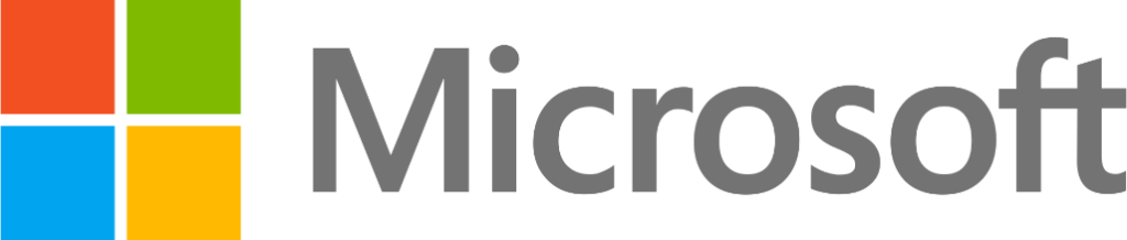
First up, one of the most iconic logos to feature a square for millennials and Gen-Z, is the logo for Microsoft. When the company started, the first product they launched that catapulted them onto the path of becoming the giant they are today, was the Microsoft Windows operating system.
One of the earliest operating systems to use an intuitive GUI-based operation instead of the classic CLI-based model common at that time, it allowed access to computing to a large variety of people. Microsoft Windows at that time had a little graphic accompanying the wordmark, which today has become one of the most iconic logo symbols of all time.
The little square window icon that you see above is the modern iteration of a symbol that personified and represented Microsoft and its products for a long time now.
Next up on this list in another famous brand logo for the modern generation, the Instagram logo. The logo represents a brand that changed the way consumers used social media, taking it away from a text-first system to a platform that was more attuned and oriented to the visual media.
And that is where the brand’s logo comes in. The design is meant to mimic that of an Instamax camera, made using a simple outline and color palette in the style of gradient logos. The design above has been a success for the brand since its launch, and is a prime example of how to portray a depth of message without increasing the complexity of your design.
In fact, it is this adherence to simplicity in design that makes this social media logo so popular and successful.
MTV
This one is not your traditional square logo. in fact, many might argue that its not one at all. However, they will be wrong. The MTV logo is designed along the dimensions and shape aesthetics of a square, trying to incorporate the same messages and visual perceptions as those found in the more traditional designs.
The style of the logo is made to depict a sense of solidity and balance, which is somewhat tempered from becoming too serious or rigid by the red spray-painted letters over the boxy M. overall, when combined with the color scheme, this is a logo that is balancing finely between seriousness and lightheartedness.
The LinkedIn logo is one of the most corporate-looking social media logos, which is ideal when we consider that it is primarily targeted towards professionals to grow their network of business and industry connections.
As you can see, the design is quite simple, with the elegant wordmark logo having a little design element in the form of a square elevating the overall impact of the design. Even if we look at the font used in the logo, we can see that while thin, the typography has a certain boxy element to it, which lends a business-like perception to the brand symbol.
BBC
The BBC logo is an old design that has been tweaked slightly to conform to the modern design aesthetics. However, it hasn’t changed much at all. The letters in BBC stand for the British Broadcasting Corporation, the national broadcaster for Great Britain.
The current iteration of the logo design has the three initials in separate squares, with each initial uppercase initial colored white over a dark black background. The overall design is subdued, simple, yet one of solidity and resilience, perfect representation of a company that has been in business for more than a century now.
Overall, this is one of the most iconic initial logos that uses geometric design elements to elevate the impact of its design.
LEGO
LEGO is another great example of a business using square logo design to elevate the impact of an otherwise plain logo. The logo for this toy company is an otherwise simple one, with rounded, bubble-like letters used to create the wordmark in white, and outlined in black and yellow.
Without anything else, this logo design, one that represents the top building bricks toy manufacturing company, would have a mediocre response at best. However, with a red-orange colored square as the backdrop to that wordmark, the overall impression of that logo is now that of resilience, perseverance, and trustworthiness.
Moreover, the addition of this colored square combined with the funky typography highlights that while building blocks are organized and structured, they can be combined in different ways to make something new and exciting.
7-Eleven
Finally, we get to the 7-Eleven logo. The current iteration of the logo may not seem like too much of a square, especially since they changed the green background to a white one. However, if you look at the dimensions and shape of the number 7, you will see that it still adheres to a boxy, square-like design.
The 7-Eleven logo is another that uses a mix of abstract design and geometry to elevate an otherwise simple design. The logo is meant to instill a level of trust and reliability, so that people actually sigh in relief when they need something and a 7-Eleven sign goes by.
And with a company focus on providing everything a consumer may need in one place, this shape is the perfect choice for its logo.
Conclusion
In short, there are a number of ways designers can use square logos to enhance the impact of your brand symbol. However, before you start to work on how to design a logo that incorporates a square within itself, you need to study the psychology behind it to know if it’s the right fit for your brand.
That is because unless your design is trying to portray the same properties as a square, using it would only end up diluting the impact of your logo, something no brand desires.
People Also Ask (FAQs)
| 1- What famous financial company has a square logo? American Express, or AMEX, has a great square logo that represents its solidity and trustworthiness as a financial institution. |
| 2- What does a square logo represent? A square logo represents strength, efficiency, practicality, and professionalism. |
| 3- What do the four small squares in the Microsoft logo represent? Those four squares in the Microsoft logo represent different products from the company. |
Latest news you want to know!
Subscribe for cutting-edge design inspiration at Logo Poppin! Elevate your brand with updates on logos, branding, web design, and video animation.
Note that by clicking “subscribe,” users may agree to our privacy policy and consent to Logo Poppin to use your contact data for newsletter purposes.
Logopoppin
Logopoppin is a graphic design agency that specializes in logo designing, web development, video production and advanced branding services. We love to innovate businesses with new age technologies, allowing them to improve their visual reputation.

