Table of Content
Discover the Evolution of Standard Oil Logo’s Design Until the Brand’s End
The Standard Oil logo, a symbol of American industrial might and a testament to the power of branding, has a rich and fascinating history intertwined with the rise and fall of one of the most influential companies in American history.
Standard Oil, founded by John D. Rockefeller in 1870, quickly became a dominant force in the American oil industry. Through aggressive acquisitions and innovative business practices, Rockefeller consolidated control over oil production, refining, and distribution, creating a near-monopoly. This unprecedented dominance, however, attracted scrutiny and criticism, culminating in the landmark 1911 Supreme Court decision that ordered the dissolution of the Standard Oil Trust into 34 separate companies.
This antitrust ruling marked a turning point in American business history, but it also gave birth to some of the most recognizable names in the oil industry today, including ExxonMobil, Chevron, and Amoco. These successor companies, while independent, carried with them the legacy of Standard Oil, including the imprint of its iconic logo.
So, let’s dive into the history of Standard Oil’s logo, and witness the transformation of the brand from a newcomer into a large conglomerate that threatened the sanctity of the free market. We will also explore how logo design services can turn a simple brand logo into an iconic symbol of an industry.
Let’s begin.
History of Standard Oil – From Its Eponymous Rise to Eventual Downfall
Standard Oil’s rise to dominance was a remarkable feat of entrepreneurial acumen. John D. Rockefeller, a shrewd businessperson and visionary leader, recognized the potential of the oil industry and systematically built an empire that controlled virtually every aspect of the oil business, from refining and transportation to distribution and marketing.
Rockefeller’s innovative strategies, such as vertical integration and aggressive cost-cutting measures, allowed Standard Oil to gain a significant competitive advantage. He ruthlessly eliminated rivals, acquired competing companies, and built a vast network of pipelines and refineries, creating a vertically integrated system that controlled the entire oil production and distribution chain.
However, Standard Oil’s dominance also drew criticism. Concerns about monopolistic practices and unfair competition led to government scrutiny and antitrust investigations. The Supreme Court’s 1911 ruling, which found Standard Oil to be an illegal monopoly, marked a turning point in American antitrust law and significantly altered the landscape of American business.
Despite its eventual dissolution, Standard Oil left a mark on American history that cannot be ignored. It served as a model for modern business practices, demonstrating the power of innovation, efficiency, and aggressive market strategies. However, it also served as a cautionary tale, highlighting the potential dangers of unchecked corporate power and the importance of antitrust regulations.
In any case, although the company was dissolved in the later decades of the 1900s, the Standard Oil logo lived on in its subsidiary companies, some of whom molded it to suit their branding needs. Thus, even in death, Standard Oil’s legacy lives on, reminding people of the giant that once was.
Evolution of the Standard Oil Logo Through the Ages

The evolution of the Standard Oil logo mirrors the company’s journey from a fledgling enterprise to an industrial behemoth and, ultimately, its fragmentation into a constellation of independent companies.
The evolution of the Standard Oil logo is a fascinating case study in the interplay between corporate identity and historical context, earning its place among many other famous industrial logos. It reflects the company’s rise to dominance, its subsequent breakup, and the enduring legacy of its once-powerful brand.
While the name “Standard Oil” may no longer exist, the visual elements of its logo continue to resonate in the logos of its successor companies, serving as a reminder of the company’s profound impact on the American economy and its enduring legacy in the annals of American business history.
The Original Standard Oil Logo (1911 to 1947)

The earliest known Standard Oil logo emerged after the 1911 Supreme Court ruling. This logo typically featured a circular design with three concentric circles, in the style of monogram logo design. The outer circle contained the company’s name, such as “Standard Oil Company (Indiana),” in uppercase lettering.
The middle circle often included the word “Service,” emphasizing the company’s commitment to customer satisfaction. The inner circle featured a prominent torch symbol, often placed next to the letter “S,” partially obscuring it. The use of red, white, and blue colors in the logo further emphasized the company’s connection to American identity.
The “Torch and Oval” Standard Oil Logo (1947 to 1973)

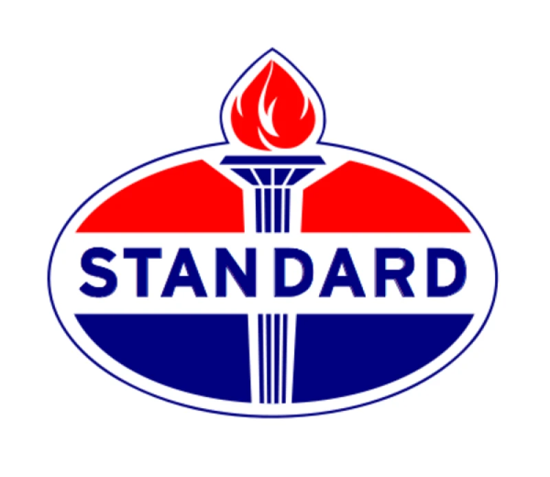
In 1947, Standard Oil introduced a new logo featuring a distinctive oval design. The oval was divided horizontally into three sections – red on top, white in the middle, and blue on the bottom, 1 mirroring the colors of the American flag.
The iconic torch symbol remained a central element, placed within the oval, symbolizing progress, enlightenment, and the company’s role in powering the nation. This “Torch and Oval” logo became synonymous with Standard Oil and its subsidiaries, establishing a strong visual identity that resonated with the public.
The Final Standard Oil Logo That Transitioned Into Its Subsidiaries

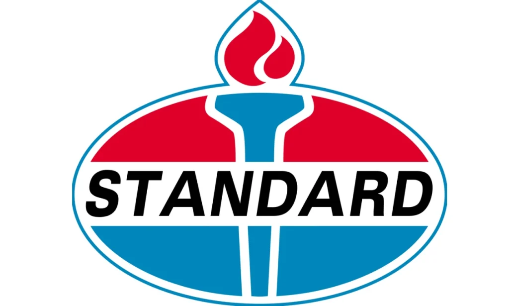
The final iteration of the Standard Oil logo saw some subtle refinements to the “Torch and Oval” design. The deep blue color was replaced with a lighter shade, and the company name “Standard” was sometimes done in black text, written in slightly canted sans-serif fonts. The torch icon itself was also slightly redesigned, with the flame becoming more stylized and less detailed. This final logo served as the basis for the logos of many of the successor companies, each adapting and evolving the design to reflect their own unique identities.
Conclusion
The Standard Oil logo, with its iconic torch symbol and distinctive color scheme, is more than just a visual identifier; it is a powerful symbol of American industrial might and a testament to the enduring power of branding. From its humble beginnings as a symbol of a burgeoning oil empire to its evolution into the logos of its successor companies, the Standard Oil logo has left an indelible mark on the American landscape.
The story of the Standard Oil logo provides valuable insights into the evolution of corporate branding and the importance of visual identity in establishing a strong brand presence. It serves as a reminder that a well-designed and consistently applied logo can transcend its original purpose to become a powerful symbol, conveying a company’s values, history, and legacy to the world.

Logopoppin
Logopoppin is a graphic design agency that specializes in logo designing, web development, video production and advanced branding services. We love to innovate businesses with new age technologies, allowing them to improve their visual reputation.


