
Table of Content
Discover How the Different Star Wars Logos Have Turned into a Cultural Phenomenon
In the late 1970, a new fantasy universe was birthed, which changed the face of what we see as sci-fi. And since its inception, it has grown into a worldwide cultural phenomenon. We are, of course, talking about Star Wars. Today, the Star Wars logo can be seen all around us, from t-shirts and vests, to even sets of Legos.
It has spawned nine different films in the main franchise, a few supporting films, different animated and live-action TV series, video games, extended universe novelization, and more. That is why today, the Star Wars Universe is one of the most popular sci-fi universes of all time.
Over the years, the logo for the franchise has gone through a few changes, in order to adapt to the times. And while it still retains it simplistic design, the franchise has hired highly regarded logo design services providers to modify it over the years.
Let’s take a look at the evolution of the Star Wars brand and its symbol.
Understanding Star Wars: The Creation of an Epic Sci-Fi Universe
The 1970s were all about science fiction. From cult classics like the Planet of the Apes series and Westworld (1973), to era defining feature films like Alien (1979), Superman (1978), Star Trek (1979), Star Wars: A New Hope (1977), the decade was full of films that went on to spawn entire franchises later on.
The last of the names mentioned above, was the film that kickstarted the journey of the franchise we call the Star Wars Universe today. The style of the film was quite different from the other sci-fi films at the time, with special effects that were quite impressive for that day and age. Fast forward a few decades, and the original Star Wars trilogy is now a cultural phenomenon, competing head to head with another major sci-fi franchise, Star Trek.
The year 1999, another installment of the Star Wars saga, called the Star Wars: The Phantom Menace was released. Using the latest in computer-aided graphics and animations, the new entry was a huge success. And despite the stilted acting from a few of the primary characters, this new trilogy of Star Wars films, called the prequels, was a hit.
The better graphics, a more dynamic storyline, and the expansion of the backstories of a few popular characters from the prequels made it popular, especially among the new fans. Purists however, criticized the prequels for being lackluster in plot, as well as the casting and acting of a few characters.
Nearly a decade and a half later, a new film called Star Wars: The Force Awaken was released in 2015. The first entry in the sequel saga, it was meant to bring the Star Wars saga to an end. And finally, with the release of Star Wars: The Rise of Skywalker in 2019, this epic story came to an end on the big screen.
However, just because the movie series is at an end, it doesn’t mean that the storyline has ended. Animated shows like The Clone Wars, or live-action shows like The Mandalorian on Disney+, or the many video game titles building on the primary and the expanded universe, are all carrying on its legacy.
Analyzing the Designs of Various Star Wars Logo Fonts in the Cinematic Universe
Over the years, the Star Wars symbol has evolved multiple times, sometimes to represent the tone of the movie, while at other times to in an attempt to modernize it. And coincidentally, for a somewhat simple wordmark logo, the changes in design have been obvious, yet subtle.
Let’s look at the evolution of the Star Wars logo, from the first film of the original trilogy, to the last film from the sequel trilogy, and discover the various logo fonts and styles they have used over the years.
Star Wars Logos: The Original Trilogy
The original trilogy of the Star Wars universe began with the release of Star Wars: A New Hope in 1977, and ended with the release of Star Wars: Revenge of the Jedi in 1983. In that time, the logo was changed a few times, until it reached a form that
Star Wars Episode 4: A New Hope
The first Star Wars logo released for Episode 4 had a unique design, where the wordmark was extending out into the distance from the bottom of the screen.
Originally, the film wasn’t called anything besides Star Wars. However, during production, the name and the logo were modified slowly, resulting in the version you see above. It was designed by concept artist Ralph McQuarrie’s team, who created multiple versions for the logo, including this one they commissioned from Dan Perri.
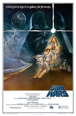
The font for the logo was bold, and had a sweet mix of curves and sharp edges that made it stand out. That, combined with its single tone, flat color scheme made it perfect for use as the movie’s logo.
This version can be seen at the bottom right of the movie poster too, giving it a perfectly balanced vibe of fantasy and sci-fi. But the logo was only used in the promotional posters and ads.
The actual logo to appear in the film was a redesign by Suzy Rice, who went along with George Lucas’s instructions that the logo should look more “Fascist”. Rice, who had recently been studying German signage from the WW2 era, quickly interpreted that into a design that perfectly fit the brief.
Star Wars Episode 5: The Empire Strikes Back
The next film in the series, called The Empire Strikes Back, featured a completely new design. Now following a franchise model for naming the movies, the logo could not just say Star Wars. And with the massive success of A New Hope, it was one of the most highly anticipated movies of that year.
While the naming convention now used by the studio included the episode number as part of the movie’s name, the marketing department felt that adding that to the logo would only end up cluttering the design. so they opted to omit that. The result, was a sleek and bold design that departed from the fascist aesthetic, and adopted a more traditional sci-fi design.
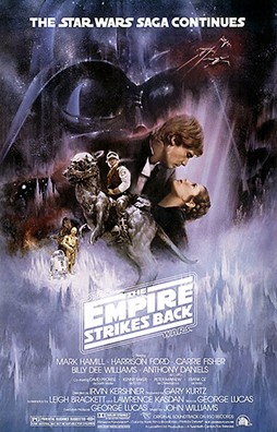
The angled text gave a feeling of speed, energy, and action. It highlights the word “Empire” in the design, portraying their significance as the film’s central characters. And to tie it all together to the Star Wars franchise, the entire design was encased in the original logo created by Suzy Rice. The swashes at the end of the words extended out to join each other, encasing the entire design in their arms.
This was one of the best Star Wars logos of all times, that paid homage to the film it represented, as well as staying true to the original logo’s concept.
Star Wars Episode 6: Return of the Jedi
The third, and last film of the original trilogy, was Star Wars: Return of the Jedi. The movie was highly anticipated by the audience, as the previous installment had ended with a few cliffhangers. Even the name was modified. Originally, the movie execs wanted to name it Revenge of the Jedi.
However, there was a major issue. Their fiercest rival at the time, Star Trek, was about to release a movie which at that time was called “Vengeance of Khan”. Therefore, the movie was then named “Return of the Jedi”.
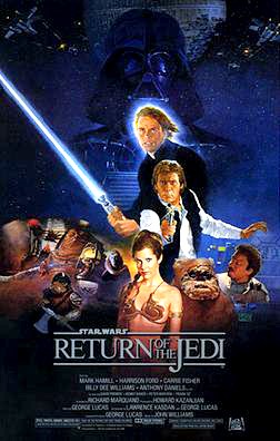
The new logo, however, wasn’t that striking or memorable. In fact, it was so simple in design, that even an amateur designer would be able to whip it up in a matter of minutes. The font itself was nothing special, and seemed quite uninspired. Moreover, the design didn’t even incorporate the Star Wars wordmark in any significant manner, not even within the border, which was a big letdown for the last film of the trilogy, after the previous two amazing logos. Even by the standards of modern minimalist logos, the execution of this logo was a big disappointment.
Star Wars Logos: The Prequel Trilogy
In the late 1990s, the studios had seen Star Wars grow from a humble sci-fi thriller trilogy, into a worldwide. To capitalize on that fame, the studios decided to create another trilogy. But instead of taking the storyline from the original trilogy forward this was to be a prequel series, meant to explore the origins of some of the more interesting characters from the originals.
With a new direction to the movies, the Star Wars logo too was redesigned to reflect that change.
Star Wars Episode 1: The Phantom Menace
The original trilogy was all about emphasizing the name of the film. As a standalone series at the time, the concept wasn’t difficult for the viewers to grasp, as the storyline progressed chronologically, according to the movies’ release dates.
The prequels, on the other hand, had a major issue. Viewers were not that receptive of the prequel concept. While there had been other prequels before this one, the fact is that people found it hard to relate the two timelines into one. This proved to be a dissonance that resulted in a cloud of confusion surrounding the film.
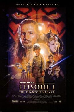
To counter that, the studio execs decided to adopt the numbered format, making it easy to sort the movies and the storyline in order. The logo for the first movie, called The Phantom Menace, sported a logo that featured “Episode 1” in big and bold letters. Moreover, the Star Wars logo was featured quite prominently at the top left corner, and the name of the episode at the bottom of the logo.
Star Wars Episode 2: Attack of the Clones & Star Wars Episode 3: Revenge of the Sith
Now, unlike the original trilogy films, the prequels had a consistent logo style for all three of its films, with only minor changes to the color scheme of each individual logo based on the theme of the movie.
While many people may argue that the similarity of logo design takes away from the individuality and creativity from the film’s design, the act of the matter is that it is uniformity like this that makes a series work.
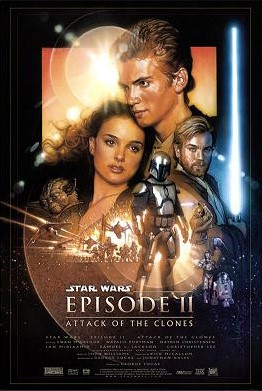
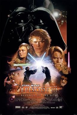
Just look at the two posters for episodes two and three of Star Wars. Don’t they have a uniform visual style?
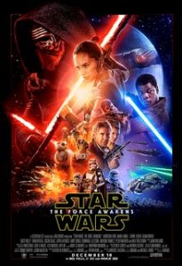
The Sequel Trilogy (The Force Awakens, The Last Jedi, & The Rise of Skywalker)
Compared to the originals, the prequels were not very well received. There were many reasons for that, but one thing that people couldn’t argue, was that the story wasn’t a good one. The last three films of this series, called the sequel trilogy, also adopts a somewhat similar style of logo design, albeit now focusing on highlighting Star Wars more than the name of the episode itself.
A decade and a half later, the studios wanted to revive the Star Wars cinematic universe, which had been a little stagnant after the prequel trilogy. Despite great action and top-tier graphics and animations, the movies had faced a lot of critics.
The studios wanted people to remember why they loved Star Wars in the first place. The new trilogy, called the sequel trilogy, was planned. And one of the most prominent changes made to it, were the Star Wars logos which showcased the premise of the series without taking away from the storyline.
The first movie of this trilogy, known as The Force Awakens, has a prominent logo that features the name Star Wars in bold, yellow-highlighted characters. The name of the episode was written in small letters between the wordmark.
The next movie, which is one of the darkest ones in the series, features a red outline to the logo. otherwise the logo was practically the same, without any memorable change at all.

The last film of this series, called The Rise of Skywalker, also has a similar looking logo. The only difference, was that the outline was now a bright sky blue, which was a kind of homage to Luke Skywalker’s original blue lightsaber. It is a very subtle reference to the original trilogy, and is something that few people learn when they find out how to design a logo.

Understanding the Various Star War Logos and Symbols Across the Fantasy Universe
Besides the primary logos and symbols that we can see in the Star Wars Cinematic Universe, there are a few others that viewers can see interspersed across the movies. From the symbol of the Jedi, to the logo for the Galactic Republic, here are some of the most popular Star Wars logos that we can find in the movies.
The Rebel Alliance
The Rebel Alliance was a resistance front created to counter Darth Sidious and Darth Vader’s Galactic Empire. The logo has a similar design to that of the Jedi logo, which is understandable considering that the rebels were often led by Jedi Knights or Jedi loyalists.
The Jedi Order
The Jedi Order was an order of force-sensitive beings in the galaxy who dedicated their lives to studying, enforcing, and upholding the teachings of the light side of the force. Originally, the Jedi studied both the light and the dark sides of the force. But after a schism that saw Jedi knights corrupted by the dark side, the study of dark side of the force was prohibited. Thus the order then dedicated itself to maintaining the balance in the force.
Galactic Empire
The Galactic Empire was ruled by the Sith Lord Darth Sidious, who was previously a Galactic Senator from the planet Naboo known as Sheev Palpatine. But after his disappointment in the Jedi Order’s failure to uphold peace in the galaxy, he took control over the known reaches of the galaxy, calling himself the Galactic Emperor.
Frequently Asked Questions
| 1- What is the symbol of the Jedi? The symbol is that of a bird flaring its wings and rising into the air. The symbol was used since the time of the old republic, and was worn on medallions by Jedi Knights who had fought for peace and justice. |
| 2- What is the Imperial logo in Star Wars? The Imperial logo is a modified form of the republic crest. It featured the six-spoke wheel of Darth Sidious’s Galactic Empire. |
| 3- What are some lesser known symbols in Star Wars Cinematic Universe? Some of the lesser known symbols in Star Wars include the logo for the Mandalorians, the Eternal empire’s logo, the logo for the Yuzhan Wong, the Chiss empire logo, and many more. |
Conclusion
Overall, the evolution of the various Star Wars logos from the different trilogies, is one that shows how the franchise has evolved over the decades. Moreover, with the expansion of the universe to include different other digital platforms and mediums, the Star Wars symbol is one that is going to last a long while, evolving along with the times for each new generation of fans.
Latest news you want to know!
Subscribe for cutting-edge design inspiration at Logo Poppin! Elevate your brand with updates on logos, branding, web design, and video animation.
Note that by clicking “subscribe,” users may agree to our privacy policy and consent to Logo Poppin to use your contact data for newsletter purposes.
Logopoppin
Logopoppin is a graphic design agency that specializes in logo designing, web development, video production and advanced branding services. We love to innovate businesses with new age technologies, allowing them to improve their visual reputation.

