
Table of Content
Learn How the Starbucks Logo Evolved Through the Years
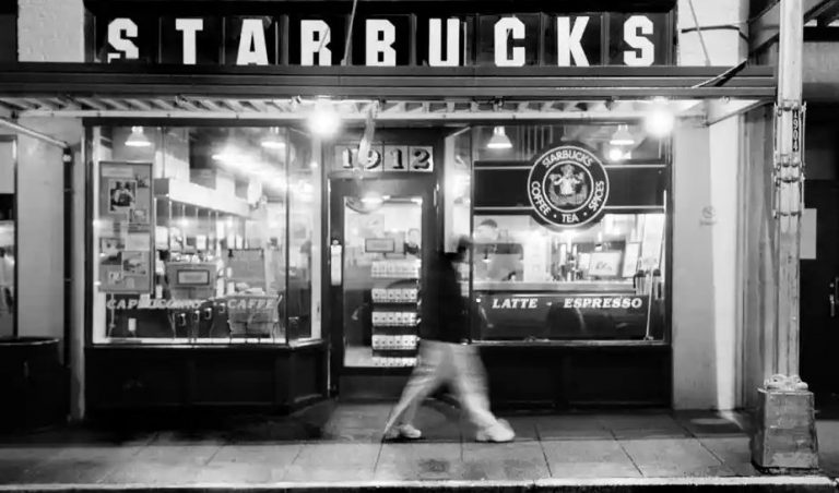
Many of us love having Starbucks coffee in our daily routine. It is one of the most famous coffee brands in the world having footprint in different major countries. People generally trust the renowned Starbucks logo whenever they are in need to have a good coffee. This is the power of Starbucks that has given its branding a huge boost in the world. Starting from Seattle, the brand has spread its outlets all over the world, showcasing its huge demand in every country. The logo itself has become a popular emblem in the coffee market, and it has got no competition anyway near.
The rise of Starbucks in the world is nothing short of exemplary. It has started from a little shop in Seattle, founded by Gordon Bowker, Zev Siegl, and Jerry Baldwin. As the days progressed, the shop grew dramatically towards success serving up to hundreds of customers per day. It should be noted that the company was not officially named Starbucks at that time. It operated with a local name, until in 1987 when a group of investors acquired and rebranded it with the name of Starbucks.
Since then, Starbucks has achieved many heights of success in the market. Today, it is counted among the biggest coffeehouses in the world due to offering great taste and quality. The Starbucks logo has therefore achieved great prominence in the market, attracting millions of customers through its single look. In this article, we will take a look at the evolution of Starbucks logo as how it evolved and achieved a solid reputation in the market rightly from its early days of inception.
The Beginning of Starbucks
Like all the big brands known today, Starbucks also didn’t start with tons of resources or investments. The logo of the company was neither created by any professional logo design agency. In 1971, the coffeehouse was first founded by three pioneering members i.e. Gordon Bowker, Zev Siegl, and Jerry Baldwin. Together, they worked hard to build the coffeehouse from a very little startup. It started to gain popularity in the market due to offering quality coffee beans.
Within just few years, it grew up from a very little shop to a known brand settled in the suburbs of Seattle. It should be noted that after getting much success, the company was still just selling coffee beans in its early years of operations. These beans were quite popular among the people, but still they weren’t matchable to getting an actual quality coffee.
The tides for the company started to change in 1986 when it was acquired by Howard Schulz. He took over the company with sole ownership which later further evolved with the joining of other investors. This was the first stepping stone towards the modernization of Starbucks. It helped the company to finally start selling coffee instead of just offering coffee beans to the people.
The Starbucks that we know today got its inception from the late 80s. It steadily started to grow with the production of different coffee flavors including Expresso, Late, Americano and more others. People really liked this approach as it was like a fresh trend in the coffee market. It further gave prominence to the already growing Starbucks, allowing its reputation to get more hype in the market.
Evolution of Starbucks Logo
The circle logo design of Starbucks has always remained a perfect center of attention in the market. Besides being highly creative, it represents the most popular coffeehouse known in the world. People trust on this logo because of its long history in the coffee brewing industry. Many people do not know about this because of its different turns and diversity in multiple stages.
If you are also one of them who is not well versed with the history of Starbucks logo, take a look at the details given below. This will let you know the complete evolution of Starbucks logo, right from its start in 1971.
Classic Logo – 1971
Like as defined above, Starbucks didn’t start its operations with its current official name. It came into the market with a unique company name called Pequod. This name was based on a whaling ship defined in a classical story titled Moby-Dick. Fortunately, this name didn’t get much attention in the market and company stakeholders didn’t also wasted any time to realize it.
They soon came up with an idea to use the name of the ship’s chief i.e. Starbuck as the new tag of the company. This was the first time when they used Starbuck as their official company name. It precisely got more attention in the market as compared to its predecessor tag. People really liked this new name, and so it started the journey of great Starbucks in the world.
The first logo of Starbuck introduced the legendary twin-tailed mermaid in the official identity of the company. Thought it was based on a classical style, but it perfectly showcased a great flare of elegance in the design.
The New Beginning – 1987
The logo of the company also took a huge overhauling when the organization was sold out to a new owner in 1986. Earlier, it used to be in a brown color with twin-tailed mermaid being printed with white. This color combination looked very classical; hence it needed an overhaul to bring something new in the branding.
We have always seen how companies rebrand themselves to rejuvenate their identity in the market. Starbucks also opted for this approach to give their brand a fresh look in the industry. It perfectly worked out for them in terms of being more creative and attractive from the first one. Furthermore, its colorful shades comprising on green and white quickly revitalized the other branding elements of the company. It gained good attraction in the market, allowing company branding to grow rapidly.
Howard Schultz, the new owner, hired a renowned artist to re-design the logo of the company. This was the first time in years the logo was getting a new look, hence Schultz thought to do it perfectly by taking services from the best. Terry Heckler, the lead artist, came up to the task by creating a new stunning logo inspired by some raw ideas. He used the concept of port of Seattle to display a sense of originality in the logo. It looked highly appealing, as the color combination of green and white made the whole logo quite unique from the first one.
Slight Modifications – 1992
The logo of Starbucks again took some little modifications in 1992. This time, the logo didn’t saw huge changes, as the work was only being done in the twin-tailed mermaid figure. Earlier, it was displayed with the iconic sirens, but the new logo precisely reduced them to the half. It focused more on displaying the face of the mermaid, as it is termed the official identity of the company.
Besides that, the typeface of the logo was also edited with a more sharpened look. It became a little thin as compared to the previous lettering style, but its sharpness was then duly increased to bring simplicity in the design. The result was that the logo became much neater and decent in looks. It illustrated how even a little customization can also bring significant changes in the design, provided it looks aligned with the general logo concept.
Retake of Classical Design – 2008
The logo introduced in 1992 got a very long run depicting the official emblem of the company. However, in 2008, the company decided to celebrate its 40th anniversary by introducing a new vintage logo. The concept of this logo was different because it was created with a classical design that first came into the market in 1971. It was primarily presented to let the people know how Starbucks was started from just being a coffee beans production company during the late 70s.
Unfortunately, this attempt didn’t go well with the people, as Starbucks saw huge backlash after introducing the classical logo. People didn’t accepted this classical design, as they were more familiar with the iconic green and white mermaid logo. They term this attempt a swift reboot of the classical design with no knowledge of the current market trends.
Looking at this huge scale of criticism, the company finally decided to reverse their introduction, so that the long-standing reputation of the company could not be damaged entirely. They brought back the iconic green and white Starbucks logo, as it was more popular among the people, especially millennials. This case also set a perfect example for other companies how they should look towards rebranding, keeping the interest and association of their customers in mind.
The Latest Starbucks Logo – 2011
In a bid to remodify company’s coffee branding, the latest Starbucks logo was introduced in the market in 2011. It is yet another a great piece of art that uses the same theme and colors like of its early predecessors. The only difference is that this logo does not include any typeface depicting the name of the company. All the earlier logos had Starbucks mentioned in their design, but this new logo doesn’t include any type of typography.
This is certainly a huge shift as compared to the pattern used in earlier designs. The primary reason to pursue this is to make the logo less cluttered than before. The company aimed to make its logo simpler and cleaner in looks. It helps them to showcase a decent identity yet strong impression of the brand in the logo. This is certainly a practice that is currently being followed by many companies. They like to keep their emblems simple by precisely using an abstract logo design created with stunning perfection.
The reduction of outer ring as well as wordmark has given the Starbucks logo a flawless appearance. It has put more focus on the face of legendary twin-tailed mermaid, which is certainly the main historical figure of the Starbucks logo.
Frequently Asked Questions
| 1. Why is Starbucks so famous in the world? Headquartered in US, Starbucks is a renowned coffeehouse company having years of experience in the field. It is mostly famous because of its top class coffee that beats all others in the market. It is also termed one of the pioneers in the industry of coffee brewing, as the company started its operations from late 1970s. |
| 2. Why is Starbucks logo so popular? Starbucks logo has become a symbol of elite class coffee in the global market. People trust on this logo because it represents one of the finest coffeehouses in the world. Furthermore, its historic value is also very much significant for the people. |
| 3. What the Starbucks logo really means? The mythological figure that resembles a mermaid in the Starbucks logo is basically called a siren. Its concept is taken from the old marine books, in which a siren is considered an important character. |
| 4. How many logo variations Starbucks received over the years? Starbucks received various logo variations during the last three to four decades. Beside keeping the main logo theme same, little changes have been done in different components of the logo, so that it can look right according to the trends. |
| 5. Which Starbucks logo is termed the best as of yet? This is certainly a difficult question because all the Starbucks logos have received equal appreciation apart from just the 2008 version. They have kept their major theme same, hence they have always remained favorite of the Starbucks lovers. |
Conclusion
That concludes our entire article in which we have discussed the evolution of Starbucks logo in complete detail. It belongs to one of those brands that is currently leading the global industry of coffee brewing. Starbucks has got footprint in different parts of the world, and its logo is certainly the major reason why people regularly gets attracted toward its coffee.
This article has perfectly defined the evolution of Starbucks logo right from its very beginning. It saw different modifications during this whole time period, illustrating how creatively company has tried to rebrand itself while keeping its core logo theme accurately intact.
If you are also looking for an agency that can help to rebrand or recreate your company logo according to the latest trends, contact us today. Our logo designers will assist you to create quality logos, so that your brand can get the required market attention.
Latest news you want to know!
Subscribe for cutting-edge design inspiration at Logo Poppin! Elevate your brand with updates on logos, branding, web design, and video animation.
Note that by clicking “subscribe,” users may agree to our privacy policy and consent to Logo Poppin to use your contact data for newsletter purposes.
Logopoppin
Logopoppin is a graphic design agency that specializes in logo designing, web development, video production and advanced branding services. We love to innovate businesses with new age technologies, allowing them to improve their visual reputation.

