Table of Content
Discover the Origin and Idea Behind the Stray Kids Logo Design That Made It a K-Pop Icon
Stray Kids, a South Korean boy group formed by JYP Entertainment, has taken the K-Pop world by storm with their unique sound, captivating performances, and innovative approach to music. The group’s rise to fame has been accompanied by a strong and recognizable brand identity, exemplified by their distinctive logo and standout charm.
The Stray Kids logo, a visual representation of the group’s values, aspirations, and musical style, has played a crucial role in their success among South Korea’s “Idol” phenomenon. The logo’s design and symbolism have resonated with fans around the world, contributing to the group’s popularity and cultural impact, similar to other groups like BLACKPINK and BTS.
Join us as we explore the history and meaning behind the Stray Kids logo, analyzing its design components and examining its impact on K-Pop today. By understanding its symbolism and significance within the context of the group’s musical identity, we can gain a deeper appreciation for Stray Kids’ unique brand as portrayed by their brand logo design agency.
Let’s begin.
Stray Kids and Their Impact in K-Pop

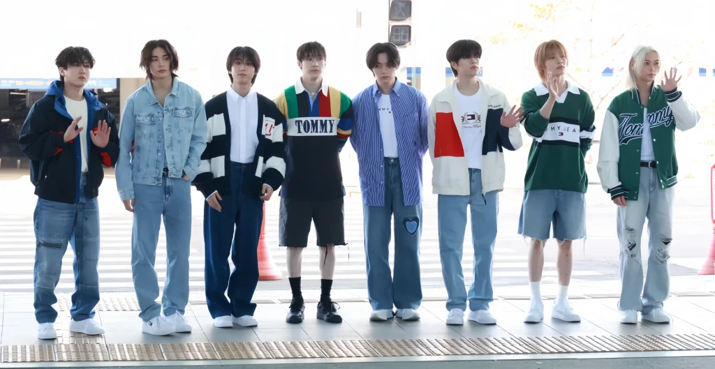
Stray Kids, formed in 2018, was originally a nine-member boy band known for their self-produced music and powerful performances. A diverse range of genres, including hip-hop, rock, and EDM, often with socially conscious and introspective lyrics, characterizes the group’s music. Stray Kids has gained a reputation for their innovative approach to music, their strong stage presence, and their ability to connect with fans on a personal level. Managed by JYP Entertainment, one of South Korea’s biggest entertainment companies, the band went down to eight members when vocalist Woojin terminated his contract in 2019 for undisclosed reasons.
Beyond their musical talent, Stray Kids has also made a significant impact on K-Pop culture. The group’s members are known for their authenticity, their willingness to speak out on important social issues, and their positive influence on young people. Stray Kids has inspired countless fans to pursue their own dreams and to embrace their individuality.
Understanding the Concept of the Stray Kids Logo and Its Design Components

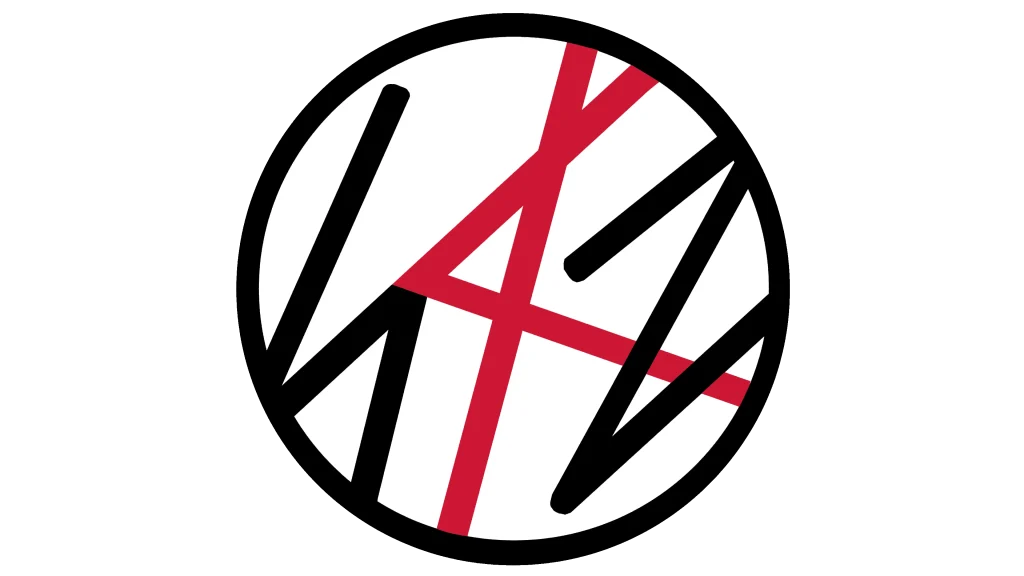
The Stray Kids logo is a simple yet powerful design mimicking the vibe of signature logos that reflects the group’s values and aspirations. The logo features a stylized “SKZ” in a bold, sans-serif font, surrounded by a circular frame. The “SKZ” is designed to resemble a keyhole, symbolizing the group’s mission to unlock new possibilities and break down barriers in the music industry.
The circular frame represents the group’s unity and their commitment to working together as a team. The logo’s overall design is clean, modern, and visually appealing, reflecting the group’s youthful energy and their forward-thinking approach to music.
The Stray Kids logo has become a recognizable symbol of the group’s identity, representing their unique sound, their powerful performances, and their commitment to breaking boundaries. The logo’s design is consistent with the group’s overall aesthetic, and it has helped to solidify their place in the K-Pop industry.
Key elements of the Stray Kids logo include:
- The “SKZ” lettermark
- The sharp angles and lines that form abstract shapes
- The bold typographic choice
- The circular frame
- The subtle yet memorable color scheme
Let’s take a look at them in further detail.
The “SKZ” Lettermark Monogram
The lettermark logo variations prominently feature the initials “SKZ,” representing the group’s name. The “S”, “K”, and “Z” are intertwined in a unique and eye-catching way, suggesting the interconnectedness and synergy of the group members.
The Sharp Angles and Lines forming Abstract Geometry
The design incorporates sharp angles and lines, creating a sense of determined strength and independence, a common design trick used to create various types of logos in the music industry. These elements reflect the group’s rebellious spirit and their willingness to challenge conventions.
The Bold Typography of the Logo
The logo fonts used for the Stray Kids logo typography are bold and assertive, conveying a sense of confidence and authority. This reflects the group’s powerful stage presence and their ability to command attention.
The Circular Frame
The circular frame surrounding the logo represents the group’s unity and their commitment to working together as a team. The circle logo design also symbolizes the endless possibilities that lie ahead for Stray Kids.
The Understated Color Palette for the Design
The Stray Kids logo is typically presented in black and white, with occasional variations in different color combinations featuring red, green, or yellow colors. The black and white color scheme adds a sense of sophistication and timeless elegance.
The Symbolism and Meaning Portrayed By the Stray Kids Logo

The Stray Kids logo is more than just a visual identifier; it is a powerful symbol that represents the group’s values and aspirations. The intertwined “S”, “K”, and “Z” suggest the unity and teamwork of the members, while the sharp angles and lines represent their determination and independence. The bold typography represents the group’s confidence, while the color scheme adds a sense of sophistication and timeless elegance.
Overall, the Stray Kids logo is a well-crafted design that effectively captures the group’s unique identity and musical style. It is more than just a visual symbol; it is a representation of the group’s values and aspirations. It embodies their rebellious spirit, their commitment to self-production, and their mission to inspire and empower young people. The design has played a significant role in establishing the group’s identity and connecting with their audience.
And its symbolism have resonated with fans around the world, contributing to the group’s popularity and cultural impact, serving as a great example of how to design a logo for an artistic sensation.
FAQs
| What does the “Z” stand for in the Stray Kids logomark? This harkens back to the Stray Kids’ Korean name, where the last letter sounds close to a “Z” than an “S”. Therefore, while the Hangul alphabet has no “Z” in it, the Romanized name for the boy band is shortened to the initials “SKZ”. |
| Do the Stray Kids have some specific brand colors? The Stray Kids logo is often written in all black. However, sometimes the logomark will feature the letter “K” in various colors, including red, green, or yellow. |
Conclusion
The Stray Kids logo is a powerful and memorable symbol that has played a crucial role in the group’s success. The logo’s design and symbolism reflect the group’s unique identity, their musical style, and their commitment to challenging conventions. As Stray Kids continue to rise in popularity, their logo will undoubtedly remain a recognizable and iconic representation of their brand.

Logopoppin
Logopoppin is a graphic design agency that specializes in logo designing, web development, video production and advanced branding services. We love to innovate businesses with new age technologies, allowing them to improve their visual reputation.


