Table of Content
Take a Look How Taco Bell Logo Used Different Iterations to Optimize its Branding
We all know how vast American fast food chain has become in the last few years. It is quite competitive yet very profitable among the other industries. Building a name in this sector requires quality products as well as unique branding of the highest order. This certainly looks difficult to some businesses, but not to the likes of famous Taco Bell. It is a highly popular fast food chain that operates in almost all of United States. The catchy Taco Bell logo is one of those emblems that is known for offering quality Tacos. It is certainly loved by the masses, including both adults and youngsters.
The rise of Taco Bell in the American market is nothing short of exemplary. In 1962, the food chain brand started with just one outlet in California. It was the time when people didn’t’ knew much about Tacos. Introducing such kind of unique fast food product was itself a matter of risk. But the stakeholders of Taco Bell took that risk, as they were confident to start a new trend in the market. They took logo design services from the professionals to design a unique emblem for their business. This worked perfectly for them, allowing their business to grow rapidly in the market.
Since then, the Taco Bell logo has become a symbol of quality Tacos in United States. Not just that, but the brand has now expanded its operations to other regions as well. Just like Starbucks logo, Taco Bell has also become globally famous which is indeed evident through its demand in different countries. This article will also discuss the evolution of Taco Bell in detail, so that you can understand its tremendous journey in the market.
Let’s first take a look back in the history how Taco Bell started its food chain business in the market.
History of Taco Bell
The history of Taco Bell goes back to the late 60s when American food chain was initially growing. At that time, people only had few fast food options available in the market. Mostly, burgers and sandwiches were common in the fast food, and many restaurants were only used to serve them.
Thinking about something new was quite a risk at that time, as the taste of people was still developing. Many food houses tried to introduce different dishes, but only few of them got the correct market response. One of them was Tacos, introduced by Glen Bell in 1962. He founded the first Taco Bell outlet in California which instantly became a great hit among the people. It had a new taste and flair which gave people a new perspective to think about fast foods.
Within just a few time, Taco Bell became the talk of the town. It started to get the attention of all the fast food enthusiasts. The restaurant also introduced different flavors with the passage of time, giving their Taco menu a further boost. The food chain then expanded to other parts of America, as Taco Bell became successful to grab the attention of masses. They also formed collaboration with other brands to promote Tacos more aggressively. This also gave their brand a huge boost, allowing their customers’ pool to grow regularly.
Evolution of Taco Bell Logo
Taco Bell has used different types of logos from time to time. They have always remained very smart in moving along with the trends to solidify their branding. The basic purpose of introducing different logos is to keep their branding fresh, so that their business representation does not looks outdated.
Starting from 1962, the company has used various brand logos till to date. They kept changing them using different colors and styles, rightly according to the evolving trends. If you do not know about the early Taco Bell logos that came in the market, take a look at the list given below. It will help you to understand the evolution of Taco Bell logos, right from the start.
Taco Bell Logo – 1962
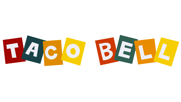
The first logo of Taco Bell was introduced in 1962. It was designed in a very funky style using different colors square box shapes. The primary purpose to use these colors was to highlight the ingredients present in Tacos. This means that golden and yellow colors depicted cheese and Taco shells, whereas red and green colors showcased an idea of chili sauce and cilantro.
This was certainly a very unique illustrated logo that portrayed a classic idea of Tacos. Many people didn’t understand its overall meaning, but they did appreciate the theme of the design. The restaurant used this logo for ten years until it was decided to revamp the identity again. It was also a necessary measure that was required to keep the company branding fresh. Nevertheless, the first logo is still remembered by many people as the first emblem that introduced Tacos in the American food industry.
Taco Bell Logo – 1972
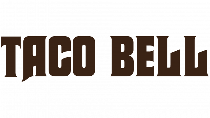
Taco Bell logo was revamped completely in 1972 according to the required trends. This time, the logo didn’t include colorful letters. It chose to go simple by using a simple wordmark with a Mexican style typography. This style was quite different from the first one, as it had a flair of strongness in the design. The wordmark was given preference over any symbol or figure to showcase simplicity in the brand name. It highlighted the Taco Bells name strongly, giving a perfect vibrant look to the restaurant branding.
This logo symbol was again used for the next twelve years i.e. till 1985. It became a solid representation of the brand, allowing it to portray a subtle theme. The color chosen for this wordmark was dark brown, as it looked great on the typography. This monochromatic logo will also be remembered as one of the original logos of Taco Bells. It had a classic vibe that precisely gave the brand a solid market representation.
Taco Bell Logo – 1985
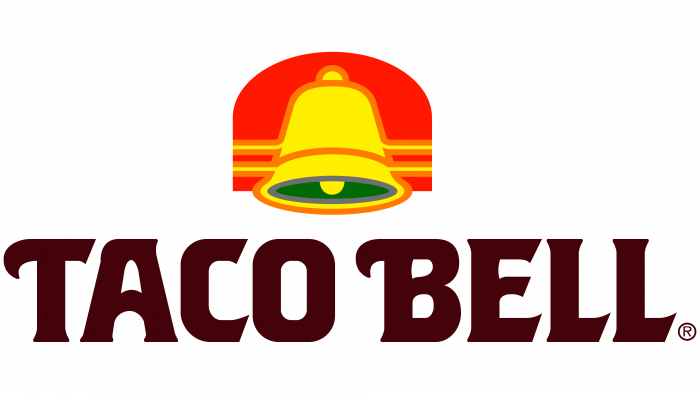
Coming to 1985, the company finally decided to add the iconic “Bell” in its logo. This was the first time when Taco Bells used a graphical picture in the logo to make it more colorful. Many people termed that this change was due for a long, as the company name itself had a bell word. This new change in the logo was appreciated widely by the people, and it became popular within just a few time.
The color of the bell was chosen very precisely. It was designed with a green, red and yellow color to depict a classic theme of Tacos. This also reminded many people of the first logo that was created using the same colors. Though it was a wordmark, but it also had the same gradient colors used in the square boxes. It could be said that the restaurant precisely used these colors to bring back the classical relevancy, as well as introducing a new figure in the logo design.
Taco Bell Logo – 1992
Taco Bell revamped its whole logo in 1992 to once again optimize the company branding. This time, the theme of the logo was entirely changed. The earlier versions of the logo were mostly created with yellow, green and red colors. However, this time, Taco Bell picked the violet color to design its logo. It was certainly a fresh change in the company branding that allowed it to present a new theme in the market.
However, this version was also one of the shortest lived logo in the history of Taco Bell. The company again revised it in 1994 when it felt to introduce a new branding perspective. This logo however permanently changed the old practices of color selection, as violet eventually became the mainstay of Taco Bell’s future logos.
Taco Bell Logo – 1994
The new logo introduced in 1994 was similar to the one came out in 1992. However, the typography and bell colors used in it were different from the earlier one. The bell was redesigned with a solid violet gradient that it made it look more vibrant. While a new masculine font was used in the typography to highlight the restaurant name strongly. This one definitely looked a far better version from the previous one, as it was created with a more glaring look.
Soon after the logo was introduced, it became immensely popular among the audience. That is the reason why Taco Bell also stayed firm with it for the next 20 years. Till 2016, this logo was still the first choice of the company, as it was designed beautifully keeping all the necessary branding elements. Meanwhile, few modified logos were also used during this time to commemorate special events like Christmas, Independence day and more others. It used the same style, except for colors that were picked according to the given occasion.
Taco Bell Logo – 2016
The current Taco Bell logo that we know today was introduced in 2016. This was not a complete redesign, but a slight modification in terms of adding whitespaces in the logo. The violet color has been kept same in this design, as it has now become the main part of company’s branding theme. The wordmark style of the logo has also been changed by using a more subtle typography. It has given the logo a very simple look, making it more decent to the eye.
Meanwhile, like the previous one, this logo has also been modified with different colors to celebrate special occasions. Every year, the company uses a red and golden logo to celebrate Christmas event. This brings a good change in the branding of the restaurant, allowing it to gather good traffic during particular occasions.
People Also Ask (FAQs)
| 1. Why is Taco Bell so famous? Taco Bell is famous throughout the world because of offering great quality Tacos. It is also one of the first fast food houses in America that introduced Tacos in the late 60s. Since then, it is termed famous because of its tasty Tacos. |
| 2. What is the design of Taco Bell logo? Taco Bell logo has been designed very creatively to grab the attention of the foodies. It includes a simple typeface, as well as an iconic Bell designed in a violet color. |
| 3. When was Taco Bell founded? Taco Bell was founded in 1962 by Glen Bell. He started Taco Bell in California from just one outlet. Within just a few time, the restaurant grew massively adding up to multiple outlets throughout the country. |
| 4. What is the color of Taco Bell logo? The color of current Taco Bell logo is violet. It was first introduced in the logo version of 1992. Earlier than that, the company used to create logos with different colors. |
| 5. Why did Taco Bell change their logo? Taco Bell knew how to keep up with the market by moving along with the trends. They applied this technique in their branding by changing the logos from time to time. It helped them to keep the branding fresh rightly according to the modern trends. |

Logopoppin
Logopoppin is a graphic design agency that specializes in logo designing, web development, video production and advanced branding services. We love to innovate businesses with new age technologies, allowing them to improve their visual reputation.

