
Table of Content
History and Evolution of the Target Logo Design
Any business can develop a simplistic, clean logo and make it memorable. Sounds like a fantasy? Take a look at the symbol of the well-known mass-merchandise retailer, Target. It has become one of the most recognizable emblems worldwide. And it serves as the best example of how to design a logo that create lasting impression.
No doubt, the Target logo has gone through several changes in the past decades. But one thing that has remained constant is its core visual metaphor. You can also see a stylized depiction of the store’s name in the logo.
It is challenging to make a simple and recognizable logo without the help of experienced logo design services providers. But following Target’s example, you can try designing a memorable logo for your brand. So, without further ado, let’s dive in and discover how the Target logo design that we know today came to be.
1-History and Inception of the Target Business Logo and Corporation
When you look at the three circles in red and white, you instantly recognize that the emblem belongs to Target Corporation. Target history dates back to 1902 when the real estate developer George Draper Dayton purchased the land from Dayton Dry Goods company.
The company later transformed into the Target franchise after Dayton’s death in 1938. After 50 years, Target was officially built in the early ’60s.
Interesting Facts about Target
If you’re a regular Target shopper, you might find the following facts about the retail brand interesting.
- It is a general merchandise retail store with outlets in 50 across the US and District of Columbia.
- The Target workforce includes 350,000+ members.
- 75% of the US population can find a Target outlet within 10 miles.
- The corporation also owns Shipt and Roundel.
- The Target slogan, “Expect More, Pay Less,” was first introduced in 1994.
- The retail store’s headquarters is still located in Minneapolis, Minnesota, since its inauguration in 1962.
2- History of Target Logo
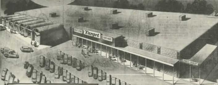
The Dayton Company laid the foundation of a discount store in Roseville, Minnesota, in 1962, and the management of the company started to look for a name and emblem for its new store.
You won’t believe it, but the company’s team discussed over 200 versions of the name and logo. As a result, the first-ever version of the logo was built, and the Target name was selected for this store.
The original version portrayed a target featuring three red circles and white spaces in the middle of them. It also featured the store name written in black color and bold masculine fonts. As an homage to the name of the store, the logo features a design that is quite similar to a bullseye used for target practice.
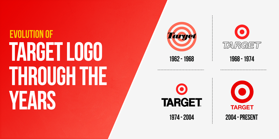
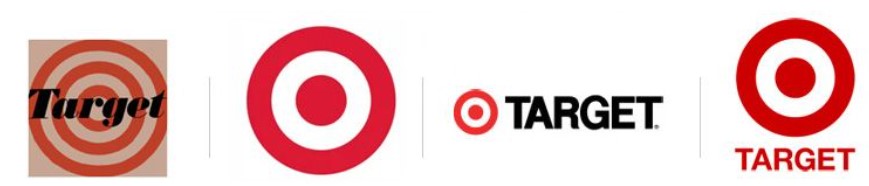
However, the logo didn’t retain the same design throughout its lifetime. The original logo has evolved over time, witnessing four different variations over the span of over six decades.
3- How has the Target Brand Logo Evolved – Target Logo Variations Over the Years
It’s no secret that Target made slight changes to its logo over time. Moreover, the current minimalist logo design is clean, recognizable but slightly different from the original Target symbol. Here’s the target logo history and its transformation over the years.
Original Target Symbol – 1962
Target released its original logo back in 1962. In this emblem, the color white begins from the center. You can also find the popular bullseye in the circular Target symbol. It had three red circles with white space between each of them. In front of the Target symbol, the company chose to put the brand’s name in solid black to complete the design.
Some people think that a Target logo with a red and black bullseye would have been a better choice, with white lettering contrasting on the darker design. However, the reason the bullseye works is by alternating high contrast colors, such as black and white, or red and white, it boosts visibility and acuity.
Incidentally, the same issue would be faced if you use the Walmart color scheme. Think about it, a blue and white bullseye? Wont have the same impact now, would it?
If you compare the 1962 version of the mass-merchandise retailer’s logo with its current version, it doesn’t appear effective. The old target logo has the elements overlapped, and several concentric circles make the design overwhelming.
On the other hand, it wasn’t easy to associate the Target symbol with the retail store. And, the target element appears similar to a marksman target which impacts the logo’s potential to garner brand recognition.
The First Target Logo with Red and White Bullseye – 1969
After using the original Target symbol for six years, the old emblem went under the modification phase for the first time in 1969. The new changes included keeping just one ring around the red dot.
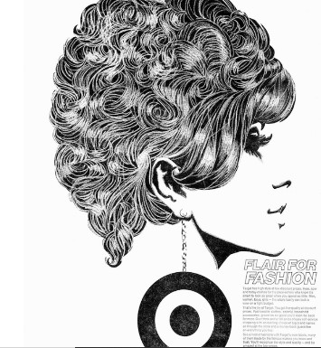
After one year, the brand made a few changes to its visual identity on the occasion of opening a new outlet. The design showed a woman wearing an earring stylized as the retail giant’s logo.
The Second Target Logo Evolution – 1975
Target decided to redo its logo after another six years. In this phase of modification, the two red circles were kept with a single white band.
However, the italicized vintage fonts were removed, and a solid black font was placed. The change of font was done to resolve the readability issue. Also, the bullseye size was reduced, whereas the uppercase font was kept in its previous position.
The Third Target Emblem Modification – 2006
Customers saw another slight alteration in the Target symbol back in 2006. The brand decided to work on the typeface and change its color from black to red. The typeface’s size was reduced than the bullseye. It was moved from the right side and placed under the iconic bullseye.
Modern Target Corporation Logo – 2018
The Target logo went under the redesigning phase again after 14 years. In this transformation, the uppercase letters were made lowercase, and the logo fonts made sharper for better visual clarity. The brand kept the bullseye but used a vibrant shade of red.
4- Target Logo Elements
It’s no secret that Target made slight changes to its logo over time. Moreover, the current design is clean, recognizable but slightly different from the original logo. Here’s the target logo history and its transformation over the years.
Target Logo Colors
The retail chain has indeed achieved simplicity and harmony using one of the simplest red and white color combinations. The red color reflects purity, passion, business responsibility, whereas the white color portrays elegance, prestige, and nobility.
Target Logo Font
There’s only a symbol in the current version of the logo. However, you will find a wordmark written in the Helvetica Neue Bold sports font if you look at the older versions.
Target Logo Meaning and the Significance of the Bullseye Design
The logo communicates business identity. It features a homocentric circle within a circle depicting a target symbol, which is practical and understandable.
The design features the company’s needs, goals, and objectives very well. More importantly, a thick band of negative space is kept to form the third ring in the logo, with the overall design one of the better examples of circle logo design.
5- The Secret Elements of Target’s Iconic Logo
A study by target revealed that 96% of American shoppers are familiar with what the bold and red bullseye represents. You might be thinking about the factors that made the Target logo a massive success.
To ensure the effectiveness of your logo, it’s essential that it represents your brand archetypes, engages the audience, and communicates your message. Target has a minimalist design style, but it successfully conveys the company’s mission and vision.
No doubt, Target’s symmetrical logo is pleasing to the eye and looks perfect. It contains elements that you can find in many iconic symbols such as FedEx, Google, and Apple.
Simplicity
You can take a retail brand’s logo to show how a simple logo can become recognizable, without being classified as one of the generic logos. It has the potential to alert customers that they are near to the store if they look at it from a distance.
Symmetry
The logo represents both a destination and a positive achievement. Its symmetrical features grab attention in an eye-pleasing manner, finding the perfect balance in design to make the intended impact.
6- Popularity of Target
The PR team of the company carried out a customer survey in 2014 in order to update their branding statistics. The purpose of the study was to identify which version of the target’s logo appeals to the customers the most.
- 20% of the participants preferred the 1962 logo due to its “less corporate” and “retro” overall look.
- 5% of the participants favored the 1975 logo version.
- 2% of the participants opted for the 1989 wordmark.
On the other hand, the retail giant’s current logo got the maximum votes indicating that it’s the most popular version among the customers.
7- Factors that Made This Retail Giant’s Logo a Success
As mentioned above, developing a logo with a precise aim is essential to make it effective. Target did the same thing and executed a simplistic logo in the best way. If you observe the logo clearly, it has no ambiguity and conveys the brand’s message, mission and vision accurately.
The color scheme also makes the logo awe-inspiring and recognizable across various platforms or channels, with the design being one of the top examples of red logos used today. As a result, these factors help in fostering emotional relationships with its customers.
The logo came into existence almost five decades ago, but its logo has remained similar with minor modifications. This consistency of Target’s brand persona resonates with its customers and builds a sense of trust.
Moreover, the shoppers in the country recognize the bullseye and consider it the logo of a brand that sells high-quality products and follows outstanding business practices.
8- Recent Modifications in the Target Logo
Considering the brand’s modifications to its logo in the past years, it’s no surprise that the management decided to make minor changes in the design. Customers noticed the alterations in California’s (Bay Area) outlet. They started to question why did Target change its logo to lowercase?
The step can be considered a part of corporate rebranding examples, where the retail brand didn’t only change the logo but upgraded their store and increased the size of aisles.
Furthermore, the outlets of Target in Canada opted for a red panel featuring the white target logo or a red logo featuring a whiteboard. And in most places, the word “Target” has been removed from the design. Most shoppers reacted to the change but regarded it with the overall vibe of the surrounding areas of the mall.
On the other hand, the newly remodeled Target outlet in Kalispell, Montana, received a pleasant wood-grain appearance to align with the overall theme of the plaza along with the new target logo. The store features the bullseye logo in the white color without mentioning “Target.”
9- Target Corporation Logo Meaning
People might be familiar with the retail brand’s logo, but only a few of them ever tried to understand what it means? The mass merchandiser decided to reflect its name through the logo.
Therefore, its meaning is easy to understand. When you look at the logo, you can recognize the bullseye image with ease.
The graphic in bright red color coordinates with the original red color you see in traditional archery targets. It’s worth mentioning that the logo is still distinct, stands out, and serves the true purpose of brand identity.
Furthermore, retail logos like Target’s can take on various meanings. For example, customers can relate it to a symbol showing a location they have been looking for, similar to a pinpoint on a map.
Also, the bullseye can be a reflection of success, achievement, profit, and accomplishment. The logo is so essential that you could argue that the brand makes achieving targets easy.
10- Memorable Corporate Logo
Target successfully built a relationship with its customers using an eye-pleasing logo like various known and memorable brands. There’s no denying that the logo is one of the many things that made the company special. It played an essential role in making the retail store memorable over time.
One of the factors that make the logo recognizable is that it stayed consistent for decades. The iconic bullseye received only minor modifications over the years. Initially, the design was cluttered and complex. Still, the slight changes illustrate that companies can make their visual assets memorable by making them simpler, thus practicing consistency in its logo symbols.
No wonder the elements such as unique color combination, instant recognition, and easy-to-understand symbol make it a well-known corporate logo design in the retail chain industry. And with a logo as simple as Target’s, its no wonder that the design is so well known that a vast majority of people could draw it from memory.
Frequently Asked Questions (FAQs)
| 1. Where did Target’s logo come from? In 1962, the PR team of the company filtered over 200 business names and decided to go for “Target”. The name resonates with the logo, and that’s how the red bull’s eye became the retail store’s logo. |
| 2. What does the retail brand’s logo symbolize? The company decided to opt for a red bullseye logo as it represents the name. The bullseye-type emblems represent concentration and focus. Its resemblance to the bullseye has made it recognizable. |
| 3. Why is the logo effective? The company name (Target) and bull’s eye align together very well. It conveys the character, essence, and promise to customers clearly and accurately. |
| 4. Why Target chose the red color for its logo? The company chose red color as it helps build emotional connections. Red also stands for passion and energy, and it grabs attention instantly. |
| 5. Why did Target change all caps to lowercase letters in the logo? Logos in lower case give a casual and approachable vibe and allow brands to connect with their target market easily. Many brands, including Target, followed the strategy for the same reason. |
| 6. What does the Target logo look like? The Target logo looks like a red on white bullseye, paying homage to its name with its target-like design. |
| 7. When was the Target logo created? The first Target logo was created in 1962. |
| 8. Who designed the Target logo? Stewart K. Widdess and his PR team, on the commission of the Daytons, the original owners of Target, created the Target logo. |
| 9. Where can I find images of the Target logo? You can easily find the images of the Target logo on many different sites on the web. However, using them in your own designs would require explicit permission from the company itself. |
| 10. How often is the Target logo updated? Over the years, the original logo has been modified four times, with the current Target logo being unveiled in 2018. |
| 11. What colors are used in the Target logo? The Target logo uses a red on white color scheme, with the wordmark also written in red. |
| 12. How can I use the Target logo for marketing purposes? In order to use the Target logo when marketing your products available in their store, you need to use only those designs which are available on Target’s website for this explicit purpose. You are not allowed to change the designs in any way, or incorporate them within your own branding designs. |
Conclusion
Target’s approach to keeping its logo minimalist and vibrant made it recognizable. You can see the Target logo included in everything from the in-store layout to promotional campaigns. Customers can find it even on the shopping carts.
The brand can do it due to the identification and simplicity of the logo design. It enables Target to incorporate or replicate its logo in the marketing collateral and promotional material. That’s why customers can spot the nearby Target outlet in a few minutes identifying its iconic logo.
If you desire you brand to have a logo as simple and iconic as Target, our logo design services create amazing designs that perfectly embody their brand’s essence.
Latest news you want to know!
Subscribe for cutting-edge design inspiration at Logo Poppin! Elevate your brand with updates on logos, branding, web design, and video animation.
Note that by clicking “subscribe,” users may agree to our privacy policy and consent to Logo Poppin to use your contact data for newsletter purposes.
Logopoppin
Logopoppin is a graphic design agency that specializes in logo designing, web development, video production and advanced branding services. We love to innovate businesses with new age technologies, allowing them to improve their visual reputation.

