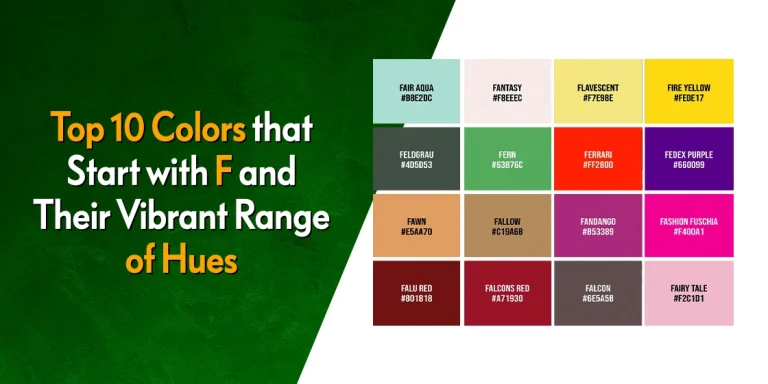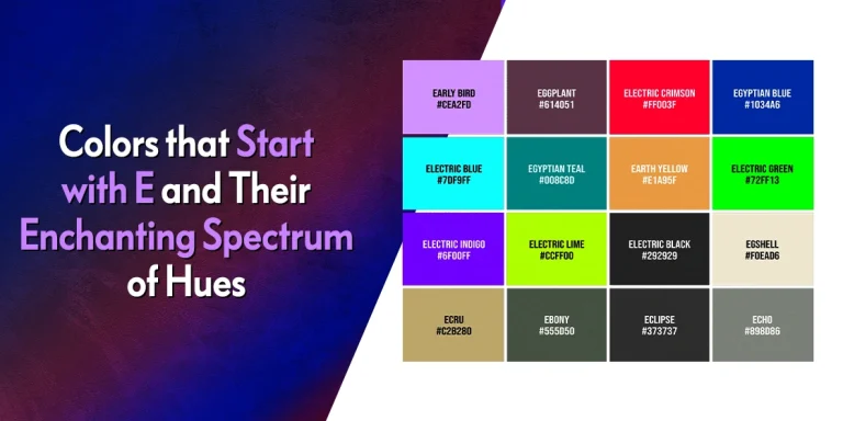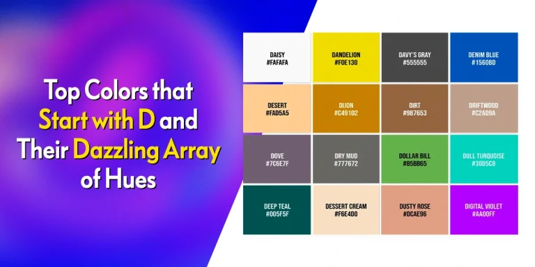
Table of Content
Understanding the Tertiary Color Examples and Their Role in Brand Development
Colors and shades are an important element in the design world. That is because they alter and influence our perception, allowing us to see something in a specific way, which would have been lost or not been apparent had it been in black/white or some other shade. Now, according to color theory, these colors can be classified into three basic groups – primary, secondary, and tertiary colors.
Now, most of us are familiar with primary colors. Back in kindergarten, we learned that Red, Blue, and Yellow, could be combined to make a host of different shades. These are called the primary colors, and they are still used like this in traditional, non-digital art. Similarly, by mixing these colors together, you get secondary colors.
But what are tertiary colors? How are they formed? And what part do they play in a professional logo design agency’s color palette today?
Let’s discover the answer to these questions and more, as we explore the mystery of tertiary colors examples, and see how these shades play an important role in helping brands establish themselves.
What are Tertiary Colors? An Overview
Tertiary colors, quite simply, are shades that are made up of secondary colors and their adjacent primary color. This mixing of a secondary color, already a product of two primary colors, and the primary color right beside it, allows for a greater diversity in color depth, which can help add more meaning to our designs.
In digital design, other factors like the HSV value and the HSL value ensure that shades vary from one another, increasing the number of available colors. However, in traditional design at its most basic, this is how colors are mixed and used.
For example, let’s take chartreuse, a tertiary color also known as Green – Yellow, and one of the more interesting colors that start with C. Of its constituents, green already contains Yellow, as it is formed by the mixing of primary colors Blue and Yellow. Then, when we mix this secondary color with its primary parent again, it increases the saturation of the color in it, resulting in a brighter, more vivid shade of color that reminds us of green and yellow both.
Understanding Primary Colors
Primary colors, as we mentioned earlier, traditionally, are Red, Yellow, and Blue. However, in digital design, we also use color schemes like RGB (Red – Green – Blue), and CMYK (Cyan – Magenta – Yellow – Key), which is based on the CMY scheme.
However, the most popular color scheme outside digital design is the first one we mentioned. Nevertheless, no matter the color scheme you choose, you will start with three shades known as the primary colors, which in turn could be used to create three more colors, called the secondary colors.
Secondary Color and Their Role in Color Theory
Secondary colors are an interesting element in design, formed by mixing two different primary shades of color. But how does that make them so special? Well, due to the mixing of those two shades, the new color incorporates elements of both those colors’ personalities. This helps brands convey more with less effort, simplifying the design process.
Moreover, these colors also develop elements of their own personalities, offering more bang for the buck, if that is what your design desires. That helps brands create more complex color combinations with fewer shades, thus simplifying their design process.
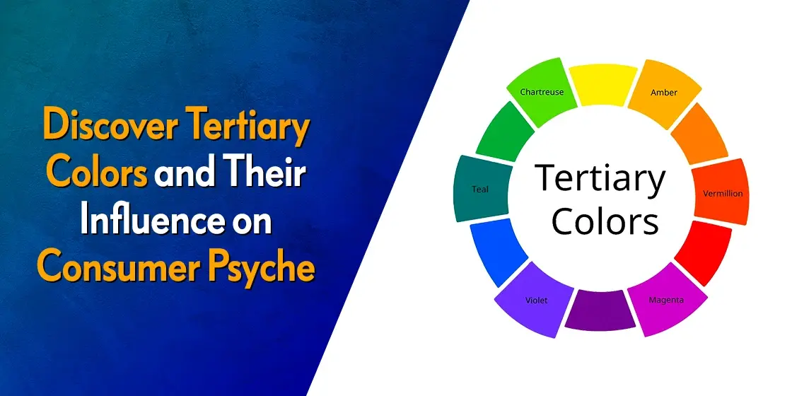
What are Tertiary Colors? Decipher the Six Tertiary Colors Forming the RYB Color Wheel
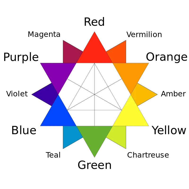
Now that we have taken a brief overview of primary, secondary, and tertiary colors, you might be wondering how these colors, especially the tertiary colors, can help you improve your designs. For today, we will specifically be studying the subtractive color model RYB (Red – Yellow – Blue), and the tertiary colors examples formed by mixing with their secondary colors Orange, Green, and Purple.
Let’s begin.
Green – Yellow (Chartreuse)

Let’s start with the first of these tertiary colors on our list. Known as Green – Yellow by designers, it is more commonly known as chartreuse. Chartreuse is an interesting shade that is formed by mixing Green, which is a secondary color formed by mixing Yellow and Blue, with Yellow again. This results in a shade of green that has a distinctively yellowish tinge to it.
The result is a brighter, more vivid shade of color that today has inspired a shade of highlighter pen. What makes this color special is that it incorporates the calming element of Blue, as well as the bright airiness and energy of Yellow. However, the addition of more Yellow than blue results in a shade that is more energetic and dynamic than your plain Green, evolving the one-dimensional color meanings of its parents.
Yellow – Orange (Amber)

Next, we have the shade Yellow – Orange, also known as Amber. Amber is one of those tertiary colors that sees a lot of commercial use, sometimes even more so than its primary and secondary parent shades. And it is also one of the most popular colors that start with A.
Amber is formed by mixing the primary color Yellow with the secondary color Orange, which itself is a mixture of primary colors Yellow and Red. Orange is a warm and passionate color that combines the fiery passion of Red with the sunny energy of Yellow, resulting in a color that is often included in both shades of orange color and yellows. Now, when you add more Yellow to it to form Amber, then you end up with one of the warmest tertiary colors that can add energy to any design or art you desire.
Orange – Red (Vermillion)

Orange – Red, known more commonly as Vermillion, is a shade of color that is quite similar in perception to Brick Red, one of the more interesting shades from colors that start with B. It is not as fiery as plain Red, nor as fiery as Orange. Yet it combines these elements from both these to form a shade that defines the warmth and solidity of your home
The act of adding more shades of Red color to Orange, which is a color that is formed by mixing Red and Yellow together, tempers some of Yellow’s energy, while the smaller portion of Yellow tempers its fieriness. Overall it is a great shade to add to your palettes.
Red – Purple (Magenta)

Magenta, technically known as Red – Purple, is one of the most popular tertiary colors. From apparel to interior design color palettes, this is a shade that is used by designers in many niches. As evidenced by its technical name, Magenta is formed by mixing Red, a primary color, with Purple, a secondary color created by mixing Red and Blue.
A vivid and electric shade, it energizes the space or design, and is often associated with a feminine energy. Overall, it is one of the best tertiary colors examples of shades that has an energizing visual impact.
Purple – Blue (Violet)

Aah, Violet. Also known as Purple – Blue, Violet offers a deep and regal visual experience that is more soothing and premium-feeling than its parent colors. Shades of blue color, one of the three primary color families, are known for their calming and serene presence. Purple, made up by mixing Blue with Red, is a color often associated with royalty and elegance.
Violet, which offers a deeper shade of purple with stronger Bluish overtones, has however superseded purple in that domain. Today, Violet is often considered one of the colors of royalty, only the second of the tertiary colors to achieve mainstream popularity, offering a richer, deeper color experience than plain purple.
Blue – Green (Teal)

Finally, we have Teal. Teal, also called Blue – Green, is a shade of blue that looks like it has barely a splash of Green thrown in. Now, Teal is one of the few tertiary colors who looks more like its primary color parent than its secondary color parent does.
It is a color that is often associated with the waters near the coral reefs, mixing the Green of the sea’s fauna with the Blue of the water. It is also quite popular with interior designers, who use it to provide a soothing backdrop over which they add splashes of color, or as an understated statement against a neutral whitish backdrop. Moreover, it is also used by some sports teams, featuring in the Miami Dolphins logo from the NFL.
Tertiary Colors in RGB and CMYK
So far, we have discussed the primary colors in the RYB color model, made up of Red, Yellow, and Blue colors. However, in digital design, the RYB model is forgone in favor of either the RGB model, or the CMY model, and its derivative the CMYK color model.
So how are they different? Let’s take a look.
The RYB model started out as a physical way of mixing pigments to form colors in real life. From artists to designers, all of then used this color model for their pieces of art. However, when digital design became popular, that’s when the need for newer color models with better digital representation was required.
The RGB model, also called the Red – Green – Blue model, has these three colors as the primary colors.
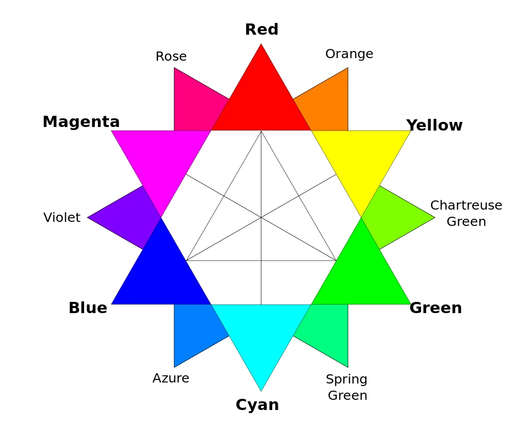
Then, the secondary colors include Yellow (Red – Green), Cyan (Green – Blue), and Magenta (Red – Blue). Finally, the tertiary colors in the RGB model include Orange, Chartreuse, Spring Green, Azure, Violet, and Rose.
Incidentally, the secondary colors of the RGB color model form the primary basis for the CMY model.
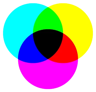
The CMY model, which also spawned the CMYK color model, is another of the digital color models used today. For CMY, the primary colors are Cyan, Magenta, and Yellow. However, designers argued that the Black formed from the mixing of these three primary shades was not a True Black, but rather a weak impersonation, like the lesser saturated shades of black color.
That is why the CMYK model was born, where K, or Key, refers to the True Black desired by creatives. Today, most color printing applications use the CMYK model to create and print color designs.
Now, while they are great for digital reproduction, they are not that great for physical applications, that is why most physical printers ask for Pantone codes for each shade, so that the right shade can selected, no matter the printer or the person running it.
FAQs
| What are the main tertiary colors for the RYB color model? For the RYB color model, the tertiary colors are: Chartreuse Amber Vermillion Magenta Violet Teal |
| What are the tertiary colors for RGB color model? The RGB color model’s tertiary colors include: Orange Chartreuse Spring Green Azure Violet Rose |
| How many primary, secondary, and tertiary colors are there in a basic color wheel? In a basic color wheel, there are three primary colors, three secondary colors, and six tertiary colors for a total of twelve colors altogether. |
Conclusion
In summation, tertiary colors play an important role in giving designers a variety of base colors to play with. Using these primary, secondary, and tertiary colors in your chosen color model, you can create a variety of hues by mixing them further with other shades, or tweaking their Hue, saturation, and more to create new options.
The study of color psychology is an interesting yet nuanced field that required businesses to known the how and why behind choosing your brand colors. Often, we see new people searching for information on how to design a logo, or choosing the perfect fonts for your typography. Yet its rare to see someone looking for guides on choosing the best brand colors for their business.
So, if you are looking to learn more about this topic, then this is the article for you.
Latest news you want to know!
Subscribe for cutting-edge design inspiration at Logo Poppin! Elevate your brand with updates on logos, branding, web design, and video animation.
Note that by clicking “subscribe,” users may agree to our privacy policy and consent to Logo Poppin to use your contact data for newsletter purposes.
Logopoppin
Logopoppin is a graphic design agency that specializes in logo designing, web development, video production and advanced branding services. We love to innovate businesses with new age technologies, allowing them to improve their visual reputation.