Table of Content
Know How the Famous Electric Automobile Logo Evolved
In the rapidly advancing world of automotive innovation, Tesla has emerged as one of the most captivating brands. As a leader in electric vehicle manufacturing, Tesla has continuously disrupted the traditional automotive industry with not only its eco-friendly cars but also with its groundbreaking technology that has redefined the driving experience. The company’s relentless pursuit of excellence and its futuristic approach to transportation have made it a household name, revered for its constant innovation and ambitious goals.
However, it’s not just Tesla’s electric vehicles and technological breakthroughs that have made a lasting impact, the evolution of its logo also tells a compelling story. The Tesla logo, a simple yet powerful emblem, has evolved over time to mirror the company’s growth and its ambitious vision for the future. Starting as a representation of electric power and energy, the logo’s design has gradually evolved to reflect Tesla’s increasing prominence in the automotive world. Its sleek and minimalist design now symbolizes both the cutting-edge innovation and the sustainable future Tesla strives to create.
Created by professional logo design services, the Tesla logo serves as a visual representation of the company’s commitment to pushing the boundaries of what’s possible. It is more than just a brand mark, it has become a symbol of progress, sustainability, and the future of transportation. If you want to know about the history of Tesla logo, read this article in detail. It will let you know how this famous logo evolved through the years, bringing in huge electric revolution in the industry of automobiles.
Why Tesla is Popular Globally?

Tesla’s global popularity can be attributed to its visionary approach to the automotive industry. The company’s success began with its focus on electric vehicles (EVs), a market that was once considered niche and unappealing to mainstream drivers. Tesla’s ability to produce high-performance EVs that offer long ranges, fast charging, and incredible acceleration has broken the stereotypes surrounding electric cars. By integrating advanced software updates, Tesla has also kept its vehicles on the cutting edge, ensuring customers always have access to the latest features and improvements.
The revolution Tesla brought to the automobile market is far-reaching, starting with the shift from traditional internal combustion engine vehicles to electric powertrains. Tesla not only proved that electric cars could be both practical and desirable, but also helped drive mass-market adoption of EVs. By creating cars that are both environmentally friendly and efficient, Tesla challenged established automakers to rethink their approach to future vehicle development, causing a global shift toward sustainability in the auto industry.
In addition to its electric vehicles, Tesla revolutionized the automotive market by integrating smart technology and advanced features in its cars. Tesla’s vehicles are equipped with autonomous driving capabilities, over-the-air software updates, and advanced driver-assist systems, positioning the brand as a leader in innovation. As a result, Tesla has not only reshaped the car industry but also made a lasting impact on the broader clean energy sector, influencing the way both consumers and manufacturers think about the future of transportation.
History of Tesla Logo
Tesla is one of those brands that has kept its primary identity intact over the years. It has not been changed many times, barring the few redesigns that focused precisely on the outer frame. Here is a short timeline of the evolution of Tesla logo given below.
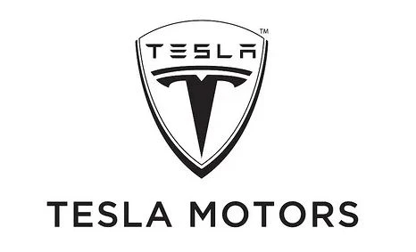
Tesla Logo – 2003

Tesla’s original logo, introduced in 2003, was a distinctive design that combined both an image and a wordmark. The trident logo featured a prominent shield, which played a significant role in conveying a sense of security and safety associated with the brand’s vehicles. The shield, an age-old symbol of protection, was strategically chosen to evoke trust and reliability, reassuring consumers that Tesla’s cars were not only innovative but also safe to drive. The use of this strong imagery aligned with the company’s goal of creating vehicles that were designed with the utmost consideration for driver and passenger safety.
In addition to the shield, the original logo included the wordmark “Tesla,” which helped establish the brand’s identity. The wordmark was crafted in a clean typeface that complemented the futuristic nature of Tesla’s vehicles. This combination of a bold visual element and clear typography ensured that the logo was easily recognizable and memorable. The inclusion of the shield further reinforced the notion that Tesla was a company committed to not only revolutionizing the automotive industry but also ensuring that safety was a core principle in its vehicle designs.
Over time, Tesla’s logo has evolved, shedding the shield element in favor of a more streamlined, minimalist design that reflects the company’s rapid growth and innovation. However, the original intent behind the logo’s use of a protective symbol has remained a part of Tesla’s brand ethos. As the company has expanded globally and become synonymous with electric vehicle innovation, the logo has continued to represent both the technological advancements and the safety-first mentality that Tesla strives to uphold in all of its vehicles.
Tesla Logo – 2017

In 2017, Tesla underwent a significant rebranding by refining its logo to better align with its evolving identity as a leader in electric vehicle innovation. The most notable change was the removal of the shield, a design element that had originally symbolized security and protection. By eliminating this visual component, Tesla embraced a more streamlined and futuristic aesthetic that reflected the company’s high-tech design. The change marked a shift in the brand’s image, positioning Tesla as a bold, forward-thinking company.
Along with removing the shield, Tesla also modernized its wordmark. The new typography featured sleek, elongated lettering with sharp edges, creating a futuristic and dynamic look. This updated design not only made the minimalist logo more visually appealing but also reinforced Tesla’s brand identity as an innovator in both the automotive and clean energy sectors. The redesigned wordmark helped establish a stronger, more memorable brand presence, making it instantly recognizable across digital and physical platforms.
The 2017 logo revision reflected Tesla’s transition from a niche electric vehicle manufacturer to a globally recognized technology powerhouse. The simplified yet bold design resonated with the company’s growing audience and its vision for the future of transportation. By adopting a cleaner logo, Tesla signaled its focus on innovation, efficiency, and sustainability. This rebranding not only enhanced Tesla’s visual identity but also reinforced its mission to revolutionize the automotive industry with groundbreaking advancements in electric mobility.
Font of Tesla Logo

The typeface used in designing the Tesla logo is known as Tesla Slab. As a slab serif typeface, it features bold, prominent letterforms with strong, squared-off edges that give it a modern yet authoritative appearance. This design choice reflects Tesla’s commitment to innovation and cutting-edge technology, reinforcing its image as a forward-thinking company in the automotive and clean energy industries. The structured and robust nature of the Tesla Slab font aligns with the brand’s futuristic vision while maintaining a sense of elegance and sophistication.
One of the unique characteristics of Tesla Slab is its inclusion of cursive italics, adding a sense of fluidity and movement to the otherwise bold and structured design. The italicized elements introduce a dynamic, almost futuristic feel, symbolizing the brand’s emphasis on speed, efficiency, and progress. By utilizing Tesla Slab, the company ensures that its branding remains visually striking, easily recognizable, and reflective of its mission to revolutionize the transportation and energy sectors.
Frequently Asked Questions
| Why Tesla has become popular in the world? Tesla has become globally popular due to its groundbreaking electric vehicles, innovative technology, and commitment to sustainability. Its advancements in autonomous driving, long-range EV batteries, and over-the-air software updates have revolutionized the automotive industry. |
| When was the first Tesla logo came in the market? The first Tesla logo was introduced in 2003 when the company was founded. It featured a shield emblem along with the Tesla wordmark, symbolizing security, innovation, and the brand’s futuristic vision. |
| What is the color of Tesla logo? The Tesla logo is primarily displayed in red, symbolizing energy, passion, and innovation. However, it is also commonly seen in black, white, or silver, depending on the branding context and background. |
Final Words
That brings us to the end of this article in which we have discussed the complete history of Tesla logo. It refers to a company that has changed the perception of electric automobile manufacturing. It brought a great revolution in the market in terms of producing high-quality EVs for masses. This is the key reason why the Tesla logo has become hugely popular in the world. It has beaten the likes of more established companies by producing cars that are technologically advanced and eco-friendly. Going by the current stats, Tesla is slated to become the top electric auto manufacturer in the world that will make EV purchasing affordable for everyone.

Logopoppin
Logopoppin is a graphic design agency that specializes in logo designing, web development, video production and advanced branding services. We love to innovate businesses with new age technologies, allowing them to improve their visual reputation.


