
Table of Content
Learn Why These Logos for 3 Letter Brands Became Such Memorable Brand Assets
In the midst of an ever-growing competition and an ongoing race towards finding a unique place in the market, brands spend millions on creating a memorable brand identity. At the heart of it all is the brand’s logo, which has to encapsulate the brand’s essence.
Whenever we think of a brand like McDonald’s, Nike, or Apple, the first thing that comes to our mind besides the abstract qualities of a brand and our experiences attached to them, is the logo which visually represents and symbolizes all those qualities and experiences in a concrete form.
The process of finding this unique brand identity is a highly complex process, but the solution to a problem need not always be reflective of this complexity. Often, brands find the perfect answer in some of the most simplistic, yet often very creative, logos that go entirely unchanged throughout the brand’s history, and even if modified, the changes are very minor.
Many of these branding assets are often found in the form of 3 letter logos, which are commonly known as monograms, and are among the most popular types of logo design projects received by our logo design services team.
Why Do Popular 3 Letter Logos Stand Out in the Crowd?
3 Letter Logos are some of the most memorable ones because the shorter a logo, the more crisply memorable it is. Of course, this applies to the brand names as well, which is why most designs feature three letter logos, as the brand name itself is shortened in the form of an acronym.
This makes it easier for people to pronounce the name and remember it, which is one of the main reasons why these logos have a straight-to-the-point attitude. Most of the time, these logos are created with a bold font which makes the text more legible, helping it stand out amid other logos.
Our Top 17 Picks of the Most Famous Three Letter Logos Around Us Today
Some of the most famous brands in the world have succeeded in effectively creating a unique brand identity with their three Letter logos. These logos have popularized so much that often people do not have a clue as to what these letters stand for, in case these letters are used as an acronym for the full name of the brand/company.
Following is our list of the most famous three letter logos ever made (in no particular order):
KFC – Kentucky Fried Chicken
KFC is a fast-food restaurant chain that has more than 25,000 branches in over 145 countries across the world. The first restaurant was inaugurated in the state of Kentucky, America in 1952. And soon popularized because of its specialty in fried chicken fast-food.
Being a global brand, KFC now has one of the most world renowned restaurant logos, which is quite easily recognizable from afar, thanks to the 1991 rebranding of it which featured the famous image of the iconic Colonel Sanders sporting a white suit and red apron.
The three big initials of the brand name Kentucky Fried Chicken also contrast against the primarily red logo which is a color that most restaurant brands use because of how it enhances a logo’s visibility. And this design aesthetic works well for many 3 letter brands on this list.
As a brand that has been at the forefront of the food industry for more than 70 years, KFC has had several versions of the logo. However, since 1991 they all share the same color scheme and stylistic elements, with the exception of the 2014 to 2018 KFC logo, which was again replaced in favor of the previous style.
MTV – Music Television
MTV is an American cable channel based in New York City which was launched on August 1st, 1981. It soon amassed popularity across the world as one of the most reputable sources of gaining insight into the new trends and events happening in the music world.
For millennials, it is impossible to have a conversation about music and not mention MTV. However, while MTV has its place in our minds due to its contributions to the world of music, the only thing visually recallable about the brand are its simplistic 3 letter logos.
What it stands for, is pretty obvious, having been named Music Television, and it being one of the most popular 3 letter company names. But the capital M is all that needs to be remembered in the logo, despite it being as self-explanatory as the two letters that follow it.
Similar to most other three letter logos, Manhattan Design studio designed the logo with a bold and solid typeface for the letter ‘M’ that is 3 dimensional, added on top of which are two letters ‘TV’ with a creative touch, to give the logo a more laid back, and casual feel, as required for a music broadcasting channel.
The ingenuity of the logo design also lies in its choice of black color mixed with the transparent elements that allow background colors to seep into the logo design, giving more character and personality to the logo, almost bringing it to life.
NBC – National Broadcasting Channel
One of the first news broadcasting networks of the US, NBC also known as National Broadcasting Channel began its journey with Radio Broadcasting in 1926. Since the very early version of its logo, NBC has featured 3 letters on its logos. However, the icons and other branding elements used in the brand logo changed through the years.
In 1942, the brand became a television network and introduced its new logo in 1944. Then, after the ability for color programming, NBC made a drastic change to its logo yet again. In 1956, the channel used a peacock on its logo designed by John J.Graham, as a way of celebrating the richness of color.
Today, the brand still sports a similar logo with very minor changes to it, such as the beak of the peacock which is now just a bit bigger, or the peacock’s eleven feathers that are now replaced with six. In 2011 the wordmark was briefly removed, however, in 2013 it was again reintroduced and has stayed the same till date.
IBM – International Business Machines
IBM is another world renowned company working in the tech industry. Established in 1911 in New York the company’s initial name was not IBM, however later on when the business expanded the company’s name was changed in 1924 from Computing Tabulating-Recording Company, to International Business Machines Corporation, or IBM for short.
Since then, the logo only underwent one major change, which was only in the case of the first design, dubbed as the ‘Globe Logo’. After that the logo was changed to a simple wordmark in 1956, followed by the incorporation of the strips that were initially 13 and then changed to 8.
These strips indicated the speed and vibrancy of the company’s pace, with which it was expanding globally. Finally, the added blue color gave the logo a sophisticated look, and brought an end to IBM’s continued struggle for a perfect logo design.
KIA – Kia Motors Corporation
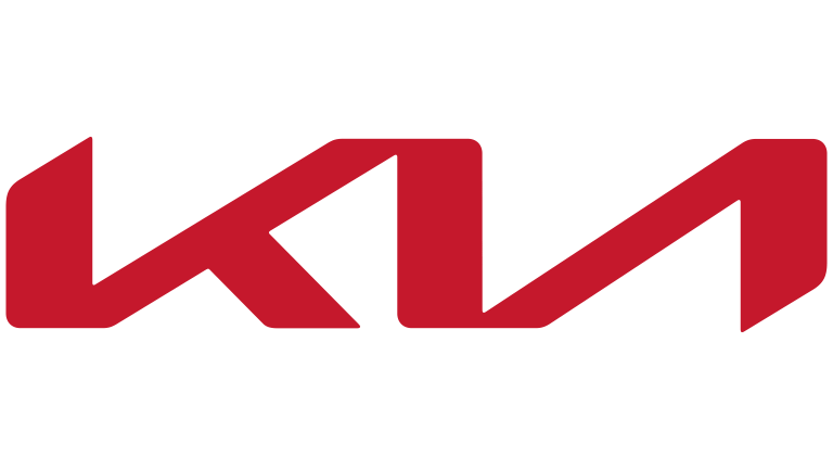
Watching a company grow as an underdog in the automotive industry selling cheap cars, to a well-reputed company increasingly stealing the market share from some of the most top notch American car brands, KIA has proved its mettle and has gained global recognition for its excellence.
Unlike most other brands that use a symbol, KIA uses 3 letter logos on its cars which kind of sets it apart from other brands, making it easily recognizable. However, the logo achieved its uniqueness owing to its simplistic design.
This, we can be confident of, as there has been a backlash on the recent rebranding of the KIA logo, which has confused many people. It’s unclear whether it reads KM, KN, or KIA as it should, which is a clear indication of why keeping three letter logos as simple as possible is always a good sign of the company.
Hopefully, the new design will grow on us, as its most likely here to stay as part of what the company calls an attempt to start afresh and change the direction of the company. In speaking of why this particular design was chosen as a revamped car logo, KIA published a statement.
In a press release they expressed the idea behind the new logo and spoke of how “The rhythmical, unbroken line of the logo conveys Kia’s commitment to bringing moments of inspiration, while its symmetry demonstrates confidence.”
DHL – Named after Owners Dalsey, Hillblom, and Lynn
Speaking of brands that have effectively captured their essence without overcomplicating their logos, DHL is among one of the top companies that comes to one’s mind. The company has its name based on the first letters of its founder’s surname: Adrian Dalsey, Larry Hillblom, and Robert Lynn.
The logistics company provides transport and courier services and has expanded its services into multiple domestic markets having previously served as a cargo transporter on international level.
Suggestive of what the company is all about, the brand also depicts its fast delivery service with the help of horizontal lines on each of its sides, to depict speed. Across the letters DHL is a thunderbolt-like line that further emphasizes this speed.
Moreover, the red colored letters against the yellow background are perfect for creating contrast to help make the logo pop out.
HBO – Hollywood Box Office
Hollywood Box Office, also known as HBO, is a cable network that is watched globally across several countries. After its first logo design between 1972 – 1975, it has consistently had the same 3 letter logos based on an ever-green black color.
This new version was designed by Betty Brugger, made using the Avant Garde Bold font. After that, the only change it underwent since 1975 was the slight adjustment in the alignment of the letter O to give the logo more clarity.
Also, in the 3rd version, the increased outline of the inner circle inside of the O was what made the letter appear more like the eye of a camera lens, perfectly depicting the medium of entertainment that the channel is aligned with.
CAT – Caterpillar
One of the most famous manufacturers of construction machinery and equipment in America, Caterpillar has achieved global recognition through its memorable and iconic three letter logos that comprises the first 3 letters of the brand name.
Much of its global popularity stems from the iconic logo featured on its work wear, which in some parts of the world is seen as a fashion brand logo. The yellow triangular shape in place of the A indicates the yellow construction signs.
Yet, despite the robust looking font that was meant to be placed on manufacturing products, the contrasting yellow and black colors seem to give a more distinct and youthful look to the logotype, more so when it is used on clothes, featuring a font that belongs to the Helvetica typeface, an unlikely choice when compared to competitor brands in the clothing industry.
BBC – British Broadcasting Channel
Simplistic in its approach, the British Broadcasting Corporation or BBC, uses a monochromatic logo that does justice to the public service channel with its minimalistic design. Without going over the top, the contrasting monochromatic logo is able to depict a public service channel’s duty of reporting everything with complete impartiality.
The current logo for BBC was designed by Martin Lambie-Naim in 1997, wherein the blocks are black and square, similar to how Abram Games originally designed the logo. However, Naim’s version had its letters refined with Gill Sans font, which gave it a fresh look. What’s best about the logo is how easily it can blend with new elements to form different logos for the multiple different channels owned by BBC.
CNN – Cable News Network
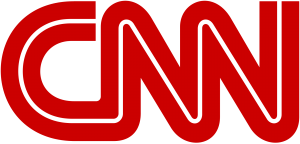
CNN did not take long to become a hit soon after the network’s inception in 1980, and since then has consistently used the same logo, all thanks to its future-proof design. All that changed was the color palette that switched to red and white, from the initial black and white used in the early years of the company.
The red color creates a sense of urgency and depicts passion and energy, while the white line in the middle is a sign of trust and truthfulness. The logo proves that with a proper execution, brands can come up with a logo that does not necessarily require repeated rebranding attempts.
NBA – National Basketball Association
The National Basketball Association, or the NBA, is one of the Big-Four sports in the United States, and one of the more popular 3 letter logos on this list. The basic design for these NBA logos has remained the same for a long time now, and features a whitespace profile of a basketball player dribbling a ball, over a vertical red and blue background.
At the bottom left is the lettermark, which seems to serve as an afterthought to connect the design to the league. Overall, this is one of those three letter logos that you are almost guaranteed to know and love.
YSL – Yves Saint Laurent
Yves Saint Laurent is a French luxury fashion house that specializes in haute couture, leather accessories and footwear, and ready-to-wear apparel. Operating since 1962, the company has established a strong foothold in the fashion industry, with outlets across the world. Since 2012, the company has dropped the Yves part from the logo and name, meaning that its vertical three letter logos are now not in common use.
This means that the vertical YSL logo we all know is now used only for accessories and the makeup brand. In any case, this wordmark logo for the French fashion brand is simple yet highly memorable, and is one of the most popular clothing logos for people who grew up at the peak of 90s fashion.
NHL – National Hockey League
The National Hockey League, commonly called the NHL is another one of the Big-Four sports in the US. The metallic design of the current symbol is quite attractive, and features the league’s lettermark across the middle of the design, like all of the NHL logos that came before it.
Although simple in its color scheme, the black over steel palette is one that makes the logo highly impactful and memorable, and one of the best three letter logos for any sports league.
GAP – The GAP Incorporated
The Gap Incorporated is a worldwide clothing and accessories retailer that has been in business since 1969. Today, the company deals in four brands – GAP, Banana Republic, Old Navy, and Athleta. Talking about the namesake brand and its various 3 letter logos, the word is written in a narrow, elongated serif font, with a letter-sized gap between each of the three letters.
The design, although one of the simplest ones on this list, makes it stand out well against otherwise complicated apparel logos, which makes the brand itself highly memorable.
NFL – National Football League
NFL, or the National Football League, is arguable the most popular sport in the United States. Although its baseball that’s called “America’s favorite pastime”, the truth is that more people tune in to watch a football match than they are a baseball match. And that makes their logo more valuable than many of the 3 letter brands on this list.
The NFL logo design is both simpler and more elaborate than the NHL symbol. Rather than going for a design with a little three-dimensional depth, the flat shield of the NFL offers a brighter, more patriotic design that connects better with the sport it represents.
UPS – United Parcel Service Incorporated
UPS, or United Parcel Service, is an old shipping and logistics company founded in the US in 1907. Known originally as the United Messenger Service, it specialized in telegraphs. However, as the times changed, it switched to a shipping & receiving, and logistics model, and has become a Fortune 500 company today, being the bigger of the 3 letter brands in logistics today, above DHL.
Its logo also follows a shield-like design, which makes the design easier to be considered part of monogram logos. Overall, the aesthetically pleasing design, combined with a dark orange-gold and black color scheme, makes it a great logo.
UFC – Ultimate Fighting Championship
UFC, or Ultimate Fighting Championship, is a US-based mixed martial arts association that rival’s Asia’s One Championship and American Bellator MMA. A fight promotion company, it is considered the largest in the world, featuring top mixed martial artists like Connor McGregor and Rhonda Rousey.
Keeping true to its brutal nature, the logo has a forward-slanting design, made up of sans-serif letters written in modern, futuristic fonts, and colored a bright, flaming red. Overall, the design is perfect for the sport and its high-emotionally charged environment.
Frequently Asked Questions
| 1- What is a good logo? A good logo should be unique and memorable, designed in a way that it effectively encapsulates the essence of a brand. |
| 2- What is a three letter logo called? A letter mark or a monogram is a text-based logo that consists of only a couple of letters. Popular examples include: IBM, KFC, and KIA. |
| 3- How do you do a 3 letter monogram? Monograms are usually made by using the initials of a full name. So if a brand or company is called The Excel Lens, its Monogram would feature the first letter of each word, spelled TEL. |
| 4- What is a text logo called? A text logo falls into the category of a monogram or a wordmark. It is essentially a business name written with an attractive typography. |
Conclusion
These famous 3 letter logos discussed above are perfect examples as to why it is not necessary for artists to come up with over the top designs for each and every client. Sometimes the need of the hour, as well as the need of the client is a simplistic brand logo that should simply focus on serving its primary purpose, which is to encapsulate the brand’s essence and leave a lasting impression on the audience’s mind, ensuring maximum memorability.
Latest news you want to know!
Subscribe for cutting-edge design inspiration at Logo Poppin! Elevate your brand with updates on logos, branding, web design, and video animation.
Note that by clicking “subscribe,” users may agree to our privacy policy and consent to Logo Poppin to use your contact data for newsletter purposes.
Logopoppin
Logopoppin is a graphic design agency that specializes in logo designing, web development, video production and advanced branding services. We love to innovate businesses with new age technologies, allowing them to improve their visual reputation.

