

Table of Content
The TikTok Emblem and the Content Platform That Changed Social Media
Social media is a big part of our lives today. As a mode of communication, news, business, and even entertainment, we rely on various social media platforms quite heavily. One such platforms that has gained popularity recently is based out of China, and is represented by the easily recognizable TikTok logo.
Known as Douyin in China, the TikTok app is a Chinese social media platform that is built on the concept of creating and sharing videos. It was launched in 2016 by a company named ByteDance. Soon, approximately two years later, the company merged with another Chinese platform called Musical.ly, which helped it expand to Europe and the USA.
Today, like other social media channels like LinkedIn or Instagram, TikTok too is leveraging the importance of social media for business and helping brands stand out.
Let’s find out how this seemingly small and simple Chinese social media platform and its representing symbol changed the way we look at social media and its impact.
The History of the TikTok Logo and the Meaning Behind its Design
Since the inception of the app in 2016, and the release of the TikTok logo a little later, the design for the brand symbol has remained the same, for the most part. The only major differences we have seen in the past five years, is the joining of the two words of the brand’s name, from Tik and Tok to TikTok.
The app was originally name Douyin, and that is the name it was known by in China. However, for the rest of the world, the name TikTok was chosen to represent the brand. Steadily gaining new users, the app saw its first major surge in new user signups when their parent company ByteDance, bought out their primary social media competitor Musical.ly in 2017.
After getting bought out, the social media platform was integrated with TikTok, with existing users migrating to the new platform due to a similar work theme. And the essence of that brand was captured perfectly by the logo design services they hired to create the TikTok symbol.
The meaning behind its logo is quite straightforward. The primary mode of posts on TikTok, and Musical.ly too, was users dubbing over small clips of existing music. The majority of the videos posted had people doing an activity that somehow related to the song overlaid on the video.
Combined with the original Chinese name for the app as Douyin, the logo symbols used always are a combination of the letter d, and a musical note.
TikTok App Logo Font
The right logo fonts are essential when it comes to creating a great brand symbol. They serve a great visual purpose. By drawing attention to your logo with their design, it informs the viewers about your brand.
So, what font is used in the TikTok logo? The custom font used for the wordmark is a simple san-serif, blocky typeface that makes it easy to read it due to its distinct design. The top stroke of the letters T in the logo has a slightly slanted right side, which draws the eyes due to the variance from the otherwise straight strokes.
So, when searching for how to create a TikTok logo, then the right font is essential to your endeavor’s success.
TikTok App Logo Color
What are the colors in the TikTok logo? And what do they represent? The color combinations used by the logo is another thing that makes the design unique, unlike the single shade color palette used by the Discord logo in its design. The predominant colors are black, used for the design and the wordmark, over a white background. However, both the TikTok icon and the letter O in TikTok are accented by a bright light aqua and reddish-pink, designed to mimic the 3D effect of the red and blue 3D googles.
The result is an understated logo design that keeps its simple smaller sizes, yet shows its true vibrancy on larger canvases. And it is this same ideology of small designs with massive impact that made the TikTok branding stand out and be successful in a social-media saturated ecosystem.
The Evolution of the TikTok Logo Through the Years
Let’s take a look at the evolution of the TikTok logo design and find out how the company modified and adapted their brand symbol through the changing design aesthetics of the consumers. But before we get to the evolution, we need to understand the basis for it. So, what is the TikTok logo?
Well, to put it simply, the TikTok sign is simply a musical note that is meant to represent the content format for the app’s original model. Moreover, the design features a dual-tome shade which adds depth to the design.
Basically, different types of logos can feature a variety of subtle changes before requiring a major redesign. As the brand manager, you need to decide what works well for your style of logo, and implement the changes according to business needs. And that is what the TikTok label designers did.
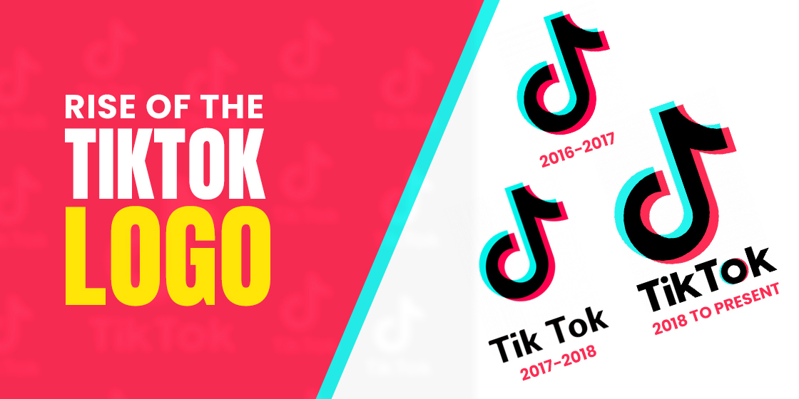
The Original TikTok Logo 2016 to 2017
As brands change their logos from time to time, those who got into the TikTok craze recently might wonder; what does the TikTok logo look like, originally? The primary symbol for all TikTok logos has always been the musical note in the shape of the letter d. So if you too were asking how to design a TikTok logo; well, there you go. This was the logo originally introduced in 2016, alongside the international release of the social media platform. The design features a simple light aqua, black, and reddish-pink color scheme.
The resultant design is an interesting logo that looks as if three iterations of the symbol are overlapping over each other, giving depth to the design. However, for a newly launched social media platform, it was hard to make its mark and be recognizable in a world already dominated by the major platforms, including Musical.ly.
The First Redesign of the TikTok Badge 2017 – 2018
A year later, the design for the TikTok platform’s logo was modified to boost its recognition, and allow people to associate the brand and the symbol easily. The new symbol featured the same musical note icon. However, a wordmark spelling the brand’s name was added to it.
The wordmark was written in bold, sans serif masculine fonts. The clean strokes and straight lines of the new wordmark logo made it easy to read the app’s name. However, the rounded edges of the curves and angles made the text hard to read even at the smallest sizes.
The Current TikTok Logo 2018 – Present
The latest tweak to the TikTok logo’s design was made in 2018. Considered a major change in terms of branding, the wordmark was modified. The new design featured the words Tik and Tok joined together, now spelling TikTok, similar to how the early Facebook logo went from being thefacebook.com to simply just Facebook.
Moreover, there were other changes made as well. The font was changed for one with more angular typeface, and the letter O was accented with the aqua and red. Moreover, the trend of adding this aqua-red color scheme to the account avatars also became common since this iteration, with many a TikTok logo maker offering this option to its users.
This version has been in use since then, and can be spotted being used by people across the globe. As for how to use the TikTok logo, designers often use the TikTok logo vector to add to their design as an icon to link their TikTok accounts to websites, or they use it as a digital stamp like those used by online TikTok logo creator tools or TikTok video editors.
TikTok Logo Icons
The icons for TikTok have been seen in a variety of styles and designs. Available in simple monochromatic styles as well as a multi-shade options, they are great as social media icons for business cards and websites.
The icons themselves are direct variations of the primary TikTok logo itself. It has three color variations besides the primary black on white color scheme. They include white, blue, and pink background, and can easily be found online if you search for TikTok logo png or vectors on the web. And if you might be wondering about any trademark or copyright issues with these logo files, and wondering where can I find the TikTok logo that is free to use, you can find some great options on sites like Freepik.
Companies today can leverage the impact and reach of TikTok to engage their consumers, as well as enhance their market reach. If we take a look at the platform’s growth in the last two or three years, more and more people are using this app, making it a great option to market to those consumers.
How to Create a Great Logo That has a Good Chance of Becoming and Iconic Brand Symbol?
When you want to know how to design a logo for your business, there are a couple of options you can pursue to ensure that your brand symbol has the potential to be truly iconic. With many people nowadays using social media platforms like Instagram and TikTok to build their brands, a common query we see is about how to make a TikTok logo that would make your account stand out.
The first, and simplest option is to use an online logo maker like Canva to create your brand logo. Their online tool uses an AI-based model that helps you choose the best visual elements in order to create a truly unique brand identifier. However, as it relies on pre-drawn art for its logos, it can never be truly considered unique. Moreover, they often do not give you access to your design files, which can be a problem.
So if you are wondering how to get the TikTok logo vector for your account, and standing out and being unique is what you desire from your logo, then your best option is to hire a professional logo designer. These design experts are skilled at taking your industry information, as well as your company design needs, in order to come up with a brand symbol that would be the perfect representation of your brand and its message, thus boosting social media engagement.
Frequently Asked Questions
| 1- What does the TikTok logo look like? The TikTok logo today features the two-tone red and blue musical note, and the wordmark that spells out “TikTok” in black. |
| 2- How do I get the TikTok logo? Many online repositories allow users to download the logo files for TikTok to use on websites or business cards. Users might search for terms such as TikTok logo png, TikTok logo transparent, or even TikTok watermark> to find suitable file formats for use. |
| 3- What is the meaning behind the TikTok logo? TikTok is a popular social media platform today, but in China, it is known by the name Douyin. Thus the logo symbol is designed to be a mix of a lowercase letter D> and a musical note combined. |
| 4- How did the TikTok logo come to be? Originally, the logo featured just the symbol, with no wordmark accompanying it. However, a little time later the company added a wordmark to it, spelling the name Tik Tok>. Despite the addition of the wordmark, the response was not good, as the words were hard to read, and the space between the words did not seem natural. A little while later, the company released a new logo, one that featured the name TikTok>, in a larger, sharper, and bolder font better suited for visibility. |
| 5- Is the TikTok logo trademarked? The TikTok logo is copyrighted not trademarked. However, TikTok as a brand is trademarked. |
| 6- What colors are used in the TikTok logo? The TikTok logo, especially the symbol, uses a mix of aqua, pink, and black. |
| 7- What fonts are used in the TikTok logo? When it comes to the TikTok logo’s fonts, the letter T of the logo has a style similar to the Conference Regular typeface, while the rest of the logo has a design similar to the Futura Maxi CG Bold Regular. |
| 8- How can I create a TikTok logo for free? You can use any of the free logo makers online to create your very own TikTok logo for your brand. However, keep in mind that you get what you pay for, which in this case would be nothing. So, if brand growth is what you are after, then a free logo from an online logo maker cannot help you. |
Conclusion
The rise of the social media platforms in recent years have been an interesting study in human behavior. And the prevalence and popularity of brands like Vine and TikTok and the famed TikTok logo is a great example of how even the simplest designs have the potential to be iconic. However, that depends if the concept behind the design is executed well.
Now that you know what helped TikTok’s symbol become so popular, want to learn how to design a logo that does the same for your brand? Logo Poppin’s expert logo designers know exactly how to leverage maximum impact out of a small logo. With years of experience helping brands grow and prosper, we know what the consumers desire, and can implement it within your design.
You might also want to explore spotify logos and its history.
Latest news you want to know!
Subscribe for cutting-edge design inspiration at Logo Poppin! Elevate your brand with updates on logos, branding, web design, and video animation.
Note that by clicking “subscribe,” users may agree to our privacy policy and consent to Logo Poppin to use your contact data for newsletter purposes.
Logopoppin
Logopoppin is a graphic design agency that specializes in logo designing, web development, video production and advanced branding services. We love to innovate businesses with new age technologies, allowing them to improve their visual reputation.

