
Table of Content
Discover the Best Examples of a Great Car Logo and Learn How They Achieved That
Cars are one of the most common mode of travel for people around the globe today. Dozens of companies around the world manufacture a variety of automobiles in several styles and sizes. With so many cars on the road, one of the most defining feature for any automobile are their car logos.
These logo symbols are great at helping people identify the automobile brand at a glance, whereas it might take a few moments to do so just from the shape and design of the car itself. Now, a large majority of these car badges represent plain, everyday vehicles. However, a few of the top brands sport iconic logos known everywhere.
Let’s discover how these car brands logos rose to fame over the years, and the meanings behind their designs.
How Does Having the Right Automobile Logos Help You Grow in the Industry?
A suitable brand logo is necessary for any brand out there, and in any industry. And that is especially true in the automotive industry. There is only so much a manufacturer can change in the shape of each vehicle that rolls off the manufacturing line each year. And with so many automobile makers in the industry, it can get confusing quite easily for a layperson.
That is where car logos come in. These iconic symbols represent each brand in a way that distinguishes them efficiently. Their purpose is not just to help people distinguish between various models in the market, but at the same time embody years of history and legacy into a small, badge-sized design.
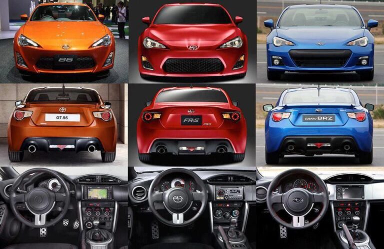
Let’s suppose we have a Subaru BRZ, a Toyota GT86, and a Scion F-RS together, but with no car badges. Would you be able to tell them apart quickly? This is a great example to understand the concept of automotive branding through car brand logos, as these three cars are actually the officially rebadged version of the same vehicle! Essentially, they are all the Toyota GT86, with minor cosmetic changes made by the other two manufacturers.
While this is too much of an on-the-nose example, there are many others that would portray the same. Logos help people identify your brand easily. That is why brands look for the best logo design services that fits their budget.
What are the Hallmarks That Define the Greatest of Car Logos?
All well-known and great car brand logos have a few factors in common. Those include attractive iconography, aesthetically pleasing color combinations, and suitable fonts. But what truly makes a great logo is much more than the sum of these great parts.
The design needs to embody the heart and soul of your brand in order to be considered an iconic brand symbol. Take, for example, the Pontiac Firebird’s famous car logo as part of its car branding. The design of a phoenix taking flight was a masterstroke, considering the name of the automobile itself. And today, decades after it went out of production, the car is still recognized and remembered fondly by a large number of fans in the US.
In the automotive industry, you will see a number of different styles of automotive logos, from minimalist logos and wordmarks to elegant designs. But what makes them great actually depends on how the company and its designers combined their aesthetics with the desires of the consumer.
Iconic Car Symbols with Wings
There are several different types of logos found around the globe, and one of the more common imagery added to these designs are wings. Wings symbolize freedom and speed, something that many automakers want to portray to their consumers, and a design element seen in some of the best automotive logo designs you will see around you.
Let’s look at some of the most memorable car logos with wings.
Aston Martin
Aston Martin, or AM, is one of the most popular British luxury and sports automaker today. It was formed by a joint venture between Lionel Martin and Robert Bamford in 1913. And it soon rose to become one of Britain’s most famous car manufacturers, with an iconic automotive logo design to match. The outline of spread wings behind the wordmark written on a British Racing Green background makes this one of the few car emblems with unmatched beauty.
Bentley
Bentley has long been known as one of the best luxury cars manufacturers in the world. Originally started by Walter Owen Bentley as a manufacturer of rotary engines for Allied planes in World War One, they soon transitioned over to cars. The current Bentley logo represents the original owner with its large and prominent lettermark, set over spread wings depicting the company aviation history. Yet despite their rich history, they sport one of the most subtle yet famous car logos of all time, representing their legacy in true British fashion.
Mini
Mini is another famous British car manufacturer, which was started in 1958 by the British Motor Corporation. However, today the brand is part of the BMW Group, and produces some of the most famous hatchbacks and coupes around the world. Their logo features one of the car emblems on this list, with a clear wordmark flanked by a pair of wings in the form of a badge. The color scheme is a simple black, with an aesthetically pleasing matt metallic sheen.
Mazda
One of Japan’s most famous automobile manufacturers for a long time, especially during the early 80s-2000s as the manufacturer of some of the most iconic tuner cars. Known for their popular rotary engine, their cars were some of the most in-demand vehicles during the height of USA’s tuner culture in the early 2000s.
Over the years, there have been multiple logo variations, ranging from the elegant wordmark at the company’s inception, to the symbol we see today. The current logo features a stylized M, made to mimic the spread wings of a bird, and signifies freedom and drive to reach higher. For a company known for producing sleek, low-slung sports cars like the RX-7, the winged icon is one of the most suitable automotive logos that could have represented the brand.
Chrysler
Chrysler is an American automobile brand that was started in 1925. It is a luxury car brand that has been known to produce some of the best premium automobiles for the US market. The elegant Chrysler logo depicts its transport company name on a dark blue background, with long and thin wings extended on both sides of the logo for an elegant look, colored in simple metallic light gray.
With its long history of producing luxury automobiles for the American market, the thin and long car brand emblem design perfectly represents the elegance associated with the automaker.
Genesis
Genesis is a subsidiary of Hyundai Motors, and specializes in producing luxury vehicles for the South Korean marquee. Although it hasn’t been around as long as many of the other automobile logos on this list, the company changed their logo in 2023. Now flattened and monochrome, the design is now more of a minimalistic design than what you would expect from luxury car logos.
Best Car Brand Logos with Animals Imagery
Animals have long been used in the automotive industry, as specific creatures are linked to various aspects common to this market. Speed, strength, and freedom are just a few feelings automakers want their customers to envision when brand symbols.
So, from amazing horse car logos to other powerful, animalistic imagery, let’s discover some of the best car logos with animals in their design.”
Ferrari
Ferrari brand symbol is one of the best known car logos around the world today. Sported by some of the best cars and drivers in the world, the iconic brand symbol is one that is most commonly associated with peak Italian auto engineering, and speed. The color scheme represents the company’s home country, as well as their town of Modena.
The Ferrari logo was first introduced at the 1932 Spa 24 Hours. Since then, the prancing horse’s stable has made their symbol one of the most well-known car brand logos of all time, especially in motorsports. Moreover, the symbol today represents that the person is part of an elite and exclusive club, one which was deemed worthy of owning a masterpiece like a Ferrari automobile.
Mustang
Ford Mustang is the company’s line of pony cars, which opened its doors in 1964. The cars they produced have some of the best shapes and styles, which have made their place as some of the most iconic cars of all time.
The old color scheme was a silver/chrome horse over a tri-color stripe representing USA’s red, white and blue color palette, cementing its identity as one of the few truly American automobile company logos. However, in a drive to be modern, the design is now a dark silver gray, with no background.
Unlike Ferrari’s logo that features a prancing stallion, a callback to the Italian stable’s origins, the Ford Mustang logo represents the wild and free mustangs that roamed the American plains in the years past. An animal native to the Americas, this animal is one that quintessentially represents all that the country stands for – strength and freedom.
Jaguar
Jaguar is a famous sports and luxury car brand that conveys power, agility, and sleek lines in both their cars and logo itself. Another entry on the list of popular British automotive logos, the Jaguar logo features an expressive design. The clean and smooth lines of the pouncing cat are a perfect show of coiled strength and power that looks beautiful, as well as quite deadly. The color scheme is a simple silver with dark accents and a detailed illustration.
Holden
Holden was an Australian automaker that began its operations in 1956. It had a working partnership with USA’s GM-Pontiac, and produced rebadged versions of its cars for the Australian market. However, as of 2020, the company has ceased all operations. A sad fate for one of the best car brand designs from the land down under.
Their car logo showed a roaring lion with a raised front paw, perfectly representing the Australian spirit, and cementing its place as one of the lesser-known yet beautiful car logos.
Peugeot
Originally a French family businesses making bikes and coffee grinders, the company soon got into producing small family cars. Building their first car in 1889, the company adopted a rearing lion imagery to present an air of sophistication and aristocracy, an emotion found in many European car logos.
While both Holden and Peugeot use the imagery of a lion in their brand logos, both take a distinctly different approach in how the mascot is incorporated within the design. The color theme used previously was chrome and blue, but today the company used a white lion’s head design over a black shield. The result of this new design is that that Peugeot too has now joined the list of modern car logos with monochrome designs.
Lamborghini
The history of the logo for this car brand start in 1962, when company owner Ferrucio Lamborghini visited a bull ranch of Don Eduardo Miura. The strong and powerful animals left a great impact on the businessman, and he decided to name his cars after famous fighting bulls, and adopt a logo representing that as well.
Originally a tractor manufacturing company, Lamborghini and its charging bull logo has cemented their place as one of the most famous car logos present today. From its metallic dark gold over deep black backdrop color palette, to the aggressive stance and performance of Lamborghini’s cars, everything about the brand portrays power and strength.
Abarth
Abarth is an Italian manufacturer of performance and racing cars, founded in 1949. Their logo is a unique shield-like design, with the colors red and yellow. Superimposed over it is a black scorpion, which was the astrological sign of the founder Karl Abarth. However, the team was sold to Fiat in 1971, which then became the company’s performance division.
Today, Abarth produces limited numbers of special edition performance variants for Fiat. These special edition cars feature the iconic Scorpion symbol of Abarth, which is one of the most unique animal-based car symbols in the industry today.
Shelby
Shelby Cobra is a marquee of special-built cars by agreement between the Ford Motor Company and Shelby Engineering, a private performance tuning and building company. The collaboration between the two started when Ford decided to end Ferrari’s dominance at Daytona and other endurance circuits. Shelby’s car setup was the best among the contenders, and his car defeated Ferrari.
After that, the brand made a deal with a British car manufacturer AC, and started importing their sports car called the AC Cobra. Tuning it up for better performance, and with a stronger engine under the hood, the team renamed the car as AC Shelby Cobra, more commonly known as the Shelby Cobra. As the first car in the brand’s marquee, the company decided they needed a symbol that portrayed this legacy. The resultant company logo was a coiled King Cobra hissing at his prey, a sign of deadly precision and strength, making it one of the most unique car logo designs like the Abarth logo.
Today, Ford Motors, who have a long history of working with Shelby, use the Cobra moniker for their top trim of the Mustang, called the GT500 Shelby.
Cool Luxury Car Logos with Hidden Meanings in Their Design
Luxury cars logo design often tends to use simple, minimalist designs. That is because simplicity and elegance are some of the most important factors in the luxury product market. So whether they are luxury fashion brand logos or luxury car logos, simple designs are the order of the day.
Let’s take a look at some of these elegant car logos and their meaning.
Rolls Royce
Rolls-Royce may arguably be the most iconic and top-of-the-line luxury car manufacturer in the world today. Known for manufacturing ultra-luxury cars for the world’s elite, the Rolls-Royce has long been considered one of the top car logos in the world of luxury automotive.
The modern design is flat, consisting of a pair of overlapped initials of the company name. Although the new design is not too different to its previous iteration, it does have a decidedly modern feel to it.
Infiniti
Infiniti was originally designed to be the luxury division for its parent Nissan Motors group. However, it was spun off into its own brand, and is today known as one of the top Japanese luxury brands. The previous car logo for Infiniti was quite similar to the modern iteration. The only difference was that the modern design has thinner strokes that adds a touch of minimalist elegance; a genius move in our opinion.
BMW
BMW is perhaps one of the more popular German car brands, right up there with Mercedes and Volkswagen. At first glance, the new BMW logo may not look that different from the previous iterations, especially as it still retains that iconic alternating blue and white circle design in the middle. However, the company has flattened the design, a popular design choice in recent years. Moreover, the accent color has been switched to a lighter grey than the previous near-black.
Acura
Just like its parent company Honda, the car logo for Acura is understated and sophisticated, making it look and feel elegant. The brand was created to bring high-performance and luxury automobiles rebadged from Honda, for the American people. The marquee has released some of the best cars for the American tuner scene, from the Integra Type-R and the RSX of the early 2000s, to the first generation Acura NSX of the 1990s, Honda’s first exotic sports model.
The brand soon evolved into Honda’s performance and luxury division, establishing itself as a formidable competitor. The success of its first car, the Acura Legend, is what prompted Toyota and Nissan into forming their own luxury brands, Lexus and Infiniti, respectively. Representing one of the great car emblems, Acura’s logo is quite simple and made in the shape of the letter. Moreover, it is also accompanied by a simple wordmark, in a logo style similar to Honda.
Audi
Audi’s symbol has long been one of the most contentious car logos of all time. Many people have put forward different theories about the idea behind this German automobile logo design, yet no one has proven themselves right so far. However, despite that confusion, the brand symbol has established itself as one of the top car logos of all time. And among the car aficionados, the logo is considered synonymous with the 4-wheel drive technology in cars smaller than SUVs.
Their logo design features a set of four rings interlinked together, colored a bright chrome. As for the meaning behind the design, the four interlinked rings of the logo represent the four companies who merged together in 1932, forming the auto union that became Audi.
Buick
Buick is one of the oldest car manufacturers in the world, dating back to 1904. It is also a member of the GMC group, which is the foremost group of companies manufacturing automobiles in the United States. The brand is known or its large and stately luxury cars, which are positioned right below the premium Cadillac brand but above the rest of the GM marquees.
The design of this car logo features three shields, a red one, a silver one, and a blue one. They represent the three initial Buick models, Electra, Invicta, and LeSabre. Moreover the color scheme also represents the brand as one of the pioneering American car brands, portraying itself as “truly American”.
Cadillac
Cadillac is one of the USA’s popular brand of luxury cars. Established in 1902, it is run today by the GMC group, and represents their top-of-the-line luxury vehicles. A popular brand with one of the best automobile logo designs, it sells a record number of products each year around the world.
The Cadillac logo is a wide shield crest which previously used red, gold, and blue with chrome highlights to make the design look sophisticated and high-end. Moreover, it allowed for the display of a color contrast to make the car logo identification easy for consumers. However, the modern iteration of one of America’s top luxury car emblems features a black-and-white color scheme.
Mercedes-Benz
Mercedes-Benz is part of the DMG (Daimler Motoren Gesellschaft), which is a large automotive group in Germany. After the original owner Gottleib Daimler passed in 1900, his sons adopted a star shaped symbol for the company in his honor. However, the design soon featured a three-point star as the logo, which represented Daimler’s drive to rule the air, seas, and land. A ring was added to it in 1916.
This makes the Mercedes logo one of the very few old car logos that is still in active production. And that is the
testament to the drive and adherence of the company to their leader’s ideals and vision.
Timeless Car Brand Logos
The majority of automotive logos in use today have seen several redesigns over the years.
However, a few of these car brands have retained the same general icon throughout most of their lives.
Let’s take a look at a few of these timeless car logos.
Mitsubishi
Mitsubishi is one of the biggest industrial manufacturers in Japan, which produces a variety of items including automobiles. Created in 1870 by Yataro Iwasaki, today it is a member of the Renault-Nissan-Mitsubishi alliance, producing a record number of cars each year. Moreover, Mitsubishi has a number of other divisions as well, including consumer electronics, industrial machinery, and even aeronautical research and development.
If we talk about popular car logos by country, then Mitsubishi would be among the top 4-5 vehicle logos on Japan’s list. The design is made to look like a tri-blade propeller, referencing the company’s history of manufacturing airplane engines.
Saturn
Saturn was an American car manufacturer, which was part of the General Motors Company since 1985. The brand was formed in order to provide a local manufacturer under the GM brand to counter the influx of high-quality budget Japanese vehicles. However, the brand was discontinued in 2010.
Coming to the logo, the logo for Saturn is one of the most interesting automotive logos you will see. The logo depicts the lower quarter of the planet Saturn, and uses a simple red and silver color palette to portray the imagery.
Subaru
Subaru’s logo is quite different in terms of design, which some consider to be boring among the list of Asian car logos like Honda or Mitsubishi. However, the six stars on the logo depict an important time in the history of the company, which made Subaru what it is today, and catapulted its logo as one of the most iconic brand emblems in the automotive industry.
The five little stars represent the five automakers who merged into a single entity, which is represented by the larger star. This iconography is depicted over the brand’s iconic blue scheme. And this bright blue car manufacturer logo design has been a mainstay in the autocross and rallying circuits since the early 90s.
Toyota
Toyota’s legacy is one that puts the Land of the Rising Sun as one of the finest automobile makers in the world. The meaning of their logo is quite contested, with some claiming that it is a stylized version of the company’s initials, while others think it a simple abstract design.
However, the true meaning behind the three ellipses, conforms to the hearts of the customers, the tech opportunities, and the cars themselves, and does not care about visions of stylized initial logos.
Hyundai
Many people believe that this South Korean automobile company just uses a modified version of Honda’s logo. However, that is not true, and its true meaning is what makes this one of the most expressive Asian car logos today.
The true meaning of the symbol also makes it one of the subtler car logos, with a strong message being conveyed to the consumers’ subconscious when looking at it. The slightly tilted design represent two people shaking hands, which incidentally also looks like the company’s initials.
Porsche
Porsche’s logo is a study in timeless design. The iconic shield of the company has been gracing the brand’s automobiles for decades now. And in all that time, there has been no change whatsoever to its design.
The Porsche logo features its origin city’s colors and iconography –the horse signifying Stuttgart’s famed stud stables, and the red /black stripes with antlers signifying the historical Wurttemberg Kingdom. All in all, this is inarguably one of the most regal automobile logos that have ever been designed.
Ford
Founded in 1903, the Ford Motor Company, now known simply as Ford, was formed by Henry Ford. Over the years, it has established itself as one of the top car manufacturers in the country, offering different car segments under its sub-brands such as Lincoln.
The Ford logo is a flat oval, which is colored in white over a blue background. The wordmark inside is written in a custom script, and is designed to mimic Henry Ford’s personal signature. The flat design with the script wordmark makes for the perfect balance between the new and the old, honoring the company’s legacy while looking towards the future, marking it as one of the top car logos of our generation.
KIA
Owned by the Hyundai Motor Group, Kia is one of the top Korean automobile brands in the world today. Their consumer cars are sold across the world, including in the US. Its name has a unique meaning in the local Sino-Korean dialect, which translates to “rising out of East Asia”.
The Kia logo is another one that follows a flat aesthetic over the more popular car emblems. Despite that, the automobile manufacturer has a sizable consumer following. The latest iteration of the car logo however, has generated a lot of controversy, as the design results in ambiguity when viewed for the first time. In fact, after its inception, there was a rise in people looking for the “KN” car logo due to the fact that the new design was interlinked in a way that made KIA look like KN.
Chevrolet
Chevrolet is another division from the General Motor Corporation, and one of the most successful ones at that. Over the years, Chevrolet has established itself as a major auto manufacturer with the advent of cars like the Camaro and the Chevelle.
The Chevrolet logo ranks among the top American automotive emblem logos, and its design has been a source of countless debates since its inception. Some people believe it to be a cross, with the overlaying elements of the logo making it into the classic shape. Others think it is a bow tie. And while there is no confirmation as to what is the actual shape for the logo, the fact is that it represents one of the top car manufacturers in the US.
Honda
Formed the year after the end of World War 2, the Honda motorbike and car symbols represent a rich and successful automotive history, especially compared to competitors who are far older in the industry. A simplistic car logo that hides the automotive genius of Soichiro Honda behind it, the brand is known for reliability, and quality in all its products, whether its cars, motorbikes, or more.
The Honda logo is a simple, slightly asymmetric design that has the upper arms of the letter H extended upwards and slightly outwards, representing the company slogan of “The Power of Dreams”. Today, this logo has proved its worth in consumer automobiles, as well as a variety of motorsports, including becoming the most successful Japanese engine manufacturer in Formula 1.
Famous Car Logos That Have Been Recently Redesigned
In recent years, the rapid rise of electric car brands like Tesla has forced many established automotive companies to enter the niche as well. To that respect, many of them have opted to redesign their logos to match the modern, futuristic aesthetic of these new auto manufacturers.
Here are some cool car logos representing some of the top car brands in the world, that have been recently redesigned.
Citroen
Citroen is a French brand of automobiles that has a long history with the country. Citroen is known for its iconic pair of upwards arrows that symbolizes its constant drive for excellence. For the modern car logo of the company, they decided to center the arrows within an oval outline to give it a sense of modern aesthetic combined with a vintage appeal. Overall, the new Citroen logo still retains that essence of the brand which was found in its previous car logos.
Dacia
Dacia is a Romanian brand of automobiles. What’s special about it is that unlike the other car logos we have discussed so far, that just tweaked their logos, Dacia went with a completely fresh and distinct design that was meant to signal the company’s redefinition. The new car logo for the brand is angular, aggressive, and best of all, features a futuristic design that suits the modern aesthetic.
Nissan
Nissan is one of the more popular Japanese car brand logos, known for such iconic cars like the Skyline GT-R series, Silvia series, and much more. Coming to the modern iteration of its car logo, the design can be said to be a flattened version of the previous logo. However, the visual impact is quite different, as the company also changed the stroke width, style, and the fonts used. The result is a cleaner logo that suits the automotive brand’s modern look.
Opel
Opel’s modern logo is also a simplified version of its previous car logo, going for a more delicate design that adds a touch of elegance to the design. Swapping out the thinner strokes that overlapped the surrounding round border, the company decided to make the lines more distinct, using gaps and whitespace to highlight stroke ends.
Renault
Renault is a popular French automotive brand, that is known for consumer vehicles like the Clio. The Renault logo has long featured a hollow, four-sided diamond shape. In its recent redesign, the company has kept that same design aesthetic. However, rather than using a single thick stroke, the company has used a set of two interlocking lines to form that same shape, thus modernizing the logo without drastic changes.
Volkswagen
Volkswagen is one of the most iconic of German car brands, and is entrenched into the history of the country. The company’s modern iteration is just a flattened version of its original logo, yet it has the same visual impact. Despite looking modern, the impact of the logo hasn’t changed, an amazing feat for those who know the difficulties in the logo redesign process.
Volvo

Volvo is a Swedish car manufacturer that is known for producing highly resilient luxury vehicles that last a long time. The modern Volvo logo is one of the few redesigned car logos that still retains its previous visual impact. Although flattened, the logo still retains that same sense on minimalist aesthetic as the previous version of the logo.
Popular Sports Car Logos We All Know and Love
There are a number of sports car logos that can be discussed today, which are popular among automotive fans. In fact, most car logos on this list here have been known to produce at least one iconic sports car.
So, let’s discuss some of the best car logos that are known to represent the best of sports cars.
Bugatti
The modern iteration of Bugatti is a French car manufacturer known for its luxury ultra-high performance vehicles like the Chiron with its iconic W16 engine. The current Bugatti logo is a great departure from the original Bugatti brand, which was one of the best car badges of that era. Consisting of a flat wordmark, the new design is extremely minimalist.
Lotus
Lotus Cars are the brainchild of automotive visionary Colin Chapman, who brought innovations to the field of understanding and producing performance cars decades ahead of the competition. Known for introducing the first era of downforce in Formula 1 and seeing great success in the sport, the consumer side of the company also benefitted from this. Today, the Lotus brand is one of the most iconic British car logos, using a flattened version of its original logo.
Italian Car Brand Logos that Represent the Country’s Automotive Heritage
Italy has a rich history of automotive excellence, spawning some of the most iconic car brand logos including Ferrari, Alfa Romeo, Lamborghini, Maserati, and more. Here are some of the top Italian car brands and their logos, besides the ones mentioned above.
Alfa-Romeo
Alfa Romeo is a popular brand of Italian sports car, and is a worthy carrier of the country’s performance automobile industry. Their logo features the Milanese Biscione which represents the House of Visconti who rules Milan in the 14th century. The other side of the logo features a Milanese cross, and the entire designs uses a blue, red, green, and silver color scheme.
This brand and its logo is one of the oldest automobile logos from Italy, with many of the future greats like Enzo Ferrari learning the ropes by working at Alfa Romeo in their earlier days.
Maserati
Formed in 1926, the Maserati symbol has remained largely unchanged, featuring a stylized trident. The idea for the logo was taken from the statue of Neptune in Bologna’s Piazza Maggiore in Italy. The design is often accompanied by their iconic red-and-blue color scheme, which signifies their Bolognese roots.
Moreover, its wordmark, written in a handwriting style typography, makes it one of the most unique car symbols on this list, especially when we combine the aesthetics of the symbol and wordmark together.
Lancia
Lancia’s logo is one that many fans of Italian car brand logos would know. In fact, it’s a symbol that is known across both the consumer market, as well as motorsports world. In the world of rally racing, Lancia is known as a legend that, for its iconic cars like the Stratos, the Delta S4, and the legendary 037. The modern logo takes an elegant approach to its previous logo, signaling the company’s comeback with a new electric option.
FIAT
FIAT is one of the more popular Italian car brands that is known for its consumer cars. But that is not the only way it differs from its Italian automotive brethren. Rather than go for a combination or symbol-based logo, the company has opted for a stylized wordmark to represent its brand. The flat, blocky letters are quite assertive, and have a strong visual impact despite the lack of many visual elements.
Popular Electric Car Brand Logos that Have Established a Foothold in the Industry
Electric car brands are now quickly emerging as popular options in the market. That is especially true for companies like Tesla whose cars are some of the most popular electric cars sold currently. In fact, Tesla’s automobiles are now competing directly with established automotive manufacturers.
So, here are some of the most popular electric car brand logos we know today.
Tesla
Tesla electric cars is named after famed visionary and experimental physicist Nikola Tesla, who is known for his work on alternating current and the potential possibilities of manipulating voltages and amperages. The design of this car emblem makes this one of the unique modern car logos.
The logo depicts the initial of the company, which is designed to look like a Tesla coil, thus honoring the legacy of Tesla’s genius. Moreover, the inverted triangle logos style of this brand symbol is one that exudes a cutting-edge vibe, perfect for a tech-first company like Tesla.
Rivian
Founded in 2009, the company is one of the newer entrants in the American automobile industry. Their focus is on creating a variety of vehicles and transport solutions with an emphasis on sustainability without affecting productivity.
The Rivian logo is an interesting design, and is designed to mimic the four corners on a compass. The company chose this imagery to create their car logos because they believe that just like how the compass changed the world, Rivian too wants to make that big of an impact.
Moreover, the outer arrows represent their drive to improve the world through innovation, and the inner arrows highlighting inspiration and inclusivity, which makes this the perfect candidate for square logos like the one it sports.
How Can You Create Iconic Car Symbols for Your Automobile Brand?
You can design an iconic logo for your automobile brand in several ways. For starters however, if you are a design amateur or have no design experience, then creating your car logo yourself is out of the question. However, there are a couple of ways around that too.
Let’s take a look at them.
Using a Freelance Designer for Budget Car Logos
If you are inexperienced in the various types of graphic design, and are short on a logo design budget, one of the simplest options is to use online freelance marketplaces to hire a freelance logo designer. These professionals can come in all levels of experience and expertise, making it easy to find one that fits your budget.
However, that will require you to do a lot of the homework yourself, as the designer will only be able to help you with the design part. Moreover, you need to remember that you get what you pay for. And many of the freelance designers on the lower end of the price spectrum will churn out substandard work due to their inexperience.
Hiring a Professional Branding and Logo Design Agency
If you desire something truly great and one-of-a-kind, the best option is to hire a professional logo design agency. These professionals are experts at creating truly great brand logos that ensure that your brand message and aesthetics are portrayed to your customers. Moreover, as they have pros who offer everything from brand design to simple logo design, they can help with the ideation process, ensuring that the resultant logo will be highly effective.
Frequently Asked Questions
| 1- Are car logos copyrighted? Yes. Car logos are generally copyrighted or trademarked, to prevent others from copying them. |
| 2- What are car logos called? Car logos are also known as badges, and models made and marketed in partnerships are usually called rebadged versions of each other. |
| 3- What are famous car logos? Famous car logos include: – Honda’s logo – BMW’s logo – Mitsubishi logo And many others as well. |
| 4- What are logos on cars called? Car emblems are badges of the company logos that are featured on cars and other automotive products. |
| 5- What car has the 500 logo? The Fiat 500 is one of the most iconic special edition car logos from the Italian marquee, and features a “500” as its model marker. |
| 6- What car logo has four rings? The Audi logo features four interlocking rings for its car emblems. |
| 7- What car logo has three diamonds? The Mitsubishi car logo features three diamonds stacked in a triangular formation, designed to look a propeller in action. |
Conclusion
Now that you know what made these famous car logos so iconic, the next step is to learn how to design a logo as timeless and aesthetically pleasing as the ones above.
If you want to hire a professional logo design agency to create your brand symbol, Logo Poppin can help you with that. Our expert designers create one-of-a-kind brand logos that perfectly represent your company.
Subscribe for cutting-edge design inspiration at Logo Poppin! Elevate your brand with updates on logos, branding, web design, and video animation. Note that by clicking “subscribe,” users may agree to our privacy policy and consent to Logo Poppin to use your contact data for newsletter purposes. Logopoppin is a graphic design agency that specializes in logo designing, web development, video production and advanced branding services. We love to innovate businesses with new age technologies, allowing them to improve their visual reputation.Latest news you want to know!
![]()
![]()
Logopoppin
![]()
![]()
![]()
![]()
![]()

