
Table of Content
Discover the Transformation of the Trader Joe’s Brand Logo Through the Years
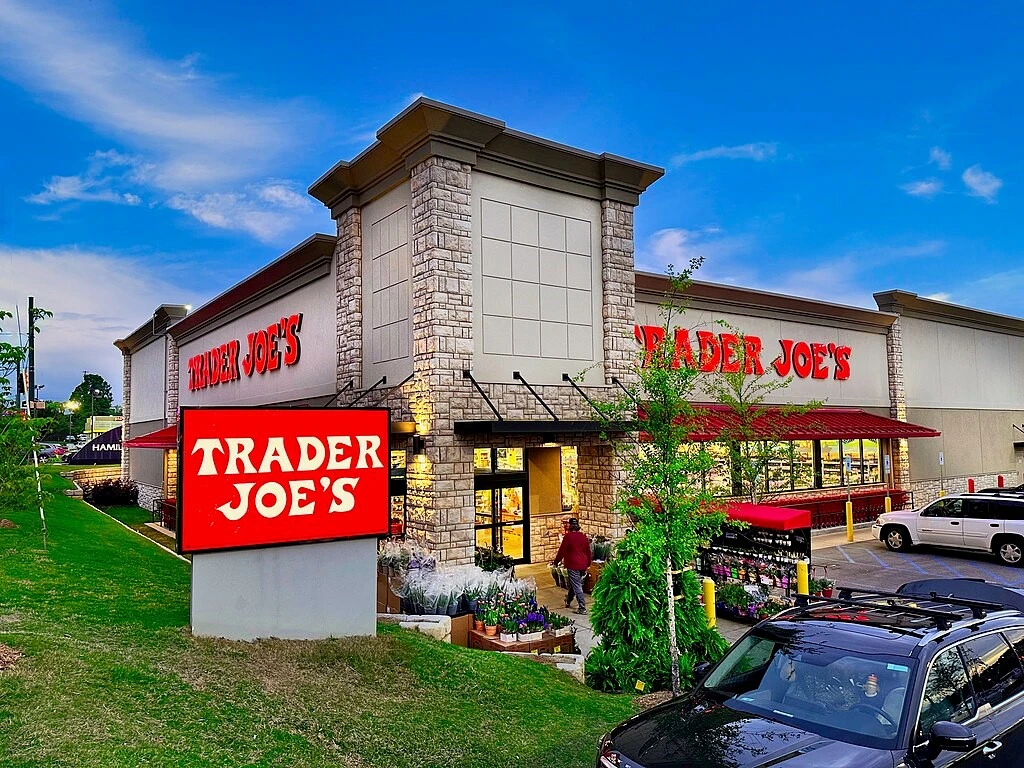
Trader Joe’s, the beloved grocery store chain known for its unique product selection and quirky atmosphere, has cultivated a loyal following with its distinctive brand identity. A key element of this identity is the instantly recognizable Trader Joe’s logo. This seemingly simple design has remained remarkably consistent throughout the brand’s history, contributing significantly to its enduring appeal and brand recognition.
The Trader Joe’s brand logo, with its whimsical font and playful imagery, embodies the brand’s unique character. It evokes a sense of adventure, discovery, and a touch of the exotic, reflecting the store’s focus on unique and often international products (albeit under their own rebranding). This consistent visual identity has played a crucial role in building brand loyalty and creating a strong emotional connection with customers.
Beyond its visual appeal, the Trader Joe’s symbol serves as a powerful marketing tool. It instantly communicates the brand’s personality and values, creating a sense of familiarity and trust among customers. This consistent brand identity across all touchpoints, from store signage and packaging to online platforms, reinforces the brand’s unique position in the competitive grocery market.
Let’s discover how a professional logo design agency would go about instilling that same sense of aesthetic into a new brand, bringing it close to the appeal of Trader Joe’s timeless design.
The History of Trader Joe’s – A Comprehensive History of the Brand
Trader Joe’s has a fascinating history, evolving from a small chain of convenience stores into a beloved grocery store chain known for its unique product selection and quirky atmosphere.
Founded in 1958 by Joe Coulombe, the first Trader Joe’s store opened in Pasadena, California. Initially, the stores focused on selling wine and gourmet food items. However, Coulombe soon realized the potential of offering unique and exotic products at affordable prices. He began importing unique and often unusual items from around the world, creating a unique shopping experience that resonated with customers.
Over the years, Trader Joe’s has cultivated a loyal following by focusing on a unique blend of factors:
- Unique and Exclusive Products: Trader Joe’s is known for its unique and often exclusive product selection, including many private label items that are not available anywhere else.
- Affordable Prices: Despite offering unique and high-quality products, Trader Joe’s maintains competitive prices, making it an attractive option for budget-conscious shoppers.
- Quirky and Fun Atmosphere: The stores are known for their quirky and whimsical atmosphere, with friendly and helpful employees, often referred to as “Crew Members,” who wear Hawaiian shirts.
- Strong Customer Loyalty: Trader Joe’s has cultivated a loyal following of dedicated customers who appreciate the unique shopping experience and the brand’s commitment to quality and affordability.
Today, Trader Joe’s operates hundreds of stores across the United States, maintaining its unique brand identity, continuing to attract new customers with its distinctive product selection, and engaging shopping experience.
The Evolution of the Trader Joe’s Logo – From Inception to Modern Day
While subtle variations may exist across different applications and over the years, the core elements of the Trader Joe’s logo have remained remarkably consistent. This consistent visual identity has created a strong sense of brand recognition and loyalty. Customers instantly recognize the logo, associating it with the unique shopping experience, the quirky atmosphere, and the promise of discovering unique and exciting products.
This unwavering commitment to a single, consistent logo has several key advantages when compared to using several logo variations. It fosters brand recognition and recall, making it easier for customers to identify and connect with the brand. It also creates a sense of familiarity and trust, reassuring customers that they can expect the same unique shopping experience and high-quality products they’ve come to know and love.
Furthermore, the consistent use of the logo across all brand touchpoints, from store signage and packaging to online platforms and marketing materials, reinforces the brand’s visual identity and creates a cohesive and memorable brand experience. This consistent visual presence strengthens brand awareness and reinforces the unique character and values that define the Trader Joe’s brand.
1967 to Present Day – Rocking the Same Logo Throughout Its Life
One of the most remarkable aspects of the Trader Joe’s brand is the enduring nature of its logo. Unlike many brands that undergo frequent rebranding and logo redesigns, Trader Joe’s has maintained the same logo since its inception. This consistent visual identity has contributed significantly to the brand’s strong recognition and enduring appeal.
The Trader Joe’s logo is characterized by its simple yet distinctive design, which has made it one of the most iconic brand positioning examples in the grocery store niche. It features the brand name “Trader Joe’s” in a stylized, handwritten font, reminiscent of a vintage travel poster. The logo often incorporates nautical elements, such as small sailboats or anchors, further emphasizing the brand’s adventurous and exploratory spirit.
This consistent visual identity has created a strong sense of brand recognition and loyalty. Customers instantly recognize the logo, associating it with the unique shopping experience, the quirky atmosphere, and the promise of discovering unique and exciting products.
The enduring nature of the Trader Joe’s logo is a testament to its timeless design. It has successfully captured the essence of the brand, conveying its personality, values, and unique selling proposition in a simple and memorable way.
Exploring the Color Scheme of the Trader Joe’s Logo
The Trader Joe’s logo typically utilizes a combination of earthy tones, such as brown, green, and beige, which evoke a sense of naturalness and wholesomeness, along with the dark, deep carmine from colors that start with C as its primary shade. These colors are often paired with bright, vibrant colors like orange and yellow, adding a touch of playfulness and excitement. This color scheme effectively communicates the brand’s focus on natural and wholesome foods while maintaining a sense of fun and adventure.
The use of color in the Trader Joe’s logo is not merely aesthetic; it serves a strategic purpose. The earthy tones convey a sense of quality and authenticity, suggesting that the products are natural and wholesome. The vibrant colors, on the other hand, create a sense of excitement and intrigue, inviting customers to explore the unique and often unexpected offerings within the store.
The consistent use of this color scheme across all brand touchpoints, from store signage and packaging to online platforms, reinforces the brand’s visual identity and creates a cohesive and memorable brand experience.
Conclusion
The Trader Joe’s logo, with its simple yet distinctive design and consistent application in fiery shades of red color, has played a crucial role in the brand’s success. Its enduring nature serves as a testament to the power of effective branding and the importance of creating a strong and consistent visual identity.
By maintaining a consistent visual identity throughout its history, Trader Joe’s has built a strong brand image that resonates with customers and fosters a sense of loyalty and trust. The logo has become more than just a visual identifier; it has become a symbol of the brand’s unique character, its commitment to quality, and its focus on providing a unique and enjoyable shopping experience.
The success of the Trader Joe’s logo demonstrates the importance of careful brand development and the power of consistent visual communication. In today’s competitive marketplace, a strong and memorable logo is essential for building brand recognition, fostering customer loyalty, and achieving long-term success.
Latest news you want to know!
Subscribe for cutting-edge design inspiration at Logo Poppin! Elevate your brand with updates on logos, branding, web design, and video animation.
Note that by clicking “subscribe,” users may agree to our privacy policy and consent to Logo Poppin to use your contact data for newsletter purposes.
Logopoppin
Logopoppin is a graphic design agency that specializes in logo designing, web development, video production and advanced branding services. We love to innovate businesses with new age technologies, allowing them to improve their visual reputation.
