
Table of Contents
Discover How Top Brands Use This Geometric Shape to Its Advantage
More than any other shape, triangles are one that have intrigued us for centuries. From becoming the universal signal pointer, to giving birth to one of the most stable 3D structures in the universe, triangles are a great.
Shapes, like colors, have specific meanings and concepts associated with them when used in logos. Circle and round shapes generally signify unity and harmony, while four sided shapes like square, rectangles, and diamonds signify structure. Triangle logos though, are a little different. Conspiracy theorists often ask why ancient civilizations made monuments like the pyramids of Egypt or the ziggurats of Machu Picchu triangular.
Well, the answer is quite evident, isn’t it? Even back then, people saw and knew that a triangle was stable. Less resource-heavy than, let’s say, a square, the triangle’s unique geometry makes it ideal for a striking image.
So, let’s take a look at some of the top brands with amazing logos that feature a triangular design, and learn how the logo design services they hired leveraged its innate stability to their advantage.
1- Triangle Logos – What are They?
Let’s start with the most basic of questions. What exactly are triangle logos? Well, to put it simply, a triangular logo is one that incorporates the shape of a triangle within its design, or is designed to mimic the dimensions and essence of the triangular shape.
For example, many logos that use the uppercase letter A within their designs tend to modify their shape to mimic a true triangle. A great example of that is the logo for Fila. Others like Delta Airlines or HGTV tend to use the shape as an additional symbol to their overall designs.
But there are some brands who use the shape to create their unique, identifiable, and standalone brand symbol, like Airbnb. And all of these combined, are types of triangular logos that can be witnessed around us, many unique, and a few uninspired generic logos that missed the mark.
But why triangle? Why do brands choose this geometric shape for their logos in the first place? Let’s find out.
The Meaning of the Triangle Iconography
As we mentioned earlier, triangles denote stability. If we think of real-life examples, like suspension bridges, fulcrums, keystones in construction etcetera, we see that the triangle plays an important role. Moreover, it also provides a sense of dynamic movement, something very important today considering the logo stats, hence its use as a pointer icon.
And the best part is that unlike other shapes where changing the dimensions might change the shape altogether, the triangle remains a triangle. However, depending on its orientation and shape, it might end up denoting different meanings to your logo.
For example, Qantas, Chevron, and CAT; all use triangles in their logo designs. Yet they all portray different meanings, with some semblance of innovative stability and trajectory. Even the orientation of the point can end up representing different things.
In design psychology, an upward pointing triangle can be considered masculine, powerful, and lethal. While if pointing downwards, it can be thought of as feminine, quick, and sleek. Their ability to be so multidimensional in their expressiveness is why you will often see the shape represented in various occult and secret societies like the Freemasons, Wicca, and Illuminati etcetera.
So now that we know the significance of the humble triangle in design across the world, let’s take a look at how designers incorporate that within their designs, especially brand logos.
2- Types of Triangle Logos We See Brands Sporting Around Us
Generally, geometric designs are one of the most popular styles of art within logos. Designers use a variety of traditional and avant-garde mix of shapes within their designs, in order to give their logos a different and interesting look.
While it’s true that triangles are an interesting shape to incorporate within your design, the fact of the matter is that unlike circles or squares, they are rarely used by traditionalists in their designs. That opens up a great opportunity for those looking to set their logos apart.
By using triangular shapes, and pairing them with the right logo fonts and colors, they can create amazing brand logos that will attract the eye and be memorable at the same time.
Generally, the types of triangle logos we see around us can be categorized into four major kinds:
- Sharp designs with clean lines and prominent angles
- Softly rounded designs
- Designs that use a triangular brand symbol
- Triangular font designs
Let’s look at these four types in further detail with the help of a few examples to see how each of them uses the triangle iconography within their logo designs.
3- Sharp and Angled Triangle Logos
The sharp-edged nature of these logos makes it perfect for the trendsetters and the rebels, or for those who want clear communication with their consumers about their brand values. Moreover, they tend to use triangles in the more traditional styles to make it easy for their consumers to understand.
Adidas

The brand symbol we know Adidas today by didn’t come by randomly. A comprehensive thought process went into creating the Adidas logo. The sloped triangular shape is meant to mimic the hardships and obstacles in life that the athlete wearing Adidas will have to overcome.
Moreover, the sloping angle also gives the idea of speed and power of going down a slope, making it the perfect brand logo for a sporting goods brand. Finally, the simple, monochrome color scheme of black on white is perfect for printing on a variety of mediums, from clothing and footwear to sports equipment, and even promotional merchandise.
Plus, the addition of the simple and clear wordmark to the sloped symbol makes for an overall clear and identifiable logo that is easy to remember and recognize.
Delta Airlines
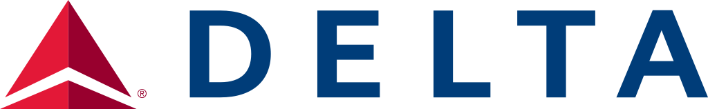
Delta Air Lines is one of the United States biggest airline service providers, and one of the five legacy carriers in North America. With a rich history spanning decades of services competing against such giants like United Airlines, TWA, Pan Am, and more, Delta has become one of the icons associated with the American dream.
But what of its own icon, or brand logo to be exact? Well, to pay homage to its name, the logo is a stylized triangle that is designed to mimic the Greek letter delta. Moreover, the 3D logo design of the triangle is such that it mimics a paper airplane flying through the air, colored a vibrant, deep red.
Overall, the logo is one of simplicity, power, and legacy, making it perfect for the Delta Air Lines.
HSBC
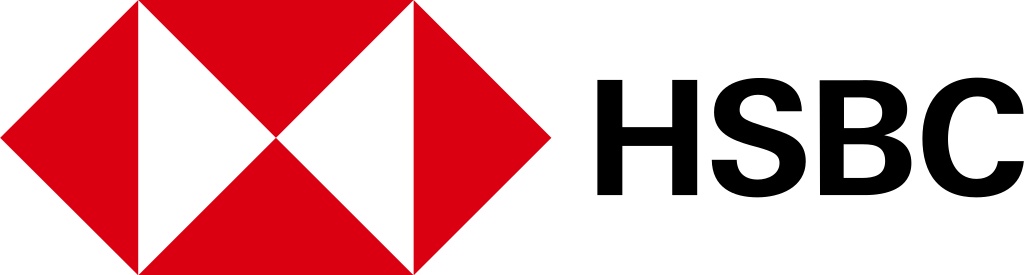
HSBC is one of the bigger financial institutions in the world today. An acronym for the Hong Kong and Shanghai Banking Corporation, which was the founding member of HSBC. Currently, it is the largest bank in Europe, with nearly $3 trillion in assets.
Its logo is a unique one. It features not one or two triangles in its design; it features six! And with the design colored in an attractive red and white scheme, the side-tilted hourglass-shaped design makes for a great brand logo. Two of the inner triangles that make up the hourglass are made using negative space, which makes them stand out among the dark red of the surrounding triangles.
The effectiveness of that logo is well known, as it has represented the bank for years, and has helped it become the global giant it is today with one of the most striking red logos we see around us today.
4- Soft & Rounded Triangle Logos
Triangles do not always have to be about the sharp angles and straight lines. A well-drawn triangular shape can be rounded and soft too, like the quintessential rounded symbol people use for arrow pointers.
But what brands would want to eschew the sharp and dynamic aesthetic of the traditional triangle for a softer design? Let’s find out.
Airbnb
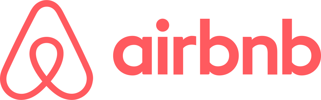
The first one is Airbnb. Now today, Airbnb has become one of the biggest hospitality and housing companies in the world, disrupting the hotel industry by allowing normal people like you or I to rent our living spaces out to guests looking for board.
Now traditionally, a consumer like that would’ve gone to a trusted hotel or motel. But now, by looking at the reviews from previous guests, or the verification by the company itself, you can choose a safe and reliable stay with the creature comforts of home.
Coming to its logo, they chose a uniquely shaped triangle to be the company’s symbol. They used a rounded design that mimics the arrow used in some of the top GPS apps – an arrow pointer with a rounded tip and blunt edges.
The soft and rounded shape makes it more approachable and welcoming, making it perfect for a hospitality app.
Reebok
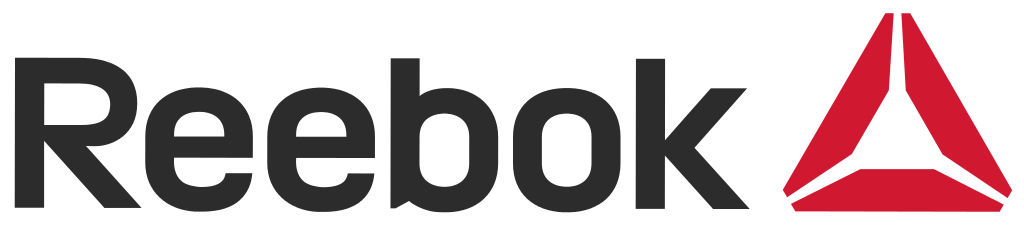
Reebok, a well-known sportswear brand is known for its awesome lettermark, and the soft, red, and segmented triangle that was the perfect inclusion along with that stylish lettering. The new logo was introduced in 2014, intending to target the mainstream market rather than just professional athletes.
The three segmented triangle used here was great at attracting the common people. The soft corners and lines made it seem approachable, something you want in your logo. As for the triangle itself, the segmented shape symbolized inclusiveness, which also attracted a lot of people to the brand. However, it was phased out in 2019.
5- Logos with Triangles as a Symbol
Next up are those brands who use a triangle logo as their primary or standalone symbol in the industry. That means with or without their wordmark, people would be able to recognize their logo just by the triangular symbol associated with it.
Let’s take a look at a few great examples.
Google Drive
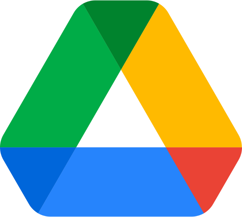
Who isn’t familiar with the multicolored and rounded triangle that is the symbol for Google Drive? And like the other logos that represent one of Google’s products, it manages to represent a lot of things into a simple design.
The different color combinations used in it represent the various other products that are associated with the brand, such as the blue for Google Docs, the green for Google Sheets, yellow for Google Slides, and more. Plus, the psychology of the triangular shape represents that your data is safe and secure within Google Drive.
Google Play
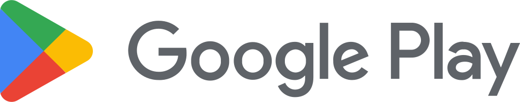
Next up is another Google product, namely the Google Play. Now, while the logo itself has gone through many variations over the year, it has kept one thing constant – a triangle on its side. That represents the play button you would find on media players like DVD players and remotes, to other media services.
And when combined with the iconic color palette of Google, it makes for a great logo that manages to link them to Google and its brand value.
6- Triangular Font Logos
Finally, we come to those logos that use a triangular approach to their fonts or the shape of their letters in the logo. This is a novel approach for some brands, while for others the design seems like an simple and obvious choice.
Some of the top brands who prefer this style for their logos include the following.
Fila
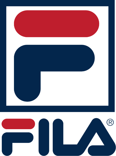
Fila is an Italian apparel brand that has over a century of business experience today. Initially, they developed and sold clothing items specifically for the people who lived in and around the Alps, but later transitioned into making all types of clothing items.
Their logo today is made using all uppercase letters, with the letter A made in the shape of a triangle. While some people may think it is a simple artistic choice as the letter inherently is shaped like a triangle, but that is not the case. The reason they made it into a triangle is to symbolize their business heritage, representing their connection with the mountain range, and showcasing their longevity and durability.
CAT
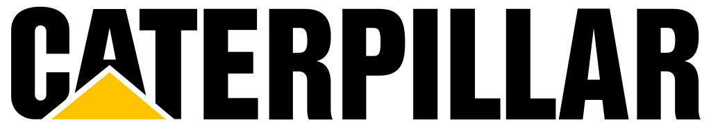
CAT is short for Caterpillar, and represents the Caterpillar Incorporated, one of the world’s largest and most well-known brands of heavy construction and mining machinery. Known for making reliable and massive machinery, it was obvious to use some symbol in the logo that represented that.
Thus, the logo that we are all familiar with came into being, one of the most widely known corporate initial logos of today. The wide based and short height triangle that supports the bold, shortened name of the company on top of it makes for the perfect brand symbol. And when combined with the yellow color that is usually associated with the hard hats and other safety equipment of the construction site, makes for an overall easy to remember logo design.
Conclusion
In short, there are a number of other brands who use triangle logo designs for their brand symbol. However, not all of them manage to turn their logo into a visual masterpiece, one that is known by consumers far and wide.
The ones mentioned above have managed to stand out by ensuring that their triangular brand symbols are more than just a visual component, but something that adds value to the overall meaning of the design.
FAQs
| 1- Which famous American car brand has a triangle logo? Pontiac’s logo is a sharp and slim triangle that points downwards, making it one of the few car manufacturers to feature a triangle logo, and the only well-known American car brand to feature one too. |
| 2- What does a triangle mean in logos? Triangles are supposed to sharp, dynamic, and representative of a multi-faceted entity. As such, they can be useful for businesses who want to portray this imagery to their consumers. Moreover, by tweaking the shape, sharpness, angles and more, you can modify the meaning of the design to suit your needs perfectly, due to the adaptable nature of the shape. |
| 3- What clothing brand is a triangle? Prada has a triangular logo that is quite well known in the fashion and apparel industry. |
| 4- Why do companies use triangles in their logos? Companies use it because the inherent shape of the triangle, with two major lines drawing the eye towards a single point, makes it perfect for attracting the gaze of the consumers, more than any other shape. |
Latest news you want to know!
Subscribe for cutting-edge design inspiration at Logo Poppin! Elevate your brand with updates on logos, branding, web design, and video animation.
Note that by clicking “subscribe,” users may agree to our privacy policy and consent to Logo Poppin to use your contact data for newsletter purposes.
Logopoppin
Logopoppin is a graphic design agency that specializes in logo designing, web development, video production and advanced branding services. We love to innovate businesses with new age technologies, allowing them to improve their visual reputation.

