Table Of Content
Know About the Complete History of Twitter Logo Below
Twitter is ranked among the top social media websites in the world. It only comes second to Facebook in terms of usage globally. When the website was first launched in 2006, nobody knew that one day Twitter will rule the social media industry. Today, everybody knows about the Twitter logo, as it has become an important symbol of social communication globally. From general audience to big celebrities, everyone loves to use Twitter as it offers a unique environment to play with. Though the platform has changed quite a lot since its inception, but it is still quite amazing and fun to work with.
Speaking about Twitter logo, you should know how it evolved over the years. The bird symbol that you see today does not represents the original logo. In fact, the original emblem logo was quite different from it because the company was based on a different idea. A lot of people do not know about this fact, because Twitter evolved rapidly and changed its identity after the first few years of inception. Its history is indeed quite interesting which is why we think you should know about it.
In this blog, we will be looking into the history of Twitter and the evolution of its logo. It will let us know how the company was founded and why it changed the path to become successful in the world. It will definitely be a good read, as it will take you down to the great early days of social media. Let us first start from the basics understanding why Twitter logo is so much famous in the world.
1. Understanding the Popularity of Twitter
Twitter is counted among the top social media platforms in the world. It is used by millions of people around the world, including celebrities, government personnel, military spokespersons and more others. Seeing this huge popularity, you can easily understand why Twitter is loved by everyone. It is a social media platform where you will find presence of everyone. This is the major reason why it has millions of users around the world that are also expanding day by day.
The Twitter logo is indeed known to everyone today. It always pops up on the Google whenever you search about top social media websites or platforms working in the industry. This tells a lot about the prominence of Twitter. Recently, it has been acquired by one of the riches man in the world – Elon Musk. This news alone describes how big the platform has become during the last few years. Just like Tesla, Musk has got great expansion plans for Twitter. This news has been well received in the market, as the stocks of Twitter has seen a massive growth during the few months.
Talking about rivalry, Twitter competes directly with giants like Facebook, Instagram and more others. Now, you would be thinking that competing with such big names is quite difficult, but Twitter has certainly proved it wrong. Through the years, Twitter has kept its dominance and it is still leading over many others in the market. It is therefore growing at a rapid rate which is why its popularity is also increasing day by day.
2. Evolution of Twitter Logo
We all know how famous Twitter logo is in the world. A blue little bird with open feathers certainly looks very unique, as it offers a perfect illustration of a renowned social media brand. However, do you know that this logo is quite different from the original emblem of the platform. Back in 2006, when the website was launched, the logo was not that same as it looks today. It saw various changes during the last few years when company took logo design services from different professionals.
Let’s take a look from the beginning how Twitter logo evolved over the years.
Twitter Logo – 2006
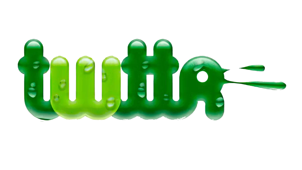
Twitter was first launched in 2006 by four aspiring minds Evan Williams, Biz Stone, Jack Dorsey, and Noah Glass. Though these men picked up some grudges against each other which later resulted into the split of partnership, but still they are termed as the early fathers of Twitter. When it was launched, the logo was quite different that we see today. It was based on a total green theme with a unique flare of splash on it. This logo also looked good as people appreciated the unique designing theme behind it.
This green logo precisely illustrated the idea of freedom and nature. It was totally based on the wordmark, expressing a great flare of simplicity and minimalism. It was created by designer Linda Gavin who is actually quite an experienced logo designer. He rightfully understood the idea of the owners and converted it into a simple wordmark that gave a good depiction of a social media startup.
This logo is also considered historic because it showcased the word “twttr” instead of the full name. This was quite intentional, as Williams and Dorsey wanted to represent the platform identity in a unique manner. It was short and easy to read, but was still changed in 2010 when company thought for a creative rebrand.
Twitter Logo – 2010

Coming to 2010, the company precisely noticed the change in logo design trends. The realized how other companies are rebranding themselves in which Facebook stood out as a good example. Seeing that, they decided to give the theme of Twitter a new look, as it was becoming an important need for them. This time, a complete overhauling in colors were required, so that a new look can be represented in the market.
To make the rebranding noticeable for the people, blue was chosen as the main color for the logo. There were various reasons behind the selection of this color in which the most important one was its relevance with the social media category. At that time, blue was seen as the major color for social media sites. From Facebook to mySpace, many were using blue which is why Twitter also decided to rebrand its theme with the blue color.
Apart from using the blue color, the brand also decided to use the full name in the logo. This time, they used the entire Twitter in the emblem, so that a strong company identity can be demonstrated. It was written in the small letters, as the earlier wordmark was also in small. This new logo got a huge appreciation from the market, as Twitter finally found a solid logo to exhibit its identity.
Twitter Logo – 2012
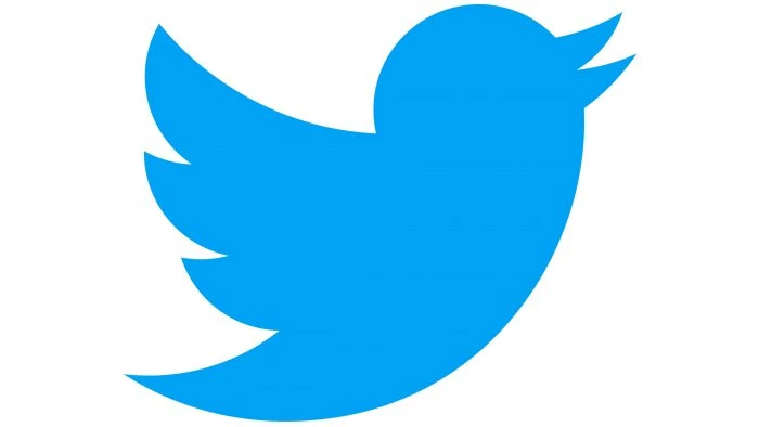
With the start of 2012, Twitter came up with a new idea of rebranding. This time, they didn’t go for the full overhaul, instead decided to do little tweaks in the logo. Earlier, the brand had used wordmarks to represent its identity, hence something was needed new this time. To meet the challenge, a new symbolic bird was introduced alongside the main logo. This move worked tremendously well for the company, as followers of the platform loved the new emblem.
The designing of this bird indeed looked very creative. It was not conventionally designed with a straightforward approach. Instead, it was uniquely designed in a vector style to give the logo a more astute look. A similar type of redesign was also in the Starbucks logo. Some people said that Twitter also got the inspiration of rebranding from Starbucks. Both of them had some similarities, which is what forced people to take some guesses. Anyway, this change was received well in the market, as the new Twitter bird became an instant hit.
Today, this sole bird is seen as the total representation of Twitter at many places. People who use social media regularly know about this bird very well. Whenever it pops out alongside any statement, it directly refers to some kind of tweet. It could be said that the introduction of bird symbol was a masterstroke by Twitter that certainly helped to enhance the popularity of the platform.
3. Core Design Elements of Twitter Logo
Twitter logo is designed quite smartly. The elements used in its designing are picked and used according to a definite plan. Those who know a bit about designing can understand this fact. From colors to shape, everything is used in the Twitter logo with a precised mindset. This is the major reason why it looks so perfect, offering a clear & subtle image of the brand.
For beginners who do not know what these design elements are, lets take a look at the listings give below.
Shape and Symbol
The shape and symbol of Twitter is quite unique. It is created with a definite mindset i.e. to exhibit a distinctive brand identity. Basically, the shape of the logo is created by keeping the picture of hummingbird in mind. It was designed by Martin Grasser who is quite well known for his designing skills. He used a combination of 15 circles in the design to build a perfect geometric shape. This smart approach gave every part of the logo an astounding perfect look. From wings to head and belly, everything is designed in the new symbol with a sheer art of geometric perfection.
Color Theme
The color picked for the logo is completely blue. It is selected keeping the general concept of social media theme in mind. Generally, blue is used by social platforms to exhibit their identity, as it suits them more. So, Twitter also decided to give its identity a strong rebrand using the blue colors. It worked well for them, because since choosing the blue color, they have not reverted the changes. The blue hummingbird specially looks very attractive, offering an astute bold image of the platform.
Final Words
That brings us to the end of this blog in which we have discussed about Twitter logo in detail. The designing of this emblem is certainly very unique, as it is created with a sheer artistry of perfection. The logo however you see today is not the original one, as the company had a different logo when it was first launched in 2006. We have covered about that evolution in detail above, so that you can know the core origins of this logo.
Meanwhile, if you are looking for an agency that can help you to develop unique social media icons and logos, get in touch with us today. We have plenty of experience in designing all types of branding stuff rightly as per the given requirements of clients.
Frequently Asked Questions (FAQs)
| 1. Why is Twitter famous? Twitter is one of the top social media platforms in the world. It is used by millions of people and is being rated as the best platform for a variety of reasons. Today, it comes only second to Facebook in terms of regular usage. All of these facts describes precisely why it is quite popular and continues to grow big with each passing day. |
| 2. When was Twitter launched in the industry? Twitter was first launched in the market in 2006. This was the time when only few social media websites were working on the digital space. So, Twitter can be counted among the early founders of social media in the world. |
| 3. When was the second Twitter logo introduced? The second Twitter logo was introduced in 2010 with a complete overhauling. It changed the color theme of the logo and adopted a full straightforward wordmark to demonstrate a strong identity of the platform. |
| 4. What is the color of Twitter logo? The color of Twitter logo is blue, as it portrays a sense of nature and calmness in the design. This color was first picked in the 2010 version of the logo, and since then, the company has decided to stick by it. |
| 5. What is the name of the bird used in new Twitter logo? The name of the bird used in new Twitter logo is Hummingbird. It is creatively designed using the combination of 15 circles to keep a perfect geometry in the design. |

Logopoppin
Logopoppin is a graphic design agency that specializes in logo designing, web development, video production and advanced branding services. We love to innovate businesses with new age technologies, allowing them to improve their visual reputation.


