Table of Content
Discover the Different Types of Logo Design That Brands Big or Small Love to Use
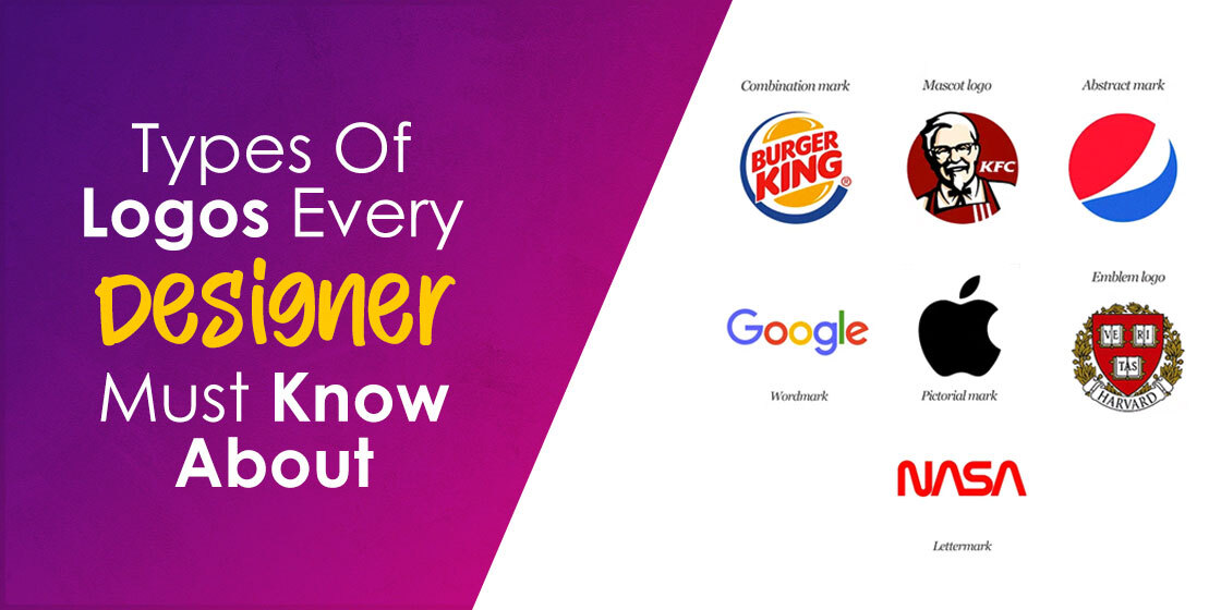
Are you all set to launch your business but struggling to design the best logo to stand out in the industry? There are several types of logos to take inspiration from.
Before designing your logo, understand that it needs to develop positive associations between your brand and the target audience. But the question is, what kind of logo, symbol, or emblem would work for your business or brand?
The logo’s success lies in a carefully selected color palette, image, logo fonts, or layout. It’s also essential to conduct extensive research to design a logo that keeps you two steps ahead of competitors and resonates with your target audience.
We’ll be discussing different types of logos in detail to make the designing part painless and fun! And we will take a look at how professional logo design services use these types of logo design for maximum impact.
So, let’s begin.
Monogram Logos

This logotype consists of letters and is also known as typography-based logos. It uses the abbreviated initials of a business name. You can also spruce up the logo design to building an innovative logo.
The type also becomes the best logo example of simplistic designs. Know that well-established businesses often use monogram logos that have built a name in the industry and don’t need personal branding.
For example, Minnesota Mining and Manufacturing company use 3M as its logo.
Which Brands Can Go for It?
You might be familiar with CNN or NASA. But can you recall the news channel or space agency’s full names?
It’s challenging to remember; therefore, Cable News Network chose CNN, and the National Aeronautics and Space Administration chose NASA for the logo.
The monogram logo design also makes the best choice for companies or businesses with lengthy or difficult-to-pronounce names. It also makes the best option if using initials is expected in your industry.
Emblem Logos
Did you know emblems are the oldest kind of logos? These logos typically feature text and images, and due to historical association, they give an impression of heritage and history.
If you observe, many beer brands opted for emblem logos for the same reason. Because in the beer market, customers trust the heritage of the brands they purchase from.
Moreover, emblems can become a great option when conveying the vibes of responsibility and tradition. That’s why educational institutions and government departments have fascinating symbols for illustrated logos.
Which Brands Can Use these Logo Types?
No doubt, people appreciate the traditional vibes in the public agencies and school logos. But you can use this logotype for private businesses, especially if the brand belongs to the food or beverage industry.
These logos go well with the beer brands. You can also opt for professional branding agencies to get the visually appealing logo with traditional vibes for your beverage brand.
Another great example is Starbucks logo. The brand’s iconic mermaid logo is unique and memorable. However, you need to be cautious when opting for the emblem logo. It involves details, and you don’t want to print untidy logos on your marketing material.
Mascot Logos
Mascot logos are among the best types of logos that help you represent your brand’s face featuring a fun character. You can consider your business and its target audience to get inspiration for the mascot as well.
It could be a fictitious character or an actual person who laid the foundation of the company. The mascot can also serve as your brand’s ambassador.
Moreover, suppose you’re looking for ways to create a wholesome environment to attract children and families. In that case, mascot logos can do that for you too.
You can make these mascots a fun attraction at events, as they impact the atmosphere by mingling with the attendees.
Which Brands Need This Logo Type?
If your brand or business belongs to the sports, entertainment, food, and beverage sector, the mascot logo can be a great choice.
Using a mascot will allow you to connect with your audience on a personal level. You can use the fun mascot in social media campaigns or even at company events.
Sports teams often have a mascot which is a fantastic way to connect and engage the fan base. The colorful and cartoonish character won’t only set you apart but also make your brand recognizable.
You can see brands, for example, KFC and Mr. Muscle, for inspiration. Many NFL and NHL logos feature a mascot, such as the Vancouver Canucks or the Pittsburgh Penguins, proving the popularity of this style of brand symbols in sporting organizations.
Wordmark Logos

It is the classic and pure logo design form and is sometimes known as a “logotype.”
Companies with short names often go for wordmark logo design. Even if your company name has two words, you can stack them to develop an eye-catching wordmark logo saving space.
More importantly, your company’s name can become a visual landmark of your brand without using symbols, typography, and illustrations.
Take Google and The New York Times, for example. Without imagery, you can still incorporate aesthetics using color, spacing, shapes, and characters.
Which Brands Can Use These Letterform Logos?
You can consider a wordmark logo if your business is new in the industry and needs exposure. With the wordmark logo design, you are likely to spread the name.
However, ensure that the name is short enough to make an appealing design because the longer term might look cluttered.
It is one of the best types of logos for businesses with a unique name and wants customers to memorize it instantly. On the other hand, these logos are easier to replicate to use across branding and marketing material.
Pictorial Mark Logos
A pictorial mark or logo symbol is a graphics-based logo, and a type of illustrated logos. Think about the brands such as Target, Apple, and Twitter. Your mind might recall the icons of the bullseye, half-bitten apple, and blue-colored bird.
There’s no denying that these logos are recognizable because these brands are established. A pictorial mark contains an image that serves as a genuine brand mark, and write. as can be seen for a number of famous superhero logos like Superman, Batman, or Spiderman’s symbol.
The only challenging aspect of going for a pictorial mark is choosing the image. Therefore, ensure that it will resonate with your audience and conveys your brand message.
You can also think about broader implications associated with the image. Hence, ask yourself if you want to experiment with your brand’s name, or you want to go for a deeper meaning or evoke an emotion.
Which Brands Can Use This Logo Types?
If you want your brand to be portrayed precisely, the pictorial mark can be a fantastic choice. You can take Apple logo, for example; the brand’s name is illustrated in the logo.
On the other hand, it might not become the best choice if you want to appear as a serious and traditional brand because choosing the right image would be challenging.
You shouldn’t think about using the pictorial logo if you’re planning to introduce more products or services. For example, the lighthearted emblem of the Miami Dolphins logo works well for a sports team, but a bank or investment firm will not do well with a cartoon-like emblem as its pictorial representation.
Abstract Logos
You don’t want to showcase literal meaning but like an image for your logo. In that case, abstract logos can become your ultimate choice. You can choose this type if you want to avoid literal representation.
In different types of logos, abstract logos can help in evoking feelings rather than a thought. The factor might be problematic, as not everyone can correctly interpret the image.
The best part about choosing the abstract logo is that no one has a logo like yours, and you will stand out in the market. The emblem of the footwear and apparel brand Nike becomes an excellent example of an abstract symbol.
It’s dynamic and conveys the vibes of energy and movement. The logo also tells what the brand stands for, even when you’re unfamiliar with the brand.
Which Brands Can Take Benefit from It?
Abstract logos promote immediate and distinct recognition. Therefore, if you want to incorporate a pictorial element to your emblem but maintain a serious tone, the abstract logo will be a safe bet.
It will also allow you to represent your brand’s purpose symbolically, giving specific meaning to the logo that aligns with your brand as well.
You can choose the abstract logo if you run a business in a competitive market to stand out. The type is ideal for global commerce, where you need a symbol catering to cultural diversities.
And if you’re sure that your products or services may change in the future, going for the abstract logo is a wise idea.
Combination Mark Logo
Do you think logos with an image are mainstream? Or do you want something more than words in your logo?
If yes, the combination mark may be the type that you have been searching for. You can combine an eye-catching symbol with a stunning wordmark to create something unique and attention-grabbing.
Think about brands such as Doritos, MailChimp, Dove, and Burger King. These brands make the best example when it comes to using the image and words together.
A wordmark featuring the brand’s name with the symbol will make your logo versatile, and people will start to link your name and image together.
Combination marks are one of the types of logos that you can trademark easily than pictorial marks.
Which Brand Can Use the Combination Mark?
The text and image in the combination mark reinforce a brand and become an excellent option for businesses from any industry.
Whether you’re a startup or longstanding corporate firm, you can never go wrong with the combination mark.
When you use the combination mark elements separately, people recognize the brand either by the symbol or wordmark. The factor helps in boosting and maintaining brand recognition as compare to the pictorial mark.
Letterform Logos
If you observe different types of logos, you will find letterform logos are the minimalistic version of monogram logos. You need to keep the overall design bold and captivating.
It is challenging to design the letterform logo because you need to represent your brand using only one letter.
Moreover, letterform logos are scalable. You can use the type of logo from the web to print materials. They look innovative and modern. Once people see the letter logo, it will invoke the brand’s full name in your audience’s mind.
For example, when you look at the letter “M” in yellow, your mind instantly recognizes that the logo belongs to McDonald’s.
Which Brand Can Go for This Logo Type?
If a simplistic and minimalistic logo is your brand’s need, you can opt for the letterform logo. When your logo consists of only one letter, it becomes easier to stick the logo anywhere without compromising its quality. As a brand, if you don’t have a specific message for your audience, you can go for the letterform logo.
However, if a company is new and stays behind the comprehensive promotion, you need to avoid using the letterform logo. These logos won’t make much difference to your audience if they aren’t well-aware of your brand.
Lettermark Logos
Lettermark logos are distinct from the similar types of logos such as letterform and monogram symbols. Although all three represent different types of logos, all serve specific purposes and should be used in situations that warrant their use, and can be used as logo variations.
Let’s say that your brand name is long, consisting of two word or longer, or if it is a word that doesn’t lend well to typographic stylings of traditional types of logo design. What type of logos should you use then?
An amateur designer may opt for a simple wordmark, but as we have established, that may not be the best choice. So what style should you use? The answer is quite simple – lettermark logos. These brand logos are quite amazing at making successful brand symbols out of otherwise lackluster brand names.
They work by using the initials of your brand name to create a shorter word. And when it is done well, the resultant logo often transcends the actual brand name. And some of the greatest examples of this type of logos include NASA and BBC.
What Type of Business Should Go for Lettermark Logos?
As we mentioned earlier, businesses with long names that either have two word or more in them, or consists of names that are too long to fit within a good wordmark, should go for a lettermark. Moreover, it could also be used as an alternate logo for an established wordmark, serving in places and mediums where the full wordmark logo won’t fit.
Unique and Modern Types of Logos Derived from the Established Logo Styles
While the different types of logos we have discussed above are the most common styles, their implementation often takes distinct formats. And sometimes, a few of those distinct formats get popular enough to become their own distinct style.
Here are a few such uncommon but fun types of logo design styles that you may consider for your brand.
Slime Logos
A style of new-age brand marks, slime logos contain cartoonish context that was especially popularized during the 90s and early 2000s era of Nickelodeon. These types of logos don’t feature standard symbols or wordmarks prominently, but rather emphasize the fun and texture of the gloopy slime in their design.
Brands that cater to kid’s interests or serves fun and playful purpose can choose to use slime logo design for their brand logos.
Dynamic Logos
Another modern type of logos is the dynamic mark. These symbols adapt to the context in which they are being used. The logo elements can be changed on different branding elements or the internet instead of having a standard logo color-text-font combination.
Also, dynamic logos contribute to keeping things interesting. Opting for these types of logos means that your audience might wait to see what you come up with next.
Typography inside a Shape
For these types of logos, the wordmark stays inside a geometric shape, such as a rectangle, circle, square, or even a mix of them. You can find many examples of popular brands doing so, including Ford, MasterCard, and Levi’s.
The idea is best to convert and promote your wordmark into a symbol, thus improving your brand identity and recognition.
Negative Space Logos
Negative space logos are one of the more interesting types of logos that rely on our visual perception to turn nothing into beautiful, elegant symbols. Rather than create the entire design from scratch, they trace out a design that looks entirely different when seen in another aspect, often requiring you to unfocus your eyes for a second to be visible.
This can be witnessed in the logo for NBC, as well as Pittsburgh Zoo and Aquarium. The apparent design shows one thing, but unfocusing your gaze for a second allows you to see an entirely different image in the design, made entirely out of empty space.
3D Logos
3D logos are a type of logos that use a design that mimics the depth of a three-dimensional shape rather than the traditional flat designs of logos. Using logos, gradients, and a variety of design styles, these logos stand out among the crowd, while also allowing for new ways to use these logos in various applications.
Some of the most popular designs using 3D include the older style of the Xbox logo, with the large, silver and green orb. However, a recent drive for simpler brand logos mean that 3D logos have largely been phased out of the industry for the time being.
Animated Logos
Animated logos are an advanced, or more elaborate form of static logos, that are designed to make the logo more attractive. These consist of either a series of static frames joined together into the form of a GIF, or a short video that serves the same impact.
Animated logos are perfect for mediums where users can observe the change; basically applications where display screens are used. Prime examples of this style of logo design include the Netflix logo seen at the start of many Netflix Originals, or the Pixar logo with its animated lamp at the start of many of our favorite childhood movies.
Hallmarks of Successful Implementation of Different Types of Logos
For any business, it’s essential to build a cutting-edge logo to promote brand recognition. When studying how to create a logo that resonates with your brand, businesses often opt for different styles of logos before selecting the one that best fits their aesthetic.
Each type contains elements, such as color scheme, layout, effects, and the types of fonts for a logo that make it captivating. The following factors also contribute to a logo design’s success regardless of the types of symbols.
Simplicity
Don’t ignore simplicity when it comes to designing a unique logo. Simple logos are easy to recognize; that’s why more prominent brands, such as Apple, opted for the simple design.
It is simple, recognizable, and memorable. Not to mention, people can recognize its logo even from a distance.
Memorable
A memorable logo is the one that pops up in your mind at the mere mentioning of the brand or product’s name.
Don’t believe it? Don’t you imagine yellow arches when someone mentions “French fries?” McDonald’s did a great job in designing a simplistic yet memorable logo.
Timeless
Hiring designers to modify your logo will cost you money to invest in your company in various ways. That’s why your focus should be on designing a timeless logo, as it will last for decades.
Take the logo of Coca-Cola, for example. The beverage brand’s logo features an elegant red wordmark. The mark is virtually the same, and the brand has been using it since 1885.
Versatile
Maintaining versatility in a logo is incredibly important. The best example of the versatile logo could be Nike. Its color scheme and reverse print stand out in the footwear and apparel industry.
On the other hand, whether it’s postcards, flyers, billboards, or print, the Nike logo goes well at any size.
Appropriate
The best logo communicates your brand message to the appropriate audience. Moreover, the color combinations, font, and graphics also help in promoting the brand’s essence.
The Toys “R” Us logo becomes the best example, as it evokes fun memories of childhood.
Frequently Asked Questions
| 1. What are the types of logos? You can choose from several types of logos. – Abstract logos – Combination marks – Emblem logos – Mascot logos – Monogram logos – Pictorial logos – Letterform logos – Slime logos – Dynamic logos – Symbol logos |
| 2. What is a perfect logo? A perfect logo promotes the intended message and is appropriate, distinctive, and realistic. It is simple in form and is easier to print at any size. The perfect logo is also effective without colors. And it needs to have great concept and execution. |
| 3. How many colors should a logo have? A logo’s color palette shouldn’t include more than three colors. You can go through the design templates from expert designers to get an idea of a color palette. These palettes are contrasted and rendered to make the best visual appearance. |
| 4. What is a modern logo? A logo containing classic and trending elements to design a brand mark that appears vibrant and fresh is known as the modern logo. The contemporary design consists of simple lettering, color, and sleek lines, including highly defined elements. |
| 5. What is a minimal logo design? Minimal logos don’t contain multiple fonts, shapes, and colors. Instead, these logos feature a basic and simple design concept that can be used across different mediums and backgrounds. Nike becomes the best example of a minimal logo. |
| 6. What is a vintage logo? Classic style or vintage logos contain a weathered or grunge appearance. These logos also follow a minimal color scheme that is muted or dulled. |
Summing it up!
No doubt, choosing the right type from various types of logos can be challenging and time-consuming. You need to know the brand from the inside out to make the process immeasurably easier.
It’s even better to understand the positioning, foundational messaging, and personality of your brand. This way, selecting the logo’s type for your brand will become intuitive and won’t become a guessing game.
To achieve this level of understanding, you need to do extensive brand research. It might also include information about the audience you want to target and the message you need to convey.
After research, you can choose different elements to incorporate aesthetics into your logo and design a unique one.
Need a logo for your brand? It’s time to collaborate with us and get an impressive design for your brand featuring innovative features.

Logopoppin
Logopoppin is a graphic design agency that specializes in logo designing, web development, video production and advanced branding services. We love to innovate businesses with new age technologies, allowing them to improve their visual reputation.


