Table of Content
Discover How You Too Can Create a Great Typography Book Cover Design
You all know how the old adage goes – “Never judge a book by its cover”. But when it comes to actual books that is easier said than done. When people browse through new books looking for something to read, most people look at the cover to see whether the book seems interesting. So automatically, we can say that focusing on the design of your book cover is imperative. And it is doubly so if it for typography book cover designs.
First impressions are important. And for books, which are primarily a text-based medium, their cover art serves that purpose. That is why designers focus on each element of its design, from the fonts used to the colors, and even any additional art in the background.
Most importantly, they need to consider how their target consumers for the book would react to that cover art. Because no matter how visually pleasing a book cover may look, if it doesn’t speak to your target consumers, it would be considered a failure.
So, let’s dive in and understand how to go about creating the perfect typography book covers, and learn some tips to ensure that your design is a success. We will also take a look at how professional eBook design services make simple typographic designs and turn them into amazing cover art for the ages.
What is a Typography Book Cover?
A typography book cover is a book cover that uses some sort of typography as its cover art. Often times, there are situations where the concept of your book cover ideas cannot be described through an image. Rather, some form of typography is considered the better choice for it.
In those cases, the cover art is designed to make the typography the hero of the design. Using amazing fonts, as well as design techniques, colors, and more, eBook designers can easily make a simple, text-based book cover and turn it into a design masterpiece.
You may have seen many such books without realizing the style of their covers. And that is exactly what a good book cover is supposed to do. They need to be so good and effortless at portraying their message that nothing else, such as the style of their design or other factors, registers for the reader until they look for it specifically.
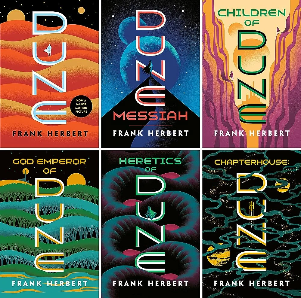
Now, while it may seem that a book cover with typography-based design might not have as great of an impact as one that features imagery prominently. However, examples like the Dune series of novels would prove you wrong. While their designs are not purely typographic, the focal visual element of their cover art is the typography.
Why Does Typography Book Cover Design Matters for Your Book’s Success?
Well, it is true that the contents of a book, its storyline and style of delivery is what hooks a reader into keeping reading. However, there is one element that cannot be ignored in this journey of a book’s success, and that is the art book cover design for your book. That is because the simple fact of the matter is that no matter how good a book, unless they pick it up interestedly, there is little chance of them reading it. And what makes them pick the book up? That’s right; it is the cover art.
Now, it doesn’t matter if your book’s cover art is typography-oriented or imagery-oriented. In either case, it is imperative that the designer focuses on the typography. In the former case, it’s because the typography is the star of the design, and as such requires utmost care and patience. For the latter, your typography needs to integrate seamlessly with the rest of the design, and thus require a lot of care and creativity.
There are a lot of elements that need to be addressed when it comes to typography. From the fonts used to their size, color, style, additional textures, and much more, there is lot that can be tweaked to make your typography book cover design look great.
Even in imagery-centric book covers, the typography is meant to stand out. The reason is that at the very least, the title of the book and the author’s name are two elements that need to stand out, no matter how great the rest of your cover art.
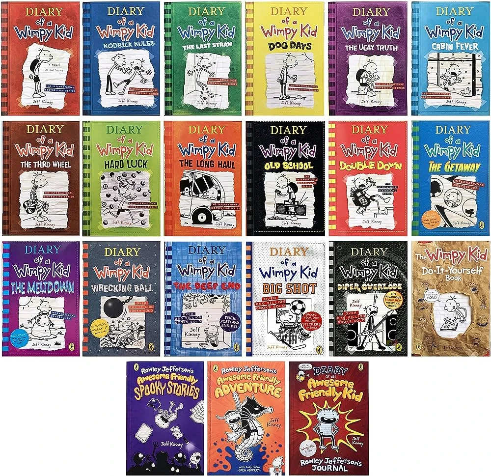
Therefore, its important that your style of typography not only matches the vibe of the rest of your cover art, but also needs to stand out without clashing with the rest of the design. Take for example, the Diary of a Wimpy Kid series of books. Despite the fact that the cover art has imagery on it as well, the typography stands out and identifies the book for us.
And that is why it is so important to the success of your book covers.
Design Your Book
Cover to Stand Out.
Create a captivating book cover design that will grab readers' attention.
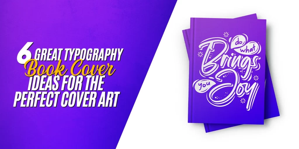
6 Great Typography Book Cover Ideas to Help You Create the Perfect Cover Art
When it comes to any of the great typography book cover ideas, the idea behind their design is to make them stand out to give an insight into the theme of the book. Your choice of typography can convey feelings like love, loss, excitement, melancholy, and much more. That means that when done right, your typography-based cover art can portray the theme and tone of your book far better than just an imagery-based design, such as popular comic book cover ideas.
Now, besides portraying the essence of the book itself, the typography also needs to be engaging. The reason for that is that the typography needs to attract readers to the book too. But how can you do both in a way that doesn’t dilute the essence of your typography book cover design?
Well, let’s take a look at the typographic book cover art of some popular books, and see how they have managed to do it.
Push – A Novel by Sapphire
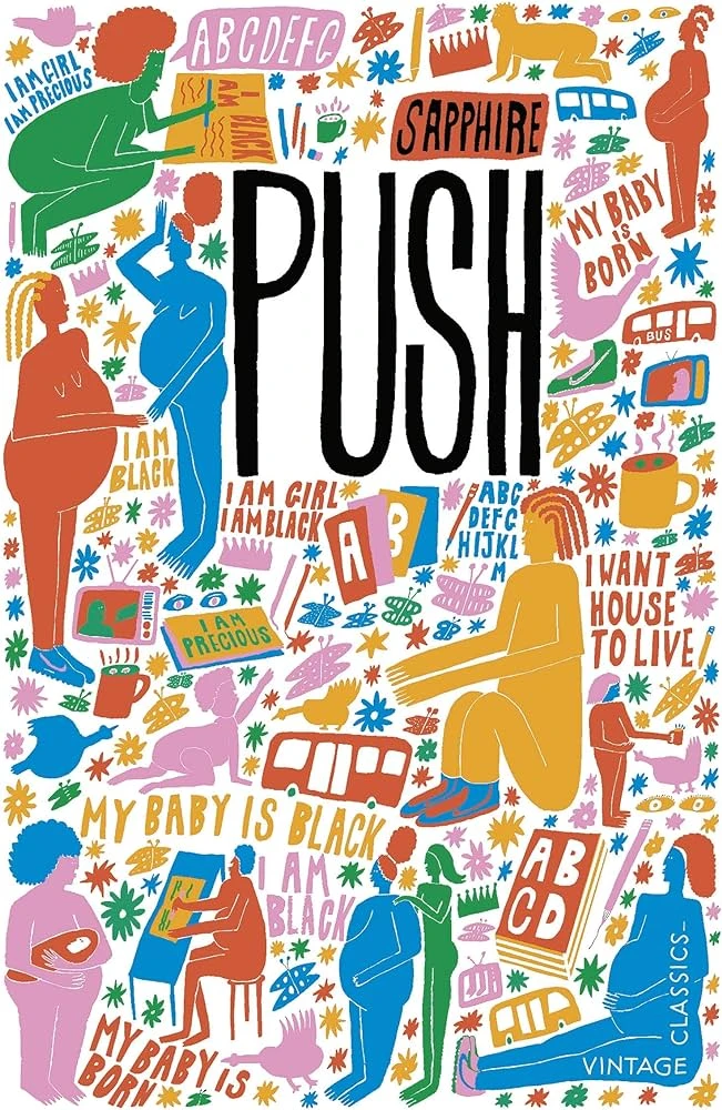
Push is a novel by the author Ramona “Sapphire” Lofton. It tells the story of a pregnant, African-American teenager who has suffered from abuse and neglect all her life. With little education to fall back on, and expecting her second child, she is fed up with her life, believing that there is nothing more to life than hardship, neglect, and a lack of love.
However, she starts at an alternative school, under the tutelage of a kind and understanding teacher who pushes her to become something more than her what her circumstances made her into. This push helps her make a change in her life, cutting ties with her abusers, and looking to build a happy, hopeful life with her children.
Now the book is written in a diary-like narrative, which is important considering the design of the cover. If you look at the image, it looks more like a journal or a diary than it does a novel. In fact, at a glance, this has more in common with many YA and children’s book covers than the serious genre it actually belongs to.
Even the title of the book in the middle is made to look as if hand drawn in the small title section of the journal cover, making it add meaning to the design. Moreover, all around the cover, there are snippets of text that represent the meanderings of a girl who believes her identity and worth is centered around her skin color and gender, and that it represents why her life is the way it is. Overall, this is an impressive book cover that subtly attracts the reader while giving away the theme of the book.
Eat, Pray, Love – By Elizabeth Gilbert
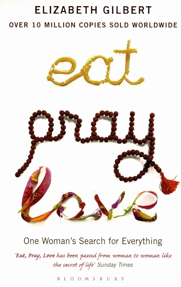
Eat, Pray, Love is an iconic book that has become a one of the most sought after books today. Written by Elizabeth Gilbert, the book tells the story of a woman who has gone through a bitter divorce, and has travelled the world to gain a fresh perspective on life. A form of autobiography of Gilbert herself, it chronicles her journey through three phases – Eat, Pray, and Love.
Each phase represents her travels to a specific country. “Eat” refers to her time in Italy, where she spent some months enjoying her freedom and the great cuisine of the country. This word on the book cover, is written using a variety of pastas, representing the design’s origins.
“Pray” refers to the time she spent in India rediscovering her spiritual self. And this word is represented by a set of rosary beads. Finally, the third word is “Love”, represented by a wreath of flower petals and such, and represents the author’s time. It represents the time she spent in Bali, and met a man she fell in love with, who she married by the end of the book.
Each word is written in the style of handwritten script, which makes the book cover seem unique and creative, yet still managing to connect with the themes inside in a subtle manner. Overall, this is one of the best typography book cover ideas to emulate in design.
On Gravity: A Brief Tour on a Weighty Subject – By A.Zee
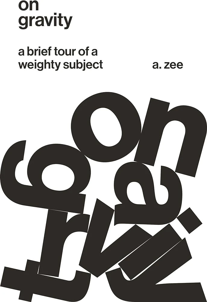
Next up we have an interesting book called On Gravity. This book is written by physicist A. Zee, and tackles the subject of Albert Einstein’s theory of relativity. Considering that the topic is about relativity and black holes, the typographic design plays with the concept of the book and its title itself in the cover art.
The book cover represents the idea that absolutely nothing escapes the gravitational pull of the a black hole, not even letters on a book, so to speak. This design not only enhances and explains the idea of the book, but it does so in a manner that makes the book look like it is going to be an interesting read.
Considering that the book is on a subject that many people not related to the sciences find boring, this type of cover art is a great way to get people interested in the topic. Overall, this style of book cover ideas are great if you want to represent something uninteresting in a manner that makes reader pick up the book out of sheer interest.
The Courage of Hopelessness: Chronicles of a Year of Acting Dangerously – By Slavoj Zizek
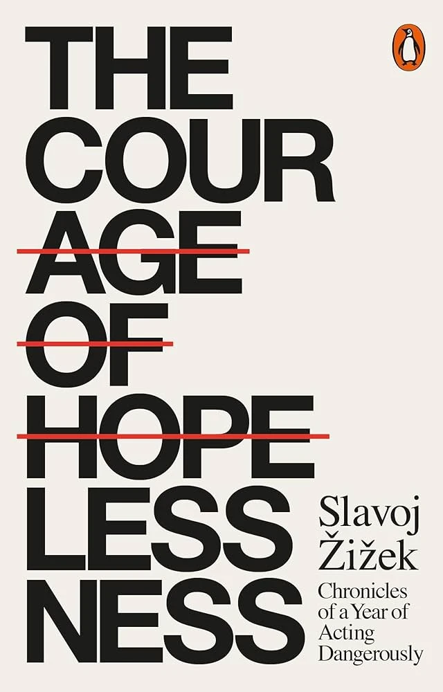
In our next book cover, the cover artist plays with words to give an otherwise lackluster book title some little panache. Taking a look at the book’s cover you see that the words were “Age of Hope”, that were then crossed out and the new title was added, which added to the original, crossed out words.
The new title thus becomes “The Courage of Hopelessness”. This type of clever, creative wordplay in design is one of the most impactful ones, and is highly effective if performed correctly. However, if you fail to connect that wordplay with the themes of the book, then unfortunately, you will end up with a cover art that would be of no use to anyone.
The beauty of this typography book cover design is that there is not no other elements on the cover. That means that the entire job of attracting people to the book lies on the typography itself. Therefore, if the style of your typography is all about minimalism, your cover art should focus closely on its typographic design elements.
An Unkindness of Magicians – By Kat Howard
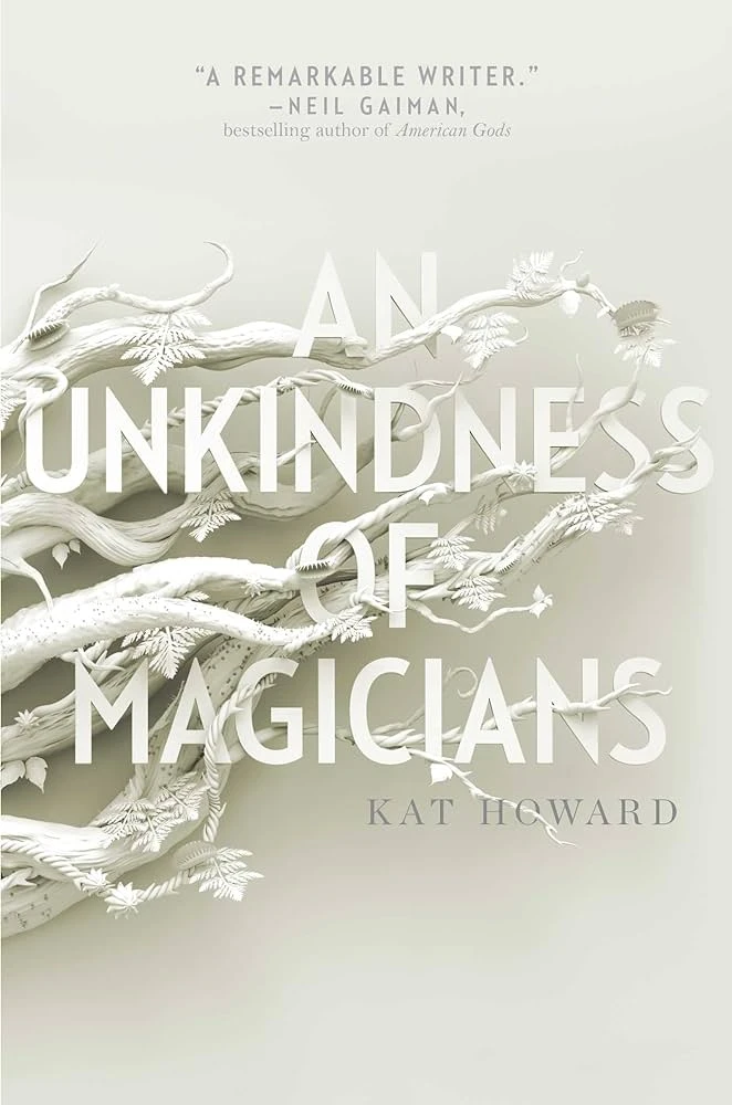
In recent years, abstract typography has become more popular, with people creating typographic design for book covers that meld with other design elements for a truly remarkable experience. This is similar to the next book on our list, called “An Unkindness of Magicians”. Written by Kat Howard and designed by Liz Bromley, the cover art is truly remarkable, with typography that seamlessly blend with the other design elements.
Despite the cover art being mostly monochrome, the details of the typography are sharp and clear, with the subtle accents of green-gray accents only serving to enhance that impact. The thorny, sharp-edged tree limb in the picture lend a decidedly cold and sinister feel to the typography book cover design’s mystical vibe.
Overall, this type of typography book cover ideas work quite well with fantasy novels that deal with the themes of magic, mysticism, mystery, and more.
In the Woods – By Tana French
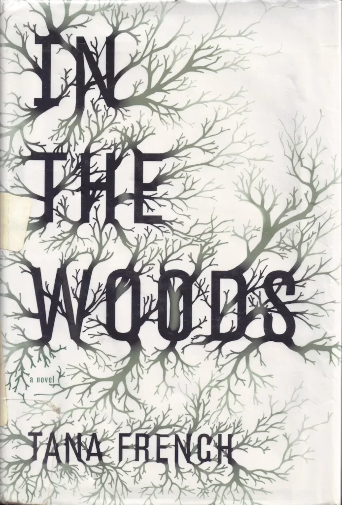
In the Woods is an entrancing mystery novel by Tana French, as the debut novel for her Dublin Murder Squad series. With its sinister overtones, and an aura of mystery that the title of the book provides, the cover art uses a design that perfectly embodies that essence, and entrances the reader into picking it up.
The story revolves around Detectives Adam “Rob” Ryan and Cassie Maddox, who are investigating the murder of a 12-year-old Katy Devlin. Pulled to the site of his own childhood trauma, Ryan grapples with his amnesia and his desires, all the while looking to find out who murdered the girl. Throughout the novel, a mysterious aura around Ryan’s past keeps the reader guessing whether it is just a vanilla mystery or something more.
As to the typography book cover design, the style is somewhat similar to the previous book cover on our list, which blended the typography with the background elements seamlessly. However, while that one was more mysterious than anything else, the sharper edges of the stark, naked trees make their branches look like claws, making the design more sinister than anything.
Overall, if you are looking for the perfect typography book cover ideas for your mystery thrillers, then this is a great one to add to your list.
Tips to Create an Amazing Typography Book Cover
Now that you’ve seen why typography book cover design is important, as well as taken a look at some great typography book covers, you are ready to begin designing your own book cover art. However, before you do that, here are some tips to help you ensure that the designs you create are exceptional, and successful.
Let’s begin.
Discover your Ideal Fonts that Match Your Genre and Vibe
As we discussed earlier, specific fonts and font styles have the ability to personify specific vibes or genre. For example, spiky, serif fonts are often associated with genres like mystical mysteries, horror, and other such genres. Blocky, digital, futuristic fonts are more commonly associated with genres like science fiction. That is why you should find the perfect fonts, which match your genre’s vibe and the tone of your book.
Less is More
Minimalism may feel obsolete when talking about typography book cover ideas, considering that many people believe that typographic designs are inherently minimalist. However, sometimes, keeping your fonts and typography simple is exactly what you need to enhance the impact of your design. Think about the book we discussed earlier; “The Courage of Hopelessness”. See how its minimalist design perfectly depicts the vibe of the book itself.
Plan Your Layout and Visual Hierarchy of Typography
When looking at various typography book cover ideas for inspiration, there is one element that many fail to address. And that is visual hierarchy of fonts in your typography. On average, there are at least two sets of typography on the cover of your book. One is the title of the book, and the other is the name of the author.
Now, you will have never seen a book where the author’s name and the book name is written in the same size and font. The title is always quite more prominent, while the author’s name is somewhat less prominent. This makes the flow of your typography logical, which makes the flow of information and the impact of your cover art better.
Custom Fonts are Your Friends
Using everyday fonts for your typography book cover design is like using your finest china and cutlery to eat buttered noodles. Its mismatched. Customizing them for your design however, improves its impact a several degrees of factors.
Once you find a font you like, you can tweak it in tools like InDesign or Illustrator to make it more suitable for your book cover, while also giving it a unique twist.
Further Reading:
Conclusion
To sum it all up, finding and using the desired typography book cover ideas for your cover art is easier said than done, especially if you do not know the impact of different elements on your design. However, if you are looking to create an amazing typography book cover design, this article here is a great place to help you start your journey.
Latest news you want to know!
Subscribe for cutting-edge design inspiration at Logo Poppin! Elevate your brand with updates on logos, branding, web design, and video animation.
Note that by clicking “subscribe,” users may agree to our privacy policy and consent to Logo Poppin to use your contact data for newsletter purposes.
Logopoppin
Logopoppin is a graphic design agency that specializes in logo designing, web development, video production and advanced branding services. We love to innovate businesses with new age technologies, allowing them to improve their visual reputation.