Table of Content
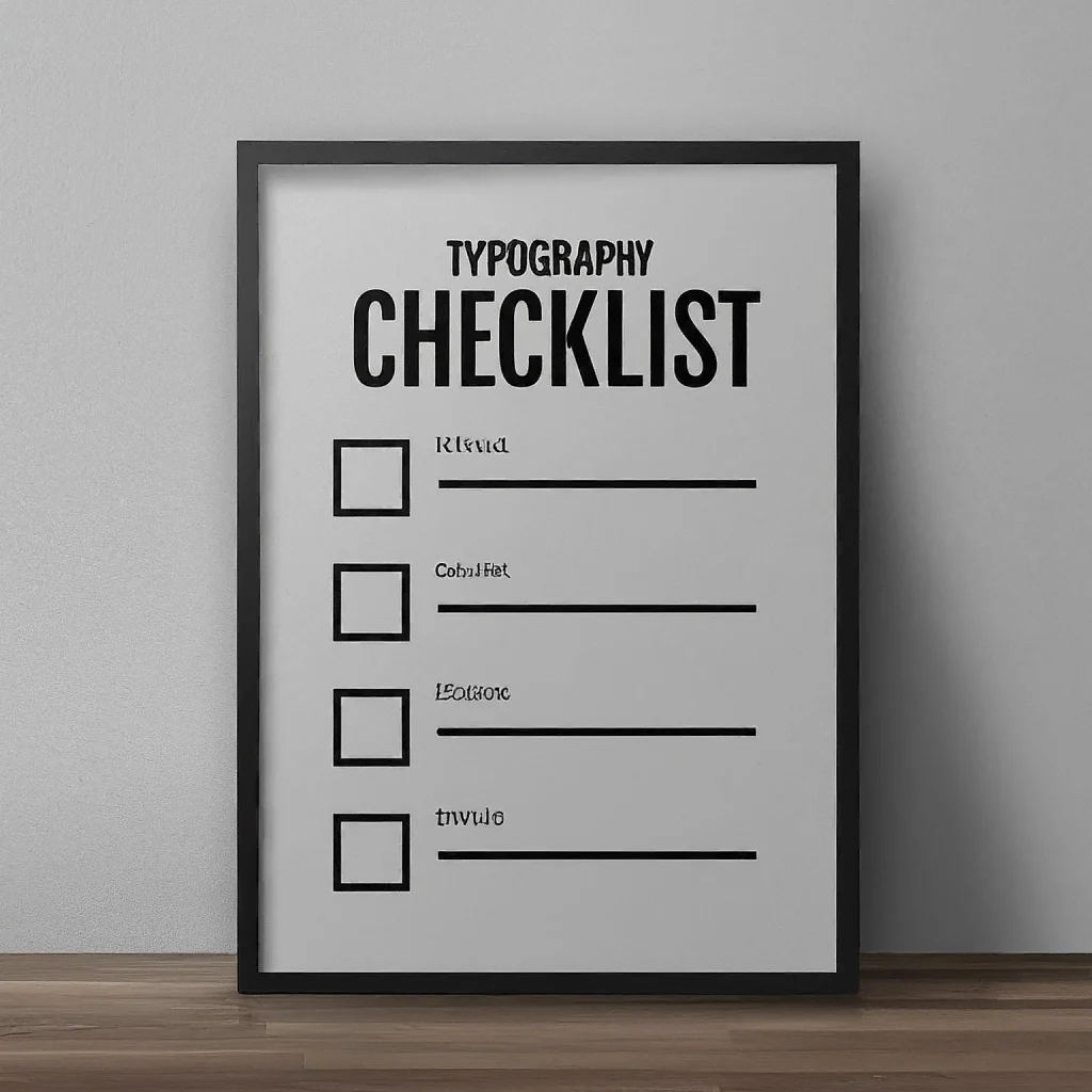
Discover How to Create a Typography Checklist to Ensure Your Font Choice’s Success
Typography, the art of designing and tweaking fonts and text in general, is a fundamental aspect of design. The right font can have a significant impact on the overall aesthetic and effectiveness of a design project, especially one that features text prominently. The reason is that a well-chosen typeface that matches the design aesthetic can evoke your desired emotions while enhancing your design’s readability, thus establishing a distinct visual identity.
Therefore, to ensure that your typographic choices are sound, it’s essential to have a thorough and detailed checklist in place. And if you take a look at the practices of any of the top graphic design agency, you will see that they too use some sort of a checklist to ensure strict quality assurance standards. In this article outlines, we will key considerations when selecting fonts, helping you make informed decisions and achieve your design goals.
Purpose of a Typography Checklist – Why Do We Need It?
A typography checklist serves as a valuable tool for designers, ensuring that their font selections are deliberate and purposeful. By systematically evaluating various aspects of a typeface, designers can make informed decisions that align with their design objectives.
A checklist helps to prevent overlooking critical factors, such as readability, aesthetics, and licensing. By following a checklist, designers can streamline their font selection process and increase the likelihood of creating successful and impactful designs.
That is why, in the long run, creating processes like these typography checklists helps separate a good and effective company from those just getting by, while also incorporating the latest typography trends.
Creating Your Typography Checklist – What Elements Should You Address?
When selecting a font for your design project, it’s essential to consider various factors that contribute to its overall effectiveness. A comprehensive typography checklist can help you evaluate these elements and make informed decisions. Here are some key areas to address:
- The typeface should match the design’s vibe
- The typographic choice should have a comprehensive design
- The font files are reliable to use for your design purposes
- The chosen typeface is useable for the purpose it’s chosen for
Let’s take a look at them in a little detail.
Matching the Design’s Vibe
The chosen font should complement the overall tone and atmosphere of your design. It should evoke the desired emotions and create a cohesive visual experience. For example, a playful and whimsical font might be appropriate for a children’s book, while a formal and elegant font would be more suitable for a corporate brochure.
Consider the target audience and the message you want to convey. A font that is too formal or too casual might not resonate with your audience, such as bubble fonts for corporate businesses. The font should align with the overall aesthetic and branding of your project.
Here are some specific questions to ask yourself.
Does The Font’s Style Match The Design’s Theme?
For example, a vintage-inspired font might be appropriate for a retro-themed design, while a modern sans-serif font would be more suitable for a tech-focused project
Does it Elicit the Desired Response from the Viewer?
Fonts can convey different emotions, such as joy, sadness, excitement, or calmness. Choose a font that aligns with the desired emotional response.
Is the Typeface’s Design Suitable for Its Intended Purpose?
The font should harmonize with the other elements of your design to create a cohesive and visually appealing composition.
Font Choice Should Have a Comprehensive Design
A well-designed font is more than just a collection of characters. A carefully crafted tool, it enhances readability, conveys specific emotions, and contributes to the overall aesthetic of a design. A comprehensive font design should consider various factors, including the following.
Does it Have Multi-lingual Support?
If your design targets a global audience, ensure the font supports multiple languages and character sets. A comprehensive font will include glyphs for a wide range of languages, including Latin, Cyrillic, Greek, and Arabic.
Is Its Finer Details Legible Easily?
Consider the font’s accessibility for users with visual impairments. A well-designed font will have clear and legible characters, even at small sizes. It should also be compatible with screen readers and other assistive technologies.
Does It Offer the Choice of Basic Font Weights and Typographic Styles?
Different types of fonts will offer a variety of weights and styles, such as regular, bold, italic, and condensed. This allows you to create a cohesive and visually appealing design. OpenType features, such as stylistic alternates, contextual alternates, and swash variants, provide designers with additional customization options. A well-designed font will offer a rich set of OpenType features. Ligatures are specific combinations of letters that are designed to flow together seamlessly. A comprehensive font will also include a variety of ligatures to enhance the typographic appearance.
Font Is Reliable to Use
The quality and usability of the font files are crucial to the success of your design project. Ensure that the font files are compatible with your design software and devices, and that they offer the necessary features and functionality for your specific needs. By carefully evaluating the compatibility and functionality of the font files, you can ensure that they meet your design requirements and provide a seamless user experience.
Are the Font Files Ready to Use for All Your Design Needs?
Verify that the font files are compatible with your design software, such as Adobe Photoshop, Illustrator, or InDesign. Some fonts may have specific requirements or limitations regarding compatibility. Moreover, if you plan to use the font on various devices, such as smartphones, tablets, or web browsers, ensure that the font files are compatible with those platforms.
Does the Design of the Font Address Spacing and Kerning By Default?
The font should have well-defined kerning and spacing rules to ensure optimal readability and aesthetics. Poor kerning and spacing can make text difficult to read and visually unappealing. On the other hand, proper spacing and kerning ensure that letters are evenly distributed and visually appealing. A well-designed font will have built-in spacing and kerning rules to optimize readability.
It is Useable for Its Chosen Purpose

When selecting a font, it’s crucial to consider its intended use and ensure it aligns with your design goals. A font that is well-suited for headlines might not be the best choice for body text, and vice versa.
Here are some key factors to consider.
Are You Using the Font for The Purpose Its Designed for?
A versatile font can be used in various contexts and across different design elements. Consider whether the font can be used for headlines, body text, logos, or other elements of your design. The font should be easy to read, especially for long passages of text. Take care of typographic factors such as letter spacing, x-height, and stroke contrast. Moreover, its usage should match the designed purpose, meaning that a display font should be used for header text rather than body.
Do You/Client Have the Required Usage Licenses for the Fonts?
Verify that you have the necessary usage rights for the font. Some fonts may have restrictions on commercial use or specific applications. You need to carefully select a font that gives you the right to use it commercially, so that your font not only enhances the visual appeal of your design but also does so legally.
FAQs
| What is weight in typography? Weight refers to the thickness of the stroke when it comes to typography. That means that a bold character from the same font will have a greater weight than the regular version of that character. |
| What does kerning mean in typography design? Kerning refers to the spacing between the characters and letter pairs that need to adjusted to make the text written in that font easy to read. |
| How important is font pairing and hierarchy when choosing your typography options? The right font pairing is essential to successful typography, as it helps connect the headings with the body of your text. Moreover, the right hierarchy of those fonts is also necessary to ensure that there is a natural flow of the reader’s gaze down the text, from the headings to the subheads and body. |
Conclusion
By following a comprehensive typography checklist, designers can make informed decisions and select fonts that align with their design objectives. A well-chosen typeface can significantly enhance the overall aesthetic and effectiveness of a project. By considering factors such as the typeface’s suitability, legibility, and licensing, designers can ensure that their typographic choices contribute to the success of their work.
Logopoppin
Logopoppin is a graphic design agency that specializes in logo designing, web development, video production and advanced branding services. We love to innovate businesses with new age technologies, allowing them to improve their visual reputation.