
Table of Content
Discover the Ideas Behind the Design of the UFL Team Logos and New League’s Symbol
American football, known simply as football in the North America, is one of the country’s favorite pastimes. From the thousands of people playing the game professionally and at schools, from middle schools all the way through college, it has surely surpassed any other sport in the country.
Its popularity is evidenced by the fact that despite a successful pro football league the NFL already covering much of the country, there is still space for competing leagues to crop up. And one of those recent contenders is the UFL. The United Football League and its UFL logos are made up of two previous entities, namely the USFL and the XFL.
But with both entities finding it difficult to compete in an already saturated market, they decided to merge and form a single league. And with the league playing its first season in 2024, they hope to gain a significant fan response from regions without NFL franchises nearby.
So, let’s dive in and take a look at these UFL team logos, as well as the brand symbol for the league and its two conferences. We will also see how the UFL brand logo is designed to be completely different from the NFL shield, and why their professional chicago logo design agency decided to go that way.
A Brief History of the United Football League and Its Conferences
The United Football League is a minor league football entity that started its inaugural season in March 2024. However, while it is considered minor league, it is a high-level league with players making it into the NFL.
It started out when the XFL and the United States Football League decided to merge into a single entity after their respective 2023 seasons. The reason was that establishing and managing an independent league was too expensive, especially when both the XFL and the USFL were targeting the same markets. In fact, a successful first season for the XFL meant that they had lost $60 million, while the USFL saw a decline in viewership compared to the XFL, despite the fact that they aired 28 games to the XFL’s eight.
With that as an incentive, the two entities decided to join hands to maximize the earning potential. Thus, he UFL was formed. However, the two leagues were incorporated into the UFL as independent conferences, meaning that the rivalry between the two could be used to the league’s advantage.
In fact, there is some similarity between the XFL-USFL merger and the AFL-NFL merger. In both cases, the rising cost of operations and running a pro league resulted in the rivals joining hands to form a combined leagues. So maybe, history will repeat itself with these two, and we will see another great sports league with amazing American football logos.
USFL Conference
The USFL conference is basically a rebranded version of the United States Football League. An independent league up until 2023, it decided that it’s was more financially prudent to merge with its rival the XFL. Although it was a far more polished football league compared to the XFL, the USFL saw a 16% drop in viewership in just its second year, dropping below its rival despite the USFL broadcasting 20 games more than the XFL.
Joining the UFL, the USFL brought three of its previous team, which includes the Birmingham Stallions, Memphis Showboats, and the Michigan Panthers. Its fourth team, the Houston Gamblers, merged with the XFL’s Houston Roughnecks, taking their name and branding, but retaining its divisional alignment, coaches, and player contracts.
XFL Conference
The XFL was an independent football league that was on its third iteration since the early 2000s. Originally owned and operated by Vince McMahon of WWE fame, it folded after just one season. 19 years later, the league was restarted for the 2020 season, but had to close operations midway through the season due to the COVID-19 Stay-Home restrictions, declaring bankruptcy this time.
The league was then bought by a consortium led by Dany Garcia, her ex-husband and business partner Dwayne “The Rock” Johnson, and RedBird investment management firm. They revived the league for its inaugural season in 2023 under new management. However, after a successful season that still saw the group $60 million in the red, they decided to merge with their rival USFL to form a single league.
In the UFL, the XFL acts as an independent conference, competing against the USFL conference. It retained four of its old teams to join the United Football League, which includes the Arlington Renegades, DC Defenders, San Antonio Brahmas, and the St. Louis Battlehawks.
UFL Logos from the USFL Conference
Now that we have an overview of the two competing conferences in the United Football League, now it’s time to take a look at the design of various UFL logos currently playing in the league. As we will see later, there is a striking difference between the logos used by the USFL conference and the XFL conference. The question is, can you spot it on your own?
Well, without further ado, let’s dive in and begin with the UFL team logos from the USFL conference.
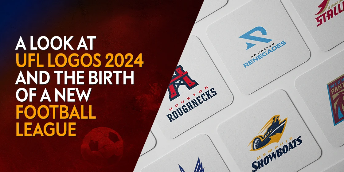
Birmingham Stallions
The first team whose UFL logo we will discuss is the Birmingham Stallions. The Stallions have a logo that is easy to understand, featuring the side profile of an angry stallion’s head and neck, with its mane flying behind it.
The design features a design that is quite similar to some of the NFL logos, especially in the style of its wordmark. Moreover, the smooth style of the art, along with the light accents that highlight the aggressive nature of the logo, make for one of the best UFL logos we are going to see on this list.
Houston Roughnecks
The Houston Roughnecks are an amalgamation of the XFL’s Houston Roughnecks, and the USFL’s Houston Gamblers. When joining the United Football League, the two constituent leagues decided to merge these teams, where the Houston Gamblers basically renamed themselves the Roughnecks and adopted their logo, while retaining everything else of their own brand.
The logo for the Roughnecks features a red-metallic oilrig, designed to mimic the shape of a giant H, with its top featuring Texas’s iconic Lone Star, a symbol also found in the NFL’s Dallas Cowboys logo. Overall, this is one of those UFL logos whose design would be difficult to understand if you don’t know the connection between oil fracking and Houston.
Memphis Showboats
The Memphis Showboats has an interesting design, which again, would be difficult to understand for mainstream consumers, football fans or otherwise. Showboats are usually over-the-top boats designed to look outrageous as a way of drawing attention. And the logo looks as if it features a wheelboat, but one rushing at speeds far greater than any such boat is capable of.
The logo features blue and yellow color combinations, along with white space used as accent to the design. Overall, it is not as impactful a design as some of the other UFL team logos on this list.
Michigan Panthers
The Michigan Panthers have a logo that takes inspiration from college-style sports logos. The rectangular logo with a tilt towards the right serves as an assertive outline, which features the name of the team as well as an abstract line art design of a snarling panther.
The color scheme is interesting, featuring a pastel plum color over a fawn background, accented by a cornflower blue. Overall, the design is sufficiently unique that it stands out in the crowd, although it may not be as versatile as other UFL logos on the roster.
UFL Team Logos from the XFL Conference
Now that we have taken a look at the UFL team logos from the USFL Conference, now its time to discover the artistic flairs incorporated by the logos from the XFL Conference. Many of these designs have been carried over from the old XFL team logos, from the 2020 or 2023 seasons, similar to how teams from the USFL continued on using their old logos.
So, let’s take a look at these UFL logos.
Arlington Renegades
The Arlington Renegades are a professional football team that previously played for the XFL in 2023, and won the championship. Now, it has joined the United Football League as part of the XFL Conference for the 2024 season, playing the first match of the season against the USFL champion from 2023.
As far as its logo goes, it is an interesting abstract design that accompanies the wordmark. The logo design uses s pair of arrows, in vastly different representations, to represent their going against the grain.
The logo symbols used in this design include an image commonly known as the GPS arrow, as well as a design that looks like an arrowhead. The arrows are pointing in different directions, and the way they are set up makes it look like an abstract “D” and “R” overlapped. Overall, a great example of a memorable brand logo.
DC Defenders
The DC Defenders are another team from the XFL Conference that previously played for the XFL in 2023. Like the Renegades, they too came over to the United Football League after the XFL and USFL merged to form the UFL.
As the runner-up to the XFL Championship in 2023, the team is a strong contender in the UFL, with a logo that matches it solid vibe. The design of the logo is made to look like carved out of polished metal, and designed in the shape of a large “D”. Inside the letter, which is colored red, a white styled “C” represents the letter’s core, with a star-shaped cutout connecting it to the outer letter.
While it may seem a little bland at first, it is one of those UFL logos that captivates you visually, both with its interesting design, as well as its striking color choice as a member of football’s few red logos.
San Antonio Brahmas
San Antonio Brahmas is the third franchise from the now-defunct XFL to join the new United Football League. Playing as part of the XFL Conference, it will serve as a valuable addition to the new football league, especially with its interesting logo design.
Taking about the logo, it has an aggressive and evil look to it, as if it is made up of elements that will hurt you if you come too close. Meant to represent the dry bleached skulls of bulls, specifically the Brahma bull, the design represents the connection between San Antonio, and Texas in general, with ranching and cattle rearing.
Overall, the yellow and gray color scheme, as well as the aesthetic of the design, is something that would inspire many fantasy football logos from that region.
St. Louis Battlehawks
The St. Louis Battlehawks are the last team from the XFL to join the United Football League, playing as the last entrant in the new minor league of football. Hailing from St. Louis, Missouri, the team filled the hole that St. Louis fans were feeling when the Rams moved away from the city.
Now, the logo for the St. Louis Battlehawks shows a short sword, similar to a Roman-era gladius, with sharp, mean looking wings on both sides. The wings have a design that is decidedly predatory, which gives the logo some much-needed aggressiveness. Moreover, the shade of blue used brings to mind the old LA Rams logo when the NFL team played as the St. Louis Rams.
Difference in the Logo Concepts Between the NFL and UFL Logos
So far, we have discussed the design and inspiration behind the various UFL team logos currently seen in its first season. Now, we will be discussing the design aesthetic of the other UFL logos, including those of its conferences, and compare them to the premier name in pro football’s logo, the NFL shield logo.
Let’s first talk about the logo for NFL. Its design a certain vibe to it that makes its instantly recognizable as an American brand. For example, the red, white, and blue coloring in the logo, as well as the addition of stars to that design, portray a strong connection between the brand and the country.
As far as the Conferences and UFL logos are concerned, only the logo for USFL has a similar motif. Using a similar pattern and design as the American flag, the logo firmly positions itself as an American brand. The XFL and UFL logos however, are more generic in the sense that they decided to keep their design minimalistic and neutral.
For both designs, the neutral color scheme serves wonderfully, with designs that are both aesthetically pleasing, yet minimalist in the truest sense of the word. Overall, we can say that unlike the NFL, the UFL logo tends to go for a more universally acceptable aesthetic of minimalist logos.
Frequently Asked Questions
| Do UFL players get paid? Yes, UFL players are paid. As it is a professional football league, even if it is in the minor leagues, the UFL, as well as its constituent leagues, the XFL and the USFL, paid its players. |
| Does the NFL own the UFL? Setting out to become a sort of rival to the NFL, the UFL is not owned by the NFL. In fact, a consortium of investors that is made up of Dwayne Johnson, Dany Garcia, and RedBird Investments owns it. |
Conclusion
To sum it up, the UFL logos and names of the various teams, as well as the conferences which were once independent leagues, are an eclectic bunch. With some logos going for an abstract representation of their logos, the teams in the UFL’s USFL Conference have gone for designs that are more detailed.
Overall, the set of logos currently representing the league ae quite distinct and different from those of the NFL, meaning the UFL is looking to establish itself as a separate but great entity. And that it does not want people to think that it is just a rehashed version of the NFL.
Latest news you want to know!
Subscribe for cutting-edge design inspiration at Logo Poppin! Elevate your brand with updates on logos, branding, web design, and video animation.
Note that by clicking “subscribe,” users may agree to our privacy policy and consent to Logo Poppin to use your contact data for newsletter purposes.
Logopoppin
Logopoppin is a graphic design agency that specializes in logo designing, web development, video production and advanced branding services. We love to innovate businesses with new age technologies, allowing them to improve their visual reputation.

