
Table of Content
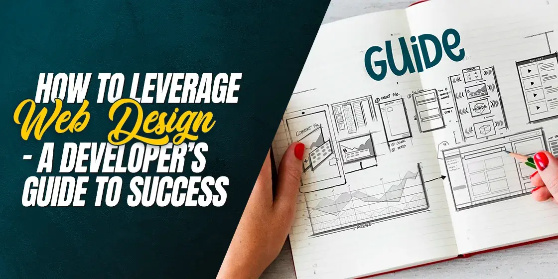
Discover a Step-by-Step Guide to Everything You Need to Create a Wonderful Website
A web presence is important when it comes time for a business to expand and grow, and build a personal brand. However, it takes more than a website that works well, for customers to adopt and adjust to the new website.
So what does a website need, besides working well functionally? Well, one of the most important elements that can make or break a website is its design. A well-designed website offers a multitude of advantages that factor into the success of the website, including better user experience, fast loading times, and even an aesthetic appeal that sets it apart from the competition.
The question now is how to combine a number of website ideas into your website front-end design. How to find the right design elements, and combine them into a cohesive website front-end?
The answer, however, is quite simple. You need to develop a website design process as the first element of your web development project. Now, if you do not know what this process entails, do not worry. Our web development experts have compiled their experiences and knowledge to create the perfect web design and development guide for you.
So whether you are a beginner or an expert web development company employee looking to improve their deliverables, this guide here is the perfect resource to help you with your projects. Let’s start, and learn how to create robust, well-designed websites that work well and have the visuals to match.
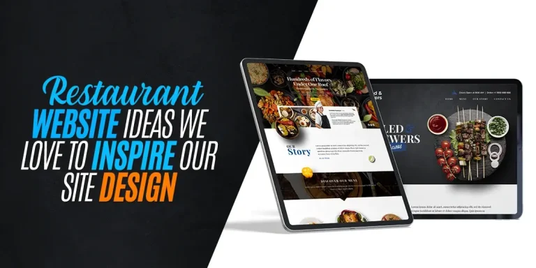
Website Design Ideas and Their Importance in a Website’s Success
When it comes to developing different types of websites, people often ignore the front-end or the design element in favor of the core functionality. They argue that the target consumer would rather have a well-working website than one that looks good.
However, what they fail to factor in, is that this isn’t an either/or discussion. In order for your website to be a success, it needs to work well, AND it should look good too.
Think of it like this. A potential consumer is offered the choice of visiting one of two sites to get the services they require. One website works well enough and has great visuals that attract the eye. The other website has better overall functionality, yet has a basic, bland design. Which one do you think would the consumer choose?
To put it simply, they would choose the one with the better visuals. And once they visit their site, chances are that those visual elements combined with the passable functionality of the website would convert that consumer, leaving the other site empty-handed — even if that other site offers something essential, like the best value VPN.
And this is just a bare overview of how a good website design can factor into a website’s success. Let’s take an in-depth look at the topic, and discover its importance and impact on user experience, as well as some top web design trends popular nowadays.
Why is Website Design Such an Important Part of the Development Process?
There is a common misconception that web design is a standalone process, distinct from the web development process. However, experienced professionals know that while technically separate, web design is an intrinsic part of the web development process.
When professionals work together to create a website, their development process starts with the front-end. And anyone who knows the metrics of a website’s success knows that web design reigns supreme here. No front-end can be good if it doesn’t involve a proper web design process, which is based on industry-standardized web design principles.
Now, we all know that no matter the website, the front-end development is the start of the project. And it is at this stage that a good web design resource or team can help your front-end developers create layouts that not only work well but offer an enjoyable and attractive user experience.
Otherwise, you may end up creating a highly functional website, which would have little to no traffic due to its bland or downright off-putting UX. With the success of the website hinging on it, that is why the website design process is considered so important in the web development process.
The Impact of Your Website’s Design on User Experience (UX) and Conversion Rates
Now, how does the design of a website impact its user experience and conversion rate? Let’s think of this example in simpler terms. Think of two apparel shops, that offer a variety of clothing items at almost the same price point.
Shop A has a streamlined structure inside the shop, with sections of clothing structured with the consumers’ needs in mind. For example, belts would be found alongside trousers, while ties alongside dress shirts. Moreover, the floor plan is designed to make it easy to build a complete outfit or to buy items separately as needed. There is soft music playing in the background, and there are salespeople to help you if needed. Overall, it provides a pleasant user experience.
Shop B however, has a more haphazard layout. There is loud music playing in the background, and there is little to no staff on the floor to help their customers. After going through the entire store to build a complete outfit, the consumer has to go all the way back to the start of the store to checkout, which results in noise that affects the experience of a potential consumer.
Now, think like a consumer. Considering that you know that the price points are almost the same across both stores, which store would you opt for at a glance? Shop A, right? User experience is an important metric that can affect the success of your software product, whether it is a mobile app, a website, or a desktop tool.
And if we build upon that premise, if two vendors are offering a somewhat similar product, you will always choose to go to the one that offers a more enjoyable experience. Incidentally, this example also shows how a good user experience can positively influence the number of conversions made. Overall, we can surely say that implementing the right web design ideas can have a massive impact on the user experience, thus driving conversion rates for your business.
What are the Latest Trends in Web Design?
When it comes to developing a successful front-end of your website, the web design ideas you use must be in line with the latest design trends popular with consumers. However, not all trends are made to last, and many of them are just that – seasonal.
Despite that, you need to look at your target market and see what trends are popular with the consumers. Of those trends, you need to identify the ones that seem sustainable and are more likely to last.
In any case, using modern design trends to sift through your web design ideas is a great idea and one that is likely to result in a good-looking website that attracts the right consumers.
Now that you have a basic idea of the importance of design trends in the success of your website’s front-end, let’s take a look at some of the most popular web design trends of today.
- Dynamic Scrolling Effects
Designers have experimented with scrolling effects for quite some time now. And for most scenarios, the implementation of this element only resulted in slower websites, or scrolling effects that were nothing more than distractions.
However, today, with extensive use of JavaScript and other technologies, dynamic scrolling effects are making a massive comeback, creating an interactive website experience. That allows the website to engage the user, making the usage experience highly memorable.
- Kinetic Typography
Kinetic Typography is another element that has been making new ground in web design nowadays. Kinetic means moving, therefore kinetic typography refers to the design trick of making letters move about, a popular trend from the 1960s which is making a comeback.
On an otherwise static page, kinetic typography can serve as a way to capture the user’s attention and draw their gaze to the point of importance on the screen. Moreover, if used well, kinetic typography can make for a natural and highly suitable design element when making the website responsive, especially when reflowing text to adjust for different screen sizes.
- Drag Interaction
Interactive website designs have been gaining popularity for some time now. However, one specific type of interaction is slowly gaining steam, and becoming more popular day by day. Drag interactions are designed to make the process of dragging more dynamic, and as close to the real thing as possible.
Users can move elements like the chat bubble wherever they want on the screen, or eCommerce sites can have people actually click and drag an object to the cart. You can also drag new menus into place, or drag and watch the story of the brand unfold across the screen.
- Element Layering
Many websites do not have a lot of text on them, simply for the reason that there is no need for it. So how can designers make the site look dynamic and attractive, with very less to work with?
One popular trend is to layer different elements in the design over each other, as a way to give the design the essence of depth. This can be quite aesthetically appealing as the crisper and more vibrant displays of today are quite well suited to these design tricks.
- Pastel Colors
In recent years, with device screens becoming more vibrant and of better resolutions, softer colors are becoming more popular. That has given rise to the use of a pastel color scheme in website design.
Many people believe that pastel shades are bland and unappealing. However, pastels can be quite vibrant and useful for those who adhere to a minimalist aesthetic. They allow you to add a spot of color and warmth to your otherwise plain design, making it a subtle but useful addition to your website front-end.
Creating Your Website Design Process – How to Plan It Out?
Now that you know the importance of front-end design in your web development project, and understand that a well-received website is one that starts from the design, how should you start?
The creation of a website design process is quite easy if you understand the fundamentals. And the fundamentals are quite simple to understand, whether you are a beginner or a veteran of web design projects.
Let’s discuss the basic steps of creating and implementing a custom website design process for your web development project, and how to leverage that design collaboration for project success.
Identify and Record Your Website Goals and Your Target Audience
The first, and arguably the most important step, is to identify the target audience of your website. Secondly, you need to evaluate and record the company goals, or the things the company hopes to achieve with the development of the website.
The reason for that is quite pragmatic. Unless you know who is going to use your website, how can you come up with a design that appeals to their aesthetic? For example, if your website is targeted towards generally the older generation, around or above the age of 55, you would obviously not use elements like a small or light-colored font. Based on your needs, you can create a set of questions to ask when designing a website, which you can put to various stakeholders involved in the project.
Similarly, without knowing who the target audience is, you will be unable to structure your web design in a way that attracts them and helps you stand out. But how can you find out both of these things?
Well, there are a number of ways you can take input from potential customers, including:
- Surveys
- Questionnaire
- Focus groups
Once you find the one that works best for you, use it to gain market insights such as information about the target market, as well as how to achieve your desired goals in your desired market.
Research Competitor Products to See What Works Well
Once you know and understand your target market, such as the things they like and dislike, their pain points, and what they desire for a solution, the next step is to see what your competition is doing. Competitor analysis is an essential step to see whether your identification of the solution has been in the right direction.
Moreover, it also helps us identify the gaps in our understanding and helps us figure out the commonalities across your industry. This way you can find elements that have made your competitors successful in your target market so that you can develop a web design process that exceeds their impact.
Similarly, market and competitor analysis allows you to identify small yet important elements about your target market, things that your competition learned through trial and error, and experience. This gives you a leg up over your competition, as it allows you to focus on delivering an experience that is better than that offered by your competitors.
Think of it like this. There is a website that offers its services in Germany, yet its pages are only offered in English. However, as there had been no suitable alternative before, people had gotten by using it without many issues.
However, if you capitalize on that need, and offer a website that offers similar functionality, as well as the option to view the content in Deutsch (the German language), it will bring consumers to you.
Develop Wireframes and a Sitemap (Graphical Preferred)
Finally, once you have understood your target market, identified your goals, and analyzed your competition, you are ready to create mockups of your web design. You now know what your consumers expect, and what the players already in the market are currently offering.
Based on that, as well as your plan about how to achieve your desired goals, you can create basic mockups of the design. Once you have done that, you can discuss those mockups with your team for their feedback. Finally, using the mockups and the relevant feedback, you can create wireframes to show how specific pages of your website will appear on various devices.
Moreover, this is also the part where you will map the customer journey. Based on the information you have, this is where you will develop a graphical sitemap, to check how a potential customer may navigate from the landing page all the way towards conversion. This will help identify dead pages, as well as the flow of information a customer will receive while navigating.
Incorporating Your Style into the Website – Choosing Your Web Design Style
When it comes to website design ideas, there is no one-size-fits-all solution for success. In order to stand out and succeed, each website needs to have a touch of personalization that portrays the essence and aesthetic of its company.
For example, all of Google’s websites adhere to its minimalist design aesthetic, with clean UIs and a distinctive design. And while Google is an Internet-based company, other businesses might find it more difficult to incorporate their company style into their design.
Listed below are some of the most popular ways that a company can implement its identity into its websites. Let’s find out what they are.
Minimalist Web Design
Some businesses follow the tenet of minimalism in everything they do, from their logo, to their color scheme, and more. Thus, when it comes to their web design ideas, the most suitable ones are the ones that are minimalist in nature.
The trend of minimalist website designs is one that has been seen rising in recent years. Using sound psychological principles, the companies are using minimalist ideals to showcase their professional ideals at the forefront, without the perceived distraction of loud visuals.
Nowadays, this style of web design is often used by corporate businesses in their website, such as law firms, financial firms, and more. Moreover, some media and fashion houses are using minimalist web designs as an avant-garde statement, highlighting their status as an elite business over their competition.
Bold, Vibrant Website Design
In sharp contrast to the minimalist web design trend, another popular strategy to highlight your company style is to use a bold and vibrant design scheme. Vibrant themes and designs tend to catch the eye quicker, acting as beacons in a sea of drab, boring designs.
Depending on your industry, as well as the general vibe of your company, utilize bold, vibrant, and visually appealing web design ideas when developing your website design plan. Using bright colors, bold designs that dazzle the eye, as well as an overall flamboyant design strategy, you can make your website stand out if done suitably well. This is more common for businesses with artistic visions, and a general theme you will notice with many graphic design websites.
Vintage/Retro Web Design
Not all businesses working today are new, and when it comes to their websites, they want to incorporate their history and legacy in their web designs as well. Similarly, the nature of some businesses is such that they give more of a vintage vibe rather than a modern one, which means that they need their visual web identity to match the perceived aesthetic.
A vintage style of web design is quite suitable in these instances, which gives off a warm, welcoming vibe to its visitors. Imagine the website of a custom, hand-built wooden furniture maker. Which design would be a better representation of their business – a bright and bold design, or a vintage design that appeals to the target market for the business?
Ideally, the vintage one would be more suitable to its aesthetic, allowing the business to incorporate its identity into its website’s design. However, in order for it to succeed, it needs a subtler hand implementing it.
Material Web Design
Material web design is a web design implementation based on Google’s “Material Design” design language. It offers a greater use of grid-based layouts, better animations, responsive transitions, depth effects such as shadows and lightning, as well as padding.
Generally, Material Design is preferred for websites and applications that are primarily going to be viewed on mobile devices. The elements in this type of design feel more real and are designed to make acceptability and adoption better for users. The target market, as well as the purpose and goals of the company, however, often dictate its use.
Its use of real-world physics makes it suitable where high visibility is required, such as if you want to implement techniques like high-contrast versions of your website for the ease of the visually impaired. Overall, material web design is a specific, purpose-built technique that is predominantly designed for devices that view content in portrait mode. And if you want to focus on a mobile-first methodology, then this is the one for you.
Responsive Website Design for Mobile Devices
Mobile phones have taken over computers for the vast majority of the world. The rise in smartphone usage has increased exponentially in the past decade. And for much of the world, the primary device for web browsing is now a smartphone instead of a PC.
Now, smartphones come in a variety of screen sizes. And even if they didn’t, the fact remains that, unlike a PC, a mobile device’s default view is in portrait mode. Therefore, your website’s layout needs to be responsive, so that despite the change in screen sizes or orientation, the view of the webpage doesn’t deviate much.
That is why you need to ensure that your website is responsive. When it comes to incorporating your style into your website, you need to ensure that design elements that represent your brands are made responsive. That will result in your brand being portrayed the same every time, no matter what device is used.
Finding the Right Colors and Typography for Your Web Design to Suit Your Brand
An important part of incorporating your brand’s identity into your website is finding the color palette and typography that complements both. Along with your logo, these two elements are often some of the first things that a potential consumer comes across.
As such, it is an important part of the web design process for your website development project. The question, however, is how can you choose the best color combinations and fonts for your website, that represent your brand, and look good too?
Let’s dive in and discover the answer to this question.
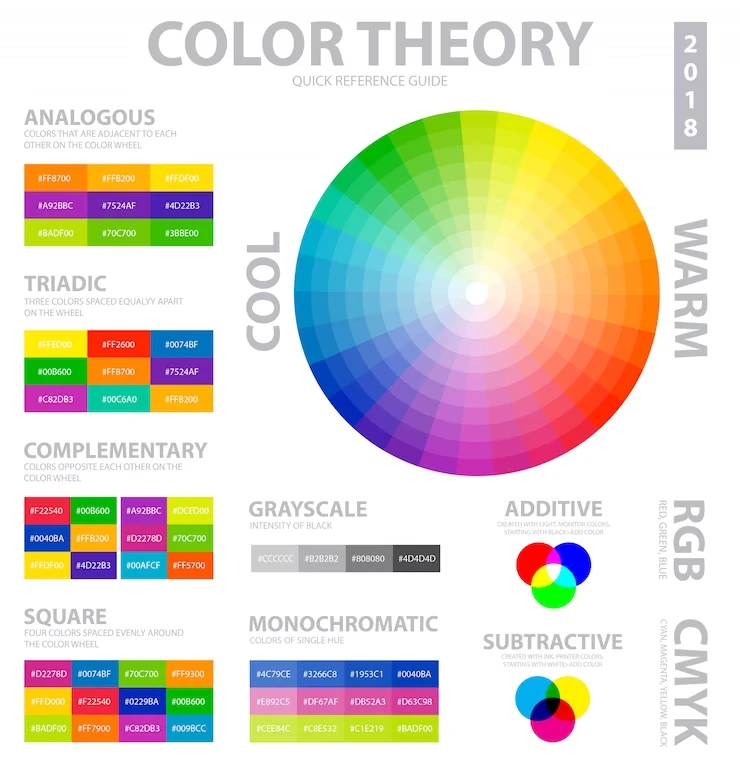
Understanding Color Psychology – What Shades Should You Use?
According to popular psychological treatises, each color on the visible spectrum has the ability to influence our moods. Some of these shades interact with our emotional spectrum to influence our social behaviors, while others affect us due to cultural and social preconceptions and biases.
When it comes to color psychology, it puts forward several techniques for finding the right set of colors. For one, it puts forward multiple techniques to choose perfect contrasting primary and secondary shades. Moreover, it also tells us how we can enhance the impact of our designs with the right colors used in a certain way.
Let’s first talk about choosing the color scheme for your website. Now, if you already have the brand colors that you have been using for some time, those are the shades you will be using as your color palette. That allows for the unification of your brand and your new website.
On the other hand, let’s say that you do not have any brand color scheme. In that case, you need to work from scratch. You need to identify and understand the tone of your business, in order to understand what works well for your brand. You also need to look at your logo and understand the visual perception it portrays.
For example, a corporate business such as a law firm with a business-like wordmark for a logo would find it difficult to use the same color scheme as another corporate business that manufactures toys.
That is where the tenets of color psychology come into play. Based on the tone of your business, they help you shortlist the best colors and shades that would suit your business. However, you will then need to work out which exact shades would suit your website and brand equally.
Choosing a Suitable Color Scheme for Your Website
Once you have discovered some colors that may suit your website needs, the next step is to find out which exact shades to use as your primary, secondary, and tertiary colors.
Now, you will find websites that use no more than one shade over a white background for their brand colors. Others will often use a mix of two or three different colors, or even different shades of the same color. This depends on what message they are trying to portray with their design, using the psychological impact of different colors to influence that message.
For example, you will often see fast food restaurants use shades of red in their design. McDonald’s, Kentucky Fried Chicken, Wendy’s, Chick-Fil-A, and many more use shades of red in their branding and website. But why?
The color red is passionate, and when used liberally as these brands do, it can condition the consumers into associating that feeling of passion and energy with the brand elements of those brands. You too can choose your website colors based on how they influence the consumers’ emotions.
For example, look at how the Barbie branding portrays itself as feminine and for kids on its website and otherwise. Similarly, you too can choose colors based on the message you want portrayed. If you want to highlight your company’s business-like aesthetic, then a monochrome color scheme is the way to go for your site. However, if you want to go for a more dynamic identity, then a mix of two or three different colors can be perfect to give your web pages some much-needed contrast.
In any case, you need to avoid going overboard with choosing colors that clash with each other, or that end up muddling the visual impact of your design.
Finding the Right Fonts and Typography to Suit Your Brand Aesthetic
Alongside your color scheme, your choice of fonts and typography is equally important when it comes to portraying your brand identity through your website. The style of font you use can change how consumers perceive your website and by extension your brand.
For example, let’s say you design your website to look state-of-the-art, with animations and transitions that make it look as if it represents a business with a modern aesthetic. However, for the text, you choose a set of vintage fonts that look similar to the old English script. Now, combine the two, and imagine what would be the message that a consumer looking at your site perceives.
That is why it is important to understand and record the type and tone of your business before you begin your web design process. Once you do that, the next step is to find font families and styles of typography that complement that business type and tone. Observing and learning from the competition can be a big step at this stage as well, so do look at your competitors’ websites before choosing your fonts.
Navigation and User Experience – Incorporating an Intuitive Layout in Your Website
Fonts and color schemes are some of the most obvious web design process elements. They help consumers associate the website with its parent brand, which is very important. Moreover, they can have a major impact on the success of the website, and in turn, the business.
However, just focusing on them won’t guarantee success either. So how can we ensure that our website is well received by the consumers?
Well, in order to improve your chances drastically, you need to focus on the overall user experience of your website, especially the navigational aspect.
But what is user experience? How does the process of navigation factor into it? And how are they both connected to a website’s success? Let’s discover the answer to these questions below.
Why Do You Need to Implement an Intuitive Web Layout in Your Website Design?
Nowadays, most consumers have shorter attention spans than in years previously. As such, they tend to look for websites and tools that are easy to understand and use, with minimal effort on their part.
That is why your website design must feature an intuitive layout. That means that if a consumer expects a certain fold of the website to scroll from left to right, then that’s how it should be designed.
Keep in mind the more things that go against the intuition of the user, the higher the chance that they will leave your site for something better. Therefore your website design must focus on an intuitive web layout.
What are Breadcrumbs and Filters, and Why Are They Implemented?
Breadcrumbs are a form of filter that is used by large websites to give their users a secondary form of navigation. It allows for easier back navigation and offers a better journey through your website for the consumer.
Now, there are three types of breadcrumbs that you can implement to simplify the process of page navigation.
- Location-based breadcrumbs are designed to show the consumer where they are currently in the website’s page hierarchy. These are useful if your website has more than two layers of navigation.
- Attribute-based breadcrumbs are most commonly known as page tags. They are designed to portray the attributes of a page, no matter where it is in the hierarchy. It is important if your website has a lot of content about a variety of topics, which may make it hard to navigate using traditional methods.
- Path-based breadcrumbs are some of the least used types, due to their tendency to be overly confusing. These types of breadcrumbs are designed to map the path the consumer has taken to reach a certain page and acts as a history of sorts for that website.
Now while technically not a part of the design, they are a part of the web design process due to their relation to site navigation. The reason they should be implemented in your site is because they allow for convenient navigation, reducing the time and effort needed to go through the site, and thus reducing the website’s bounce rates.
Optimizing Your Web Design for Optimal Load Speeds – The Less is More Strategy
One major aspect of user experience is your website’s load speed. The quicker your site loads, the quicker the consumer is able to get the information they need. On the other hand, the longer it takes your website to load, the higher the chance that the consumer will lose interest in using your site.
Now there are a number of ways you can reduce your load speed. While the majority of the factors affecting site speed are related to factors other than your website design process, there are a few major design elements that can be tweaked to make your site load faster.
First, you need to ensure that the images your website uses are in the webp format. This image format is designed specifically for use on the web and has a smaller file size than conventional formats like Jpeg or PNG.
Next, try not to go overboard by adding too much multimedia to your web pages. The more media that the browser has to load, the longer it will take to completely load the page. Moreover, more media means that there is a greater chance of some elements not loading properly, which will negatively affect your site’s visual appeal.
The best way to solve both these issues is to keep your website design as simple as possible, without making it completely bland. The old adage of “Less is More” is common in the design world, where too many elements can end up destroying the visual message you are trying to portray.
Therefore, you need to carefully plan out all the design elements you need on a page, and then use them judiciously. You need to ensure that no extraneous element, that is a graphic element that does nothing to add value to your design, clutters up your website’s layout, thus impacting its performance.
Once you have ensured that you have optimized your website design as carefully as possible, the next thing you need to do is start working on the visuals themselves.
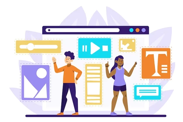
Choosing Your Visual Content & Media Integration to Complement Your Web Layout
We understand that good performance is important for a website’s positive user experience. However, that isn’t all that makes for good UX. The visual attraction of a website and its web pages is as important to achieving a positive user experience.
Now, visual attraction doesn’t mean making your web design all flashy and overwhelming. It means using visual content like pictures and videos, as well as animations and more to make the visiting experience more enjoyable.
But we discussed earlier that your web pages would be light and quick to load. And that too much or larger sized media will end up slowing your site down. And that is the ultimate question, isn’t it? How can you incorporate attractive, hi-res multimedia into your website design without affecting its load speeds too much?
Let’s find out.
Using High-Quality Imagery
Using high-quality imagery in your website design is a given. You need to ensure that the images you use are relevant, and are crisp and sharp when viewed on a variety of different screens. But there is a big problem with this.
How can you ensure that the image you use is sharp, but isn’t too big to impact your site load speeds perceptibly?
For one, you need to get clear pictures. On the internet, you may find some very high-quality imagery that could be used to enhance the visuals of your website easily. However, you need to do a couple of things before implementing those images in your design.
First, you need to convert those images into the Webp format. The reason for this is that Webp is designed for lightweight web usage. It does so by compressing the image with as less of a loss as possible. This means that users can add imagery to their web design without affecting load times very much.
Secondly, you need to find images that are reasonably sharp and clear, without being too large in size in the first place. That is because even converting to a compressed web format like Webp can only do so much to a file size before it starts to degrade in quality.
Adding Videos and Animations that Add Value
Another great way to add media to your web design is to use animations or videos to your design. Now for videos, there are a few ways to do it, while animations can be directly made a part of the design with JavaScript.
For videos, you can either convert it into a gif format image, where instead of a video, it’s a multi-frame image that plays like a video. This version allows the “video” to be integrated directly into the design without much issue.
However, if you want to integrate a true video, one of the most popular ways to do it is to use an embedded player that plays a video via a video streaming platform like Vimeo or YouTube. This allows the actual size of your webpage to be smaller, as the video is not directly a part of the webpage. However, it still may impact your overall load times, as well as user experience. So be very careful when using it in your web design.
Using Audio and Interactive Elements for Better UX
Audio is another medium that can be integrated into your design. However, it is something that is rarely witnessed. Audio as a medium can work well in the background when a consumer loads your website and could act as a way to enhance the browsing experience.
For example, if it is the website for a music studio or a musician, then a version of their most popular music could play in the background, adding to the audio-visual experience.
However, that too faces the potential issue that its pros are quite heavily outweighed by the potential cons, making it risky to incorporate within the design unless you’re sure that it will work. Therefore, assess your website’s needs, and evaluate if your web design needs audio integrated.
Similarly, interactive components can also be added to enhance the browsing experience, by engaging the consumer into the site. Unlike audio, however, they are a much more feasible addition to a website’s design, meaning you should look to make your website more interactive if possible.
Developing Content That Builds Onto Your Website Design
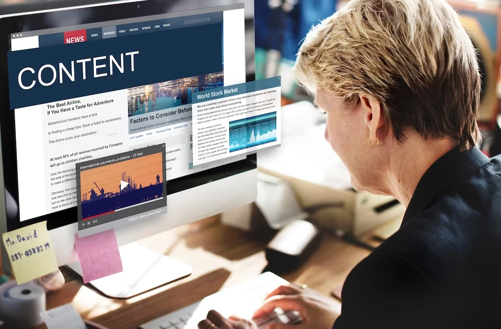
So far we have discussed elements like colors, images, videos, and more that can enhance the user experience of someone visiting your website. However, for the vast majority of cases, content is king. The written content featured on websites is often one of the most important elements that can help convert a visitor into a customer.
Most people visit websites looking for some kind of information. And while images and other media are good, nothing beats solid, well-written content. So how do you prepare content for a better user experience? Let’s find out.
Understanding Content Hierarchy and Layout
One of the first things to understand when we talk about developing well-written and structured content is to understand what good web content looks like. When we talk about effective content, there is a flow and hierarchy as to how the web content should flow.
For example, if you offer some form of professional services on your website, you do not just start advertising and trying to convert your visitors from the first fold of your homepage. You need to first establish a rapport and trust with the user before you start to advertise your services.
That is why content hierarchy is important. It tells you how your content should flow through different phases of the sales funnel. The initial part of your content should establish a connection with the user, slowly informing them about your brand and its services. Next, you will take them to your services section or pages, where you will tell them why they need a specific service from you, turning them from visitors to leads. Finally, the addition of CTAs helps the leads convert and buy your services.
Now, this hierarchy helps us influence the psyche of the user, helping us convert them effectively.
Formatting Your Text for Better Readability
Next, once you’ve understood content hierarchy, is to optimize your content for better readability. This is incredibly important, as most people today browse on their mobile screens. If your text is not very clear, people will have a hard time reading it quickly.
What we need to understand is that web content is quite different from other forms of content, in that people tend to go for it if it reads at a glance. No one spends the time to carefully read everything you’ve written on a webpage unless something they like attracts their eye.
That is why you need to ensure that your text is formatted correctly, with distinct heading styles, clear fonts, and the content broken down into small chunks to make it easier to read. Lackluster headings, minuscule typography, and long walls of text are some of the things you need to watch out for in your web content.
Using Whitespace to Your Advantage
Whitespace is one of the greatest tools that can enhance the impact of your web design ideas. People today who visit websites are not looking for overwhelmingly full webpages full of content and media. They want to find the information they are after quickly and easily.
Whitespace allows you to keep your design light, airy, and clear. It allows for quick scanning of the webpages for the information required, something highly necessary considering that most people are looking at it on a screen less than 7 inches across.
The Importance of Call-to-Actions and Optimizing Them for Conversion
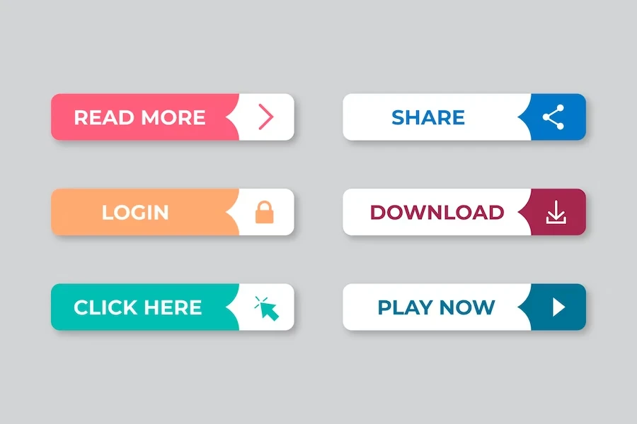
Earlier we mentioned the addition of CTAs, commonly known as call-to-actions, as part of your content hierarchy. These small pieces of content are intended to derive the intended action from a lead, turning them into a customer, which is important if you want to make a website that makes money.
But what does a CTA look like? And how can you incorporate them with your website design ideas effectively? Let’s read on to find the answer to these questions.
How to Design a CTA and Where to Place Them Effectively?
When it comes to designing a CTA, there are a few important things that you need to be aware of.
First, you need to know what action the CTA needs to drive. That means that your CTA should be designed around the action that it needs to drive. For example, if you want your visitor to sign up for a newsletter, the format and tone of the CTA would be light and airy. However, if the CTA were to get the visitor to buy your product, its tone would be quite different.
This leads us to your second point, which is that the CTA needs to come naturally within the content, without unduly standing out. You’ll often see sites where their call-to-actions are only recognizable at a glance because of their buttons. That is because if your CTA is read as part of the narrative, then they have a better chance of converting.
Finally, placement. A CTA at the start that urges the user to buy your services or product would be of little help, as it will generally cater to consumers who are already prepared to become customers. For better results, you need to have your CTAs placed a little lower within the content so that you have the time to prepare them for some sort of positive interaction.
Moreover, you cannot be done with just one CTA. You need to have at least 2-3 different CTA that are driving the consumer towards different actions. These actions, while different, would all be catering to visitors who may be at different parts of the sales funnel, thus covering all bases.
A/B Testing to Optimize for Conversions – Does it Work?
Generally, call-to-actions are designed to convert leads or guide them down the sales tunnel. However, in order to do that, their designs need to speak to their consumers. One great way to measure the effectiveness of CTA is to find the ratio between the number of times your content is viewed, and how many of those viewers have clicked on.
Generally for most websites, a 2% ratio between the two is considered good. However, if it is not performing up to the mark, you may need to tweak it. A/B testing is a process where you clone your CTA, and change one single element on it. It may be the color of the button, the language used, or some other factor. Then you publish them both together, so that half of your visitors see one version, while the rest see the other version.
Based on how they perform, and slowly changing different parameters to perform multiple A/B tests, you will be able to find out a version that performs better than the original.
Creating and Implementing Forms to Address Lead Capturing
As we know, not all consumers would be ready to buy by the time they are ready to leave our website. Some would be wanting more information, others might require more convincing. In any case, these visitors are now leads, that is people who know about you and are interested in what you have to offer. All they need is a little extra push to convert them into paying customers.
However, if they leave the site before that happens, they will be lost. And chances are that all the effort your website spent converting them would go to waste. Therefore, you will often see websites utilizing contact forms, usually at the bottom of the web pages, to get the contact info for those leads. Wherever you place those forms, they should be designed to be prominent enough not to miss, yet blend in with your overall web design.
Once you have the info, your sales team can contact them later, and finish the process of converting them.
Optimizing for Mobile Devices – The Importance of Mobile-Friendly Design
The next aspect of user experience we are going to discuss is the process of optimizing your website design for mobile screens. Mobile devices now make up the bulk of devices used by consumers to browse the web. Therefore, when designing a website, you need to focus on mobile-friendliness.
So how can you make your suitable for both mobile and desktop? Considering that between the two mediums, there are a variety of screen sizes, for both portrait and landscape modes, how can it be achieved?
Let’s find out how it can be done.
Responsive Web Design and Its Importance
The biggest thing about web design and development in recent years has been the popularity of responsive web design. That means that rather than binding design elements to specific screen sizes as was done previously, your web designs can respond to the different screen sizes or orientations, and adapt accordingly.
Now, it’s understandable why responsive web design has become so popular. With the 2010s seeing a massive rise in smartphone usage across the globe, a change was observed in consumer browsing habits. Increasingly, people were using their phones as the primary device to browse the net, rather than desktops or laptops.
Now, websites that were designed just for landscape PC screens were impossible to view properly on mobile phones. And even if they were usable on one phone, there was no guarantee that a phone with a different-sized screen would be able to view it too.
Therefore, the responsive design came into vogue, with its ability to restructure and reflow its elements based on device screen sizes. And in the present day and age, not adopting a responsive design philosophy means alienating nearly your entire target market.
Common Best Practices of Mobile UX
While we have discussed some best practices for an overall website user experience, mobile phones require a few more considerations. That is because mobile phones bring in an entirely new avenue of interaction, which needs to be considered if you want users to have a good time using your website, no matter the device.
There are many best practices when it comes to mobile web UX. However, we will discuss some of the most popular ones below.
- Avoid Clutter
Considering that mobile phone screens are quite a bit smaller than desktops, one of the first best practices is to avoid clutter and keep it clean on the screen. Unless an element is necessary, it is better not to have it on the screen.
- Prioritize Features
Developers tend to try and fit in as many features as possible into a single app. However, from a UX point of view, that can be a major problem. Therefore, list down all the features you want to integrate and prioritize the ones linked to the core objective.
- Focus on Touch Targets
Human fingers have a cross-section of 7-10 mm. And with the smaller sizes of mobile phone screens, touching the right element among a cluster of many can be difficult. Therefore, if anything is a touch target, make it at least as big as the fingertip, and provide ample spaces between multiple touch targets.
- Use Clear Text
The clarity in your text is extremely important, especially for screens as small as a mobile phone. Therefore, use clear fonts, with an easily readable size. Too complicated of a typeface, and people would end up skipping it.
Why Should You Optimize for Different Screen Sizes?
As we discussed earlier, over time the trend of people using their PCs to browse the internet changed, with more and more people now using their smartphones. Now the biggest difference between the two types of devices is the orientation of the screen.
PCs have screens in landscape mode, while mobile devices predominantly use portrait mode. Moreover, mobile devices come in a variety of sizes, with tablets having screens anywhere from 8-13 inches, and mobile phones with screens anywhere from 5-7 inches. This means that unless your website is able to cater to these different sizes, you would be losing out on a massive chunk of your target market. Therefore optimizing your website for different screen sizes is extremely important.
Factoring in Accessibility and Inclusivity in Your Web Design
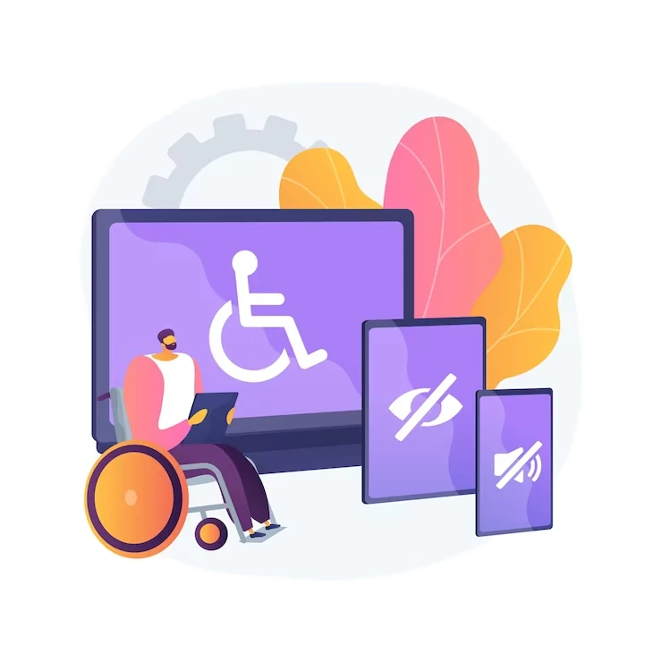
Technological advancements today mean that many people with disabilities are now able to browse and use the internet. That means that they might be part of the target market. But how can you ensure that they too are able to enjoy your website?
From high-contrast color schemes to textual descriptions of multimedia, let’s discuss the different ways we can ensure that our website is accessible and inclusive of people with disabilities.
Designing Websites for People with Disabilities
There are many different ways you can adapt your website design to accommodate people who have visual disabilities. For example, people with nearsightedness may find that design elements with high contrast are easier to see. Or those who are completely visually impaired can use text-to-speech and voice search to browse the internet easily.
Some of the things that you can implement to make your website friendly for people with disabilities include:
- Offer high-contrast versions of your website.
- Offer optimized monochrome versions of your website for people with color blindness.
- Offer written transcripts for audio streams used in the design, or high-contrast subtitles for videos. Similarly, integrate alt-tags for images, describing them for the visually impaired.
- Keep the UI clean for text-to-speech readers to make the design friendly for the visually impaired.
Using Alt-Tags for Images – How Do They Help the Visually Impaired?
Nowadays, with highly effective accessibility options available in mobile phones for people with disabilities, it is becoming a major task for websites to ensure they are inclusive. That means that they need to optimize their websites for people, especially the visually impaired.
However, while text isn’t a problem, images integrated into the website cause problems for such users. If your content relies on an accompanying image to understand, then how are the visually impaired going to get the context?
That is where the alt-tags come in. They are short descriptions of the images, that describe what is going on in the picture. Accessibility tools like text-to-speech converters then read this description, conveying it to the users.
Adding Textual Descriptions for Multimedia on Your Website
Now, why should you add these descriptions for multimedia on your website? Well, as people with difficulties are increasingly becoming capable of overcoming the limitations via technology, they are looking for businesses that are willing to accommodate them.
If you optimize your website accordingly, you would be able to tap into a target market that is still widely ignored, despite a lot of awareness. That is where you will enjoy the benefits and growth that being a pioneering business offers.
Testing and Optimization of Your Website Design
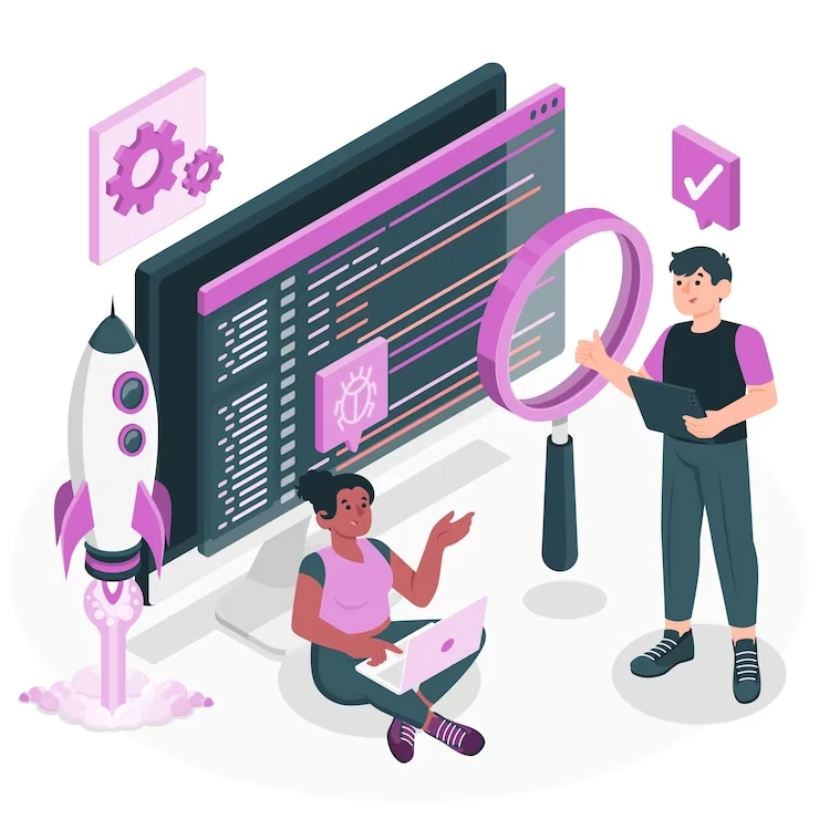
Once you are done with your web design, you need to test it out. You may present it to a group of your fellows for their feedback and testing, or you may decide to test it live. In any case, user testing is an important aspect and one that cannot be skipped.
The Importance of User Testing and Implementing That Feedback
The entire purpose of the website design process and its focus on user experience was to ensure that the actual users have a good time when using it. Therefore, user testing is a crucial test that your final design needs to clear to be considered a success.
User testing tells us how close we were to what the actual users expected from our website. The closer we are, the greater the chance that they’ll adopt and use it. However, once you release it, the users will have some feedback, both positive and negative. Now the reason this feedback is important is that it will help you fix the shortcomings of your current design, and tweak your design for better response.
If you ignore this feedback, users will slowly stop visiting your website, feeling that you do not value their concerns as a business. With trust in your business shattered, they will look for other alternatives, one that is willing to listen to them.
Improving Your Website Design Using Metrics and Data
Besides user feedback, you also have access to website performance metrics. Issues like CTR, bounce rate, and slow load speeds are elements that relate to your design. You can use the data captured by these tracking tools to fix your design gaps, thus improving your design and its importance.
Other tools like heat maps are also important, as they can help you optimize your designs for better readability.
Improving and Optimizing Your Design Overtime
Over time, design aesthetics change. Consumers’ needs evolve, and with it, their design expectations. Therefore, it is often said that logo and web design is often a lifetime task, as once it is done, you can keep improving it for eternity.
When working on a web development project, metrics and usage data is your friend to improve your website for the changing aesthetic. Thus, keep an eye on this all-important data, such as CTR, bounce rate, and more, and tweak your web design accordingly.
Branding and Its Consistency with Your Website
When we are working on website design ideas, there is one important aspect that you need to consider as a business. And that is its consistency with your existing branding identity.
As we mentioned earlier when talking about website colors, a business website should use the same colors as its parent brand. In case the parent brand does not have any established color scheme, then the shades used for the website would now become that brand’s colors.
However, what other ways are there to ensure the consistency of your website with your branding? Let’s discuss.
Incorporating your brand Elements into Your Website Design
Brand elements that are shared across multiple mediums include logos, color palettes, custom fonts, and more. If your brand already has one or more of these elements established and associated with your brand, then your website design should be centered around them.
Your logo is the most important brand element that you need to incorporate across mediums. Therefore, you need to ensure that your website is able to use it in its original state, and should there be a need for it, the web design should be modified to accommodate it.
As for fonts, in case your brand has any associated custom fonts, those should also be featured prominently on your website’s design.
Consistency in the Use of Design Elements Throughout the Website
Now, when we use branding elements in our web designs, we need to check for consistency. Consistency means that if we are talking about the color scheme, then the primary and secondary colors should be the same across the entire website. The same goes for the logo and fonts.
Take, for example, the various sites of Google. All of them have consistent branding, both in colors, design, and appearance. That is how you ensure that different mediums representing your brand, whether it’s a website, a social media page, or a physical brochure, are all consistent with your brand identity, and with each other.
Integrating Social Media into Your Web Design
Nowadays, to have maximum visibility to your target market, you need to link your various online personas to ensure that potential customers can move between mediums seamlessly. Therefore, just like your social media pages would have your URL displayed, so should your social media accounts be linked with your website.
Let’s see how you can easily and quickly link your social media pages to your website.
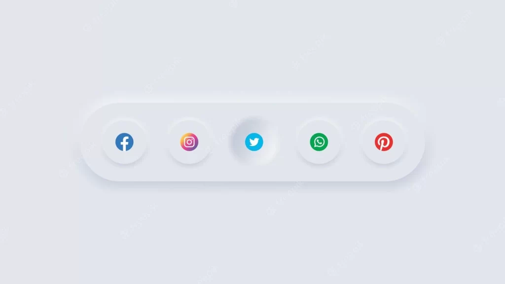
Add Your Social Media Buttons to Your Website
The first, and most common option, is to use small buttons for different social media accounts. These buttons are most commonly found in a sidebar, or at the footer of the webpage. And if a visitor desires to visit your social media accounts, all they have to do is click on the button for the channel desired, and they’ll be redirected to your page.
This is the simplest, and one of the cleanest ways you can integrate your social media handles into the design of your website.
Displaying Social Media Feeds as Widgets
If you want your social media pages to be more prominent, then another way to integrate social media into your website design is to create small, widget-like screens on a sidebar or at the bottom of the page. These screens would show the feeds from your various social media accounts, and users would be able to interact with them directly without having to be redirected.
However, this is more difficult to implement and can increase your site load times.
Integrating Logins via Social Media
Now, if your website allows its users to create accounts, then another option you can integrate to make the user experience more fulfilling is to allow them to sign up using their social media accounts.
Think of it like how websites allow you to sign up using your Google or Facebook credentials, meaning that all of your account information would be carried over from the social media site. That would make signing up and logging in easier for the users, ensuring that more potential leads are able to enter their contact details.
Personalization as a Design Option in Interactive Web Design
So far we have discussed various elements and options to improve the overall UX of your website design. However, there is one last aspect that could potentially give you a huge advantage. That is because this last element is one that is still largely ignored by website designers and developers, as it is harder to implement effectively, and largely not worth the effort.
However, with times changing and businesses looking to stand out, it is only a matter of time before someone manages to implement it, thus gaining the pioneer benefits. That element is the ability to personalize and modify UI by the users of the website. Let’s find out how we can use it to enhance our website’s design.
Offering Personalized User Experiences for Better Adoption
Imagine if you could modify the positions of various design elements on your favorite website so that the view could be exactly as you wish. However, this level of personalization currently, would only end up causing more problems than improvements.
Nevertheless, the ability to personalize your views is a feature that is offered by many custom-developed web portals, especially those with custom dashboards. Think of it like the account pages for Myspace or Orkut. Both offered a blank canvas, onto which the account holder could customize their views with widgets and design elements.
In any case, companies like Google have been trying to bring the element of personalization to a wider variety of elements, such as changing the view of their email app. But there is a long way to go.
Allow Consumers to Modify Design Elements
Customization of design elements is another way of personalization that can be implemented within your designs. Let’s say that you offer the option the change the color scheme of your website based on the user’s personal preferences. Or offer a classic vs modern view where the former offers a vintage-style design of its pages, while the latter the modern design you want to portray.
However, this all depends on the type of website you are designing, as well as the requirements of your target market. In any case, for most circumstances, this is too much effort for what it is worth.
Opt for Dynamic Content Based on User Preferences
Dynamic content optimization is something that could be doable. For example, if you are a website that offers a lot of blogs, articles, and other such publications, you can offer the option of a “You might be interested in” section that shows published resources related to the topic of that user’s interests.
That is an element of personalization that is already being used by many websites, who have seen different benefits after implementing it into their design.
Focus on Web Security

Finally, we come to the last, and perhaps most critical element of our website development project – implementing security measures into our website. Nowadays, data breaches are getting quite common. And businesses that want to retain the trust that their consumers put in them, should invest in some solid web security measures.
So how can you make your website secure? Let’s find out.
Using SSL for Security
The first thing you need to invest in is incorporating SSL into your website’s codebases. SSL, or Secure Sockets Layer, offers a secure, encrypted connection between your website and the server. This prevents unauthorized access to your data pipeline between the front-end and the back-end of your website.
Display Security Certificates as a Sign of Trust
Besides SSL, you also need to implement other security measures, such as anti-phishing measures and more to ensure that your website and its data are safe and secure. Moreover, just getting them isn’t enough. You should prominently display those certificates as a sign that you care about your consumers and the security of their data,
Developing a Privacy Policy and Terms of Service
Finally, you need to create and add a Privacy Policy and a Terms of Service document to your website. This would allow you to establish your liabilities, as well as the duties and liabilities of your users. That would help prevent legal liabilities in case of an issue, and cover you in cases where your site isn’t directly liable.
Conclusion
To conclude, using website design elements to start out your web development project is a surefire way to success. However, there is a lot more than a good design to make a website successful. From evaluating your business to developing your website, several elements are involved that help in making your website popular with the consumers. Those elements include:
- Your brand color palette
- Your brand fonts
- Style of your website
- An intense focus on user experience
- Integrating your brand elements into your website and making it consistent
- Focusing on the navigation and user journey
- Choosing the right visuals and their accessibility alternatives
- Adding the proper call-to-actions
- Integrating your website with your social media handles
- Testing and improving your web designs
- And implementing security measures to protect yourself and your customers
All in all, this comprehensive guide shows that while elements such as web security are important to a site’s success, ignoring the benefits of implementing web design ideas can be quite hazardous to your website’s sustainability.
Therefore, whenever you pitch your web design services to businesses or embark on a web development project, always start by creating an awesome web design.
Latest news you want to know!
Subscribe for cutting-edge design inspiration at Logo Poppin! Elevate your brand with updates on logos, branding, web design, and video animation.
Note that by clicking “subscribe,” users may agree to our privacy policy and consent to Logo Poppin to use your contact data for newsletter purposes.
Logopoppin
Logopoppin is a graphic design agency that specializes in logo designing, web development, video production and advanced branding services. We love to innovate businesses with new age technologies, allowing them to improve their visual reputation.