
Table of Content
Discover the Best University Logos and How They Incorporate History into Modernism
Going to college or university is a great achievement in the life of many people across the world. In the US, being accepted to a university means that you are one of the few people whose academic/athletic prowess was good enough to merit a place at the varsity.
Due to their rich and interesting histories, many of the best university logos in the US belong to institutes like the Ivy-League schools and other old varsities. These logos are designed to showcase the university’s heritage, and in most cases, do it well.
Now, there are a number of different types of logos that can be used by these institutes for their university logo design. And based on their specific aesthetics, that is what most of these educational institutes too.
These logos, when designed well, play a major role in that university’s branding. The changing perceptions in the industry, especially of the consumers, has forced their hand into recreating their logos for the modern times, such as those sported by newer institutions such as community colleges.
So the question is – how can you improve your branding using quality university logos to help you attract prospective students and donors to your institutes? Well, one thing we do know is that this will require the help of a professional logo design agency.
Lets take a look at some of the most famous university logos, and discover what it would take to create such an amazing symbol for your institute too.
Impactful University Logos – Why is it So Important to Have One for Your Institute?
There is no denying that every brand NEEDS a logo with a strong, positive impact. With a logo serving as the first contact between a business and a potential consumer, a strong, memorable logo will help your brand become known far quicker than your less impactful competitors will.
Let’s take a moment to think about this. Let’s say that there is a donor who wants to donate to a university’s neurological sciences department to honor a dear departed friend. As a first-time donor, they want to ensure that their donation goes to the best candidate, rather than to a specific varsity.
So, he asks a few universities to craft proposals as to why they would be the best option to receive his donation, and soon those proposals start to come in. A few they reject right away due to their short, uninspired proposals. Three however, he keeps to study further.
Now, each of those proposals is well designed, with their logos emblazoned across the front, as well as embossed or watermarked across all papers. Interested, the donor reads all three of them, with each offering similar, and highly persuasive arguments.
In such close calls, which one would you think that the donor would choose?
Well, chances are, that as the arguments are all quite close, the donor would think about which proposal speaks to them better. Here’s where your logos come in. Out of all three, the proposal featuring the best of the three university logos would be their subliminal choice all along.
So, a quality logo for a university subtly influences its viewers, drives engagement, and boosts brand memorability among consumers.
The Various Shapes and Colors of Famous University Logos
Before creating university or school logos, it is important to understand their different types. Nowadays, you can find various kinds of logos used by universities and colleges. Some are made conventionally, while some are created as per the latest standards.
Here are some common types of college logo designs that you should know about. They are used with different combinations of colors and styles as per the requirements of educational institutions.
University Logos with a Shield Design

Many universities prefer to design their logos incorporating some sort of a shield in their design. It can be said that within the educational logo design industry, the shield is an evergreen style of university logos that looks very engaging and attractive.
There are tons of university logo examples available today that use the shield style such as the logos for Harvard, Princeton, and more. And the reason is that the shield offers a vibe of antiquity, which lends well to a varsity’s aesthetic of high educational capabilities due to a long and rich legacy.
Generally, a short university motto is also used with this type of logo, often in Latin to solidify that legacied aesthetic of the university. Combined with the logo design, the motto defines the values of the institution or sometimes its historical significance. Either way, you can use any creative slogan with this sort of logo, as it brings more boldness in the illustration.
University Logo Design with Architectural Depictions

Many modern university logos are moving towards a new style of logo design that use some sort of architectural feature as part of their logo. That feature is most commonly one of the most prominent and popular features of the university, which makes associating the symbol with the brand much easier. This looks very decent and unique, providing a subtle branding image of a university. Some of the top examples of university and college logos in this regard include Dartmouth and more.
Though the overall design of these logos often look more complicated, the resultant professional association between brand and actual university more than makes up for it. Moreover, as they are often designed using a single color, it adds a touch of simplicity and uniformity in the design.
Simplicity with Typography in Design

Some universities just want to promote simplicity in their logos. That is why they use simple, masculine fonts in their designs. This helps them to offer a very decent wordmark logo, which has an assertive presence due to the choice of fonts, allowing everyone to understand it easily.
You can find many university logos created with a simple typeface, such as the symbols for the University of Idaho, University of California – Berkeley, and more. All of them are made with a simple yet assertive font, providing a clean view of the whole logo design.
Lettermark University Logos

When it comes to creativity, lettermarks may be one of the most overused ideas in the university logos. And the style most popular with fans of this design method, is the letter overlap. Now, we aren’t saying that it looks bad; in fact, this style is used one of the most popular MLB logos today.
However, while it does look unique, the style is quite overused, and frankly, rarely is it properly executed. Generally, the main initials of the University name are used for overlapping letters. This makes them look different compared to your conventional logos, there is a big chance that similar initials may cause problems.
For example, two universities in the USA have the initials “ASU”. Imagine how big of a nightmare would it have been had both of them decided to go for a lettermark logo!
Some of the famous university logos that are made with this style include University of Delaware, North Dakota University and more. They look quite attractive and striking among others, offering a real creativity in the logos.
Best University Logos from the United States’ Top Varsities
Each industry niche, such as restaurant or university logos, have some specific aesthetics and elements Being a beginner, if you are short on ideas on how to design a logo for any university, take a look at these examples. They are created with ingenuity to express the real values of the institutions, perfectly in a professional manner.
MIT

The MIT logo is an interesting one, that uses line art to create the lettermark of the university’s initials. One of the most interesting and unique designs when it comes to university logos in the US, the design shows a forward thinking and modern approach aesthetic that is the hallmark of the institution.
Dartmouth
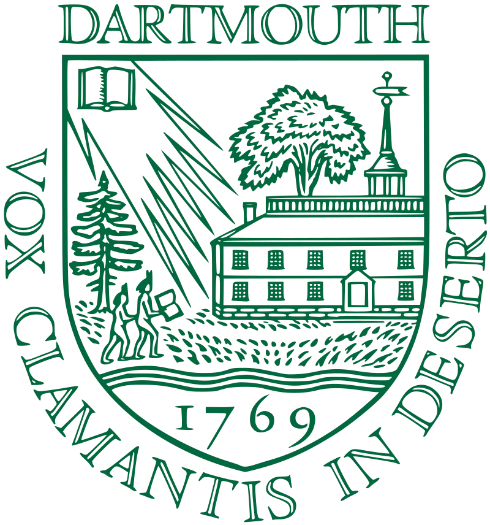
Dartmouth is one of the oldest educational institutes in the United States, and that can be witnessed in its logo too. The design showcases a couple of students walking the grounds, with the central Dartmouth building in the background. From the top left corner, the rays of the sun can be seen shining onto the students and the entire image, yet instead of the sun, it’s an open book, representing education’s enlightenment.
University of Notre Dame

University of Notre Dame was founded long ago in 1842 by the renowned French priest Edward Sorin. Since then, it has remained a symbol of top level education in the world due to offering great academics. The logo of the university is precisely created to represent its historical value to the people. It looks very engaging and provides a stunning bold identity of the institution.
Looking at its overall structure, you can clearly analyze the idea behind its design. It strongly represents the identity of a catholic institution. This makes its whole illustration highly unique, allowing the people to understand the true standards of the university.
Harvard University

Harvard University doesn’t need any kind of introduction. It is one of the most reputed professional institutions in the world that has got a great historical value. People from all around the world aspire to join Harvard University due to its amazing educational standards.
The logo of the university is delicately crafted as per the modern design trends. It looks simple and clean to the eye, providing a subtle image of the university. This logo could be a good pick for you to take the design inspiration. It offers a great neat look that is termed suitable for all university logos.
American University

American University is also a reputed national institution located in Washington. It has always remained a top choice of many students throughout America. Apart from great academics, the university is also renowned because of its extracurricular activities.
Talking about its logo, you can clearly see the richness in its design. The beautiful combination of red and blue makes the whole logo highly attractive. Its color tone also resembles the theme of the American flag. It defines how to build color relevance in the logos, precisely to show some sort of special connection.
University of Texas

If you want to design any university logo boldly, take a look at this amazing example. The Texas University logo looks quite fierce with an illustration of a longhorn bull. This particular symbol is precisely chosen to show a flare of compactness in the logo. It also represents all the sports teams of the university which is indeed a great characteristic of this logo.

The brown color in the logo stands for consistency and stability. It makes the whole logo representation very subtle as well as attractive. This is the major reason why other branding elements of Texas University are also designed using brown color. It helps to bring uniformity in the elements, so that people can find a good relationship.
The State University of New York
It is not always necessary to design a university logo with rich colors or style. Sometimes, you need to just keep it simple in order to showcase decency in the logo. The State University of New York logo is indeed a fine example for that.
It is artistically created with a simple design and neat typography. The acronym “SUNY” used in the logo stands for The State University of New York. It makes the whole logo very catchy, allowing the design to creatively stand out from others.
Michigan State University
Michigan State University was founded in 1855 and it is still considered as one of the top educational institutions in America. People from around the world regularly enroll in MSU to get quality education. The official logo of Michigan State University is also designed quite creatively. It includes a green Spartan in the logo which perfectly shows a bold image of the institution. If you are looking to design a university logo with a bit of uniqueness, take a look at this logo as it is a fine example of bold illustration.
Stanford University
Stanford University is also one of the highly reputable universities in the United States. Located in California, Stanford university is a top attraction of many national and foreign students. The logo of Stanford University is designed with a lot of simplicity. The redwood tree in the logo looks very clean and brings a flare of calmness in the emblem. It is certainly a great example of a simple university logo that is designed with a subtle perfection.
Foreign University Logos with Great Brand Visuals
When it comes to the top university logos, many institutes around the world sport amazing logo designs. So now that you have looked at some of the best university logos from the US, let’s take a look at the most famous university logos from various countries.
University of Bologna
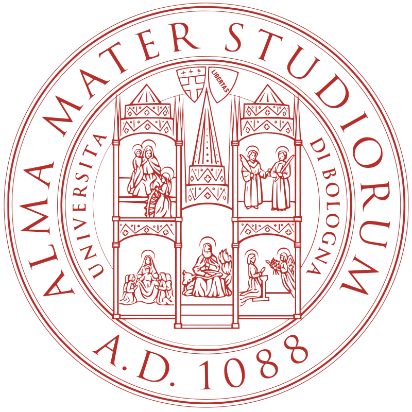
University of Bologna is the oldest university in the world in continuous operation, founded in 1088 by a students’ guild. The logo features the name of the institute, as well as the date of the university’ foundation.
The vintage-style design lends well to the legacied history of the institution, with the highly detailed imagery in the design making it one of the best circle logos we have seen.
University of Cambridge
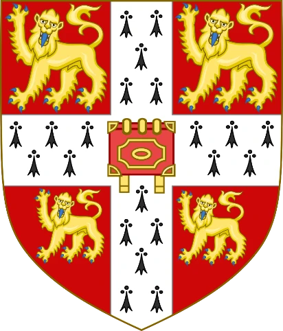
As one of England’s top educational institutes, the logo for University of Cambridge sports something similar to what you would expect from an old aristocratic family. The shield-like shape of the university logo design offers a sense of regal charm that blends well with the royal red and the Windsor lions of the design.
Cairo University
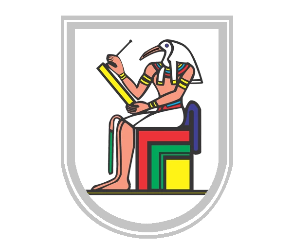
The Cairo University is one Egypt’s top universities, and makes good use of the hieroglyph art style to design their logo. The design features a white-gray shield outline, which encloses the image of ibis-headed Egyptian deity Thoth, who is known as the god of divine words and the creator of hieroglyphs. Overall the design represents the history of Egypt well in its logo.
Kyoto University

Kyoto University is one of Japan’s top educational institutes, and one with a rich history. Founded in 1897, the university’s seal-like design incorporates an old, widespread tree, with the name of the institute and the date it was founded on around it. This circular seal works as a great logo, incorporating both elements of both modern university logos as well as a vintage vibe.
University of Melbourne
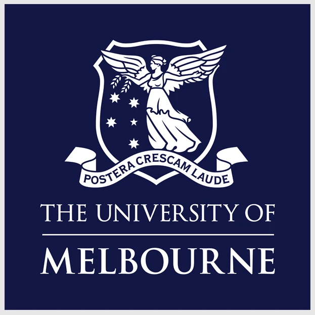
University of Melbourne’s logo is another interesting one, which uses a more elaborate shield design than some of the previous options we have seen. The logo also features an image of an angel with their wings spread wide, against a few twinkling starts. Underneath it is a ribbon banner that has the university’s motto on it. Overall, this is a subtle yet great design among modern university logos.
University of the Philippines

The University of Philippines has a logo that looks like it could be perfect for a government organization rather than an educational institute. The eagle with its wings spread out, perched over a shield depicting the top three study options at the university, makes this a highly expressive logo. However, the dark red and forest green color combinations, accented with yellow-gold, makes this one of the most regal university logos on this list.
Tohoku University

Finally, the university logo design for Japan’s Tohoku University is an abstract representation so the global world of education today. Going for a vine that wraps around in a circle the design look like mix of the yin-yang symbol, as well as the depiction of the earth. That, combined with the simple wordmark underneath makes this one of the best university logos on this list.
Frequently Asked Questions
| 1. Why do universities use logos? The primary purpose of university logos is to demonstrate the unique identity of the institution. It helps the people to know about the university’s branding symbol and its exclusive representation in the market. |
| 2. How to design creative university logos? To design creative university logos, you have to consider different aspects of the design. From typography to colors, everything should be picked perfectly knowing the exact branding requirements of the university. |
| 3. How many types of university logos are popular in the market? There are different types of university logos used in the market. The most famous among them includes the shield, building structure, simple wordmarks and more others. |
| 4. Name some of the famous modern university logos? Currently, there are many university logos famous in the world. Some of the top rated among them includes University of Notre Dame, Stanford University, John Hopkins University and more others. |
| 5. Where to find free vectors for university logos? You can find free vectors for University logos from different sites. The best platforms where you can download free university logo samples includes Freepik, DesignEvo, depositphotos and more others. |
Final Words
Logos are termed important for the representation of any educational institution. They not only let the people know about its identity, but also come handy in various types of promotional activities. That is why the designing of the best university logos is always considered an important job. It describes the theme of an institution, so that people can know about its unique market identity.
Here, we have discussed some of the most famous university logos in the world today. From common logotypes to some unique examples, we have listed all the important stuff you will need to design a proper logo. Meanwhile, if you want to get an expressive university logo design from the expert designers, get in touch with us today. We will help you to design quality logos that can grab people’s attention quickly.

Logopoppin
Logopoppin is a graphic design agency that specializes in logo designing, web development, video production and advanced branding services. We love to innovate businesses with new age technologies, allowing them to improve their visual reputation.


