Table of Content
Discover What Makes These Retro Vintage Logo Designs So In-Demand Today
The nostalgia associated with vintage logo design is not unique to the just the logo design industry. From automotive to the apparel industry, and even construction and interior design. all of them and more rely on our love for the aesthetics of the past to get inspired for new designs.
But the question arises, that even though the modern design industry has changed drastically compared to the decades past, why is it that the retro-craze calls out to the people constantly? What was it about those classic designs that made them so timeless?
Join us as we discover why the vintage design craze has seen a resurgence in recent years, and how professional logo design services incorporate retro vibes into logos without making them look dated.
What is Vintage Logo Design? Understanding the Classification
When we talk about anything vintage, we understand that the vibe is all about the story it tells. Any design with decades of history behind it has a rich tale to tell. When you think about a brand that has been around for more than a few decades, you want its rich tapestry of history to be displayed in their logo.
Now, vintage logo design evokes feelings of a simpler time, an escape from the fast paced life of today. When people look for something vintage, they are looking for something familiar and comfortable, something nostalgic rooted into the fabric of the world around them.
Coming to what makes brand symbols retro, vintage logos are easy to recognize. Their entire being portrays a sense of reliance and solidity, something that has braved the changing aesthetics through decades without change, and come out of it victorious. This may sound like an abstract description, but while retro logos are easy to recognize, they are hard to describe.
Different Eras and Their Signature Vintage Logo Design Aesthetic
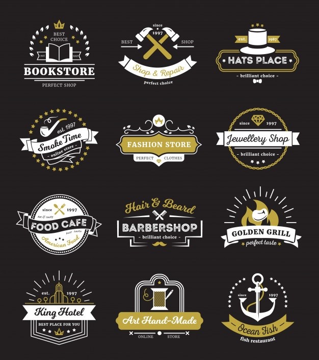
When it comes to creating a vintage logo design, many different types of logos can be created to give off the desired retro vibe.
Any good vintage logo is not just about incorporating the design aesthetics of a specific era. It is about enhancing your brand identity using specific styles and ideas from the past to give your logo a sense of history and legacy.
That is why, before you get on with the design of your brand symbol, you need to know the design characteristics of the era you want to embody within your logo. That will help you know the exact elements you will need for your brand logo.
Let’s take a look at some of the most common styles and aesthetics of retro logo designs from different eras in history.
The Roaring 20’s
The roaring 20’s, as they are called, refers to the 1920s. This era was known for its extravagance and financial prosperity, after a brutally debilitating First World War. After years of hardship, this decade personified freedom, decadence, and prosperity.
After the war made many women more self-sufficient and employed, a new potential segment appeared in the market – the independent females.
One of the primary industries to target this new market, was the fashion and apparel industry. They quickly revamped their styles to create items meant for the office and other casual events, rather than purely evening wear.
Moreover, with women now freer and more independent, their aesthetics also changed. Less elaborate clothing and hairstyles were introduced to cater to the needs of a freer, post-war western woman. But that is not why it was called the raring 20s.
This era was defined by the popularity of jazz, parties, smoking, and recreational drinking, for the women and the men. This boom in the freedom from societal shackles, the use of vibrant and rich color combinations, and intricately designed logos, are the reason this era is considered vintage.
The Recovering 50’s
Like the Roaring 20s before it, the 1950s too was a post-war era. Unlike the First World War, which saw a rise in cultural reform, the years after the Second World War was the age of consumerism. In the United States, and much of the developed western world, the years following the war was a time for industrial growth.
During the war, the design styles were simple, with blocky masculine fonts, and bold colors which made it easy to identify the art created. Made using simple printing presses, this design aesthetic stuck around even after the war ended, bringing with the art of blocky logo designs.
The color schemes used were mostly pastel, which was a great choice given that they were the best choice when we consider color fading due to age. And as most of the advertising was done through the print medium, it personified the vintage aesthetics of the mid-20th century.
The Freedom Era of 60’s
The 1960s was a time of social turmoil in the United States. Many minority groups rose up against the injustices they continued to face in their country, and the call for reform and retribution was on the lips of a vast majority of people.
This phenomenon gave rise to a general sentiment of anti-establishment and anti-war philosophies, giving rise to the popularity of hippies and their concept of free love. Also the decade known for the infamous Woodstock 69, this era was defined by a more naturally grounded designs.
The aesthetic was to often use a mix of psychedelic colors, elaborate poppy logo fonts, and revolutionary designs in their art. This makes styles from this era some of the most sought after vintage design ideas today.
The Daring Disco Era 70’s
The 1970s are well known as the disco era. From the elaborately styled hair to puffy shirts, and bell-bottom trousers, the age of the funk is one that is fondly remembered by many. However, the era is also known as one of social reform, with many movements fighting for equality, freedom, and justice.
The most visually memorable aesthetics of this era, are the bold vintage fonts and bright colors, which are still used in conjunction with a variety of patterns to make the design look somewhat overwhelming. Using text effects in design was made popular in this era, mixing bold and pastel shades for a visually pleasing look.
The 8-bit Digital Era 80’s
The 1980s saw the rising popularity of the modern digital world, with 8-bit graphic designs ruling everywhere from the gaming industry to Sci-fi TV shows and movies. This design style also carried over to the logo design world, with the retro 8-bit style becoming one of the most popular vintage logo design ideas in use today.
Edgy and unconventional designs with bright neon shades, crazy patterns and futuristic fonts, stretchy lycra leggings and elaborate hairdos made using liberal amounts of hairspray are what the 80s are known for. With many consumers who still remember the era with fondness, it is a great way to evoke the feelings of nostalgia and convince them into interacting with your brand.
Psychological Pull of Everything Vintage – Why Retro and Vintage Logo Design Attracts?

Humans are highly visual creatures; we all know that. Sight is the sense we rely on the most, and it is the one that helps us gather our first impression about anyone and anything around us. Moreover, along with the sense of smell, it has the ability to bring up specific memories and moments from our past.
That is why, as a marketing and branding tool, logo design, or graphic design in general is a great way to leverage nostalgia to a company’s benefit. For example, finely stenciled wordmarks are a thing of the late 19th century, and as such bring to mind a well-established business. Similarly, a café that uses warm, earthy tones for their logo paired with a simple, minimalist font portrays a modern aesthetic.
Now, vintage logo designs can be broadly categorized into two groups. The first category contains those brand logos who have actually stood the test of time and have represented their companies for decades. The other category contains the new logos who used the vintage aesthetic for their brand symbols, such as the design of the Detroit Red Wings, one of the only NHL logos to have seen only minor improvements over the decades.
The first category keeps the same design to portray their legacy and long experience. The other category aims to use nostalgia to get consumers attracted towards their offering. While both use retro logo designs, the concept behind their use is quite different for each.
Hallmark Characteristics of Great Classic or Vintage Logos

There are two major factors when using vintage logo designs for your brand symbol. The first factor, is the visual theme you want to portray. The second, are the design elements you want to incorporate within your design.
Let’s take a look at the visual themes that are usually portrayed in vintage and retro logo designs.
Nostalgically Emotional
These logos rely on their nostalgic factor into influencing consumers to buy from your brand.
Local Born and Bred
These logos are often used to show a connection with the local community, portraying their roots within the community and the values they work by.
Quaintly Rural
Retro style vintage logo designs are often used to portray rural connections. A well-known example for this phenomenon can be the Pepperidge Farms brand.
Charmingly Rustic
A simple rustic charm is perfectly portrayed by an old-style brand symbol, portraying their salt-of-the-earth business model.
Besides the popular themes portrayed above, there are a number of other subliminal messages often portrayed by retro logos.
No matter the style of the logo, there are a few elements that are common to vintage logo creation. They most common among them include:
- Textures and patterns.
- Fonts with elaborate designs.
- Bright splashy colors.
- Elaborate serifs and tails added to the characters.
Depending on the type of theme you wanted to portray, these and many other elements would be combined to create a truly nostalgic vintage logo design.
Famous Brands Known for Their Vintage Logo Designs
Many brands today use vintage logo designs to portray their business identity. These brands have a rich history, with decades upon decades of legacy serving their customers, perfectly represented by their old-world aesthetic.
Let’s take a look at some of the most well-known retro logo designs.
Levi Strauss
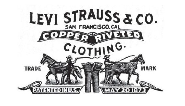
Levi Strauss Denim company is an old company established during the Gold Rush. The company has been using the same brand symbol since its inception, with only minor changes through the years later. Even today, this vintage logo is well recognized around the globe.
Coca Cola

Who doesn’t know the classic Coca Cola logo. The exquisitely curving lines, and the script-like font used in the wordmark have been in use for more than a few decades. With only minor alterations through the years, the logo is testament to its everlasting design, becoming one of the top red logos we know today.
Jack Daniels
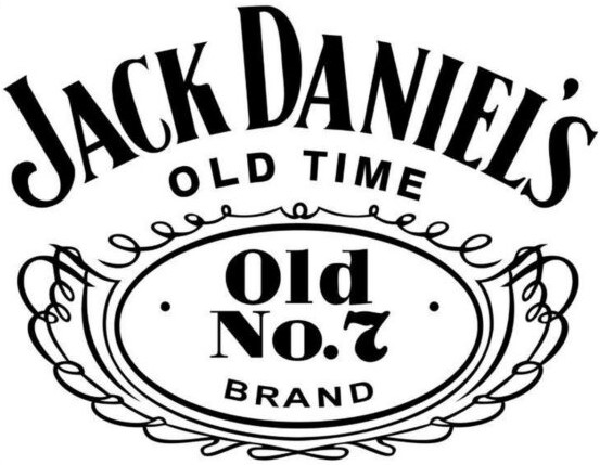
Jack Daniels whiskey is an American classic. Aged in charcoal-treated wooden barrels, the classic aged whiskey known around the world uses an old style logo since its inception. The intricate yet relaxed line work combined with the blocky, old-style typography, makes for an interesting vintage logo concept.
How to Update Your Vintage Logo to Ensure It Retains Its Charm
One thing that many business owners, and even designers forget, is that having a vintage logo requires more than just coopting a classic design. And when focusing on the retro aspect of that design, you need to ensure that it performs as well in the modern day too.
Often, the common theme behind businesses featuring vintage logos is that they want to highlight their historical roots, or they want to portray a specific business vibe. But with that, they need to make sure that their logo is scalable, legible, and versatile for use on a variety of mediums, both digital and otherwise.
One way to carry over and “modernize” the vintage vibe without affecting that aesthetic is by simplifying the design’s complex elements. Often, old logos like these featured intricate line and scrollwork, elaborate coat of arms, and more, which are neither scalable, nor effectively visible at distances.
To make them suitable for modern times, a designer can identify the core design elements of those logos, and then recreate them in a way that makes it scalable, yet retain its vintage charm. A great example of this phenomenon is the IBM logo, which more or less stayed the same, yet featured light revamps that modernized and simplified it for modern usage.
Tips to Effectively Capture That Classic Feel with Your Vintage Logo Design
A great way to ensure that your vintage logo retains its retro look is by understanding what logos looked like in your chosen era, as well as your chosen market. For example, in the late 19th century to the early 20th century, European printing was more advanced and articulate than the Americana style. That meant that in the case of the latter, the lines tended to be less clear, the colors bled into the surrounding canvas, making the logos less effective.
Similarly, colors like brown, orange, and other high-visibility, low fade pigments from that era were used. These are some elements that you can incorporate into your design along with specific symbolic and design aesthetic, for that perfect vintage vibe.
Effective Vintage Logos – Ensuring Your Brand Logos are Classic, Not Outdated
Now that you the know why vintage logos are so important for many brands, let’s look at how to design a logo for your business. Keep in mind that a great logo is one that perfectly incorporates the desired retro vibes within your brand identity.
Employing a Professional Branding Agency to Create Your Vintage Brand Identity
The simplest option is to hire an expert branding agency that specialize in creating vintage logos to help you create your brand symbol. With a team consisting of market analysts, designers, and brand specialists, you will be able to establish a strong brand image, fronted by an amazing vintage logo. However, this option can be a little expensive for some smaller businesses.
Hiring an Experienced Logo Designer Expert in Creating Vintage Logo Designs
If a branding agency is not an option for you, then the next best thing is to hire a freelance logo designer to design your vintage logos for you. These experts are specialized in perfectly merging your brand identity with relevant vintage elements designed to amplify your logo’s impact. And while it may not be as well-suited as the one a branding agency may provide, it will be a lot more effective than the online vintage logomaker tools.
Frequently Asked Questions
| 1- How do I make a vintage logo? You can create vintage logo designs using either an online logo maker tool, or you can hire a professional designer to create one for you. |
| 2- What is a vintage retro logo? A vintage or retro logo is one that uses design aesthetics from the past within your brand symbol. |
| 3- How do I make a vintage logo in Photoshop? You can create a vintage logo design in Photoshop by either importing an existing vintage template into the tool, or creating one from scratch using vintage design elements. |
| 4- How do I make vintage logo in Illustrator? The process of creating a vintage logo in Illustrator, is the same as Photoshop. You can either import a template into the tool, or you can create one from scratch using retro design elements. |
| 5- What makes a logo look vintage? Elements like typography, color scheme, and graphics elements are three important factors that make a vintage logo look retro. |
| 6- Why do vintage logos look so good? As the retro style of logo design went against the minimalist aesthetic of today, a vintage logo serves as a welcome breath of fresh air in an otherwise array of simplistic brand logos. |
Conclusion
Vintage logo designs are all the rage nowadays, and there are many businesses who want to have a retro style brand symbol for their business. Whether it’s to pique their consumer’s nostalgic interest, or it is meant to portray your long history in the industry, vintage logos are only great if used the right way.

Logopoppin
Logopoppin is a graphic design agency that specializes in logo designing, web development, video production and advanced branding services. We love to innovate businesses with new age technologies, allowing them to improve their visual reputation.

