Table Of Content
Discover How the Logo for the Washington Commanders Came To Its Current Form
The NFL has mixed bag of teams and franchises currently playing in the league, with some nearing a century of gameplay, while others who barely joined the sport a couple of decades ago. Now, considering that football is so popular in the US, its small wonder that the logos for the teams have achieved a cultural icon status. And one of those icons, is the Washington Commanders logo.
The franchise is one of the oldest teams to still be playing the sport, with football featuring the team from Washington for nearly nine decades now. However, recent events forced the franchise to change its mascot from the controversial native American caricature, to a more neutral brand symbol.
So, how did this evolution come to be? And what prompted this response? Let’s dive in and take a look at how the Washington Commanders got to where they are today.
1- The Origins of the Washington Commanders
Founded in 1932 as the Boston Braves, the franchise changed its name to the Redskins only a year later. In 1937, the franchise moved to Washington DC from Boston, and now became the Washington Redskins.
The team has been quite successful in the sport, winning two NFL championships before the AFL-NFL merger, and three Super Bowl championships. They are one of only five teams in the NFL with over 600 wins, and they have played more than a 1000 games since their inception. Moreover, the team has a current valuation of $5.6 billion, making it the sixth most valuable NFL franchise.
When we talk about the logo for the team, they used the caricature of a Native American man for their brand symbol. Now, it may have seemed like a perfectly fine emblem logo design based on the name, but the term “Redskins” has long been considered a pejorative in among the northern states, especially in Washington.
For a long time, the franchise had been defending their use of the name and symbol. However, the team was forced to change both in 2020, die to pressure from the League and sponsors. The team hired a professional branding and logo design services specialists to come up with a neutral, non-offensive symbol for the team that would represent its long and lucrative history in the sport.
Thus the symbol we now know as the Washington Commanders logo was born.
2- The Controversy behind the Redskins Name and Imagery
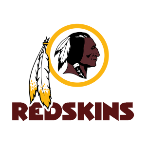
Since 1933, the team that we know as the Washington Commanders today, had been using the name “Redskins” for the team, accompanied by the caricature of a Native American man. Now, initially, that wasn’t a problem.
However, since the mid to late 1960s, there has been an increasing controversy regarding the cultural and societal appropriation of names and symbology from the Native American and First Nations people. Civil rights movements for the indigenous people was at its peak, with many non-indigenous people and celebrities calling out those who used such names and imagery that were considered pejorative or derogatory.
Due to these protests, many businesses and educational institutes retired any names or mascots, which would have hurt the sentiments of the indigenous people. However, professional sports franchises in the US were highly reluctant to do so, and were afraid of trying out new naming and branding examples in case they lost their fan support.
Now, at that time most of the league and other sporting leagues has symbols that were inspired by animals or other things. However, NFL teams like the Redskins or the MLB logos and names for teams like the Cleveland Indians were still causing issues.
In 2020, after the George Floyd killing, the sentiments were again on an edge, and finally, these teams changed their names and symbols to something more inclusive.
3- The Evolution of the Brand from Washington Redskins to Washington Football Team
In over ninety years of playing the game as part of the NFL, the team has gone through five different names and symbol. Some have been part of their move from one city to another, while others have been prompted due to a controversy.
Initially, the franchise was called the Boston Braves. However, only a year later, they renamed themselves the Redskins. The newly renamed Boston Redskins moved from Boston to Washington DC in 1937, and renamed themselves yet again, now calling themselves the Washington Redskins.
Since 1937, the team has been located in Washington DC, and has been known by the moniker Redskins. However, in 2020, the murder of George Floyd, and African American man, at the hands of a white police officer, resulted in riots and protests.
As a result of that, under pressure from sponsors and the NFL itself, the team renamed themselves as the Washington Football Team. However, this name was meant to be a placeholder until the franchise could choose a new name, and finally in 2022, the team released their new moniker, called the Washington Commanders.
Now, the new name and logo for the team may not be as striking as say, that of the Philadelphia Eagles logo and brand. However, for a team as old and successful as the Commanders, it wouldn’t be a problem.
4- The Present Day Washington Commanders Logo
Now we come to the Washington Commanders logo of today. After dropping the Redskins name in 2021, the NFL franchise rebranded itself as the Washington Commanders, and released a new logo to go along with it.
The new logo is quite different from the ones we usually see in the NFL logos. The design features a lettermark instead of an animal-based mascot or another symbol, which has reduced the impact of the logo to some extent.
Nevertheless, let’s take a look at the new logos for the Washington Commanders.
Primary Washington Commanders Logo

The primary Washington Commanders logo features a bold, serif “W”, a design that is carried over and tweaked from their placeholder logo they used in the interim. The color combinations used is quite striking, with the letter colored in a dark burgundy outlined in dark gold. This striking combination makes the details of the lettermark quite visible even at a distance, something extremely important for brand symbols such as sports logos.
Alternate Washington Commanders Logo
The alternate logo for the Washington Commanders looks like a crest or a emblem, which depicts the round symbol divided into four quadrants, and displaying the formation date of the team, as well as its logo and wordmark.
This style can be quite utilitarian, and is a great example of minimalist logos used effectively to convey a lot of information quickly and easily.
Wordmark Variant for the Washington Commanders
The wordmark logo for the Washington Commanders is a simple, two-step design. The top row displays the host city, i-e Washington, in small and thin typeface. The lower row however, displays the team’s given name, i-e Commanders, in bold and large typeface.
The logo fonts used are plain, san-serif fonts with clean lines and spacing designed to be legible from afar.
90th Anniversary Logo for the Washington Commanders
The year 2022 was the 90th anniversary of the team’s formation. To commemorate that milestone, the Commanders decided to unveil a special logo, which featured a diamond with the number 90, emblazoned across it in a big typeface.
To the left and right of the number, were the initiation and the current years written, to highlight the team’s legacy in the sport. Designed using the team’s burgundy and gold color palette, the resultant logo was a masterpiece.
Conclusion
In short, the Washington Commanders logo has a rich, if contentious history. However, despite that, the symbol has been one of the more successful ones in the history of the NFL. Despite that, the case of the controversy that surrounded the brand, and which resulted in the change in its name and logo, shows us that ensuring that your branding does not offend anyone. And that is especially necessary if your brand identity can potentially impact a persecuted group.
However, if you want to know how to design a logo that doesn’t offend anyone, learning from the case of the Washington Commanders and the MLB’s Cleveland Guardians is a great place to start.
People Also Ask (FAQs)
| 1- What is the new logo for the Washington Commanders? The new logo is a stylized, serif W colored in the classic Washington burgundy and outlined in dark gold. The color scheme is the one that the team has been using since 1933, which pays homage to their legacy as a team despite the rebrand. |
| 2- What does the Washington Commanders logo mean? The Washington Commanders logo features a modern style to its typeface, with the angled shape of the design and the forward serifs designed to portray a sense of moving forward and progressing. This is a nod to the team rebranding after yearly nine decades of playing in the NFL, due to the Native American insensitivity controversy. |
| 3- Do the Washington Commanders have a mascot? The new name and logo for the Washington team required a new mascot, which was unveiled as an armored hog by the name of Major Tuddy. This ties it up with the militarized theme of the new brand, going perfectly well with the new name Commanders, and is designed to highlight Washington DC’s rich military history. |

Logopoppin
Logopoppin is a graphic design agency that specializes in logo designing, web development, video production and advanced branding services. We love to innovate businesses with new age technologies, allowing them to improve their visual reputation.

