Table of Content
Why is Web Design important?
A good web design is important for retaining website visitors and standing out among your competitors. It ensures that the user finds your website visually appealing and is able to navigate through your website without any hiccups or difficulty. Suppose there is an e-commerce store with the best items you can find on the market. But, there’s a catch: the design has multiple glitches. In your opinion, would that website last long in the business? Of course not. That is why web design helps a business massively.
So, it’s important for your website to have a good UX/UI experience. Because functionality and visual appeal work simultaneously in created a successful website design.
Why has Web Designing changed?
The changing trends in web design result from improved technology that has allowed designers to make more visually appealing websites. Around the time when Facebook, YouTube, and Google first appeared on the internet, websites were predominantly based on HTML.
However, over the years changing consumer behavior and marketing techniques created a demand for innovation. Consequently, new coding languages were introduced, which allowed designers to incorporate more than one language in the web designing process for a much advanced UX and UI experience.
Also, today innovation in design language has allowed for more advanced online tracking. Now, algorithms more effectively collect in-depth insights on user behavior, which helps designers create products that effectively attract the right audience with the help of consumer psychology.
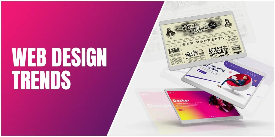
What are the Latest Web Design Trends?
Among the trending web design approaches for 2022, the influence of retro themes will be dominant. However, its usage depends on the type of website you wish to create. Here are some of the most notable trends for this year:
Decreased Loading Time:
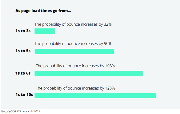
With everything becoming fast-paced, websites with increased loading time do not make sense. Adding lots of catchy visuals to your website should not be at the cost of your website’s loading speed. No matter how gob-smacking visuals your website intends to treat its visitors with, it defeats the point if visitors don’t stick around long enough for the page to load in the first place. That’s why one of the new web design trends for this year is prioritizing website speed. Using fast hosts, optimizing website media, and cleaning up database are some of the several methods to have a faster website.
According to Deloitte and Google, faster loading speeds can result in a 35% lower bounce rate on average and 70% longer sessions.
Narrative Visualization:
Another recurrent trend that has been doing rounds for the past several years is narrative visualization. It focuses on using the entire landscape of your webpage to create a visually appealing storyline that extends downwards as you scroll through the website. It’s like a vertical carousel with a series of visual images that connect chronologically to convey an engaging story.
Of course, narrative visualization is also executable with horizontal scrolling, which can make websites equally compelling and beautiful. This technique works very well for web pages that showcase art galleries, travelogues, etc.
Another variant of horizontal scrolling is Parallax scrolling, which uses the background to move at a different speed than the foreground content. This effect allows the designers to turn the mundane act of scrolling into something more engaging. An excellent example of a website that has incorporated narrative storytelling in its web design is How my dad fishes for the future.
Text-Only Hero Images:
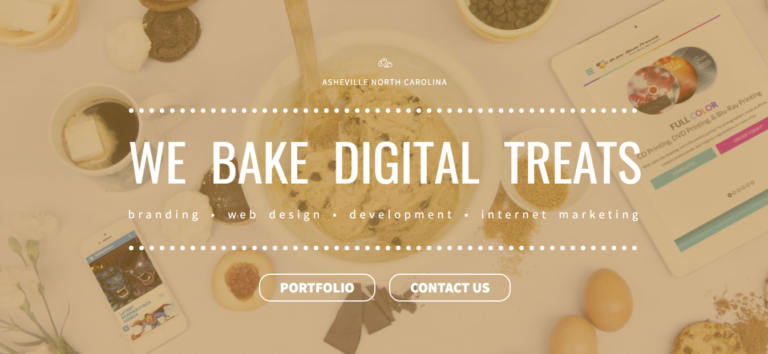
Large typography is becoming increasingly prevalent among web designers in place of art-based work. Most websites now prefer sporting a text-based hero section. Placed in the Hero section, words become more graphic and impactful, making that typography the website’s focal point. Moreover, the proper font choice determines how well you set the tone for your website’s visitors. Sometimes it isn’t easy to convey a message through visual imagery, as art is subject to open interpretation. With the help of typography, words make it much easier to connect with your audience.
Inclusive and gender-neutral designs:
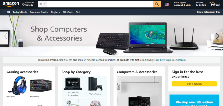
As web designers, when we bring certain biases to the table, it can hinder our creativity. To counteract the possibility of any such mistake, we must approach our designs with inclusivity in mind. Thus, designing gender-neutral websites has become the latest trend.
To avoid gender stereotyping, using grey, black, white, light brown, beige, and olive green colors in your website’s color palette is ideal for a gender-neutral design. Moreover, typography also plays a major role in shaping the personality of a website. Cursive, smooth, and round fonts are feminine, whereas bold, wide-spaced, and straight-lined fonts are more masculine. Opting for classical font trends is an ideal choice for a gender-neutral design.
Regarding a more gender-neutral UX design, websites are no longer shying away from giving multiple genders and pronoun options on their website forms. Websites have even started to avoid categorizing products and services based on gender.
Reminiscent Retro:
This approach calls for giving websites a 90’s feel through retro trends, using classic image filters, retro typography, grainy textures, and pastel colors.
This idealization with the web design styles of the 90’s stems from the artistic freedom that web developers enjoyed in those days, as web designing was an entirely new concept back then and did not have standard rules and regulations.
Claymorphism:
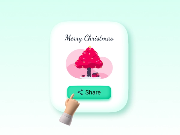
Claymorphism is another nostalgic trend that reminds me of my favorite childhood cartoon show, Gumby. The 3D web design graphics are now simplifying into a back to the basics clay-art design, called Claymorphism. Instead of having a box-like angular design, this approach focuses on creating clay-like objects that pop out with rounded corners and double-sided shadows for extra depth. Such 3D objects give the impression of sitting on top of the display.
Although similar to Neumorphism, Claymorphism has that extra ‘oomph’ that helps pop out the design. In today’s VR era, Claymorphism is gaining popularity because its design aesthetics blend well with VR and AR technology. The 3D feel of Claymorphic design makes things look tangible, which is why it’s easier to navigate through objects.
Glassmorphism:
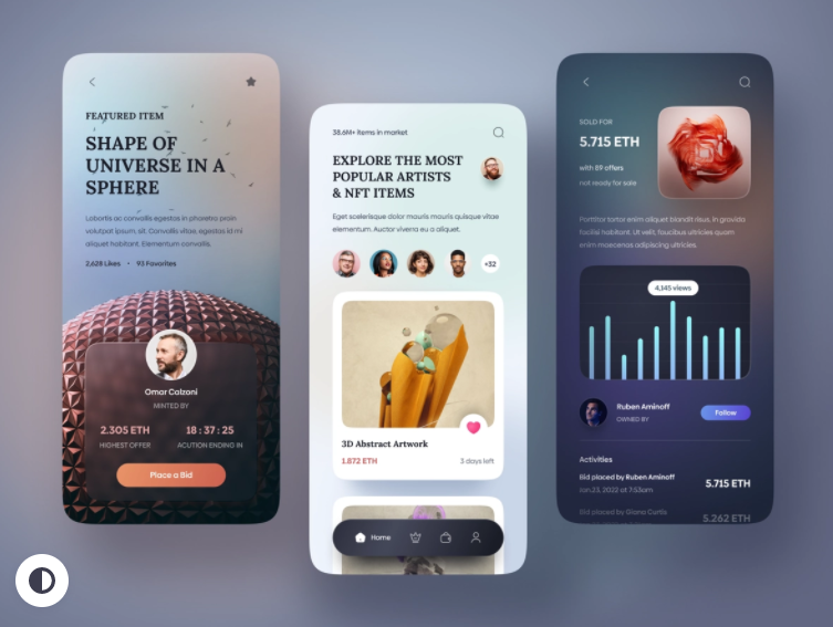
The name says it all, Glassmorphism creates a glass-like look which gives the UI a sleek look while creating a visual hierarchy similar to the Claymorphism. However, instead of darker shadows, Glassmorphism uses highlights to create glossy designs that look premium and classy. The highlights can also help the user’s eye gravitate towards essential elements on the page.
Moving and Interactive Text:
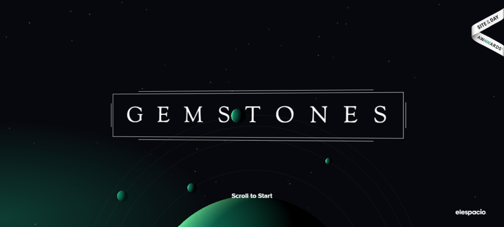
2022 seems to be all about the retro stuff. Just like the 60’s movies that began showing their movie intros in animated text, graphic designers, in an attempt to make an incredible first impression, are now using interactive and animated text to grab the attention of website visitors.
The idea is not just to have animated text on your webpage but also to have interactive text that engages the audience and compels them to interact with it repeatedly. With new technology, there’s ample room for creativity.
Micro animations:
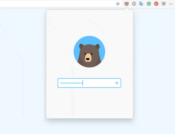
Micro animations have been popular for a few years, but in 2022, it’ll be about using them organically. As our UI/production designer explained, we’ll be thinking about how things move, if they’re on a curve or wheel instead of on a flat plane.
One of the latest e-commerce web design trends sites is using micro animations to enhance user experience and give shoppers a taste of their products. Notice how Remember, a website for creating secure and memorable passwords, uses a micro animation of a bear on its password creation screen. It’s not only a fun way of using micro animations for engaging your users but perfectly encapsulates the idea behind the product.
CGI and Immersive 3D designs:
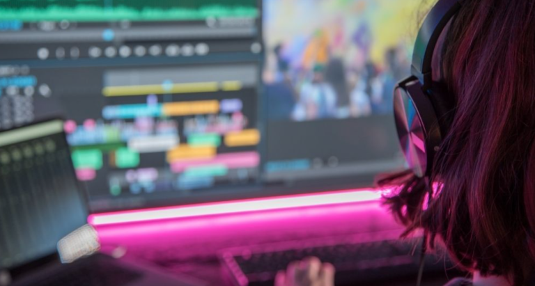
High-quality visuals aligned with the latest graphic design trends can leave a professional, reliable, and trustworthy first impression of your brand. The next trend guarantees a tremendous visual experience for interactive websites that keep customers engaged. CGI graphics perform best in web design with animation, and their intricacy speaks of quality and high-end technologies, which is a significant benefit for firms that can afford them. The unlimited possibilities and benefits of having CGI graphics are, thus, becoming a trend for agencies and businesses that don’t specialize in CGI.
Using Cinema 4D, ZBrush, or Maya demands a great deal of talent and expertise, but we’re not talking about full-fledged cinematics here. Long and elaborate CGI sceneries and hyperrealism are not required to create high-quality CGI visuals for a website to make the business stand out.
In reality, small animations and semi-abstract graphics could work perfectly well in your design.
Brutalism in Web Design:
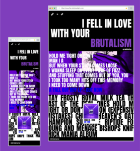
Brutalist design is a reaction to the flimsy aesthetic of modern society. Used to create a solid, rough, and natural look instead of sensational and ephemeral, it’s not that Brutalism is anti-modern. It’s the opposite. For these design lovers, Brutalism’s defiant and artistic personality is evident in how it captures the actual thing’s structure.
Brutalism emphasizes the natural look of things, which may be beautiful or ugly. However, as ugly as it may be, Brutalism’s honest, raw truth attracts its lovers. For some, the look and feel of Brutalist design seem crude, which is understandable, given that design methods that prefer a glossier and shiny look in striking contrast to Brutalist design are trending alongside it.
Grainy Gradients:
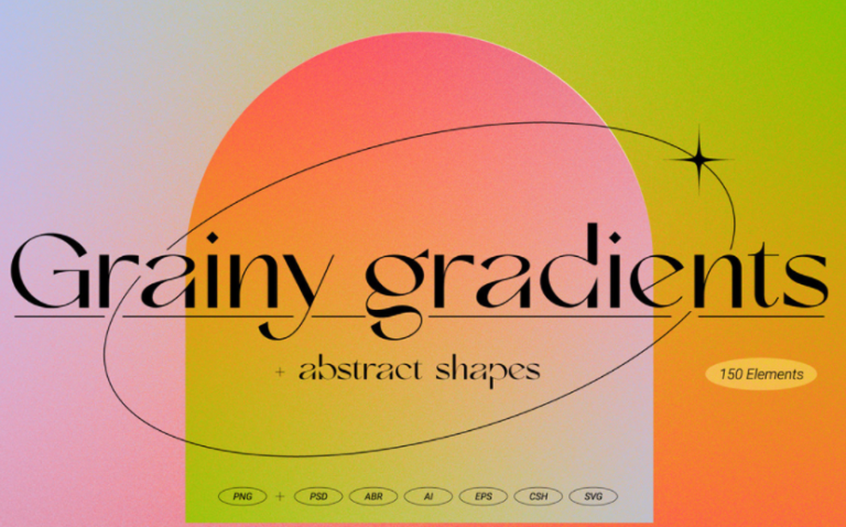
For retro art lovers, the glossy and smooth gradients may not be as attractive as noisy gradients. The amount of grain added to an image determines its outcome. Depending on that, adding noise can make an image look photographic or paper-printed.
The more commonly used method of making attractive designs is using multiple colors to create a very film-like feel. Whereas adding grain to an image with a monochromic palette can make it look like a silk-screened poster. The use of gradients is not limited to images only. It can be used throughout a website, using it for an entire webpage.
Drag & Drop Web Design Tools:
The no-code movement is in full-throttle, encouraging non-programmers to be on board with design ideas for a more collaborative approach. In the last few years, many new apps have surfaced that allow DIY web designing to non-programmers. These apps provide a user-friendly interface that makes the design process fun and easy.
Another added benefit of these apps is that they can make it easier for clients and designers to work together on materializing the desired outcome. For starters, clients can provide designers with a rough mock-up of what kind of layout design they expect. Doing so would make it easier for the designer to polish that work with their expertise.
These design apps also help teams collaborate effectively in hybrid and remote environments. After the pandemic, it became tough for programmers to communicate and work with their teammates. With the help of drag and drop web design tools, that issue is now resolved with collaborative features like live editing.
Frequently Asked Questions
| 1. How to keep up with web design trends? The best way is to subscribe to blogs and Instagram accounts based on the web design niche. Also, network with other web designers and join forums where discussions can give birth to creative new ideas. |
| 2. What are the principles of web design? There are various principles of web design, some of these include simplicity of design, grid based layout, website purpose, easy navigation, and short loading time. |
| 3. What is the difference between web design and web development? The difference between these two terms is that web design is more focused on the visual aspect of the user experience, where graphic designing comes into play. Whereas web development is based on building the framework of a website with coding languages. |
Conclusion
Web design trends have kept changing over the years. Thus, businesses need to stay updated with the latest trends to ensure that their website is following does not seem outdated. Moreover, using the latest technology is not only important for attracting visitors with visually-appealing websites, but is also necessary for providing a better user-experience with latest features. While many websites that offer free templates, they are not specifically designed for your target audience and business needs. Opting for web design services is an excellent option for creating a website that is made from scratch with your business needs in mind.

Logopoppin
Logopoppin is a graphic design agency that specializes in logo designing, web development, video production and advanced branding services. We love to innovate businesses with new age technologies, allowing them to improve their visual reputation.

