
Table of Content
Discover How to Create a Wedding Website Design That Embodies the Couple’s Essence
A wedding is an important event in people’s lives. It heralds the start of a new chapter in life, one that will now be shared between two people who love each other unconditionally. Considering it is such a special day, people are always looking to make the day as enjoyable for themselves, and the people they hope to share it with. And a highly popular method to do that nowadays is coming up with wedding website ideas to match the vibe of the couple or the wedding theme.
Now, ideally, a wedding website’s primary purpose is to give the guests the required information, such as details of the wedding ceremony, reception, after party, and more. Moreover, they also allow the guests to RSVP back easily, allowing the couple to have an idea of how many people would be attending the event far quicker than traditional ways.
However, there are some differences compared to a traditional website design project. And therein lies the problem. How is a professional web design services provider, who has never created wedding website designs before, ensure that the project they deliver is going to be a success?
Let’s dive in and take a look at some great examples of wedding websites, and see how the designs have embodied the essence of the couple and the event, to become a memorable website.
Why Do People Need Wedding Website Ideas in the First Place?
Traditionally, wedding invitations, save-the-dates, and other such announcements were done manually. However, in recent years, with the rise of technology and the slow death of traditional mail, people are finding it easier to do some of it digitally.
Today, many people still send their wedding invites via mail, as it is still an enjoyable, albeit stressful part of the wedding process. However, some people, especially those that got married during or around the COVID restrictions, opted for digital invitations, or e-vites.
Another part of this digitalization is the rising popularity of wedding websites. In the years past, someone invited to the wedding had to send in their RSVP via mail as well, confirming that they were going to be there at the wedding. This often resulted in issues, with people’s RSVPs getting lost in the mail resulting in last minute panic for the couple, and disappointment for the guest.
However, today, this process can be done using the wedding website, where the guests can confirm their presence, as well as any companions (if invited), directly via the RSCP section on the site. This allowed the couple to have an idea about the guests attending far quicker and more accurately than the manual system, resulting in fewer mishaps.
Now, coming to the reason for the need of wedding website ideas. Everything about the wedding, from the invites to the décor of the wedding venue and the reception, it should all be aesthetically, pleasing, and more importantly, match the vibe of the couple. And considering that the wedding website is part of that brand, so to speak, it should have a design and layout that complements that vibe.
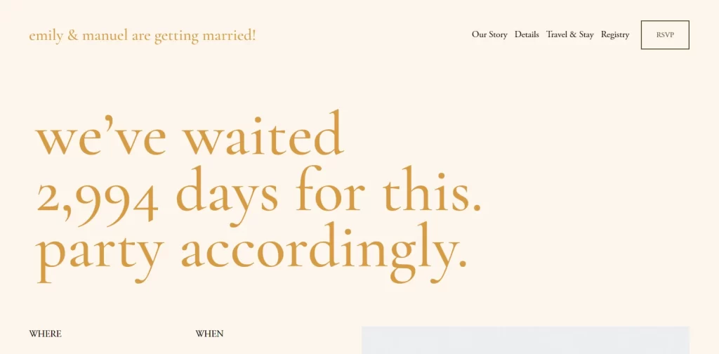
Take the example above representing the wedding of Emily and Manuel. The wedding website design is simple, yet still pleasing, and perfectly represents the union of two people who have been in love for over 8 years! The overall design is relaxed, homely, and with a slight hint of excitement commonly found when you do or find something you have wanted to do for a long time.
Summing it up, there is a great need for wedding website design ideas, as it allows people to create sites that would be the perfect medium to commemorate the union of two souls.
Defining an Amazing Wedding Website Design
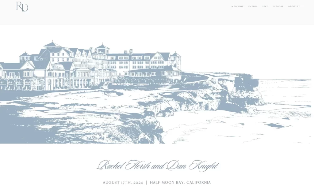
Now that you have an idea of the importance of wedding website ideas, and why they are so important for the overall vibe of the event, the next question is – what makes a wedding website like the one above so amazing?
This question however, is a complicated one. Different businesses operating in different niches all have different requirements when it comes to measuring a website for success. Obviously, there would be significant differences between your wedding website designs, and the designs for a professional business. So, with that, we can understand that in order to judge your wedding website, you need to know the elements that should be there, thus knowing how well it fits the brief.
To start you off, here is a list of a few ideas to ensure that the website you have created is an amazing wedding website every time.
- Add incredible imagery. Photos are the lifeblood of a personal website, such as a wedding website. Depending on the vibe of the wedding, try adding as many high quality images to your site as possible, spelling out the couple’s journey, via casual or professional photographs.
- Go for a fun, casual, and relaxed vibe. We know that planning a wedding can be quite hectic, and people tend to overcompensate for it by being too formal. But these are your close friends and loved ones. People want to hear from the real you, the one they know in life. So, add a little humor and fun to spice it up, and tell them that your wedding is going to be lit.
- Ensure that all necessary information is easily available. Although it can be easy to get carried away, your wedding website is not the place for long winded expositions. It is there to provide your guests with the information about your wedding. That includes details such as the date of the wedding, the venue and its location, and the day’s itinerary. Moreover, you can also add information about the menu, so that those with dietary restrictions can be aware beforehand, as well as whether the event would be a family one, or strictly sans-children.
- Opt for a modern-style website design. Unless you are a professional web developer, it is better to hire one to build you an amazing wedding website. In fact, even in you are one, its better to hire another to save you a lot of stress. And considering that you’ll be getting married only once (at least you hope to be), its better to let someone else focus on your site for an amazing result.
- Ensure that guests can easily RSVP. Provide a way for your guests to easily RSVP their presence, and fill in any additional information like music requests, dietary restrictions, and etcetera. This will allow the bride and groom to have quick and easy access to all pertinent information regarding their guests.
Elements that All Wedding Website Ideas Need to Be Considered Complete
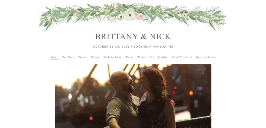
Now that you know how to ensure that your wedding website ideas are a success, you might be thinking that you are ready to begin your journey creating an amazing wedding website. But hold on!
Do you know all the elements that make up a wedding website like the one for Brittany and Nick above? What do you think needs to be there for a wedding website to be considered complete? Well, the elements you usually see on wedding sites can be categorized into two groups – the must-haves, and the would-like-to-haves. And that is true for literally any kind of website, as evidenced by nearly every web design guide worth its salt.
However, we are going to discuss only the must-haves over here. That is because they are the ones whose absence will result in an incomplete website. The would-like-to-haves are the ones that would improve on your site’s impact, but whose absence won’t impact it.
Now, considering that most wedding websites are single page affairs, here’s what the homepage of such a website must incorporate.
- The personal details of the couple. That could include the story of how the two met and got to this place. This can be done textually, but a far better impact could be achieved by blending a bit of imagery and text.
- The actual wedding details. This section would contain the date, venue, day’s itinerary, theme (black-tie/casual/chic etc.), and the contact information of the hosts for the actual wedding day. This is done textually, and is better received if done in larger, more prominent lettering than the rest of the text.
- Guest list information. This section usually displays the information about who can come to the wedding. This includes information regarding whether the guests can bring their kids, or if a plus one is allowed for single guests, as well as info on how to RSVP.
- Location information. This section usually displays the details about the venue, as well as suggestions regarding the dress code, such as wearing flats instead of heels to a beach wedding, or bringing a hat along. Moreover, it also lists information regarding guest lodgings, as well as transportation information.
- Dining and Catering information. This section is often considered as part of the would-like-to-have group. However, considering the amount of dietary restrictions around us today, it is better to list this information, and if possible, offer alternatives for people to choose from.
- Hotel information. If you have guests coming in from out of state, or flying in from another country, its always a good practice to guide them about suitable options nearby the venue. Moreover, try contacting the hotels beforehand to see if you can score some promotions or deals for your guests.
- Finally, there is a huge amount of miscellaneous information such as music requests for the reception, safety measures, timeline of the entire event, interesting places to visit nearby for out of town guests, and etcetera.
8 Amazing Wedding Website Ideas That Inspire and Awe
So far, we have discussed the why and the how-to of creating and using wedding website ideas. However, there is still something critical left that you need to know before embarking on this journey. And that is where to start with your design.
In order to understand that, you need to take a look at some of the best examples of wedding website designs, to discover what it is about them that makes them so special. Let’s find out.
Abby and Will’s Wedding Website
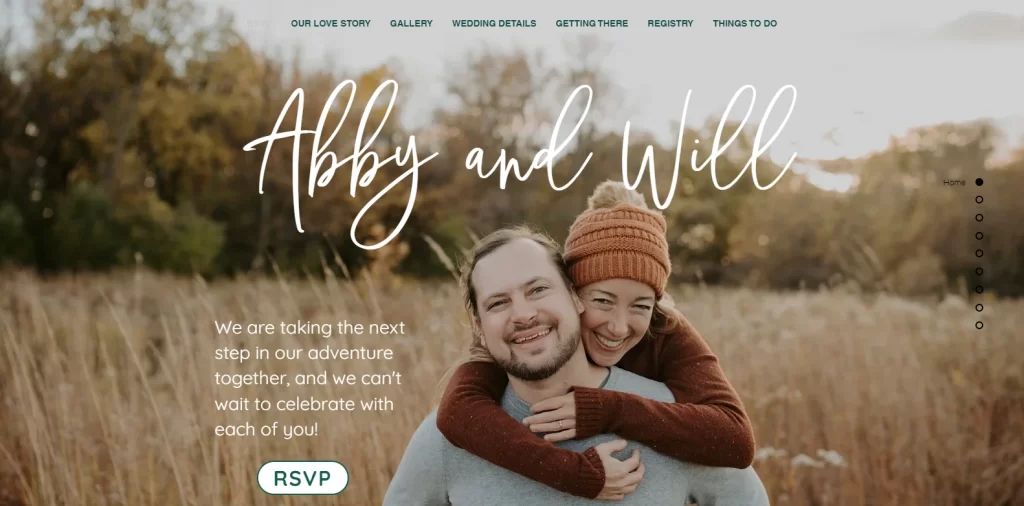
The first one on our list is the cute and heartwarming website for Abby and Will’s wedding. This is a great one to start with, as this style is one that would suit nearly everyone looking for a good wedding website design to emulate.
Going or something lighthearted yet beautiful at the same time, the website showcases as the hero a large, full page image of the couple hugging and looking at the camera, among a field of tall grass. Although the image is posed, it looks natural and effortless, unlike many professional photographs which look and feel forced. Rather, this one feels like a candid taken at just the right moment.
Paired with it is the title on the page, written in a modern, script-like typography that gives it that touch of modernism. Beneath it us a small announcement of their marriage, with a brief message, and an easy to see RSVP button. With easy navigation, and a dark-green themed color scheme, makes this one of the best wedding website ideas to utilize on this list.
Andrew and Amanda’s Nuptial Site
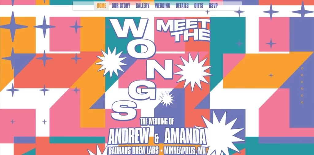
Next up is the wedding website for Andrew and Amanda. Unlike the previous one that focused its design on the couple right from the start, this website embodies a colorful theme that highlights that this wedding is going to be more of a party.
Sporting a colorful, eclectic mosaic covering the beginning of the page, and funkily arranged words announcing the wedding and its venue, this is a design perfect for people looking for something exciting. Moreover, this style carries over well towards wedding signage ideas, meanings that their entire wedding can have a colorful feel to it.
With an easy navigation bar to the right of the page, similar to Abby and Will’s website, everything about this website screams that its fun.
From the casual language, to the perfect party venue as the venue, guests are told to prepare for a night of carefree enjoyment, and if they want to, continue to party with the couple the next day too.
Calyani and Matthew’s Wedding Site
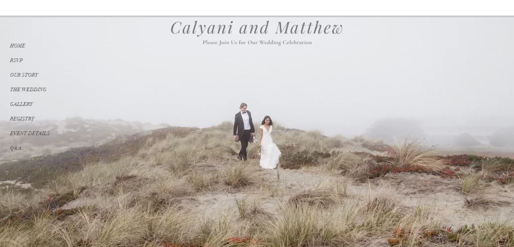
Next, we have the website that announces the conventional wedding ceremony between Calyani and Matthew. This is an interesting one. The design starts with a full-page image of the couple in their wedding garb, walking along a rolling field of sand and brush.
Set against a beautiful background shrouded in mist, the entire image has muted tones that make the bride and groom stand out as two points of visual focus. Moreover, everything about this site screams elegance. From the style of the typography, to the muted pastels used for the theme of the website, the entire design is one of the best wedding website ideas on this list.
Charlotte and Will’s Wedding Website
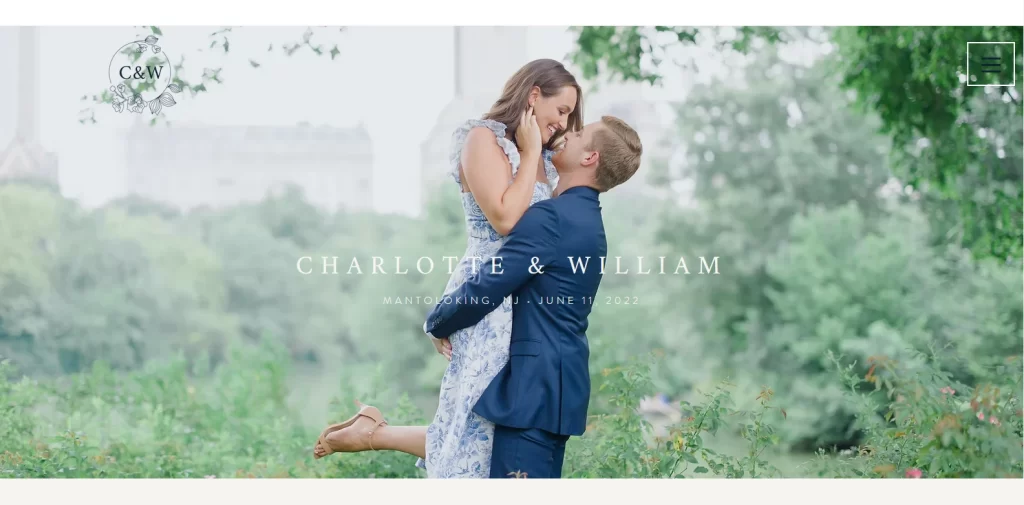
This next one on our list is designed to show that there are more ways than one to achieve elegance in the design of your wedding website. The website for Charlotte and Will’s nuptials is one that seamlessly blends elegance with the vibrant tones of blue.
Not only is the color visible in various shades throughout the wedding website design, but the happy couple have complemented that theme by wearing clothes that feature the color prominently. She with blue flowers on her dress and him with his blue suit, on the full-sized hero image, makes for a website that practically draws you into emulating its design.
Moreover, it sports one of the most elegant wedding logos at its top left, which only adds to the allure of the website. If you can manage this level of cohesion in your website design, then you need to count it among your top wedding website ideas.
Marysa and Zachary’s Wedding Site
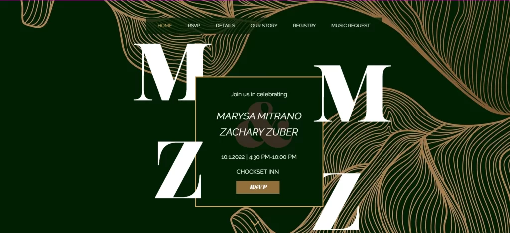
While emulating a proven style in website design is a great way to ensure your website’s success, sometimes going a different way can pay unexpected dividends. And that is exactly what the wedding website design for the Zubers did.
Designed for the wedding festivities of Marysa Mitrano and Zachary Zuber, the design takes on an abstract design for their website. Going for a modern design, they chose to go with a golden-brown colored, abstract line art that mimics the patterns of flowing gauze across much of the background. That design pops really well against the dark, deep green background, providing an interesting, and appealing visual contrast.
Centered on the page, are the initial of the couple in a sort of square-ish formation, which incidentally, are alliterative, meaning the bride’s initials are MM and the groom’s are ZZ. And places between that formation is a small rectangle that announces the celebration, the time and venue, and the RSVP button. Overall, this design is modern elegance in action.
Ronnie and Ashley’s Wedding Website
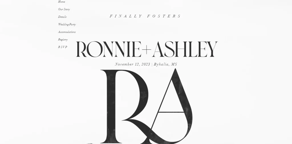
Up next is the wedding website for Ronnie and Ashley. So far, we have been reviewing websites that have used visuals such as images of the couple or smart abstract designs that pop up amazingly. However, there is nothing more elegant than a minimalist, artistically styled wedding website with no visual elements other than a textured, eggshell white background and beautiful typography.
And that is all there is to this website. Using a script-like font with calligraphic elements, the homepage’s hero is an amalgamation of the couple’s initials, atop which is the wedding announcement. The background is made to look like high-end textured card stock, as the one used for invitation cards. The color combinations used here are quite interesting, which some may mistake for monochromatic.
However, this design isn’t monochromatic. The typography is done using a dark smoke gray shade, while the background is an elegant shade of eggshell white, which complements the font color perfectly. Overall, if minimalism is what you are after, this is one of the best wedding website ideas to emulate.
Rush and Danit’s Nuptial Site
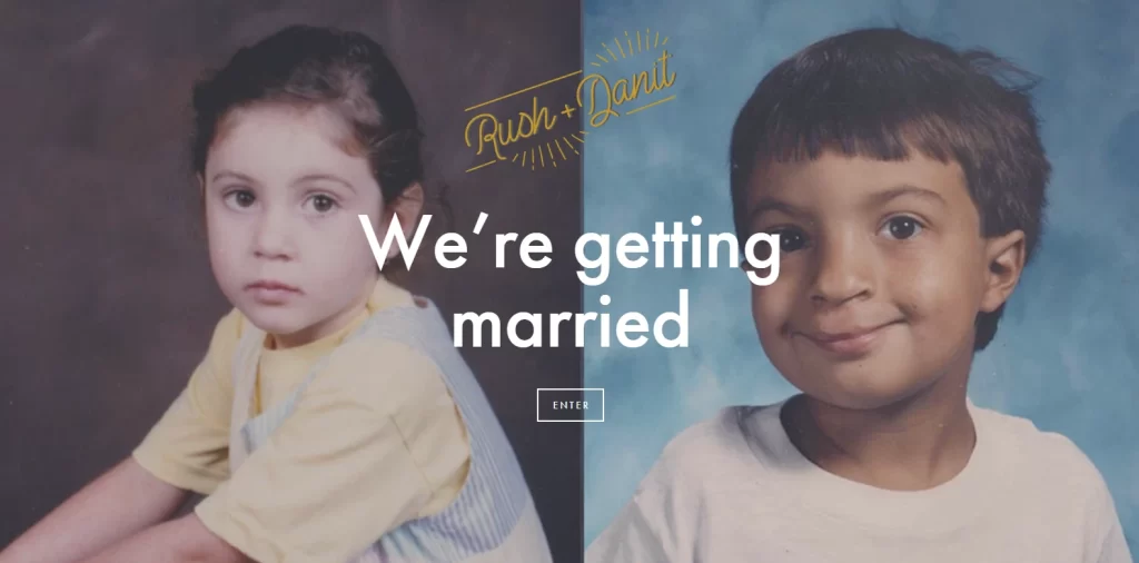
If going for something unique in your wedding website design had an award, then this website for Rush and Danit’s wedding would have surely won it. Rather than go in directly in to the main website, they have formed landing page that simply proclaims their intention to marry, and a button to enter the site with.
In the background, they used a pair of cute photographs from their childhood, showing both of them in their primary school era. That, combined with the unique style of their website, is enough to justify its addition on this list.
Tori and José’s Wedding Site
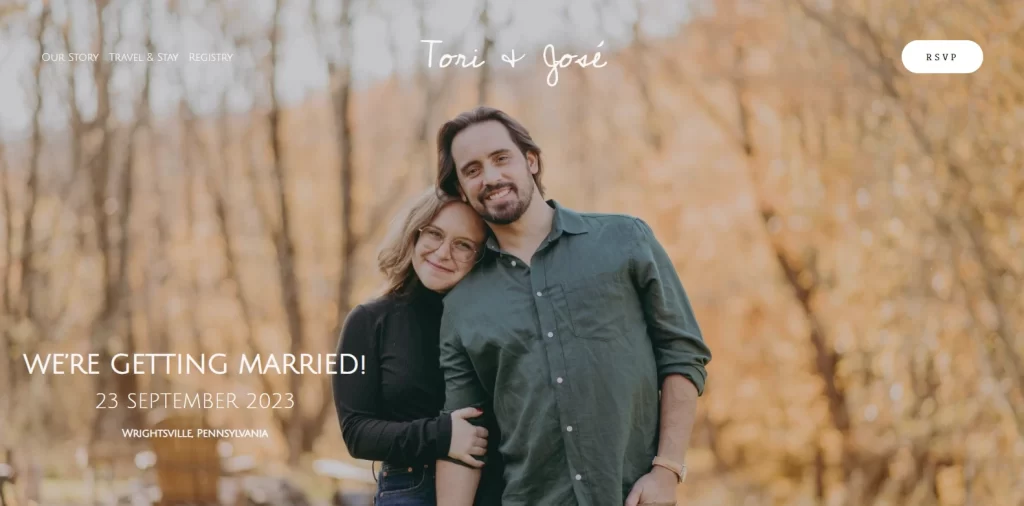
Finally, we come to the last one on our list. This wedding website for Tori and José is all about portraying the fun side of the couple, and in this instance, it starts with the domain name itself. The homepage shows a full-sized image of the couple in autumnal woods, with the golden leaves in the background contrasting well with the dark clothed couple in the foreground.
To the couple’s left is the announcement of the wedding, as well as the date and city of the impending nuptials. At the top right corner of the screen is a small white button that allows invited guests to RSVP easily. And while it is small, the button stands out well enough for a user to easily pick out whether they are on a desktop or a phone.
Overall, the soft aesthetics of the website lend well to its overall design, and is one of the many reasons for its addition on this list of wedding website ideas to try.
Conclusion
To sum it up, finding a number of wedding website ideas might not be that difficult. However, choosing the ones that complement your style and vibe may be a bit harder. Nevertheless, if you want to start creating your own wedding website design, then this article will be a great help to you, guiding your journey to success.

Logopoppin
Logopoppin is a graphic design agency that specializes in logo designing, web development, video production and advanced branding services. We love to innovate businesses with new age technologies, allowing them to improve their visual reputation.

