
Table of Content
Discover How the Wonder Woman Logo Helped Feminism and Female Empowerment
Comic books have had a massive impact on today’s society. From making some of the highest grossing cinematic masterpieces of all time, to becoming a source of representation in mainstream media for many different fans, comic books are important nowadays.
With DC and Marvel being two of the biggest comic book producers for the last few decades, their characters have a special place in the hearts of many fans. Like the iconic Batman or Captain America symbols, the Wonder Woman logo has been the ideal for many female comic book fans, giving them a character to look up to.
But what does the logo’s design stand for? What was its original inspiration, and how has it evolved over the years? These questions and more will be answered in this article. So, read on, and find out why the Wonder Woman symbol has had such a massive impact on the industry.
Wonder Woman – Who is the Character?
The Wonder Woman logo ideally rates among the top superhero logos of all time, ranking right up there with popular symbols like that for Batman, Superman, the Flash, and more. So what is so special about it? How is it considered paradigm shifting because it belonged to the first mainstream superheroine? Or is there something else behind it?
In order to understand that, we need to understand the character of Wonder Woman first.
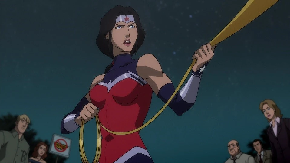
First introduced in 1941, Wonder Woman was arguably the first female protagonist of a comic or comic book series. It was the first time that a female character wasn’t added to a comic book as a supporting character or a minor role. However, it wasn’t until the 70s that her character got the fame it truly deserved.
The rising feminist and empowerment movement meant that women were looking for representation wherever they could. And that is where Wonder Women and what she represented became a focal point for those struggling for female empowerment.
Even today, with the number of female super character now in the hundreds, Wonder Woman is still considered THE SYMBOL of an empowered female superhero. Princess, and later queen to the island tribe of Amazonians, as well as being one of the core three members of DC’s Justice League, Wonder Woman broke new ground for host of female comic book characters.
With a character that is constantly shattering glass ceiling after glass ceiling, it is a no-brainer as to why their symbol would be considered so iconic.
The Wonder Woman Logo Explained
Understanding what Wonder Woman stands for, and her connection to the women empowerment movement, is essential if we want to understand the significance of the Wonder Woman logo. During the Second World War, and all the way up through the 80s, American patriotism was to be found in all sorts of things.
The government, and various media outlets, including comic book creators and more, incorporated America symbolism into their superhero characters, in order to portray their side as the heroic one. Both DC and Marvel had such characters, including Superman, Wonder Woman, Captain America, and more, which were used to portray the United States and its allies as heroic.
And while this topic is too long to discuss in its entirety in a single blog post, we will discuss the Wonder Woman logo and symbology here.
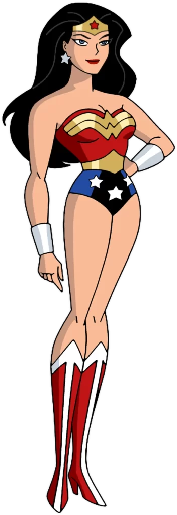
Let’s start with her dress. Despite being an Amazonian of Greek origin, her costume featured predominantly a red and blue motif. Tall, fair, and dark haired, she represented a fair portion of the American female populace, which made the subliminal messaging all the more successful.
Then we have her symbol. Throughout its evolution, the logo has retained its original essence in some form that of an eagle with its wings spread. Now, the national symbolic bird for the US is the bald eagle, a symbol that can be found in many official seals and logos of the American governmental establishments. The addition of the eagle imagery, combined with the red and blue colored costume for a pioneering female superhero, was a great way to get the American female populace to connect with their material.
Now, as we take a look at the evolution of this logo, you will see how the designs incorporate techniques used by the top logo design services providers, building an entire brand around a fictitious character.
History of the Wonder Woman Logo’s Evolution
Now that we have seen the significance of the Wonder Woman logo in the US patriotic and feminist movements, we understand that as a superhero, she is an important cultural icon. We know that the design of the character’s symbol has changed quite drastically in the past eight decades since its launch. It is similar to how Marvel’s Spiderman logo has evolved over the years to represent the changing aesthetic of the friendly neighborhood web crawler.
So how have the designers been able to capture the original essence of the Wonder Woman, and incorporated it within the new designs for print and cinematic purposes?
Let’s explore the design evolution of Wonder Woman’s primary symbol, and see how the core meaning has been embodied by the newer designs.
The Original Wonder Woman Logo (1941 – 1981)
When Wonder Woman debuted in 1941, the world had been at war for over two years, with the US preparing to enter the Second World War actively. That was a time when patriotism amongst the populace was sorely needed. And with the war only escalating with no end in sight, it was important that the same patriotic sentiment be cultivated in youngsters, including women and girls.
Thus, the original Wonder Woman sported the symbol of an eagle over her chest. There could have been no better symbol than that of a bald eagle, USA’s national bird. And when combined with the red and blue of the costume, it was the perfect American call to patriotism, while subliminally messaging their readers that they are the heroes, fighting against tyranny and evil.
The eagle imagery remained in one form of the for the next four decades, seeing minor changes throughout its lifespan. However, at the start of the 80s, the aesthetic was changing. Something fresh was needed, and the logo was changed in 1981.
The Core Wonder Woman Logo Today (1981 – Now)
The Wonder Woman logo released in 1981, was made using two stacked W’s with elongated arms at the end to mimic wings. This logo was released as a 40th anniversary present to the character, and has since been used as the primary design for Wonder Woman’s symbol.
The design is perfect as a symbol or monogram, with a simple design that is unique yet clear enough to be seen and recognized from afar. The clean lines of the wings make it seem similar to aviator wings, while the stacked W of the design combines the winged eagle aesthetic of old with the stylized monogram of modern design.
It is from this exact logo design that multiple variants have sprung up to denote different comic book runs, thus separating different realities from the primary one. Thus, the logo and all its variants embody a similar, stacked W with wings format.
First Modern Wonder Woman Symbol Variant (2006)
The first variant spawned by the modern Wonder Woman symbol was an elaborated and fleshed out version of the design released in 1981. The overall designs became more angular and sharp, while the wingtips were curved down to mimic a more natural winged profile. The lines of the logo design were also tweaked, while the overall design saw the addition of a hawk head and beak to the symbol.
This variant was a true masterpiece, as it managed to combine the visual impact of both the original logo, and the modern design. The stacked W design was still there, while at the same time viewers were able to relate the symbol to an eagle better.
The new design, when colored in yellow or bright gold worked great with the red and blue of Wonder Woman’s costume. This logo was used in conjunction with the core stacked W logo, and saw use in specific runs of Wonder Woman, as well as in the animations of different DCAU movies.
Second Modern Wonder Woman Logo Variation (2011)
The year 2011 saw another variant made of the Wonder Woman logo, this one used specifically for the animated character in DCAU movies. The new designed was more angular, sharper, and similar to the winged bat design used in the Batman logo.
This variant, rather than modifying the core design of 1981, modified the 2006 design to incorporate better animation and design aesthetics of the modern world. This change came about with the change in the character of Wonder Woman, with the superhero now adopting a sharper, Greek warrior-like aesthetic with a sword, shield, and a sharp headdress.
The new logo now featured an elongated design. Outlined in black, the sharp-edged design was colored light gold originally and then silver, and now looked more like a bird of prey than any of the designs before it. Despite that, it also managed to embody a more feminine design, without losing the strength or power of its portrayal.
This was the first time that a metallic look was incorporated within the logo design, which perfectly complimented the now uniquely armored Wonder Woman in her comic and animated runs.
DCU Wonder Woman Cinematic Logo Variant (2016)
Finally, we come to the final logo variant of Wonder Woman that we know today. Over the years, the character of Wonder Woman has been portrayed on TV and the big screen, with Lynda Carter’s portrayal of the Amazon warrior alongside Adam West’s Batman one of the best ones.
However, in 2016, DC decided to reboot all of its primary superheroes, including Superman, Batman, Aquaman, Flash, and Wonder Woman. Their goal was to build towards a cinematic blockbuster like Marvel’s “The Avengers”, where a massive team-up of earth’s mightiest heroes stop a cataclysmic disaster.
In order to do that, they needed to rebrand and reboot the Wonder Woman character. They came up with a new logo, one that paid homage to the 2006 variant we saw above, as well as the core modern logo released in 1981. They also ensured that the rebooted logos of their superheroes were in line with the new Justice League logo they had envisioned for their climactic team-up.
The result was a masterpiece in design that was colored a dark, deep gold. Drawing on the character’s Greek origins, the design is made to look as if made out of beaten and shaped bronze, customary of the Greek culture. The shape is utilitarian, and perfect for the militarized tone of the character that the filmmakers were trying to portray.
The lines of the logo, enhanced by negative space to make for better clarity between the stacked W’s, makes for greater visual recognition, as well as enhancing the individual elements of the design.
FAQs
| What does Wonder Woman logo represent? It represents the power, wisdom, and ever-seeing eye of the brave women who rule the world. |
| What is Wonder Woman’s real name? In Themyscira, she is known as Princess Diana. But in the real world, she uses an alias known as Diana Prince. |
| What does Wonder Woman stand for? She stands for justice and equality for all mankind. |
Conclusion
To sum up the entire topic, the Wonder Woman logo is one of the more recognizable superhero logos we know of today. Unlike Marvel, symbology has greater importance in the DC Universe, with many of their characters, both heroes and villains, relying on their symbols for recognition. In fact, some like the Superman logo or Batman symbol are also used to portray specific feelings, where Batman uses his symbol to strike fear in criminals, while Superman uses his to instill hope in people.
With that in mind, Wonder Woman’s eagle symbol is perfect to represent someone like her. A free and independent character who struck against the norms of her people to make a name for herself doing what is right. She is strong, regal, swift, and ruthless when needed, just like an eagle.
Therefore, when it comes to the Wonder Woman’s symbol, there is no design better than the modern iterations shown.
Latest news you want to know!
Subscribe for cutting-edge design inspiration at Logo Poppin! Elevate your brand with updates on logos, branding, web design, and video animation.
Note that by clicking “subscribe,” users may agree to our privacy policy and consent to Logo Poppin to use your contact data for newsletter purposes.
Logopoppin
Logopoppin is a graphic design agency that specializes in logo designing, web development, video production and advanced branding services. We love to innovate businesses with new age technologies, allowing them to improve their visual reputation.

