Table of Content
Know How to Create a Wordmark Logo Perfectly According to the Trends
We all know how important logos are considered for business branding. It plays a major role in elevating the identity of any company. People generally anticipate about the services of any company by looking at its logo. This is the core reason why designers are always advised to create logos with a bit of uniqueness. Sometimes, adding a bit of simplicity also works well for logos. It also helps to grab people’s attention, provided the overall theme has been made accurately. The example of a wordmark logo is quite evident in this regard. These logos do not look very flashy, but they do offer a sense of neatness and simplicity to all the onlookers.
Nowadays, many companies have chosen the wordmark style to design their logos. They know that keeping the brand emblem simple could also do wonders for them as long as it looks relevant to their overall theme. They have taken this inspiration by looking at the logos of top multinational brands such as Balenciaga, FedEx, Google, Canon and more others. These brands have precisely kept their branding simple, so that people can focus more on their names rather than looking somewhere else.
In this blog, we will discuss about some core principles how a wordmark logo should be created according to the industry standards. But, before moving straight to the tips, let us first understand why logos are termed important for business branding. Let’s take a look at it below.
Why Logos Are Termed Important for Branding?

As discussed above, brand marketing is dependent heavily on logos. It represents the identity of any company; hence it should be made accurately by consulting with any professional logo design agency. The perception of people generally starts to build after looking at the brand logo. If any logo is not designed according to industry standards, then it brings a whole lot of questions on the reputation of that company. People start to think negatively about the company which eventually brings some sort of effect on their sales and growth in the market.
To avoid getting this type of perception, it is best advised to keep your branding especially logo designing strong. The reason is that your company logo gets into public eye at various types of places. Hence, its proper designing is highly recommended to solidify the overall company branding. It ensures to get people’s attention, and take the marketing standards of a company to a stunning professional level.
What is a Wordmark Logo?
A wordmark is a special type of logo that just showcases the name of the business. It doesn’t include any type of graphical element or flashy stuff at all. The primary purpose of creating a wordmark logo is to keep the brand representation simple and clean. It allows people to directly look on the name of the business, rather than analyzing any random component in the logo.
Some people think that a wordmark logo is an illustration of an old school style. They get this idea by looking at the brand emblems of classical era that were also designed in the same manner. This concept is certainly not true because wordmark logos are considered to be an evergreen style. It always stays in the fashion as long as you have designed it correctly according to the standards.
Today, many brands prefer to use wordmark logos over any glitzy style. They have kept their brand logos simple, so that its name can be properly understood by the targeted customers. The logo examples of Samsung, Mobil, Target, and more others are quite relevant in this regard, as all of them are created in the same manner to showcase maximum simplicity in the style.
Best Tips to Create a Wordmark Logo
Many people think that creating a wordmark logo is as simple as anything. They anticipate that these logos are created by just using some letters. This is certainly a very flawed concept, because wordmark logos also require a complete pre-analysis before starting the work.
The expertise required for creating a wordmark logo is similar to that of any other logo. You have to work on some tips to get the perfect results for these logos. If you do not know what these tips are, take a look at the points given below.
Select the Right Typeface
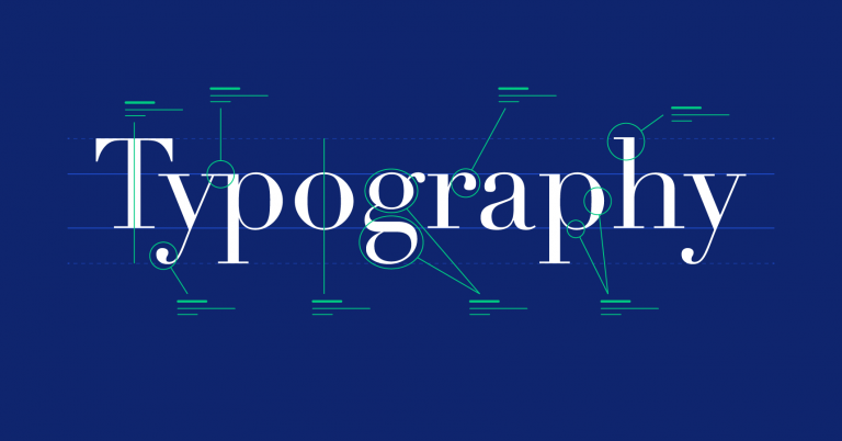
The first thing you need to do while creating a wordmark logo is the selection of a typeface. It is undoubtedly the core thing that brings attention on your logo. People will first see the styling of your typeface before analyzing any other thing of the logo. You need to make sure that the typeface should be picked accurately to describe the correct theme of the brand. Any inappropriate typeface selection will affect the styling of whole logo, taking all your efforts into vain.
Nowadays, there are dozens of lettering styles available in the market. They are categorized into different classes depending on their core styles. From recursive to masculine fonts, you can find variety of typefaces available on the internet. It is up to you to select the right one among them that suits best according to your requirements.
You can also take a look at the examples of popular brand logos that are made using the typefaces. This will precisely help you to analyze the current trends, and pick the best styles for your wordmark logo.
Pick Engaging Colors
Next thing you need to do is to pick an engaging color that could make your logo representation unique among others. The selection of the color is also dependent on your brand theme. Ideally, it should be similar to your brand, so that people can easily understand its relation with the company. If you will try to pick any other color, it could bring some sort of confusion in the branding. It will not form the required connection, and will make your logo look like a standalone element.
As seen in the market, the selection of logo color also bring effect on the other branding elements. They are also designed using the same color to bring a flare of singularity in all the elements. Whether it is a business card or company brochure, the same color used in the logo will also be selected for the designing of these elements. Hence, picking the right color will not be just important for a wordmark logo, but it would be crucial for the designing of other elements as well.
Meanwhile, some brands also prefer to create logos with two colors. This practice is precisely used to introduce a classification of primary and secondary version in the logo. It allows businesses to market themselves creatively, precisely to get a unique branding edge among others in the industry.
Focus on a Character Feature

Sometimes, using just a simple typeface do not offer much attraction in the wordmark logo. It requires an extra bit of creativity to bring some sort of magic in the brand emblem. This could be done by using different techniques, such as introducing a character feature in one of the letters of the logo. It is a technique that differs from the “regular” wordmark styling. It makes the design of anyone letter different from the rest, such as increasing its size or reverting its position to bring creativity in the logo.
If you do not have much idea how to introduce a unique character feature in a wordmark logo, take a look at the examples of some popular brands. The official logo of Braun, Casper, Vans and more others offer a very good explanation in this regard. It will let you know how to bring exclusiveness in one specific letter of the logo, so that it can look different from others.
Using their concept, you can choose what type of character feature you want to introduce in the logo. You can also use the idea of negative space logo in this case. Many brands also use this technique to bring uniqueness in their wordmark logos, rightly as per the latest logo design trends.
Make Sure to Use Correct Spacing
While creating a wordmark logo, you must also need to pay attention on the spacing between the letters. It is a very important point which is often forgotten by most of the designers. They think that the logos only require a creative typeface with unique colors to make the whole representation catchy. They do not anticipate how big the roll of spacing could be in the designing of a logo. It allows to make any logo clean, and look flawlessly decent to the eye.
Adding the right spacing between the letters enhances the readability of the logo. It is a simple technique not just for creating wordmark logos, but for the general writing as well. It has been seen that neatly written words often produce more impact as compared to the cluttered writing. Though the message in both of them will be the same, but people will always prefer to read neatly written sentences over roughed up writing. Same logic applies to the designing of wordmark logos, as they should also be designed with proper spacing to get more attention from the onlookers.
Utilize Shapes Perfectly

It has been recently seen that designers are also using shapes to bring more diversity in the wordmark logos. These shapes do not disrupt the actual illustration of the wordmark. They are very smartly utilized to make the whole wordmark styling look different from the conventional practice. Sometimes, they are used with the concept of negative spacing, while sometimes they are used to cover some specific letters in the wordmark.
You can take a good idea on how to utilize particular shapes by looking at the current logo of LinkedIn. Though it is a wordmark logo, but it also utilizes a square box at the end of the logo. Similarly, the logo of Showtime is also created with the same concept. It basically uses the art of negative spacing to make the wordmark look different from the rest. This type of styling adds a bit of uniqueness in the logo, provided you have designed it with complete perfection.
Frequently Asked Questions
| 1. What is a wordmark logo? A wordmark logo is a specific type of logo that is precisely created using letters. These logos help to bring more focus on the company name rather than just plainly emphasizing on graphical components |
| 2. Why wordmark logos are popular in the market? Wordmark logos are popular in the market due to their subtle styling. They look neat and clean to the eye, allowing people to show more interest on the actual business name. |
| 3. Which type of typeface should be used in a wordmark logo? There are no limitations to the usage of letterings in a wordmark logo. From recursive to futuristic fonts, you can choose any type of style in these logos that fits best according to your company’s branding requirements. |
| 4. Which colors should be preferred for wordmark logos? The color selection for a wordmark logo should be done after looking at the branding theme of a company. It helps to form a relation that lets the people know how the logo is connected to the main theme of the company. |
| 5. How many companies use wordmark logos? Many companies have created their logos using the wordmark style. Some of the popular names among them includes Sony, Mobil, Google, Subway, Jeep, FedEx, Microsoft and several more others. |
Conclusion
That concludes our entire article in which we have discussed useful tips to create a wordmark logo. These logos are undoubtedly very simple and decent in looks. The primary purpose of creating these logos is to get more attention towards the actual name of the business. That is the major reason why many brands have opted for this technique to create their fashion brand logos. From Balenciaga to Chanel, there are enough number of examples from which you can learn from. They have expertly created their logos to take full advantage of wordmark and its flawlessly subtle styling.
If you are looking for a logo design agency that could help you to design engaging wordmark logos, get in touch with us today. Our experts are quite skilled in creating different types of wordmark logos, rightly according to the custom requirements.

Logopoppin
Logopoppin is a graphic design agency that specializes in logo designing, web development, video production and advanced branding services. We love to innovate businesses with new age technologies, allowing them to improve their visual reputation.

