Table of Content
Discover the Transformation of the Symbol for One of Pro Wrestling’s Most Iconic Brands
Few brands in sports entertainment have undergone as dramatic a visual transformation as World Wrestling Entertainment. The WWE logo has evolved from a simple territorial wrestling promotion’s emblem into one of the most recognizable symbols in global entertainment, reflecting the company’s journey from regional obscurity to worldwide dominance.
The story of the WWE logo is intrinsically tied to the McMahon family legacy and the evolution of professional wrestling itself. Each iteration represents not just a design change, but a fundamental shift in how the company positioned itself within the entertainment landscape. From the horn-like symbolism of the Capitol Wrestling Corporation to the sleek modern WWE branding, these logos chronicle seven decades of innovation, controversy, and unprecedented growth.
Today, the WWE logo stands as more than just corporate branding. It’s a cultural touchstone that instantly evokes memories of legendary wrestlers, iconic matches, and transformative moments in sports entertainment history. Let’s explore this evolution from the lens of a professional logo design agency for insight into how a small wrestling organization became a publicly traded entertainment conglomerate worth billions.
World Wrestling Entertainment: From Humble Territory to Entertainment Giant
World Wrestling Entertainment’s origins trace back to January 7, 1953, when the Capitol Wrestling Corporation (CWC) produced its first show. Founded by either Jess McMahon or his son Vincent J. McMahon (sources vary on the exact founder), the CWC began as a northeastern territory within the National Wrestling Alliance (NWA), focusing primarily on the New York metropolitan area and surrounding regions.
The early years established the foundation that would eventually support a global entertainment empire. Under the guidance of Vincent J. McMahon and famous New York promoter Toots Mondt, the CWC gained significant influence within the NWA, eventually controlling approximately 70% of the organization’s booking decisions. This dominance stemmed largely from their control of the heavily populated northeastern United States market, which provided substantial revenue and political leverage within the wrestling alliance.
The company’s business model during this era focused on traditional wrestling presentation, featuring legitimate athletic competition combined with theatrical elements that would later evolve into modern sports entertainment. Stars like Antonino Rocca, Hans Schmidt, and “Mr. America” Gene Stanlee drew significant crowds to venues like Madison Square Garden, establishing the foundation for what would become wrestling’s most prestigious venue and the company’s eventual home base.
From World Wrestling Federation to World Wrestling Entertainment: A Strategic Evolution
The transformation from wrestling federation to an entertainment company represents one of the most significant corporate rebranding examples in sports history. In 1979, Vincent K. McMahon purchased the company from his father and immediately began implementing an ambitious expansion strategy that would fundamentally change professional wrestling’s landscape. The younger McMahon recognized that traditional territorial wrestling had limited growth potential and envisioned a national, entertainment-focused product.
The shift from federation to entertainment wasn’t merely cosmetic—it represented a philosophical change in how the company approached its product. While traditional wrestling promotions focused on athletic competition within specific geographic territories, McMahon’s vision encompassed mainstream entertainment that could compete with television shows, movies, and other forms of popular culture. This transition included celebrity involvement, elaborate storylines, and production values that far exceeded traditional wrestling presentations.
The entertainment focus proved prescient as cable television and home video created new revenue opportunities that traditional wrestling territories couldn’t exploit effectively. By positioning WWE as entertainment rather than sport, McMahon created flexibility in content creation, marketing strategies, and revenue generation that continues to benefit the company today. This strategic pivot culminated in 2002 when the company officially adopted “Entertainment” in its name, legally cementing its evolution from wrestling federation to multimedia entertainment corporation.
The Transformation of the WWE Logo: Seven Decades of Brand Evolution
Now let’s take a look at the evolution of the WWE logo and discover what the transformation of the brand’s symbol represented for the business. Let’s begin and explore the various types of logos the brand has sported over the years.
1953-1963: Capitol Wrestling Corporation Era – The Birth of an Icon

The earliest WWE logo emerged from the Capitol Wrestling Corporation’s need to establish visual identity in a crowded wrestling marketplace. The CWC logo featured the company’s initials arranged in a distinctive pattern that resembled bull horns—a fitting symbol for a wrestling organization that emphasized toughness and confrontation. The design utilized symmetry effectively, with the two “C” letters flanking a central “W” in a configuration that suggested both strength and aggression.
This original logo demonstrated sophisticated design thinking despite its apparent simplicity. The horn-like appearance wasn’t accidental. It deliberately evoked imagery associated with power, determination, and the kind of raw strength that wrestling audiences expected from their entertainment. The design’s boldness and symbolic strength reflected the company’s growing confidence and ambition, foreshadowing the dramatic expansions that were to come.
1963-1971: The World Wide Wrestling Federation Era – Embracing Wrestling’s Theatrical Nature

The transition to the World Wide Wrestling Federation (WWWF) in 1963 required a completely new visual approach that reflected the company’s expanded ambitions and formal separation from the National Wrestling Alliance. The new WWWF logo abandoned the abstract symbolism of the CWC era in favor of literal representation. This new design featured two wrestlers in action—one holding another overhead, showing the dynamic nature of professional wrestling.
This approach marked a significant departure from the previous logo’s abstract design philosophy. The wrestling figures provided immediate visual clarity about the company’s business while suggesting the excitement and athleticism that audiences could expect from WWWF programming. The logo included both the full “World Wide Wrestling Federation” name and the “WWWF” abbreviation.
The logo’s design reflected the era’s appreciation for detailed illustration and narrative visual communication. Rather than relying on symbolic interpretation, this logo told a story through its imagery, immediately communicating the product’s nature to potential audiences.
1971-1979: The Final WWWF Iteration – Modernizing for Television

The 1971 logo redesign represented the WWWF’s adaptation to television broadcasting’s growing importance in professional wrestling promotion. This iteration featured a globe backdrop with outlined “W” letters positioned prominently in the foreground, symbolizing the federation’s aspirations for expanded geographic reach. The globe imagery suggested international ambitions that would later prove prophetic as the company expanded beyond North American markets.
The design’s emphasis on the double “W” letters that were designed to look like three, foreshadowed the eventual abbreviation strategies that would define later logo iterations. The letters were positioned prominently against the backdrop, the typography becoming more prominent than in previous versions, reflecting TV’s need for clear, readable graphics for broadcast requirements.
This logo served during a crucial transitional period when the WWWF was positioning itself for the aggressive expansion that would characterize the 1980s. The lifespan of this logo coincided with significant business growth that would enable the company’s transformation into a national entertainment powerhouse.
1979-1982: The Birth of World Wrestling Federation – Streamlining for Success

The 1979 transition to World Wrestling Federation (WWF) marked the beginning of Vince McMahon’s aggressive expansion strategy and required visual branding that could support national ambitions. The new WWF logo simplified the previous design while retaining the globe element, featuring “WWF” letters prominently displayed over a stretched globe background.
This design choice reflected the company’s commitment to geographic expansion while providing clear, readable branding suitable for various media applications. The simplification strategy proved crucial as the logo needed to function effectively across different markets and media platforms, from television broadcasts to merchandise to arena signage. The clean, straightforward design met these requirements while establishing visual consistency that would support brand recognition as the company entered new markets previously controlled by competing wrestling territories.
1982-1985: The Tilted WWF Logo – Dynamic Branding for the Cable Era

The 1982 logo redesign introduced dynamic visual elements that reflected the energy and excitement of professional wrestling while adapting to television broadcasting requirements. The WWF letters were tilted at a leftward angle and contained within a blue box, creating visual movement that suggested action and excitement. This design approach aligned with the company’s increasingly entertainment-focused programming strategy and its embrace of cable television distribution.
The tilted orientation created psychological associations with movement and progress, suggesting a company in motion rather than static traditional wrestling presentations. The blue background provided color contrast that enhanced visibility in television broadcasts while creating distinctive brand recognition that differentiated WWF programming from competing wrestling shows.
The logo’s television-optimized design reflected the company’s prescient understanding of broadcasting’s crucial role in wrestling promotion. Unlike traditional wrestling territories that relied on live attendance and local media coverage, McMahon’s expansion strategy depended heavily on cable television distribution and national advertising revenue.
1985-1995: The Golden Era WWF Logo – Colorful Branding for Mainstream Success

The mid-1980s logo redesign coincided with professional wrestling’s emergence into mainstream popular culture and the company’s achievement of national prominence. This iteration reversed the color scheme from the previous version, featuring white letters with black outlines instead of the previous color arrangement.
The logo modifications supported the company’s entertainment strategy during professional wrestling’s “Golden Era.” Stars like Hulk Hogan, Andre the Giant, and “Macho Man” Randy Savage attracted unprecedented mainstream attention, requiring visual branding that could function effectively in various entertainment contexts.
This ten-year period represented the longest single logo tenure in the company’s history, reflecting the design’s effectiveness and the business stability achieved during this time. Its longevity demonstrated successful brand recognition and customer acceptance that would influence future design strategies.
1995-1998: WWF Logo Refinement – Maintaining Identity During Competition

The 1995 logo represented subtle evolution rather than dramatic redesign, maintaining core design elements while making minor adjustments that reflected the company’s continued growth and market maturation. The modifications preserved brand recognition established during the previous decade while updating visual elements to remain competitive in a crowded entertainment marketplace.
This period coincided with intensified competition from World Championship Wrestling (WCW) and the beginning of what would become known as the “Monday Night Wars.” The logo needed to maintain established brand equity while supporting marketing initiatives designed to compete with rival wrestling promotions challenging WWF’s market dominance.
However, the logo’s three-year lifespan reflected the rapid changes occurring in professional wrestling during the era. Industry competition, changing audience preferences, and evolving TV programming strategies created pressure for more dramatic branding changes. Nevertheless, it set the stage for the dramatic visual changes that would accompany the “Attitude Era” to come.
1997-2002: The Attitude Era WWF Logo – Edgy Design for a Revolutionary Period
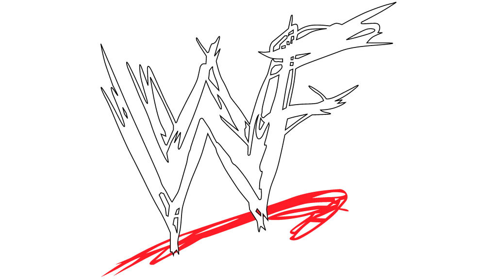
The 1997 logo redesign represented the most dramatic visual transformation in the company’s history. It introduced the “scratch” logo embodying the rebellious, edgy attitude that defined late 1990s professional wrestling. The design featured WWF letters that appeared to be scratched or carved into a rough surface, with a distinctive red slash beneath the letters that suggested blood or aggressive marking.
The scratch-style monogram logo design’s rough, unfinished appearance deliberately contrasted with the polished, mainstream presentation of previous logo iterations. This visual rebellion reflected programming changes that included more adult themes, controversial storylines, and anti-establishment characters who challenged traditional wrestling presentations.
The logo’s aggressive aesthetic targeted young adult audiences who were attracted to edgier entertainment content, with characters like Stone Cold Steve Austin and The Rock to accompany it.
2002-2014: World Wrestling Entertainment – Transitioning to Entertainment Focus
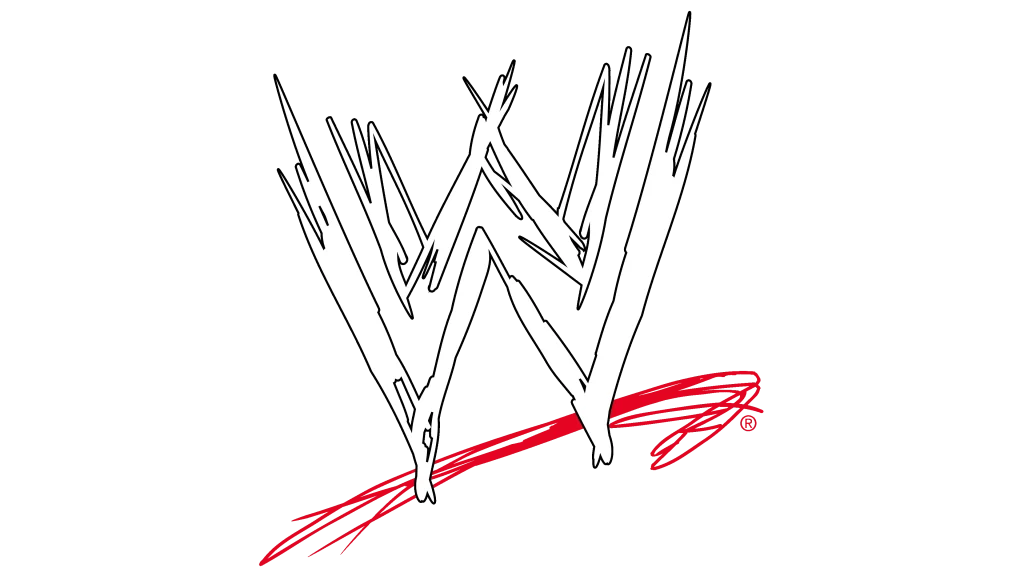
The 2002 transition to World Wrestling Entertainment required logo modifications that reflected the company’s legal name change while maintaining visual continuity with established brand recognition. The solution involved removing the “F” from the scratch logo design while preserving the overall aesthetic and the distinctive red slash element.
The “Get the F Out” marketing campaign that accompanied this transition turned a potentially damaging legal requirement into a successful promotional opportunity. The modified logo maintained the edgy, attitude-era aesthetic, which was a welcome surprise. And the twelve-year lifespan of this logo iteration reflected the design’s effectiveness and the company’s business stability.
2014-Present: The Modern WWE Logo – Streamlined Design for Digital Success

The current WWE logo, officially launched in 2014, represents a complete departure from the scratch aesthetic in favor of clean, modern typography. The design features two stylized “W” letters stacked vertically with a red accent line, creating a minimalist approach that prioritizes clarity and versatility over aggressive styling.
It reflects the company’s evolution into a global entertainment corporation that operates across multiple platforms, from TV and streaming services to social media, movies, and video games. The logo’s clean lines and simplified structure ensure optimal performance in digital contexts while maintaining distinctiveness that supports brand recognition across international markets.
Frequently Asked Questions
| What was the first WWE logo and when was it created? The first logo was actually the Capitol Wrestling Corporation (CWC) logo, created in 1953. It featured the letters “CWC” arranged in a distinctive pattern that resembled bull horns, with the two “C” letters symmetrically flanking a central “W.” The CWC logo served the company for ten years until 1963, when the organization became the World Wide Wrestling Federation (WWWF) after separation from the National Wrestling Alliance. |
| Why did WWE have to change from WWF to WWE in 2002? WWE was forced to change from World Wrestling Federation (WWF) to World Wrestling Entertainment (WWE) due to a trademark lawsuit with the World Wildlife Fund, which had been using the “WWF” acronym since 1961. The legal dispute culminated in 2002 when the wrestling company lost the case and was required to stop using “WWF” branding. |
| How many different logos has WWE used throughout its history? WWE has used approximately a dozen different logo variations throughout its seven-decade history, depending on how you count minor modifications versus major redesigns. Each change reflected significant business developments, from name changes to market expansion to legal requirements. |
| What does the current WWE logo design represent? The current WWE logo features two stylized “W” letters stacked vertically with a red accent line beneath them. This minimalist design represents the company’s evolution into a modern, global entertainment corporation. The clean, digital-friendly aesthetic ensures optimal performance across all platforms, from mobile devices to large arena displays. |
| Which WWE logo is considered the most iconic by fans? The “scratch” logo used during the Attitude Era (1997-2002) is widely considered the most iconic by fans. This design featured WWF letters that appeared carved or scratched into a rough surface with a distinctive red slash beneath them. Its popularity stems from its association with professional wrestling’s most successful and culturally relevant period, with an edgy, rebellious aesthetic perfectly capturing the era’s adult-oriented programming and anti-establishment themes. |
Conclusion: A Logo Legacy That Mirrors Entertainment Evolution
The evolution of the WWE logo represents far more than a series of design changes—it chronicles the transformation of American entertainment itself over seven decades. From the territorial wrestling era’s horn imagery to today’s sleek digital-first branding, each iteration reflects the company’s growth and broader shifts in media consumption, cultural values, and industry dynamics.
The logo served as both catalyst and symbol for significant business milestones, helping communicate new positioning to audiences while maintaining connections to established brand equity. Perhaps most remarkably, the WWE brand logo has managed to preserve essential brand recognition across multiple generations of fans and logo iterations. This shows the genius branding strategy that helped WWE become one of the world’s most recognizable entertainment brands.

Logopoppin
Logopoppin is a graphic design agency that specializes in logo designing, web development, video production and advanced branding services. We love to innovate businesses with new age technologies, allowing them to improve their visual reputation.


