
Table of Content
Discover How the X-Men Logo has Evolved Over the Years Into a Marvel Icon
Marvel comics has a variety of characters, divided into heroes, villains, and anti-heroes. With hundreds of these characters to play with, and with numerous storylines to use, its ideal to bundle them together into different groups or teams, like the Avengers, Defenders, or the X-Men.
Now, what does bundling them together into groups like the X-Men help? Well, it allows the comic book producers to create stories that help the reader automatically identify different storylines based on the logo they see at the top. And that is where brand symbols like the Avengers logo or the X-Men logo come into play.
Think about it for one second. When you imagine the Marvel logo, what characters come to mind? It’s the Avengers, right? Similarly, when you imagine the X-Men, what characters come to your mind? It isn’t the Iron Man, or the Hulk, and it certainly isn’t Mister Fantastic. However, what you would imagine are characters like the Wolverine, Professor X, Cyclops, or Magneto. That is why these logos are so important. It helps its readers to quickly remember what characters and storyline to expect in a comic book we are about to read.
So, the question is, how could a professional logo design services come up with a logo that could encompass and represent all of these wild identities into a single symbol? That is because while the Avengers and the Justice League logos, two wildly popular superhero team symbols,
The Origins of the X-Men in the Marvel Universe
It was the early 1960s, and popular Marvel characters like the Iron Man, Fantastic Four, Hulk, Thor, and the friendly neighborhood Spiderman had become individually popular. Comic book savant and co-creator of these characters Stan Lee wanted to create a new set of characters for another series.
However, explaining the origin of each character’s powers and the reasons for their weaknesses was something that took a lot of effort and creativity, which often took away from the storyline. Stan Lee wanted to avoid all that. He wanted his new characters to have powers, without having to explain how they got them. But the question was, could it be done?
What he came up with was an idea he originally called “The Mutants”. For the characters introduced in this series, he came up with a simple, elegant origin story. He portrayed them as mutants, people born with their ability due to a mutation of their genes. But the Marvel executives weren’t so sure of the idea, and they scrapped the name Stan Lee originally proposed, saying people wouldn’t understand mutants.
The next name Lee came up with was “The X-Men”. Now this was a name that had the intrigue necessary to make it a good superhero name, like the Avengers. It is normally believed that he decided to name the comic series after a core character within his initial list of characters, a mutant named Professor Charles Xavier. However, in the storyline, the origin was retconned by the Professor, who claimed he called his team the X-Men because they had something extra within them.
Over the years, this side of the Marvel comics have developed and released a number of characters, with some like the Wolverine superseding others in popularity. Moreover, the X-Men have been adapted in animation, as well as cinematic characters, often centered around the X-Men team, or the mutant Logan aka Wolverine.
Meaning Behind the X in the X-Men Logo
The X in the logo, as per canon, is a symbol that Charles Xavier gave to his team, called the X-Men. Unlike the normal people around the world, he believed that mutants weren’t abnormal, but rather they had something extra, something that made them unique.
Its significance is in accepting your differences, ignoring the haters, and doing whats right regardless of how the people, even those you are helping, perceive or treat you. It is a symbol of perseverance in the face of adversity, hate, and misguided prejudice, something other popular comic book symbols like the DC Comics logo lack. And overcoming all of that to continue doing what’s right for the remainder of your life.
That is what the X-Men logo stood for, and strives for today. However, during different storylines, the mission of the X-Men has been perverted. There are heroes who have turned down dark paths to become some of the worst villains, and villains with such tragic pasts that you couldn’t help siding with them, despite their heinous actions.
All in all, each individual member of the X-Men, and the team as a whole, have a complex, nuanced backstory, which in many cases is the result of that “Something Extra” that makes them special. And this is often reflected in their individual logos, which tend to use color meanings to portray their moral leanings.
Evolution of the X-Men Logo and Its Various Iterations
Now that we have seen the origins of the X-Men in the mainstream Marvel universe, and have witnessed the idea and the logic behind the iconic X-Men logo, let’s take a look at its evolution. The concept of the X-Men is rooted in representing the mutants, the outcasts of society who are different from the rest of the people, all because of a mutated, or evolved, gene. And while superhero logos often tend to cast characters like these in shades of gray morally, X-Men managed to make them heroic.
Based on that concept, the logo for such an organization needs to be representative enough to capture the essence of the multitudes of these misunderstood people. It needs to show them in a light that takes them away from prejudice and hate they experience every day, and portray them as heroes.
Let’s take a look at the evolution of the X-Men’s iconic symbol, which has represented dozens of characters over the years, from the grizzled Wolverine, to the Wakandan queen Aurora Munroe.
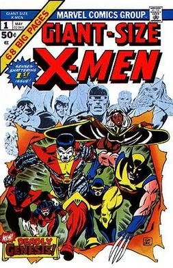
1963 – 1968 Comic Books Logo
1963 is a year in an era that is considered the golden period for superhero comic books. It was at that time, that visionary Stan Lee decided to come up with a new series of characters and a new comic line that would be a part of the greater Marvel Universe, yet still be independent enough to attract new readers.
The first logo for the brand was a simple design. The word “X-Men” was written in a blocky, raised lettering, with clean lines and angles, while the word “the” was written in cursive, lowercase logo fonts. The X of the logo however, was made rougher, and more dynamic, which meant that it was larger than the other letters, and had rough-torn edges at the top and bottom lines. The color was a bright yellow, with the shadows behind the wordmark being colored black.
Thus, the iconic X-Men logo was revealed in 1963. Though it may seem not as aesthetically pleasing or attractive as custom would dictate, the fact is that the message it stood for was an important one, and people flocked to it.
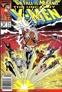
1969 – 2002 Comic Books Logo
It was a few years later that Stan Lee and his team decided that it was time to revamp the logo for Marvel’s favorite mutant team. The reason for this redesign was that comic book sales were down, especially for this series.
Over time, comic book logos like the Fantastic Four logo, or even individual logos for superheroes and villains have changed shape to bring the groove back into their brands. Comic books provide people with a reprieve from the humdrum monotony of life, lighting up their imagination with images of powerful superheroes battling it out for the humankind.
The new logo for the X-Men featured a three dimensional design over the somewhat flatter visuals of the previous iterations. The dynamic design was made to pop up and out of the page, and the tilted visual aesthetic was designed to show the team and the series moving forward.
The color scheme of the logo was bright yellow, but a tad warner and with a slight orange tint that made it look more dangerous. However, the sides of the design were colored orange, instead of the previous design’s black, and the shadows were removed completely. The combination of these two shades was awesome, and paved the way for some of the future logos.
2003 – 2018 Comics Book Logo
2003, and the changing aesthetic of people post-Y2K meant that the X-Men logo needed a revamp. The new century also meant that the wordmark wasn’t going to cut it anymore as a superhero symbol, as the new norm was heroes having specific emblems representing them. With that in mind, the designers needed to refresh the brand identity, and give it a fresh look at the start of Grant Morrison’s design era.
The designer bought about a reboot of the X-Men universe, and this new universe required that the X-Men have a more identifiable logo. Taking from the popular emblem and monogram logos found in comic books, the designers came up with the new X-Men brand logo.
The new design featured a uniform X, encircled by a round ring. The arms of the X were merged with the ring, and the overall design had a thick, chunky feel to it, as if it was designed to be a part of the X-Men uniforms. It came in a number of colors. Primarily, it was colored red, over a neutral or any background. However, the symbol was also recreated in black over yellow and steel-gray over black.
This logo was used for over 15 years by the company, and most of the fans today remember this iteration of the X-Men brand logo the most, as it featured on merchandise like belts buckles, gloves, hats, t-shirts and more. Moreover, it is the logo that most comic books fans in the late twenties and early thirties remember the most.
2019 – Present Comic Books Logo
2019 saw another revamp to the logo. The new design was a modernized version of the logo released in 2003, taking inspiration from the round emblem design. However, there were some big changes in its core design, which made it look the most superhero-like logo design in all its iterations.
For one, the ends of the arms of the X were no longer merged with the round ring surrounding it. Now, the edges of the X formed a tapering point, the end of which lightly touched the inner edge of the ring. Moreover, the X also had a thin white line going vertically through the middle of it, as if the design was painted over a set of sliding doors.
This redesign was quite fresh, and had a modern look to it, similar to the modern Nightwing logo in the DC Universe or Captain America’s shield logo in Marvel. The design is perfect for the new runs of the X-Men comics, especially post the House of M timeline, and the present resurrection timeline on Krakoa.
This new design has been in fact used in Charles Xavier’s modern headgear, emblazoned across the entire face of the helmet worn by the Professor. And the reason it is perfect for the team is because unlike the previous logo iterations, this one is more ambiguous in its heroic meanings. And that means that the logo is equally suitable for characters like cold and uncaring Professor, or the new bloodthirsty and psychotic Beast, as it is for the true heroes left on the team.
The X-Men Cinematic Universe Logos
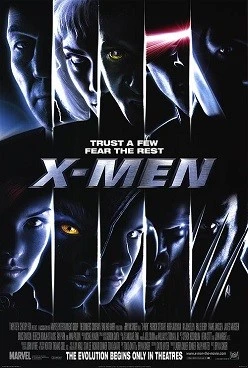
The X-Men logo as also been seen on the big screen, making its debut in 2000 when the first X-Men movie was released. The logo had a metallic design to it, and was written in a bold, sans-serif font, with all uppercase letters and with a slight italic style.
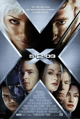
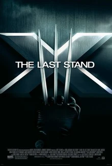
The color scheme was a bright, shiny silver, which went well with the overall dark theme of the movie. The style of the logo used in this was used only for the first movie of the initial cinematic run of the X-Men. For X2 and X-Men: The Last Stand, with the former being released in 2003 and the latter in 2006, the design was revamped to use the X like symbol used by the comics. However, the color scheme remained the same, even if the design didn’t.
After the initial run ended, the Wolverine saga had an entirely different style of logo, which took inspiration from the lettering of the first X-Men movie, but made it more streamlined and aesthetically natural. However, it was the prequel series that started in 2011 that changed the style of the X-Men logo again.
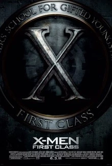
The first film of the series had a logo that looked a Roman or Greek seal, an ancient, weathered design that bought to light the antique origins of the team before the start of the Cuban Missile Crisis. The design was interesting, but not suitable enough to be used for later movies. And it was changed again.
Starting from 2014, the first movie to feature the revamped logo was 2014’s X-Men: Days of Future Past. It featured a more streamlined wordmark, which had wider lettering that made the design easier to read. Moreover, the logo was more geometric, which combined elements of modern and vintage logo design.
FAQs
| What does the X-Men logo mean? The X-Men symbol is about overcoming the inherent prejudices of the world around us, that tells us we are freaks for being different. It shows that there is the ability to be good and pure in anyone, if you are just ready to forgive the past and look forward. |
| What does X mean in Marvel? While many people believe that the team is named after the professor, it is actually named for the its members having something EXTRA. They are people who aren’t just different from the normals, but they are people who have something extra that allows them to overcome the hate they face and do good. |
| Why are the X-Men called X exactly? Some believe that the team continued with the X because to them it meant extra power, power over the humans and the mutants equally. This belief is reinforced since the arrival and joining of multiple Omega-level mutants to the X-Men roster. |
Conclusion
To sum it up, the X-Men logo has been an integral part in boosting Marvel’s profile as a leading comic book universe. However, unlike the regal tones of the Wonder Woman logo in DC, this logo has more of an organic, everyday feel. A power that shows that no one is abnormal, or a freak, but rather one with something extra that makes them special. And that is a beautiful, natural feeling more powerful than any that a superhero can portray on their own.
Latest news you want to know!
Subscribe for cutting-edge design inspiration at Logo Poppin! Elevate your brand with updates on logos, branding, web design, and video animation.
Note that by clicking “subscribe,” users may agree to our privacy policy and consent to Logo Poppin to use your contact data for newsletter purposes.
Logopoppin
Logopoppin is a graphic design agency that specializes in logo designing, web development, video production and advanced branding services. We love to innovate businesses with new age technologies, allowing them to improve their visual reputation.

