Table of Content
Explore the XFL Logo History and Discover the XFL Team Logos Used Today
All of know that the NFL, or the National Football League, is the pinnacle of professional football in the United States and Canada. And while the CFL, or the Canadian Football League is considered a pro football league, it’s a commonly known fact that the NFL has the better talent and the history to back its top spot.
So while we all know the NFL logo design, exposed to it for so long, how many of us know about the XFL logo? XFL was a minor league pro football association that originally started out in 2001 as a joint venture between WWE and NBC. It later had a revival in 2020, as well as 2023, before joining the United Football association as one of its two conferences besides the United States Football League.
So, now that you have an idea about the league, you might be curious, how has the league’s logo evolved across these three revivals? Is there any similarity between then at all? And if so, how has that influenced the team logos in the XFL?
Let’s dive in and take a look at the XFL logo evolution, and discover how the visuals have evolved with the changing aesthetics of professional logo design services. Let’s begin.
History of the XFL Logo and the Football League it Represents

The XFL has an interesting history behind it. Let’s start with its name. Till date, no one is sure what the acronyms stand for. At the start, people believed that it stood for Xtreme Football League. However, there was already an entity registered who was playing by that name, so that was a no go. Today however, people believe that the name stands for X Football League.
The XFL started out in 2001 as a joint venture between the World Wrestling Entertainment, or WWE, and NBC. NBC had lost the rights to the AFC (American Football Conference) coverage to CBS in 1998, ending a relation that dated right to the early days of the American Football League. Previously, NBC had also lost the rights to NFC, also to CBS. This meant that the broadcaster was looking for a new piece of that football pie.
Enter Vince McMahon. Carrying on the WWE’s popular Attitude Era, he planned on creating a new football league that would be single entity ownership instead of a franchise model. Moreover, it would have more of that dramatic element including trash talking, feuds and vendettas, and more. He planned to make this a rawer version of football, with less significant penalties for fouls, and fewer rules overall.
Revealing the first XFL logo that year, the team played for just one season at its inauguration. It was revived in 2018 by Vince McMahon as a successor to the original league he created in 2001. The revived league’s first season was cut short after just five weeks in 2020, due to the COVID-19 pandemic, leading to the league declaring bankruptcy.
Later, it was taken over by Dwayne “The Rock” Johnson and his Danny Garcia led consortium for the 2023 season, and has now joined UFL as one of its two rival conferences. Due to its more aggressive nature, the XFL team logos and names are quite unorthodox. And with eight teams only, the league aims to play just after the end of college football and pro football, to capitalize on the lack of the sports on TV at that time.
A Journey through the XFL Logo History – The Various Designs of the XFL Logo
Now that you have an idea about the XFL logo history, let’s take a look at the variants of the XFL logo used by the different iterations of the team, from 2001 to date. Here we will see how the sports logos used as the league’s primary identifier came to be.
2001 XFL Logo
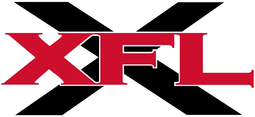
The first iteration of the XFL logo featured an angular black “X” as the background, over which a thick serif wordmark featuring the word “XFL” was written in bright red color. The juxtaposition of the red over the black utilized color theory to create the dynamic and emotionally charged design, perfectly representing the influence of WWE in the league’s formation.
2020 XFL Logo
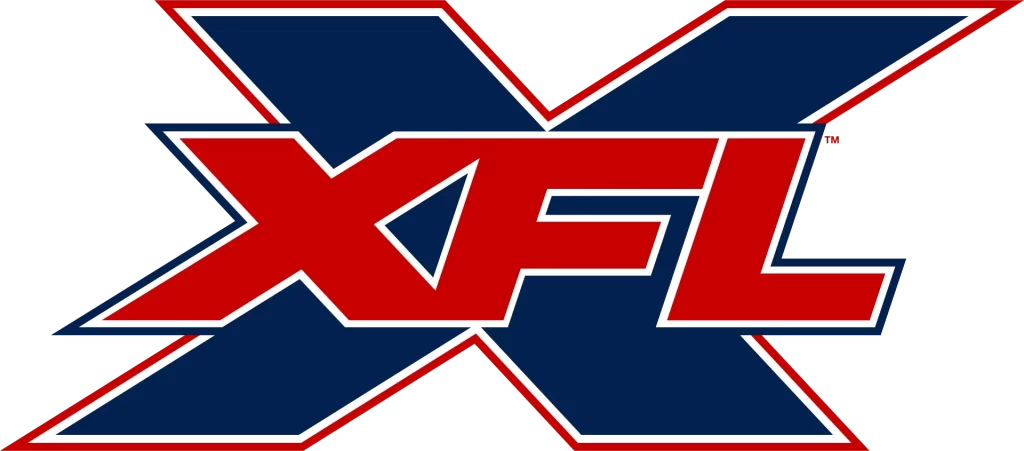
The revival of XFL in 2018 meant that the new XFL played its first season in 2020. However, due to the onset of the COVID-19 pandemic, and the ensuing isolation rules, meant that the season was cut short just five weeks after start. In any case, the league had released a new XFL logo that featured a modification of the previous design. This time, the background “X” was made slightly smaller but thicker, colored a dark blue with a thin white and red outline, and with slight slant to the letter.
The wordmark too used a brighter shade of red, with a white and blue outline, and had a slight slant to it, which made each shade in the color combinations stand out. Overall, it was a great design that reflects its entity’s brand perfectly.
2023 XFL Logo

Finally, we come to the current iteration of the XFL logo that shows a certain modern design aesthetic. As the previous two versions of the logo used a somewhat classic font, the design of the new wordmark uses a set of futuristic fonts that would be right at home with any sci-fi brand.
This style of XFL logo has been used by the team for its 2023 season, and has been carried over into the XFL’s assimilation into the United Football League for 2024 and beyond.
The Franchises and XFL Team Logos Currently in Play
Now that we have seen the XFL logo history, let’s take a look at the teams currently on the XFL’s roster, and the logos sported by them since the 2023 season. Incidentally, these teams have continued being a part of the XFL despite the merger between the XFL and the United States Football League.
Arlington Renegades
The Arlington Renegades is the rebranded franchise known as the Dallas Renegades in the 2020 iteration of the XFL. Compared to the old XFL team logo, the new one is an abstract design that incorporates the imagery of arrowheads for its logo symbols, paired with a modern, clean wordmark. The color scheme is a bright blue, which acts as an intriguing counterpart to the otherwise rule-bucking franchise name of Renegades.
DC Defenders

The DC Defenders have an interesting logomark, which uses the concept of negative space to mark out the second letter of their lettermark. Their logomark features the name of their city, “DC”, written in an interesting manner where the letter “C” is written as a negative space cutout from the middle of the dark red “D”.
The team’s wordmark uses a similar style of fonts as the Arlington Renegades, although their font has slant-cut edges while the renegades have smoothly rounded edges. Moreover, its prominently red coloring makes us add it to the list of top red logos in professional football.
Houston Roughnecks
The Houston Roughnecks use one of the more interesting XFL team logos. The twin metal pillars with rivets on them, connected by a straight metal beam placed in the middle horizontally, looks like a depiction of an oilrig, a common site in Houston, Texas.
However, a closer look shows that the design also mimics the shape of the letter “H”, which represents the team and its city, especially when combined with the single star at the top. This is a symbol often used by sports teams, especially football teams, which hail from the state of Texas, representing its nickname of the Lone Star State, just the Dallas Cowboys logo of the NFL. Mixed with the navy blue and red wordmark, the overall impact of the logo is one of beauty and strength, perfect for the Lone State’s most popular city.
Orlando Guardians
Orlando Guardians sports an XFL logo that symbolizes strength, speed, and vicious aggression. Their logo design features a snarling wildcat, something like a panther or a jaguar, which although smaller than most of its prey, uses its superior strength, cunning, and stamina to overpower the strongest of foes.
However, despite its similarity to the Carolina Panthers logo in terms of design choices, the Panthers logo depicts a more lifelike caricature of a wildcat, while the Guardians logo lacks that somewhat. Nevertheless, the gray outlined in black, with neon green accents around the eyes and the fangs make for one aggressively memorable image.
San Antonio Brahmas
The San Antonio Brahmas is another team from Texas besides the Houston Roughnecks. However, rather than go for something of a more expressive nature, the franchise decided to go for something aggressive. The Brahmas logo looks like the skull of a Brahmas bull, a popular cattle breed in the US that has been bred in the country. The aggressive design of the logo makes it look as if looking at a stylized gilded gold helmet for a Brahma bull, which is further evidenced by the vibrant yellow color scheme for the logo. Overall this is a great design for a professional football field.
Seattle Sea Dragons
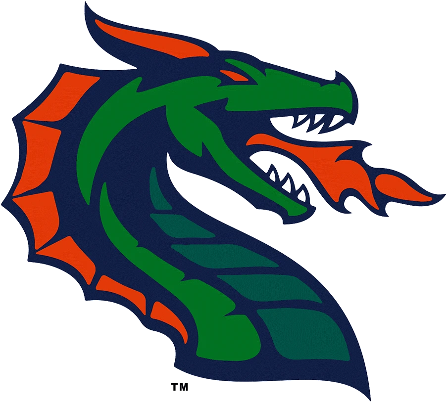
The Seattle Sea Dragons is a rebranded version of the Seattle Dragons from the 2020 XFL revamp. The XFL logo sported by the team is a simpler version of the design used in the previous iteration, which adds to the serpent-like approach used today. The color scheme remains the same at green and red, outlined in a dark, deep blue. While popular color meanings may say that these shades do not work well together, the Sea Dragons have found a design that works well for then and has used it for their XFL team logos.
St. Louis BattleHawks
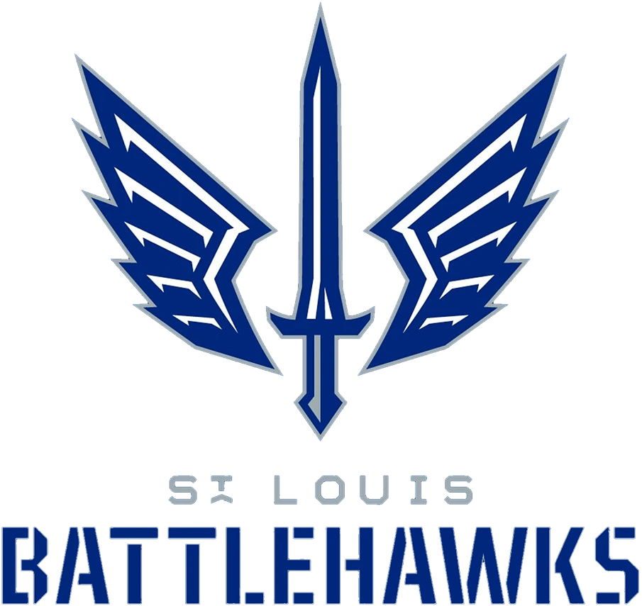
The St. Louis BattleHawks is another XFL franchise that uses an interesting design for its logo. Taking inspiration from its name, the franchise decided that the logo design would include a pair vicious hawk wings, a symbol often used by many ancient warrior cultures to depict speed and ruthlessness. Moreover, to drive the point of the BattleHawks preparation for gridiron war, the central symbol is that of a sword, in a style similar to the Roman Gladius. Overall, the Romanesque design is perfectly suited to the name and brand personality of the team, especially when colored a dark, deep blue.
Vegas Vipers
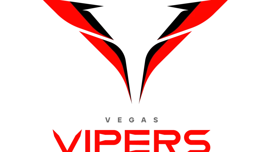
The Vegas Vipers is the second XFL franchise to hail from Las Vegas, after the Las Vegas Outlaws from the League’s very first iteration in 2001. Taking their name from the 2020 Tampa Bay Vipers, who were now rendered defunct, the franchise came up with a new XFL logo that utilizes the concept of negative space logo design perfectly.
The color scheme is an interesting orange and black, with sleek lines and a design that mimics the sharp profile of a vipers face, from their vertical slit eyes to the v-taper of their pronounced nose ridge.
Historical XFL Logos from the Original and 2020 Iterations of the League
Now that we have seen the modern XFL team logos for the franchises playing in the United Football League as part of the XFL Conference, let’s take a look at some great XFL logos from the past. As the league has gone through two short-lived iterations previously, there are a number of now defunct team logos that can inspire our design aesthetic.
Let’s find out the secrets behind these old XFL team symbols.
Birmingham Thunderbolts (2001)
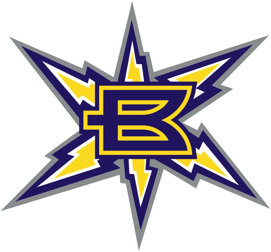
The Birmingham Thunderbolts logo is pretty obvious in its design, using a six-directional thunderbolt cluster in the shape of a star, with a creatively designed letter “B” in the middle of it. The color scheme used was one common in electricity-related symbols, predominantly using a bright and pale yellow combo, combined with a dark blue and blue-gray outline.
Chicago Enforcers (2001)
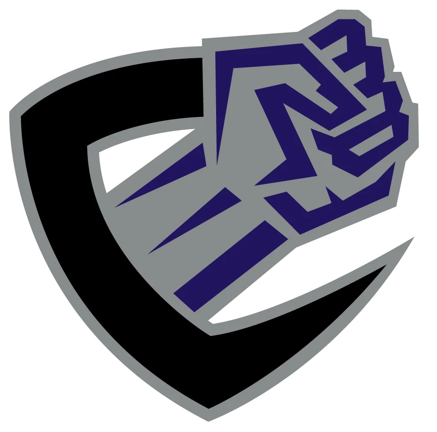
Going for a strong and shocking brand presence, the logo for Chicago Enforcers capitalized on Chicago’s history of mob violence, where enforcers for the outfit would shake down individuals and businesses. Using a strong, clenched fist shoving through a stylized letter “C” in the shape of a shield, this served as a great example of monogram logos in the XFL.
Dallas Renegades (2020)
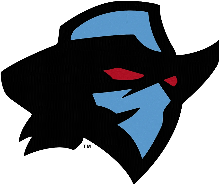
The Dallas Renegades logo draws on the region’s connection with the Wild West, taking on the symbol of a masked outlaw with a ten-gallon hat, and eyes that flash red to show how dangerous they are. The primarily blue coloring outlined and accented in black gives a picture of a moonlit renegade cowboy who is hiding from the law. Overall, this is a great symbol, and one that can inspire logo designs today.
Las Vegas Outlaws (2001)
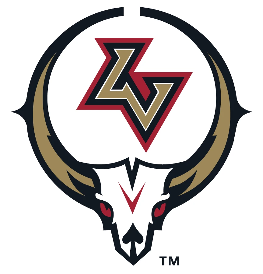
Las Vegas Outlaws carried on the tradition of using shocking and highly memorable team logos for the first iteration of the XFL. With their proximity to the Mojave Desert, and the often used imagery of bleached white skulls and bones of animals in the desert near Vegas, the team decided to use something inspired from that.
The bleached white animal skull of a unknown origin, with long, curving horns and red eyes presents an ominous image, one that is enhanced further by the angular accents to the design, making it perfect for the team symbol. Overall, one of the more memorable XFL logos from the early iteration of the league.
Los Angeles Wildcats (2020)
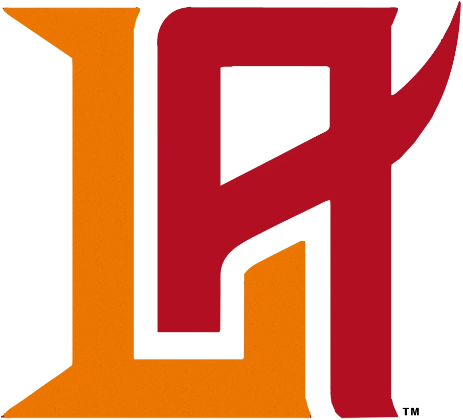
The Los Angeles Wildcats were a team from the second iteration of the XFL, starting play in 2020. Their logo design featured an abstractly designed lettermark of the team’s city initials, with a simultaneously swishy and angular design that depicted the playful indifference of a cat, whether it’s a domestic cat, or a wildcat. The design was colored a bright orange and dark red, and had an understated image.
Los Angeles Xtreme (2001)
The Los Angeles Xtreme was the first XFL team from LA, and featured a design that looked a four-bladed shruiken. The dark blue coloration of the shruiken makes the design look vicious and sharp, especially with the lighter colored highlights on the edges of the blades to show a shiny sharp edge.
The yellow cross in the middle, combined with the initials “L” and “A” on either side of the design, makes this one of the top XFL team logos on this list.
Memphis Maniax (2001)
Memphis Maniax were a XFL franchise from Memphis, Tennessee. Going for a simple yet vicious design, the team opted to go for a design that looked as if clawed across by a wild predator. The torn look of the lettermark featuring the team’s initials offer a red-tinted glimpse into the woods at night, with the white accents and the rough black outline working wonders to give the logo an animalistic vibe.
New York Guardians (2020)
The New York Guardians were an XFL team launched in 2020. And while the COVID-19 pandemic cut its season short, the XFL logo used depicted an animalistic, ghoul-like design with gray and black logo, accented with the red around the eyes and the teeth. Although the name of the team was the Guardians, the imagery served as a stark contrast to that name, making for a great overall logo.
New York – New Jersey Hitmen (2001)
Unlike the New York Guardians’ chosen XFL logo in 2020, the New York – New Jersey Hitmen from 2001 chose a less controversial design, which featured the best of the early 2000s design aesthetic. The large, blocky “H” with upper and lower serifs served as a great design, resulting in a logo that looked like the sights of a gun, referencing the team’s name.
Orlando Rage (2001)
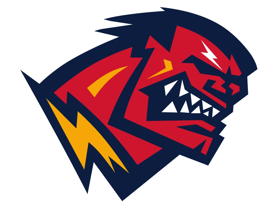
Orlando Rage was another team from the first iteration of the XFL in 2001, and featured an interesting design choice for their logo. Referencing their name, they decided to go for a tongue-in-cheek design, resulting in a logo that looked like the popular Marvel Comics character, the Red Hulk. The blood-red character with yellow thunderbolt accents, a thick neck, gnashing teeth, and an angry expression perfectly represented the team’s brand.
San Francisco Demons (2001)
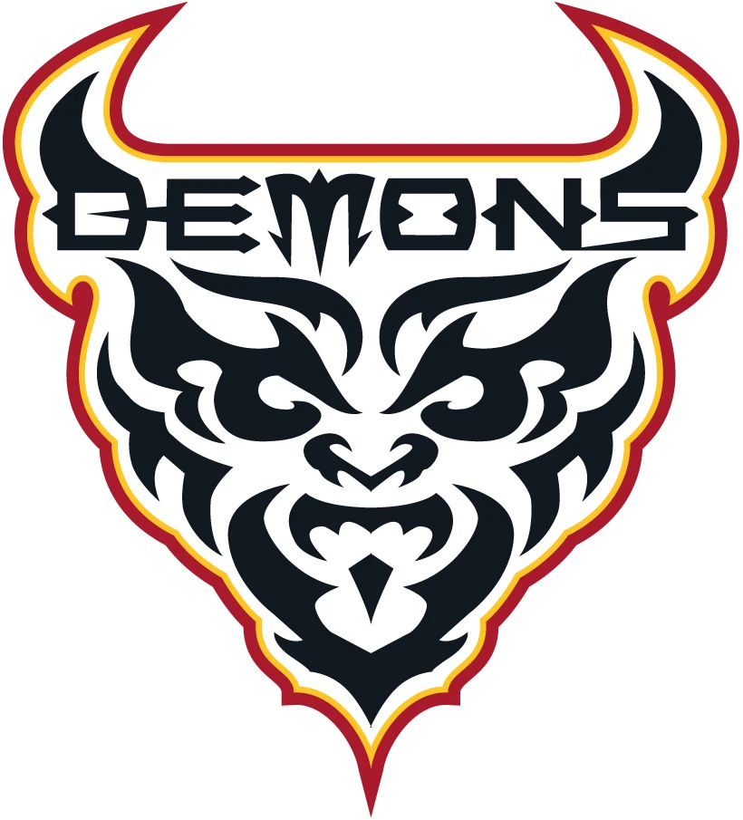
The San Francisco Demons chose another great art style from the early 2000s, continuing the tradition of great XFL team logos from the league’s inaugural season. With a name like the demons, what would your first thought be? Flames and lots of it. The franchise decided to go with a flaming head caricature of a demon, using flaming art tattoo style to create the demon’s facial feature, and the entire design wrapped in a red, orange, and white flame. The result is a great design that highlighted the modern design aesthetic of that era.
Seattle Dragons (2020)
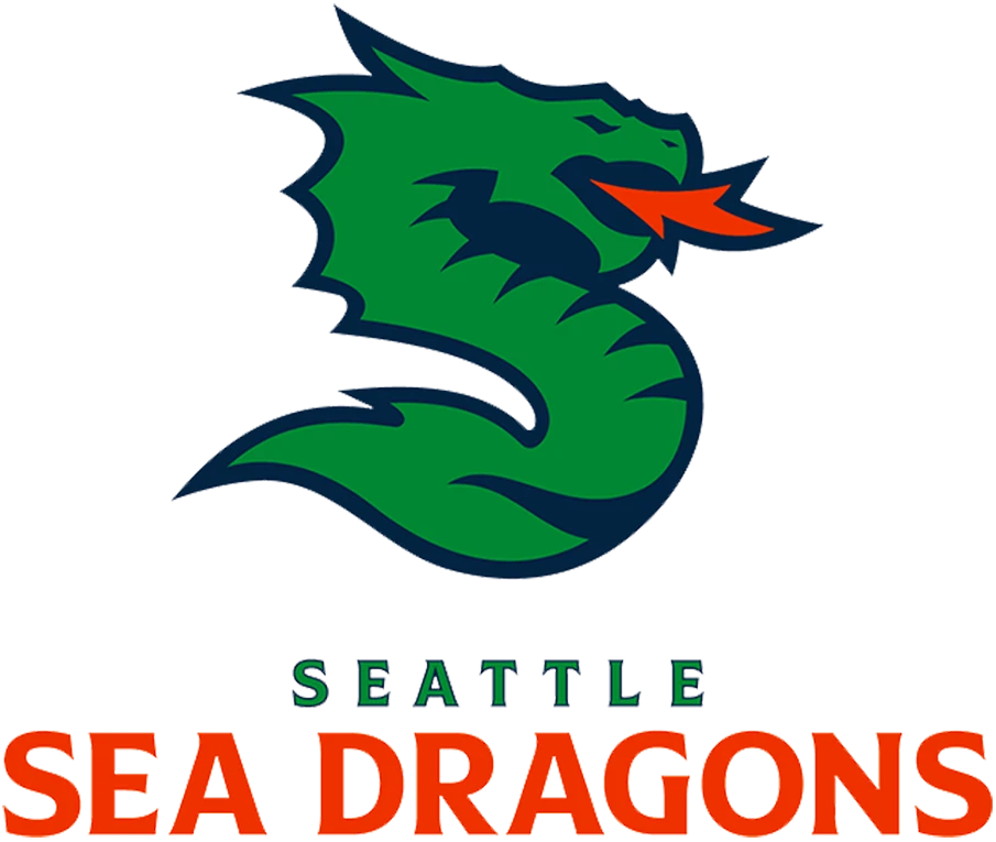
The Seattle Dragons were the earliest iteration of the modern Seattle Sea Dragons in the XFL. Their design was what inspired the current XFL logo for the Sea Dragons, but with a few changes. For one, the Seattle Dragons logo had a design that featured the typical depiction of a dragon we see in fantasy, while the modern design made a few subtle changes to highlight the dragon’s aquatic nature. Overall, it is another addition in long list of XFL team logos from the 2001 season.
Tampa Bay Vipers (2020)
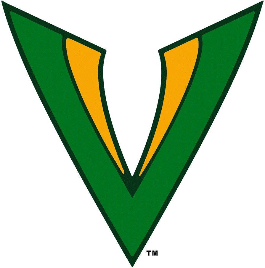
Finally, the Tampa Bay Vipers were a team from 2020 who were disbanded when the league shut down due to the COVID-19 pandemic. It was later reincarnated as the Vegas Vipers, who played in the 2023 XFL season, and will feature in the upcoming UFL season as part of the XFL Conference. Their logo featured a stylized “V” colored a dark green and yellow, designed to look like a yellow venomous fangs against a green background. Subtle, yet highly effective, this logo inspired the modern Vipers logo too.
FAQs
| What does the XFL stand for? While some people think that the XFL stands for Xtreme Football League, that is not true. Rather, it stands for X Football League, with the “X” representing something special. According to Vince McMahon, the original owner of the league, the XFL stood for Xtra Fun League, as the NFL was the No Fun League. |
| Who owns XFL football league? The XFL is co-owned by Dwayne “The Rock” Johnson, his ex-wife and business partner Dany Garcia, and RedBird Capital’s Gerry Cardinale. |
Conclusion
In summation, the XFL logo is a phenomenon that drew in over 600 thousand viewers for their 2023 season. And this year, when combined with the United States Football League under the United Football League, the XFL is expected to draw in even more viewers.
So now that you know the XFL logo history, and the evolution of the various XFL team logos, what do you think? Can the XFL compete with the NFL in terms of branding? Or will this new addition to the football related 3 letter logos be a bust too?

Logopoppin
Logopoppin is a graphic design agency that specializes in logo designing, web development, video production and advanced branding services. We love to innovate businesses with new age technologies, allowing them to improve their visual reputation.

