
Table of Content
Discover Why Yellow Logo Ideas Are Considered So Attractive in Branding
Color is a powerful tool in design, capable of evoking emotions, influencing perceptions, and shaping brand identities. Among the diverse spectrum of colors, yellow holds a unique position, often associated with positivity, optimism, and energy. It is no surprise, then, that many iconic brands have incorporated shades of yellow color into their logos, leveraging their vibrant and attention-grabbing qualities for effective yellow logos.
Yellow, as a color, is often linked to happiness, warmth, and creativity. It can also symbolize intelligence, caution, and optimism. When used effectively in logo design, yellow can create a sense of fun, excitement, and approachability. It can also help brands stand out and be easily recognized in a crowded marketplace.
Join us as we explore the use of yellow in logo design, highlighting some of the most famous brands that have incorporated this vibrant color into their branding. We will dive into the psychological impact of yellow colors, the reasons why it is a popular choice for top logo design services, and the strategies used by them to leverage yellow in their visuals effectively.
Understanding the Attractive Charm of Yellow Logos – Why Is It So Prominent in Branding?
Yellow, one of the primary colors, is often associated with brightness, happiness, optimism, and energy. It can evoke feelings of warmth, cheerfulness, and excitement, and an overall vibe of happiness. That is why you will often see various brands incorporate some yellow into their designs, from being the primary shade to being used as accents.
But why yellow specifically? Many other colors and color combinations can give us the same set of vibes as yellow. However, while they may embody some of these vibes, there is no beating the actual color group that embodies it all. When used in branding, yellow can help to:
- Attract Attention: Yellow is a highly visible color, making it ideal for grabbing attention and standing out from the crowd. Its brightness and vibrancy can immediately catch the eye and draw people in.
- Evoke Positive Emotions: Yellow is often associated with positive emotions such as joy, happiness, and optimism. It can create a warm and inviting feeling, making it a great choice for brands that want to build a positive brand image.
- Stimulate Mental Activity: Yellow is believed to stimulate mental activity and creativity. It can be a good choice for brands that want to convey a sense of innovation and forward-thinking.
- Represent Youth and Energy: Yellow is often associated with youth, energy, and fun. It can be a great choice for brands that want to appeal to a younger demographic.
Famous Brands That Feature Yellow Logos
Many well-known brands have successfully incorporated yellow logos into their brand identity. From using it as the primary shade like with the McDonald’s or Snapchat logo, to using it as an accent such as in the Caterpillar or DHL logo, here are a few examples of the most prominent examples.
McDonald’s
McDonald’s iconic golden arches are one of the most recognizable restaurant logos in the world. The vibrant yellow arches are associated with happiness, fun, and family-friendly dining. The simplicity of the design, combined with the vibrant color, makes it instantly recognizable.
Best Buy
Best Buy’s logo features a bold yellow square-ish shape mimicking an old-style price tag, symbolizing the brand’s commitment to technology and innovation with an emphasis on its long history. The yellow color evokes a sense of energy and excitement, standing out among the plain black of the rest of the design, and reflecting the fast-paced world of retail logos.
Snapchat
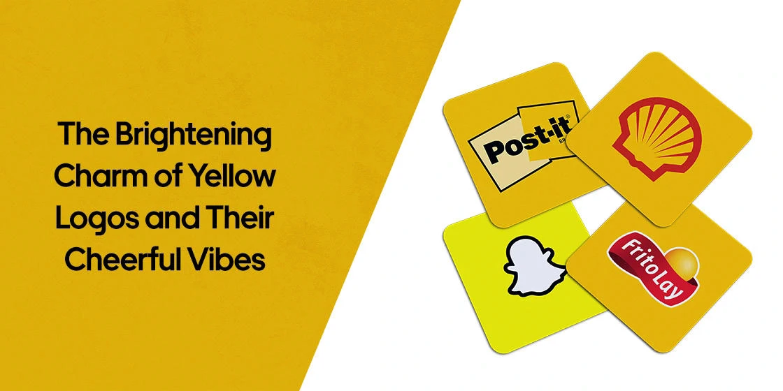
Snapchat’s logo features a yellow ghost, representing the app’s playful and youthful nature. The ghost’s friendly demeanor and bright yellow color make it instantly recognizable and appealing to a younger demographic.
DHL
DHL is one of the top courier and transport company names in the world, and its logo features a yellow background with the company’s name in a bold, red font. The yellow color symbolizes speed, efficiency, and optimism, reflecting the company’s commitment to fast and reliable delivery services.
Pokémon
The Pokémon logo features a yellow circle with a red Poké Ball in the center. The yellow color represents friendship, happiness, and the joy of exploration. The simple yet iconic design has made Pokémon one of the most recognizable gaming logos and brands in the world.
Bumble
Bumble’s logo features an abstract yellow and black illustration of a bumblebee, symbolizing the app’s focus on female empowerment and connection. The bee’s busy nature and its ability to work together in a hive reflect the app’s mission to connect people. And its innovative design has made it one of the most recognizable dating app logos in 2024.
Denny’s
Denny’s logo features a thick red-maroon hexagon with its inside colored yellow and the wordmark at its center. The yellow color represents warmth, friendliness, and comfort, reflecting the brand’s family-friendly atmosphere.
Frito Lay
Frito-Lay’s logo features a yellow sphere with a red, flowing-ribbon design. The yellow color symbolizes happiness, fun, and snacking, as well as both a sun a perfectly peeled potato. The logo’s bold and playful design reflects the brand’s commitment to providing delicious and satisfying snacks, making it one of the most popular food logos today.
Kodak
Kodak’s logo features a dark yellow square with a red and black design. The yellow color represents creativity, innovation, and photography. The logo’s simple and iconic design has become synonymous with the brand, making it one of the most well known photography logos of all time.
National Geographic
National Geographic’s logo features a yellow border around the company’s name. The yellow color symbolizes exploration, adventure, and discovery. The logo’s classic and timeless design reflects the brand’s commitment to quality journalism and storytelling.
CAT
Caterpillar’s logo features a yellow triangle underneath the first “A” of the wordmark. The yellow color represents strength, power, and durability over a long journey, the triangle representing both an upwards trajectory and a road disappearing in the distance. The logo’s bold and simple design reflects the brand’s reputation for building tough and reliable machinery.
Shell
Shell’s logo features a yellow scallop shell, symbolizing the company’s origins in the oceanic oil exploration industry. The yellow color represents energy, power, and innovation. The logo’s clean and modern design reflects the company’s commitment to sustainability and progress.
Post-Its
Post-it Notes’ logo features a pair of yellow squares with a black and white design. The yellow color represents creativity, productivity, and innovation, as well as the actual product’s default color. The logo’s simple and iconic design reflects the product’s versatility and usefulness.
Chupa Chups
Chupa Chups’ logo features a colorful flower with a yellow background, designed by famed artist Salvador Dali. The yellow color represents sweetness, happiness, and childhood. The logo’s playful and colorful design appeals to children and adults alike.
BIC
BIC’s logo features a yellow circle with a red and blue design. The yellow color represents creativity, innovation, and writing. The logo’s simple and iconic design reflects the brand’s commitment to providing affordable and reliable writing instruments.
Pirelli
Pirelli’s logo features a yellow rectangle with a red “Pirelli” in the center. The yellow color represents speed, performance, and power. The logo’s bold and dynamic design reflects the brand’s association with high-performance tires.
Rockstar Games
Rockstar Games’ logo features a white star with a dark yellow background. The yellow color represents energy, excitement, and gaming. The logo’s bold and edgy design reflects the brand’s commitment to creating innovative and immersive gaming experiences, making it one of the most famous yellow logos, especially among the younger generations.
Why You Should (Or Shouldn’t) Use Yellow in Your Logo Color Palettes?
When considering whether to use yellow in your logo color palette, it’s important to consider the following factors:
- Brand Personality: Yellow can be a great choice for brands that want to convey a sense of optimism, energy, and friendliness.
- Target Audience: Consider your target audience and their preferences. If your target audience is young and energetic, yellow can be a good choice.
- Brand Message: Yellow can be used to highlight key messages or calls to action.
- Color Combinations: Yellow can be combined with other colors to create different effects. For example, yellow and blue can create a sense of harmony and balance, while yellow and black can create a bold and striking contrast.
However, it’s important to use yellow in moderation. Too much yellow can be overwhelming and can make your logo difficult to read. Additionally, yellow can be perceived as a cheap or tacky color if not used correctly.
By carefully considering these factors, you can use yellow to create a visually appealing and effective logo that will help your brand stand out from the competition. When brainstorming yellow logos, it’s also important to weigh their pros and cons.
Ultimately, the decision of whether or not to use yellow in your logo design will depend on your brand’s personality, target audience, and overall branding strategy. By carefully considering the psychology of color and the specific connotations of yellow, you can create a logo that is both visually appealing and effective.
Pros of Using Yellow in Logo Design
Some of the most prominent arguments for yellow logos include:
- High visibility: Yellow is a highly visible color that can help your logo stand out.
- Positive associations: Yellow is often associated with positive emotions such as happiness, optimism, and energy.
- Creativity and innovation: Yellow can be used to convey a sense of creativity and innovation.
Cons of Using Yellow in Logo Design
While yellow logos are quite popular, they do have some cons too, such as:
- Can be overwhelming: Too much yellow can be overwhelming and distracting.
- Can be associated with caution: Yellow is also associated with caution, so it’s important to use it judiciously.
- May not be suitable for all industries: Yellow may not be the best choice for all industries. For example, it may not be appropriate for a law firm or a funeral home.
FAQs
| What is the most famous yellow logo? McDonald’s if often considered the most famous yellow logo out of the many we see today. |
| What does the yellow color represent in logo design? Yellow is often used to represent happiness and energy in logo design. |
| What famous brand sports a yellow and blue logo? IKEA is a famous brand that sports a logo colored yellow and blue. |
Conclusion
To sum it up, the charming vibes of yellow logos makes them an interesting and effective choice for your brand symbols. However, as the saying goes, “With great power comes great responsibility.” And while yellow-colored brand logos are quite impactful, failing to balance them properly within your branding can backfire on you quite drastically. In the end, if you follow the tips and guidelines above, and understand why the brands we discussed above chose to add yellow to brand icons, you will be able to make the right choice.
Logopoppin
Logopoppin is a graphic design agency that specializes in logo designing, web development, video production and advanced branding services. We love to innovate businesses with new age technologies, allowing them to improve their visual reputation.
