
Table of Content
Take a Look How the Famous Real Estate Symbol of Zillow Evolved
Zillow Group has established itself as a leader in the real estate industry with its comprehensive online database, offering detailed information on over 100 million homes across the United States. Through its platform, Zillow provides a wide range of tools for buyers, sellers, and renters, allowing them to explore housing options, estimate home values, and access vital market trends. This extensive digital presence has made Zillow logo quite popular in the industry that is naturally very competitive and complex.
In 2011, Zillow expanded its reach by launching an advertising network in collaboration with Yahoo!. This strategic partnership allowed Zillow to connect more effectively with audiences while also providing valuable advertising opportunities to real estate agents, brokers, and other professionals. By leveraging Yahoo!’s massive online traffic, Zillow was able to enhance its visibility and expand its services, solidifying its position as a dominant force in real estate advertising.
When it comes to its logo, Zillow has crafted an emblem that is not only simple but also deeply symbolic of its industry focus. Created by professional logo design services, the design incorporates elements that immediately convey the company’s specialization in real estate. In this blog, we will talk in detail about the history of Zillow logo, so make sure to read it completely to learn the entire transformation journey of Zillow logo till to date.
Understanding the Popularity of Zillow Logo
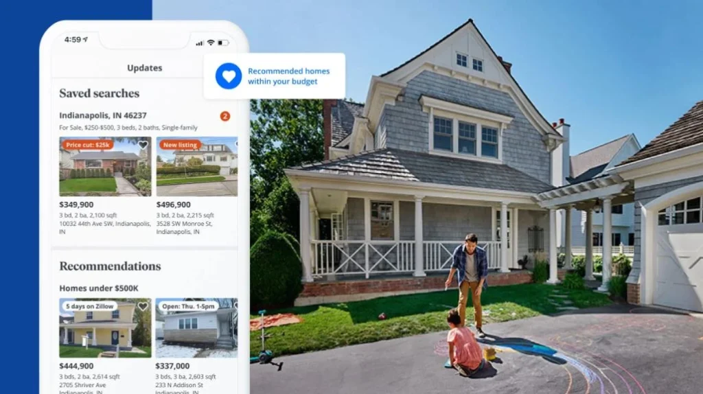
Zillow’s popularity in the U.S. can largely be attributed to its comprehensive and user-friendly online platform. With over 100 million properties listed on its database, Zillow offers detailed property listings, home value estimates, and neighborhood insights, making it a one-stop resource for anyone interested in the housing market. The platform’s ability to filter search results based on various preferences like price, location, and home features further enhances its accessibility, making it an indispensable tool for real estate enthusiasts.
Another key factor driving Zillow’s popularity is its innovative features that simplify the home buying and selling process. Zillow’s Zestimate, has become a defining feature of the platform, providing users with an initial understanding of property prices before making any decisions. Additionally, Zillow’s mobile app allows users to access real-time information on listings and market trends, making it convenient for people on the go. These tools empower consumers to make informed decisions, giving Zillow a competitive edge in the real estate industry.
Furthermore, Zillow’s reputation for being an accessible, transparent, and reliable source of real estate data has helped it build trust and loyalty among users. The platform’s focus on providing detailed insights into home prices, trends, and neighborhood statistics allows users to feel confident in their decisions. All these factors combined have helped Zillow maintain its position as one of the most popular and trusted real estate websites in the U.S.
History of Zillow Logo
The history of Zillow logo is quite diverse, as it has been changed and redesigned from time to time. If you do not know about the Zillow logos that came before the current one, take a look at the complete timeline of vintage logos given below.
Zillow Logo – 2004
The emblem described above is the original logo introduced by Zillow in 2004. This early design featured only the company name, “Zillow,” presented in a simple and straightforward typeface. The letters were rendered in thin black lines, with a slightly elongated and streamlined appearance, which gave the logo a clean, modern look. This minimalistic design was effective in communicating the brand’s focus on simplicity and clarity.
In terms of its composition, the arrangement of the letters in the logo was deliberately loose and unstructured, with the characters spaced at an optimal distance from each other. This flexible layout gave the wordmark logo a sense of openness and approachability, reinforcing Zillow’s goal of providing a user-friendly experience. The spacing allowed the name “Zillow” to stand out clearly, ensuring easy readability while maintaining a sense of balance and harmony in the design.
Zillow Logo – 2006
The “Z House” emblem made its debut in the Zillow logo in 2006. This updated logo incorporated a creative representation of a house, cleverly shaped around the letter “Z” to symbolize the company’s focus on real estate. The design utilized a split structure, where the “Z” visually divided the house into two distinct sections. The top portion of the house was depicted in a shade of blue, while the bottom portion was represented in green.
In this original design, the division between the blue top and green bottom of the house not only created a visually appealing contrast but also symbolized the company’s commitment to providing comprehensive real estate services. The blue color often evokes feelings of trust and reliability, while the green bottom conveyed a sense of growth and stability, aligning with Zillow’s goal of helping users find their ideal homes.
Zillow Logo – 2008
The Zillow logo introduced in 2008 closely mirrored its previous version. One notable change was the overall enlargement of the logo’s components. The size of the lettering, as well as the house graphic, was increased, giving the logo a more prominent and bold appearance. This adjustment helped the logo to stand out more effectively, aligning with Zillow’s expanding influence and recognition as a leading platform in the real estate sector.
Another significant modification in the 2008 version of the logo was the removal of the “.com” suffix, which had previously been included to emphasize the company’s online presence. This change reflected Zillow’s shift from being solely associated with the internet to becoming a well-established brand in the real estate industry. Additionally, the design no longer featured the “beta” label, which had been present in earlier iterations.
Zillow Logo – 2019
The Zillow logo underwent a significant redesign in 2019. One of the most striking updates was the color shift, which featured a fresh and modern palette to enhance the brand’s visibility and appeal. The font was also refined, adopting a more contemporary and bold style. This updated logo was designed to feel more dynamic and professional, aiming to resonate with both users and real estate professionals on a larger scale.
Another key transformation in the 2019 logo was the redesign of the arrow, which now prominently features the letter “Z” at its center. The “Z” is integrated in a way that it cuts across the arrow, drawing a direct parallel to the iconic movement of the “Zorro” character. This visual reference adds a sense of strength, decisiveness, and action to the logo, positioning Zillow as a bold and influential force in the real estate market.
Zillow Logo – 2024
Following the 2024 redesign, the core concept of the Zillow logo remained consistent with previous versions, maintaining its recognizable house-shaped emblem and the overall brand structure. However, significant changes were made to the color palette to enhance the logo’s visual appeal and modernize its overall appearance. The blue used for the house graphic was deepened to a darker shade, which conveyed a stronger, more professional presence.
Just like industry’s other real estate logo designs, the font of the company’s name underwent a subtle yet impactful update. The lettering was changed to a more formal title case, offering a cleaner and more structured look. To complement this shift, the color of the text was adjusted to black, further enhancing the logo’s boldness and clarity. The black lettering provided a sharp contrast against the blue elements of the emblem, ensuring that the brand name was instantly legible and prominent.
Frequently Asked Questions
| Why real estate companies need a creative logo? A creative logo helps real estate companies stand out in a competitive market. It also conveys professionalism and trust, key qualities for attracting buyers and sellers. |
| Why is Zillow logo famous in the US? Zillow’s logo is famous in the U.S. because it symbolizes the brand’s strong presence in real estate. It effectively represents Zillow’s mission to provide accessible and trusted housing information to millions of users. |
| What is the color of Zillow logo? The Zillow logo primarily features shades of blue, with a darker blue for the house graphic and a brighter blue accent. The text is presented in black, offering a sharp contrast to the blue elements. |
Final Words
That concludes our entire blog in which we have discussed the complete history of Zillow logo. It is a highly reputed emblem in the industry of real estate and property marketing. Over the years, this logo has been changed several times, precisely to keep the branding of the company fresh and updated. This blog has listed all those logos in detail, so that you can see the complete timeline of their evolution. It will let you know how the famous identity of Zillow evolved over the years, outmatching all others in the industry of real estate.
Latest news you want to know!
Subscribe for cutting-edge design inspiration at Logo Poppin! Elevate your brand with updates on logos, branding, web design, and video animation.
Note that by clicking “subscribe,” users may agree to our privacy policy and consent to Logo Poppin to use your contact data for newsletter purposes.
Logopoppin
Logopoppin is a graphic design agency that specializes in logo designing, web development, video production and advanced branding services. We love to innovate businesses with new age technologies, allowing them to improve their visual reputation.
