Table of Content
Discover How the Zoom Logo Transformed Over the Years From Its Inception
The logo for Zoom, a simple yet instantly recognizable wordmark and icon in a vibrant blue color, has become a common symbol of modern video communication and remote collaboration. In a surprisingly short span of time, the Zoom app transformed from a mere startup into the leading video conferencing platform relied upon by individuals, businesses, and educational institutions worldwide.
The evolution of the Zoom logo mirrors this remarkable trajectory too, showing the company’s growth, and its commitment to providing a seamless and user-friendly communication experience. From its initial, descriptive logo to the sleek, minimalist design we see today, the Zoom icon has gone through a transformation reflecting its increasing market dominance and focus on simplicity.
Exploring these various logo designs from the POV of a professional logo design agency provides insight into the strategic decisions behind the branding. It also helps us explore how they aimed for memorability, clarity, and a visual representation that resonates with their diverse and expanding user base. Let’s explore the topic in greater detail.
Inception of Zoom into the Leading Video Conferencing Tool We Know These Days

The journey of Zoom Video Communications began in 2011 with a clear vision from its founder, Eric S. Yuan, a former Cisco WebEx engineer. He set out to create a video conferencing platform that was reliable, easy to use, and accessible across various devices. In its early days, the company focused on building a robust and user-friendly platform that addressed the frustrations many users experienced with existing video conferencing solutions.
The emphasis of the team was on a seamless experience, high-quality video and audio, and features that helped achieve effective collaboration. This core focus on user experience proved to be a key differentiator in a crowded market, especially when the COVID-19 lockdowns came into effect, bringing the world to a virtual standstill.
Following its official launch as Zoom in 2013, the platform quickly gained traction due to its intuitive interface and reliable performance. Unlike some competitors like Skype, Zoom offered a streamlined experience that required minimal technical expertise, making it appealing to a broad range of users, from individuals to large enterprises.
What Fueled the Early Adoption of Zoom During the COVID-19 Pandemic?
The platform’s early adoption was fueled by its freemium model, which allowed users to host short meetings for free, thus encouraging organic growth and word-of-mouth marketing. As the demand for remote communication and collaboration tools increased, Zoom strategically added to its features to include screen sharing, recording, breakout rooms, and integration with other popular productivity applications.
The pivotal moment for Zoom’s exponential growth arrived with the global pandemic in 2020. As lockdowns and social distancing measures were implemented worldwide, the need for reliable video conferencing solutions skyrocketed. Zoom was uniquely positioned to meet this unprecedented demand, offering a platform that was known for its ease of use and scalability.
The platform became an essential tool for remote work, online education, virtual events, and connecting with loved ones. This surge in usage propelled Zoom from a successful tech company to a household name, solidifying its position as the leading video conferencing tool in the market. Today, Zoom continues to innovate, expanding its offerings beyond video conferencing, further cementing its role as a comprehensive communication platform.
Transformation of Zoom Logo, From Representing a Startup to the Mega Brand Today
The Zoom logo has undergone a few subtle yet significant transformations since the company’s inception in 2011. And these changes reflect Zoom’s evolution from a startup with a specific focus to a global communication giant we know today.
Let’s take a look at the different types of logos Zoom has sported over the years.
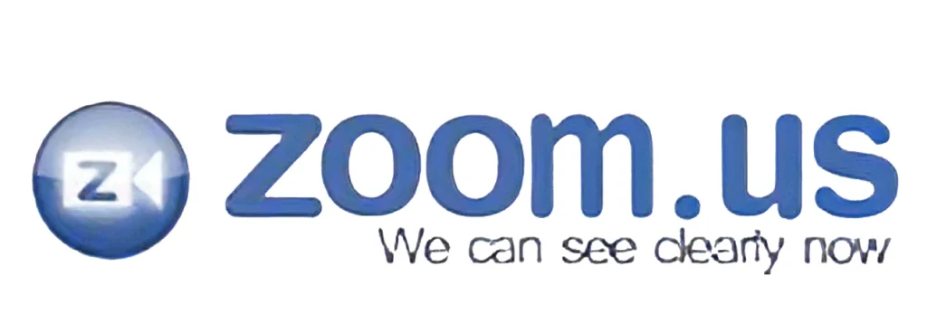
2011-2013 Zoom Logo

The initial logo used by Zoom in its early years (2011-2013) was more descriptive and directly communicated the platform’s core function. It featured the word “Zoom” in a simple, lowercase, sans-serif typeface, often in a light blue or grey color. To the left of the wordmark was a graphic element that resembled a stylized camera lens or aperture.
This graphic was typically depicted with concentric circles or segmented lines, clearly suggesting the visual aspect of video conferencing. This early logo was functional and clearly conveyed the nature of the service being offered. The lowercase lettering gave it a somewhat approachable and informal feel, typical of many tech startups at the time focusing on user-friendliness. The inclusion of the lens graphic left no doubt about the platform’s primary purpose: visual communication.
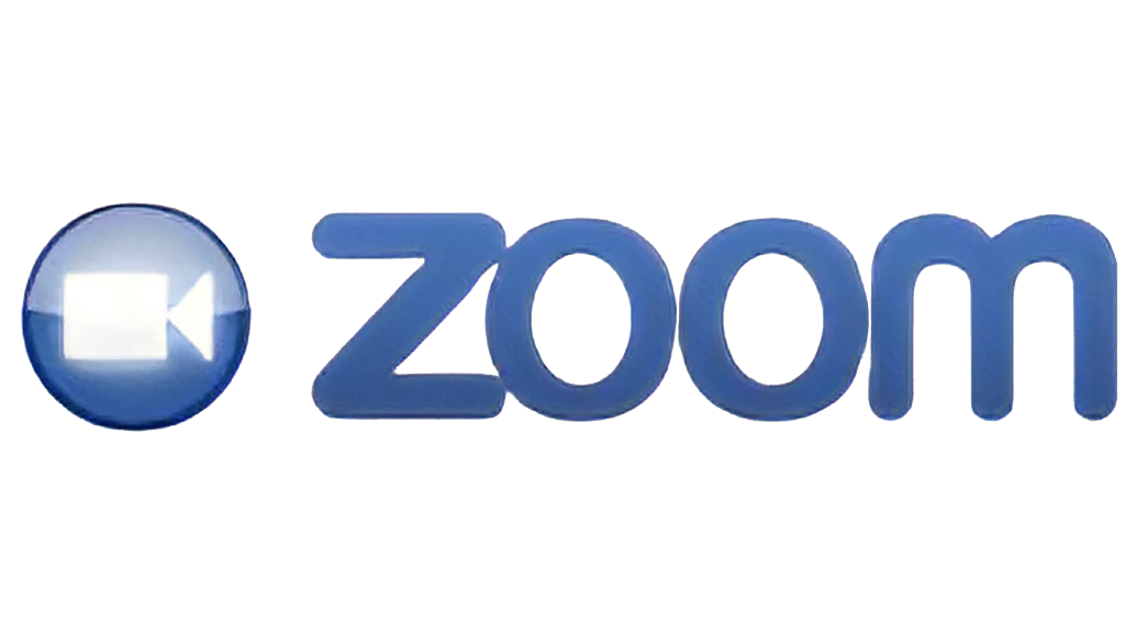
2013-2014 Zoom Logo

Around 2013-2014, as the company officially launched and began to gain more traction, the Zoom logo underwent a slight refinement. The core elements of the wordmark “Zoom” and the camera lens graphic were retained. However, the typeface for “Zoom” became slightly bolder and more distinct, often rendered in a brighter shade of blue. The camera lens graphic also saw a subtle update, often appearing more solid and less abstract, sometimes with a more clearly defined shutter-like design.
This iteration maintained the clear communication of the platform’s function while introducing a slightly more confident and visually impactful design. The brighter blue started to establish a more distinct brand color, and the bolder typeface lent a stronger presence to the company name. This evolution reflected the company’s growing confidence and market presence as it moved beyond its initial startup phase, and one that would prove important during its rise during the pandemic.
2014-2022 Zoom Logo

The logo that became widely recognized and synonymous with Zoom during its period of rapid growth, particularly throughout the 2020 pandemic, was introduced around 2014 and remained largely consistent until 2022. This iteration saw a significant simplification and modernization of the brand’s visual identity. The stylized camera lens graphic was replaced by a clean, white, rounded rectangle with a smaller, centered white circle inside, resembling a simplified camera icon.
This icon was consistently placed to the left of the wordmark “Zoom,” which was now rendered in a custom-designed, lowercase, sans-serif typeface with rounded terminals. The primary color for the wordmark and often the background surrounding the icon became a distinct and vibrant shade of blue, similar to that era’s Skype or Discord logo. This design was clean, simple, and highly memorable.
The abstract camera icon was easily recognizable, and the rounded typeface contributed to a friendly and approachable brand image. The vibrant blue became strongly associated with the platform’s reliability and user-friendliness, playing a significant role in its brand recognition during its period of explosive growth and widespread adoption.
2022-Current Zoom Logo

In 2022, Zoom unveiled a more subtle yet strategic refresh of its logo. While the core elements of the white camera icon and the blue “Zoom” wordmark were retained, the update focused on refining the typeface and the overall visual balance. The custom sans-serif font for “Zoom” was subtly adjusted, with slightly more distinct letterforms and improved legibility. The spacing between the letters was also carefully considered to enhance visual harmony. The vibrant blue color remained a key identifier.
This evolution reflects the brand’s maturity and its aim for a more polished and professional look while retaining the core elements that had become so recognizable. The subtle refinements suggest a focus on clarity, trust, and the platform’s continued evolution as a comprehensive communication tool for a global audience, cementing its place among the top web app ideas of that era. The consistency of the core elements ensures continued brand recognition while the updates signal a commitment to modern design principles.
FAQs
| What is the logo for Zoom? The Zoom logo is represented by a custom wordmark, as well as a symbol that shows the outline of a camera. This shows its primary service, which is video conferencing. |
| What is Zoom’s full name? The full name of Zoom is Zoom Communications Incorporated. |
| Who is the CEO of Zoom? Zoom’s current CEO is founder Eric S. Yuan, who left WebEx to found the video conferencing tool that he imagined would be the future of the industry. |
| What is Zoom’s slogan? Zoom’s slogan is quite well-known, and says “Zoom – We Deliver Happiness.” |
Conclusion
The evolution of the Zoom logo, from its initial descriptive representation to the sleek and globally recognized icon of today, mirrors the company’s remarkable journey from a promising startup to the leading video conferencing platform worldwide. Each iteration of the logo reflects the company’s growth, its strategic focus on user experience, and its adaptation to the changing landscape of digital communication.
As Zoom continues to play a pivotal role in how individuals and organizations connect and collaborate, its instantly recognizable logo serves as a powerful and enduring symbol of its impact on the modern world.

Logopoppin
Logopoppin is a graphic design agency that specializes in logo designing, web development, video production and advanced branding services. We love to innovate businesses with new age technologies, allowing them to improve their visual reputation.


