Table of Content
Take a Look at the Stunning Evolution of World’s Biggest Superhero Logo
Superman is one of those characters that is known to everyone in the world. It is especially loved by the kids because they find the persona of Superman quite enthralling. It is the core reason why the Superman logo is quite popular in the world. This emblem always exhibits a bold identity that is simply unmatchable with anyone. Though the logo of other DC characters are also very famous, but the prominence of Superman logo is still far ahead of them.
If you will look at the history of Superman logo, you will find a wide stack of changes done in the emblem during the last few years. The logo that was first introduced in 1938 is seen nowhere today, in fact nobody knows about it. If you will try to find it, the best traces you can get related to it can be seen in the old comic books that were also released decades ago. This is the major reason why a huge section of audience do not know about the history of Superman, as how it emerged and what type of styling it had in the classical era.
If you want to know about this exact question, but have got no reliable source to read on the internet, take a look at this blog. It is precisely written to let you know about the history and evolution of your favorite superhero character. The article will dive deep into the beginning of comic book universe, so that you can understand how Superman became the first ever character of this immersive world.
So, without wasting much time, let us first take a look at the early days of Superman, as that will let us know the beginning story of this famous Krypton’s last son. Let’s take a look at it below.
The Origins of Superman

The enthralling persona of Superman is liked by everyone, however, his origins is not known to many people except for comic book readers. The story of this great character is indeed very interesting and worth reading. It was first released in 1938 when the hero was not known much in the world. At that time, there was also no concept of comics, as people had different reading habits. They usually liked to read old folk stories that were literally quite boring and straightforward.
However, the trend started to change once new characters like Superman and Batman came to the scene. At first, they got the attention of kids because these characters were originally created for them. With the passage of time, the story of these heroes got more changes and they became interesting for everyone. Their superhero logos also evolved, allowing the characters to showcase unique branding identity through them.
This is how the emergence of superheroes started in the world. Here, we must need to acknowledge the importance of comic book stories, because they were used as a strong base by the writers to introduce these characters in the market. The story of Superman is therefore quite worthwhile to read, as it describes how the last son of Krypton escaped the implosion of the planet and came to the earth as an orphan.
Evolution of Superman Logo Over the Years
Superman is a character that is active in the industry from last many decades. It came first to the scene in 1938, and since then, the popularity of hero has only grown only bigger. Besides animated series, the character was solidly portrayed in different movies, in which the classic adaptation of Christopher Reeves proved to be a game changer.
Talking about the logo of Superman, DC made several changes to it during the last few years by taking different logo design services. If you will see the Superman logo that came first to the scene in 1938, you will probably disregard it stating the straightforward ordinary quality of the emblem. However, you should still have some knowledge about those logos if you are a real character fan.
For your convenience, we have compiled a complete list of these logos below to let you know about them effectively. Let’s take a look at them in detail below.
Superman Logo – 1938
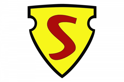
The first official series of Superman was released in 1939, however, one year before, its logo appeared in the 1938’s Action Comics #1. This was the first time when the identity of Superman was revealed to the world. Though the character didn’t had any major role in the Action Comics #1, but a teaser was given for his appearance. This logo helped to make up the minds of people, and it actually offered great results when the first official series came out next year.
Though this logo was quickly removed from the scene, but still it is termed as the first logo that showcases the identity of Superman to the world. It looks simply, offering a subtle concept of the famous character.
Superman Logo – 1939
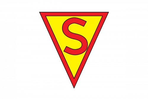
After the first teaser in 1938, the official series finally released in 1939. This time, the logo of the character was also changed, giving it a more decent look than the previous one. This alteration was not expected, still the creators of the character opted to go with the other logo. This logo was also very simple just like the first version, which is why its resemblance was also quite similar.
The color combination used for this logo was also the same. It had a similar yellow and red combination that made the visuals of the logo quite fancy.
Superman Logo – 1940/41
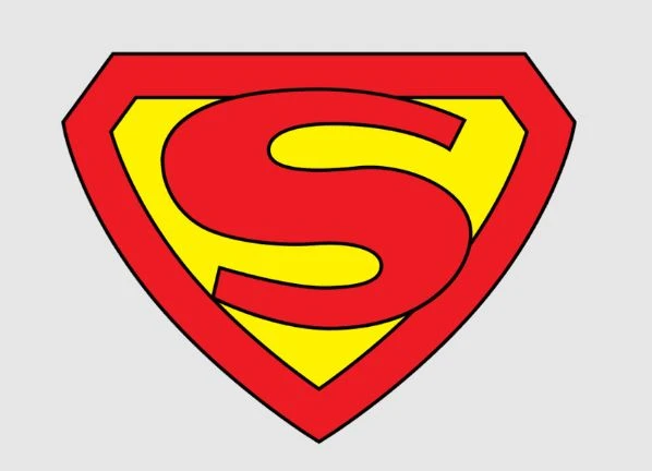
In 1940, Superman logo was again altered by introducing a proper figure of shield in the logo. This was the first time when shield was included in the logo with a certain meaning. Earlier, only triangular shapes were being used in the logo to give it a decent look. However, this time, creators decided to go with the shield to give logo a more intrepid look.
If you will analyze the shield closely, you will notice that it is still being used in the modern adaptation of Superman. It looks great which is why designers thought to move along with this to create an advanced design for the identity of Superman.
Superman Logo – 1943/44
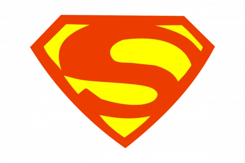
In 1943, the logo of Superman again got slight modifications. This time, the borders of the shield became more solid, as strong shade of red was chosen for this job. The inner part was almost similar, as it didn’t had any bigger changes. The ‘S’ sign was however enlarged in the new design to give the logo a more strong look.
The combination of yellow and red was not changed in this logo, as it became a standard for the Superman logo at that time. Though some earlier logos tried other variations, but the final call stayed with the blend of yellow and red.
Superman Logo – 1944/55
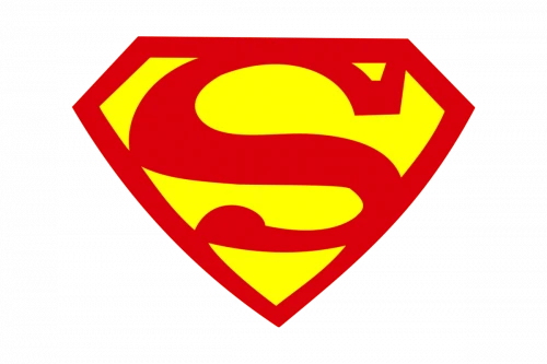
In 1944, the colors of the Superman logo were again tweaked to bring some sort of freshness in the design. This time, more strong gradients of red and yellow were chosen for the logo. This was precisely done to make the identity of the character more prominent in the eyes of people. This new version successfully achieved that objective, as people liked this version more than the previous ones.
Due to its enthralling colors, the logo was well received among the fans. This was the major reason why DC didn’t went for a new change in the coming years, as this logo remained the official Superman emblem for next ten years.
Superman Logo – 1955/86
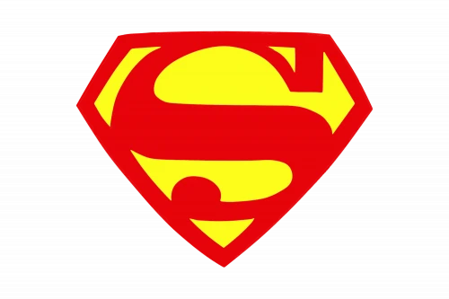
The logo of Superman saw little modifications in 1955. The majority of these modifications came in colors, as the gradients of red and yellow were again changed. It was basically done to keep the branding of the character fresh, so that people can show interest in it. At that time, the trends of designing were also changing, so it was required to perform some changes.
The size of the ‘S’ sign was also changed in this new logo. It was made bigger and better from the last version, precisely to make its visuals more bold.
Superman Logo – 1987/99
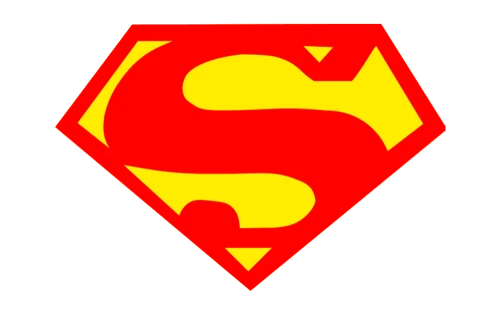
In 1987, the trends of graphic designing started to evolve. It was the time when new practices of logo designing were being used by other brands. So, DC decided to give the Superman logo a slight new look by doing some modifications in the design. Like the Batman logo, they changed the shape and size of the shield a little bit, and also picked a lighter tone of red color for the design.
The lettering style of ‘S’ was also changed a bit in this new logo, but it was not much prominent. Perhaps it was done intentionally, so that more changes in the design do not looks overly evident.
Superman Logo – 1998/2009
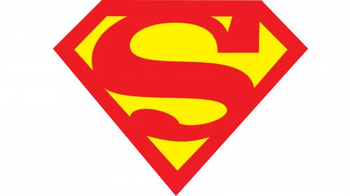
Keeping the changing trends of market in mind, Superman logo saw a good change in the 1998 redesign. Just like Spiderman logo, it was made sharper and bolder in the new design which certainly enhanced its overall outlook. The edges of the shield were smartly scaled, so that the size of the logo do not becomes too large.
The color combination used for this logo was almost similar to the last design. It didn’t required much changes, so DC decided to not perform any unnecessary stuff in the logo.
Superman Logo – 2011-Present
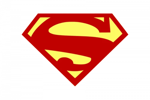
A new design of the Superman logo was again introduced in 2011. It was basically an extension of the 2009 design. It only came up with change of color gradients, as more strong shades of red and yellow were picked for the logo.
It could be said that the 2011 logo was much brighter and clearer from the previous versions. The audience also gave a positive response about this change, so till to date, this logo is stated as the official emblem of Superman.
Frequently Asked Question (FAQs)
| Why is Superman logo popular in the world? The character of Superman is quite famous among the comic book fans. It is the core reason why they love the logo of Superman, because it represents the identity of him. |
| When was the first Superman logo introduced? The first Superman logo was introduced in 1938 in the Action Comics #1. This logo was only used to announce the character of Superman in the next series which was later released in 1939. |
| How many times Superman logo was changed? During the last few years, Superman logo has seen massive changes. It was basically done to keep the branding of the character fresh, so that people can always show interest in his appearance in comics. |
| What type of colors are used in the Superman logo? The color combination used in the Superman logo is red and yellow. It is being used from the very first version of logo, and till to date, it is preferred for the designing of Superman logo. |
| What is the meaning of Superman logo? The letter ‘S’ in the Superman logo means hope for the humanity. It is carefully designed to look bold in the logo, so that its visuals can attract people’s attention at the first glance. |
Final Words
That takes us to the end of this blog in which we have discussed about Superman logo in detail. It is one of the most popular emblems of the comic world that is loved by everyone around the world. The history of this logo is however not known to many people. So, this blog is precisely written for those who want to know about the diverse history of Superman logo. Though it was introduced way back in 1938, but still it is very much popular in the world.
If you are also looking for an agency that could help you to design quality fancy logos, get in touch with us today. We will help you to design all types of logos rightly as per the needed requirements.

Logopoppin
Logopoppin is a graphic design agency that specializes in logo designing, web development, video production and advanced branding services. We love to innovate businesses with new age technologies, allowing them to improve their visual reputation.


