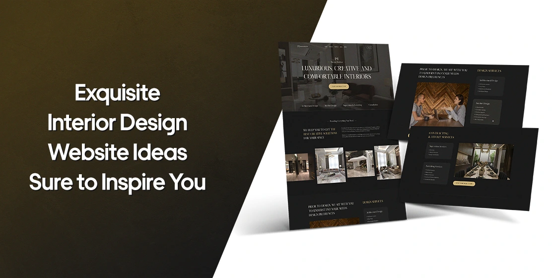
Interior design is a visual industry — and your website is the first portfolio a prospect ever sees. Before a client reads a single word about your process, they judge your taste from your homepage layout, typography, image treatment, and how effortlessly your work loads on their phone. That means your site has to do two jobs at once: showcase beautiful rooms, and be beautifully designed itself. This guide walks through eight of the best interior design websites on the internet today, breaks down exactly what makes each one work, and covers the practical questions every designer asks when planning or revamping a site — features, platforms, cost, SEO, portfolio presentation, mobile behavior, and the mistakes that quietly sink otherwise gorgeous designs.
Why Interior Design Website Ideas Matter More Than Ever
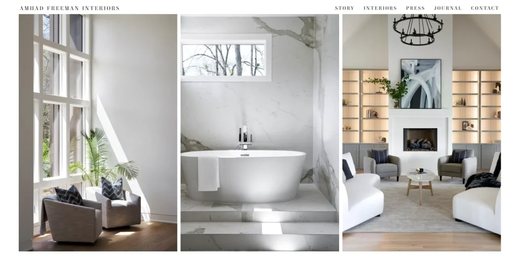
Let’s start with the why. Traditionally, people assume that because interior designers work in an artistic field, they’ll naturally produce a great website layout on their own. That is rarely the case. Interior design is about arranging aesthetics inside a physical space — it’s a different skill set from arranging aesthetics inside a browser window, where you have to think about grids, load times, breakpoints, and click behavior.
That’s why the most successful studios hire web professionals, or study proven interior design website ideas closely before committing to a direction. A business in any niche today struggles to grow without a strong web presence, but for interior designers the bar is doubly high: prospects arrive expecting the site itself to feel designed. A bland or dated homepage doesn’t just fail to convert — it actively contradicts your value proposition.
Following proven website ideas — rather than reinventing the wheel — dramatically raises the odds of a successful launch. If you want a broader primer on the mechanics behind a strong web presence, our ultimate web design guide and our roundup of web design principles both make solid companions to this article.
Elements That Every Successful Interior Design Website Shares
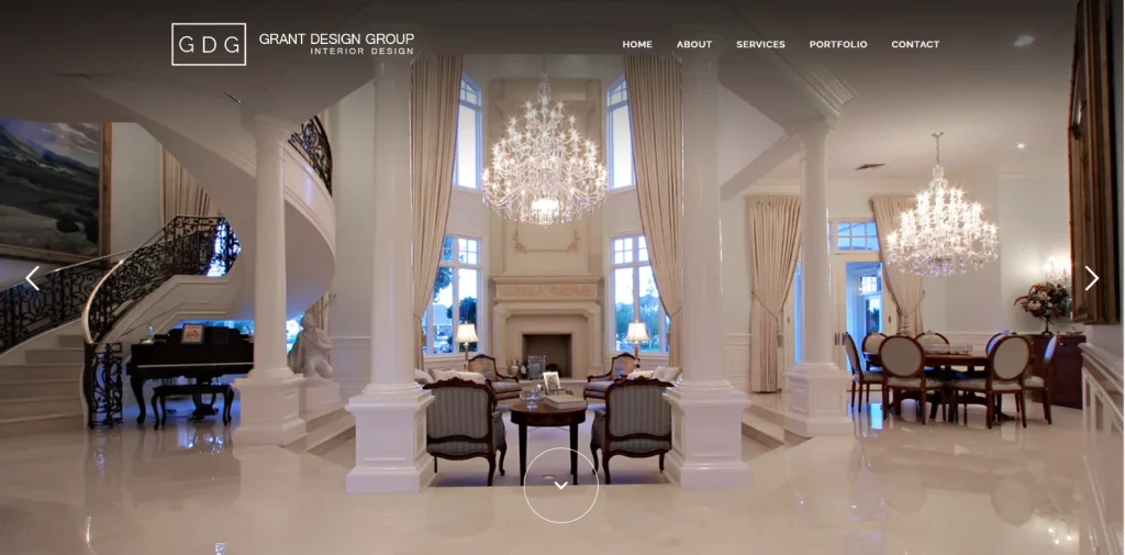
When you strip away the surface style, the top interior design websites share a small number of structural traits. The first is imagery that carries the brand. Every strong site leads with high-resolution photography from real projects, and the site’s color palette, typography, and spacing are chosen to complement that photography rather than compete with it. Neo-pop interiors deserve a bolder, more playful shell; refined minimalist interiors deserve airier layouts and quieter type.
The second is navigation that stays out of the way. Image-heavy sites often bury the menu or make it clever at the expense of being usable. The best ones keep the primary paths — Projects, About, Contact, Shop — visible in one or two clicks from anywhere on the site, and use hover states, sticky headers, or slide-out panels to keep the visual space clean without leaving visitors stranded.
The third is a considered brand system that extends past the site into everything else. Your interior design logo, color palette, and a documented brand style guide should reinforce the same story your website tells. When those three pull in different directions, prospects sense it even if they can’t articulate why.
8 Interior Design Website Ideas to Show How You Can Make Your Website a Success
Below are eight interior design websites we keep returning to. Each one solves the presentation problem differently, and each one carries at least one idea worth stealing for your own project.
1. Cathie Hong Interiors
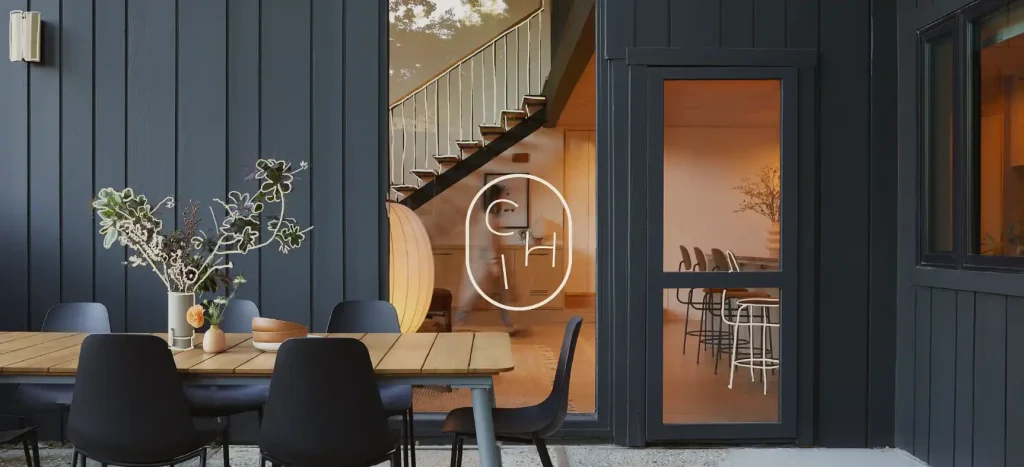
Cathie Hong Interiors proves that restraint reads as sophistication. At first glance the homepage is almost aggressively simple: a plain white background, a clean grid of project images, and a sizable band of whitespace framing each thumbnail. That whitespace is the whole trick — it forces the eye to slow down and treat each project as a standalone piece, the way a gallery mats a photograph.
The wordmark uses a straightforward sans-serif, echoing the site’s minimalist approach — a good example of the principles behind wordmark logo design and minimalist branding. If your interior design philosophy leans quiet, warm, and pared-back, this is the reference to study first.
2. Tyler Karu
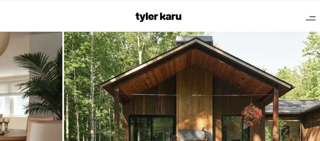
Tyler Karu shares the minimalist DNA but swaps the grid for a hero slideshow. A few carefully chosen projects rotate across the top of the page, and hovering over any image swaps the cursor for an oversized custom pointer inviting you to open the full project. That single micro-interaction sets the site apart from ninety percent of portfolio templates.
The rest of the page is quietly disciplined: text is short and scannable, the logo sits confidently without competing with the imagery, and a full-page navigation panel expands from a single button in the top right. It’s a masterclass in UX vs UI thinking — every choice serves the visitor’s attention, not the designer’s ego.
3. Karageorgiou
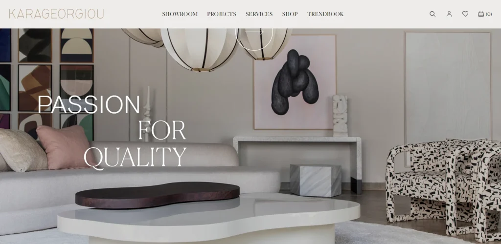
Karageorgiou is a Greek studio that leans into a modern minimalist aesthetic softened by warmer neutrals. Instead of the reflexive white background, the site uses a pastel cream-brown backdrop with darker brown accents, then punctuates it with black type and contrasting imagery. The result feels rooted, timeless, and unmistakably European.
Text and images alternate rhythmically down the page, and the density never tips into clutter — proof that a bold color choice, applied consistently, does more heavy lifting than any single hero image ever could.
4. Studio Jari
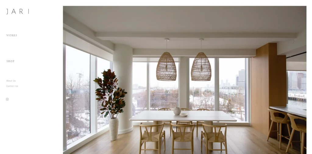
Studio Jari is the shared studio of Seyeon Jeong and Jeeheyung Kim, two Korean designers who met studying in New York. Their interiors lean into clean layouts and wood-forward materiality, and the website mirrors that ethos exactly.
A vertical navigation panel occupies the left quarter of the screen with prominent links to Projects, Shop, About, Contact, and Instagram. The remaining three quarters host a full-height slideshow of their work. It’s a layout worth borrowing if you want visitors to feel like they’re browsing a curated gallery rather than clicking through a marketing site.
5. Renner Interieur
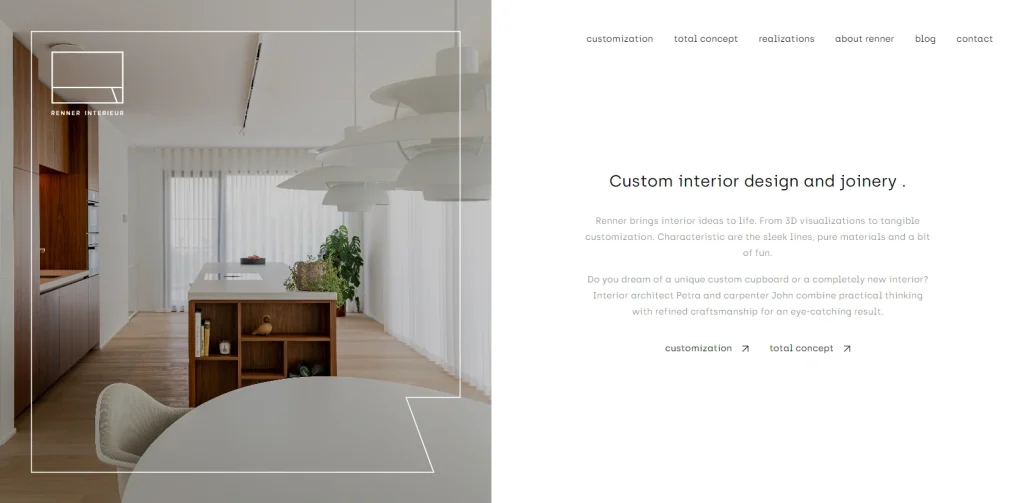
Renner Interieur, a Belgian studio, splits the hero section straight down the middle: imagery on one side, text and navigation on the other. Subsequent pages flip the arrangement, which keeps the site feeling composed but never repetitive.
Where Renner really earns its place on the list is motion. Scrolling is deliberately slow and buttery, and select elements move at a slightly different pace to create a subtle parallax effect. It’s a good showcase of how motion, applied sparingly, can lift a static portfolio into something closer to a physical showroom. If you’re curious how motion trends are evolving more broadly, our web design trends roundup covers the current landscape.
6. AphroChic
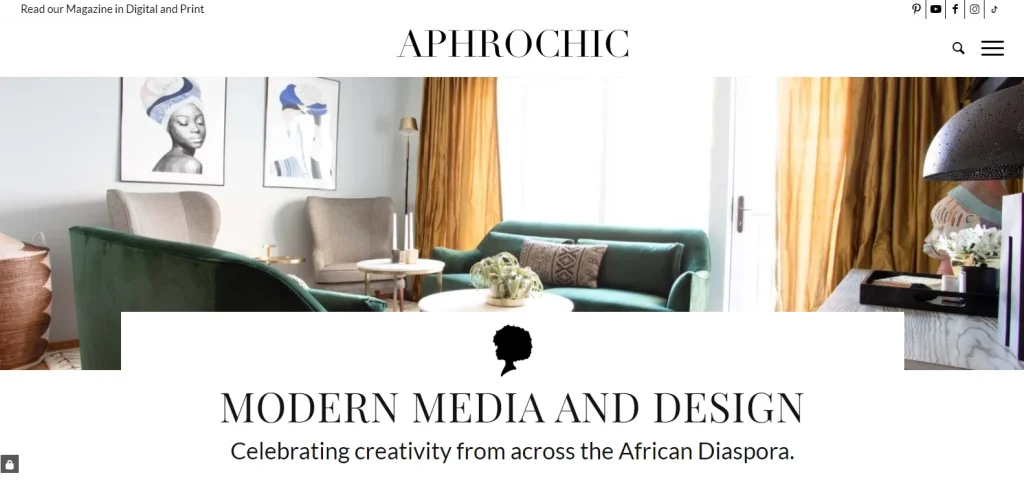
AphroChic centers its work on African-inspired interiors, and the site uses that identity as a design system. A crisp white background acts as a canvas for saturated rectangles of imagery leading to the gallery, e-commerce store, and design shop. The palette isn’t just decorative — it’s the brand.
It’s a strong argument for treating your website’s color story as a strategic asset. If you want to think more deliberately about the emotional signals your palette sends, our guide to logo color meanings transfers directly to web design decisions.
7. Sashya Thind
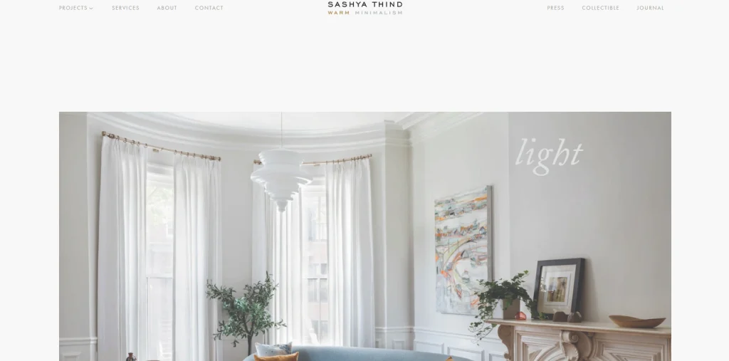
Sashya Thind coined an approach she calls warm minimalism — minimalist geometry rescued from coldness by organic textures and softened neutrals. The website practices what it preaches. Instead of the usual stark white, the background is a light gray-brown pastel, buttons are a complementary warm brown, and the body copy shares that same family.
The result feels human without giving up any of the discipline that makes minimalist design so effective online. It’s also a reminder that typography trends and background color are just as important to the mood as the photography itself.
8. IN56
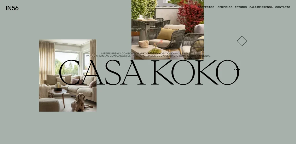
IN56 is a Spanish studio based in the Biscay region, with a bold, Basque-influenced visual identity. The site pushes convention hardest. Instead of the usual vertical scroll, the homepage moves horizontally, taking visitors through a sequence of projects — each named with the prefix “Casa” — like frames in a strip of film.
As you scroll, the background color shifts between complementary tones, and imagery layers over and under blocks of type to create a multi-plane composition. It’s the most technically ambitious idea on this list, and for studios with the budget to execute something similar cleanly, it’s one of the most memorable references you’ll find anywhere online.
How to Design an Interior Design Website From Scratch
If you’re building a site rather than remodeling one, the process is more predictable than most designers expect. Start with positioning — decide who you want to work with, what style of project you want more of, and which two or three feelings you want a visitor to walk away with. Everything downstream, from color to type to case-study length, gets easier once that’s written down.
From there, the standard sequence is: gather your best 8 to 12 project photo sets, write short project descriptions for each, sketch a homepage wireframe, pick a platform, choose or commission the visual identity, build the site, and stress-test it on real phones before launching. Working through a structured list of questions to ask when designing a website before you begin can save weeks of rework later.
Solo designers and small studios don’t need the enterprise stack — often a considered template and disciplined content is enough. Our overview of web design services for a small business covers what to expect at that scale.
The Best Platforms for Interior Design Websites
Almost every interior designer’s site runs on one of four platforms: WordPress, Squarespace, Wix, or Webflow. None of them is universally correct, but each suits a different kind of studio.
WordPress remains the most flexible option if you plan to blog seriously, sell products, or eventually add booking, membership, or multilingual features. It carries a steeper maintenance load — updates, security, hosting — but rewards you with almost limitless customization.
Squarespace is the default recommendation for independent designers who want a beautiful, image-first site with minimal ongoing effort. The templates are strong out of the box, and photography-heavy portfolios look premium without much fiddling.
Wix has closed the design gap with Squarespace considerably and offers more granular drag-and-drop control, which suits designers who want to art-direct every pixel themselves.
Webflow sits at the top end. It gives you the visual freedom of a custom-coded site with a designer-friendly editor, and it’s the platform behind many of the more ambitious references on this list — including sites with horizontal scroll, parallax, and complex hover states.
Must-Have Features Every Interior Design Website Needs
Regardless of platform, a small set of features distinguishes a working interior design site from a digital brochure that never converts.
- A project portfolio organized by category (residential, commercial, hospitality) or by style, with each project treated as its own case study rather than a lone image.
- A clear About page with a real photograph of the designer or team — prospects hiring for their home want to know who is walking through the door.
- A press and features section if you have one; third-party validation shortens the trust cycle dramatically.
- A contact page with a short qualifying form (project location, budget range, timeline, scope) rather than a bare email address.
- A journal or blog for SEO and to demonstrate taste between project launches.
- An optional shop for designers who license products, sell decor, or maintain an affiliate storefront — see our e-commerce web design trends for what’s working right now.
- Fast, well-compressed hero imagery and lazy-loaded galleries — nothing kills a portfolio site faster than a slow first paint.
Interior Design Website Design Trends Worth Following
A few directions are shaping the best new interior design sites this year. Editorial-magazine layouts, borrowed from print interiors publications, are replacing generic portfolio grids: think oversized serif headlines, generous margins, pull quotes, and captioned imagery. It reframes the studio as a publication with a point of view rather than a service vendor.
Warm neutral palettes — bone, oat, taupe, terracotta — have largely replaced the stark black-on-white default that dominated portfolio sites for a decade. Motion has become more restrained: subtle parallax and gentle image reveals rather than the aggressive scroll-hijacking that defined the mid-2010s.
Custom cursors, oversized on-hover project cues, and slow-crossfade slideshows all keep showing up in the strongest new launches. If you want a wider view of the current visual direction of the web, our full write-up on current web design trends goes deeper.
How Much an Interior Design Website Costs to Build
Pricing varies more than most people expect, so it’s worth naming the three tiers honestly. A self-built Squarespace or Wix site using a premium template typically runs $200 to $800 in first-year costs once you add the domain, hosting, template, and stock photography. It’s the right choice for a first site, or for a designer who wants to launch quickly and iterate later.
A designer-built WordPress or Webflow site, using a customized template with your branding baked in, generally lands between $3,000 and $10,000. That price usually includes photography direction, copy polish, a small CMS setup, and basic SEO — enough to compete credibly with established local studios.
A fully custom, agency-built site with bespoke motion, a considered content strategy, and integrations like booking or e-commerce typically starts around $15,000 and can climb well past $40,000 for the more ambitious references on this list. That tier makes sense when your projects are large enough that a single additional lead per year pays for the entire build.
SEO Considerations for Interior Design Websites
Interior designers routinely underinvest in SEO because their sites look beautiful and their portfolios speak for themselves. But most inquiries still start on Google, and the studios that win the top local map spots for “interior designer + city” capture a disproportionate share of qualified leads.
The fundamentals are boring but non-negotiable. Every project page should have a descriptive title tag, a unique meta description, and alt text on every image that names the room, style, and location where relevant. Your Google Business Profile should be filled out completely, with fresh photos added regularly and reviews requested from every completed client.
On-page content matters more than most designers realize. A short paragraph beneath each project explaining the brief, the challenge, and the outcome does more for rankings than any technical trick. Pair that with a consistent journal — one thoughtful post a month is enough — and internal links between related projects, and you’ll outrank most competitors within a year. If revenue is the goal, our guide to how to make a website that makes money ties these threads together.
Portfolio Presentation Best Practices for Interior Designers
Your portfolio is the entire site, so it deserves a deliberate treatment. Group projects by category or aesthetic so a visitor searching for a modern coastal home isn’t hunting through mid-century farmhouses to find one. Within each project, lead with a wide establishing shot, follow with medium shots of key vignettes, and close with detail images. Three to eight images per project is a good working range — enough to tell the story, few enough that people actually reach the end.
Add captions to at least the establishing shots. A one-line note about the brief, the location, or a specific design decision gives context that pure imagery can’t, and it feeds keywords to search engines without making the page feel padded. If you’re rebuilding an older portfolio site from scratch, our roundup of website redesign ideas covers common structural pitfalls to sidestep.
Mobile Responsiveness for Interior Design Websites
More than sixty percent of visits to interior design sites now start on a phone. That single fact reshapes almost every design decision. Vertical images consistently outperform horizontal ones because they fill more of a phone screen. Navigation menus should collapse into a hamburger or slide-out drawer that stays reachable with a thumb. Text overlays on hero images need enough contrast to remain legible in bright outdoor light, not just on a color-calibrated desktop monitor.
Test your site on at least two real phones — one small, one large — before launching, and again after any significant update. Cross-device testing catches the issues that desktop previews reliably miss. Our brief on user testing in web design walks through a lightweight approach that works for solo designers.
Choosing Colors and Typography for an Interior Design Website
The palette and type on your website should feel like they came from the same studio that designed the interiors in your portfolio. That sounds obvious, and yet the most common mistake on interior designer sites is a generic black-on-white theme that could belong to a dentist, a lawyer, or a SaaS startup.
For color, pick two neutrals and one accent drawn from the palettes you actually use in projects. If your work leans warm, your site should feel warm; if your work is monochromatic, your site can afford one restrained pop. Our overview of interior design color palettes is a good starting reference.
For typography, resist the temptation to use three or four typefaces. One serif for headlines and one clean sans-serif for body copy handles almost every situation on a portfolio site. If you want the headline face to carry more personality, pair a distinctive display serif with a neutral sans-serif and let the display type do the work. Our overview of current typography trends covers what’s landing well right now.
Mistakes to Avoid When Designing an Interior Design Website
A handful of mistakes appear on almost every underperforming interior design site. The most common is oversized, uncompressed imagery that stalls load times on mobile — a 4MB hero photo will lose you more prospects than any design flaw. Next is hidden or clever navigation that looks elegant on the designer’s desktop and becomes unusable on a phone.
Cluttered case studies come next: fifteen images from one project, all similar, with no captions or narrative. Trim ruthlessly. Then there’s the missing contact qualifier — a bare email link invites tire-kickers, while a short form filters for real budgets. Finally, dated copyright years, broken portfolio links, and a blog with two posts from three years ago all quietly telegraph that the studio isn’t paying attention.
If any of these ring uncomfortably true, our questions to ask when designing a website checklist doubles as a diagnostic pass for existing sites.
Single-Page vs Multi-Page Interior Design Websites
Not every studio needs a sprawling site. A well-executed single-page site can carry a boutique practice for years — hero project, three or four featured case studies, short bio, contact form, done. It loads fast, is easy to maintain, and forces editorial discipline about what really matters.
Multi-page sites become necessary once you have more than a dozen worthwhile projects, an active blog, an e-commerce component, or multiple service lines you want to rank separately in search. If you’re leaning toward the simpler route first, our roundup of one-page website examples shows how strong that format can look when done well, and our overview of types of websites to create covers the wider landscape.
Conclusion
Some industries have a harder time than others locating the right design direction for a website, and interior design sits near the top of that list. The bar is high because the whole audience is visually trained. But once you know the vibe of your studio, have chosen a few interior design website ideas to steal from, and have committed to the boring fundamentals — fast images, clear navigation, honest case studies, real SEO — the path from blank page to a site that actually wins work is more straightforward than it looks. Use the eight sites above as your reference shelf, borrow shamelessly, and build something that looks like it could only have come from you. And if a fresh interior design logo is part of the revamp, that’s usually the right place to start.

Logopoppin
Logopoppin is a graphic design agency that specializes in logo designing, web development, video production and advanced branding services. We love to innovate businesses with new age technologies, allowing them to improve their visual reputation.